
5 Things to A/B Test to Make Your Mobile Apps Better

A/B testing is long and arduous—and necessary—especially for mobile apps. Your app store listings, promotional landing pages, even external ads are all ripe opportunities to get more users and make more money in the process.
One of the problems with blindly following design trends is that we stop trying to find the optimal design, content, or features for our own apps. There are always exceptions to the rule, and with something as subjective as design, chances are good there are slight tweaks you could be making to your apps that would improve the overall performance.
Keep in mind that when we talk about performance, we have to think much more broadly than just how to make more money from the app. Things like app store discovery, download rates, and lifetime engagement matter, too.
That’s why A/B testing is really valuable for mobile apps. Not only can you test alternate designs and content within the app to maximize performance and conversions, but you can experiment with outside elements as well.
5 Things to A/B Test to Make Your Mobile Apps Better
A/B testing is basically the scientific method for designers.
- Start with your mobile app in its natural state (the control or “A” version)
- Identify something that’s either wrong with it or that you believe could be improved upon
- Form a hypothesis (e.g. “If I change this one element, 5% more users will upgrade to a paid subscription.”)
- Design the alternate design, content, or layout (the “B” version), choosing only one element at a time to test
- Run the test
- Review the results and determine if they were significant enough to implement the variation
It seems straightforward enough, doesn’t it? But what’s tricky about mobile apps is the fact that it’s not just a conversion rate that needs to be fixed. You may need to improve:
- The amount of traffic to the promotional landing page
- The number of downloads from the app store
- The number of in-app upgrades
- The time spent engaging with the app
- The average lifetime value of your users
- Or you might simply want to test a new feature before rolling it out
So, let’s look at the various things you may need to set your sights on when A/B testing your mobile app.
The App Store
Why should you A/B test?
If you’re not getting any impressions in the app store, then visibility in search results is a problem. And if you are getting impressions but very few downloads, then there’s something wrong with the content on your app page.
Either way, the goal here is to attract the right kind of attention and get users to click the “Get” button.
What parts should you A/B test?
If the issue is impressions, then you need to focus on two things:
- Building authority with customer reviews (which you can’t A/B test)
- Improving the appearance of your app in search results (which you can test)
Now, Google Play is the only app store that allows app developers and designers to A/B test their store search results. That doesn’t mean you can’t improve your app’s performance in the Apple store. It just means you’ll have to do your testing over on Google and then implement the winning updates in the Apple counterpart.
Just keep in mind that mobile apps appear differently from app store to app store.
For instance, this is how matches for “productivity” appear in the iOS app store:

When users do specific searches in the Apple store, they receive detailed previews of each matching result.
The same search in the Google Play store, however, results in the following display:

Google Play is much more concise in how it displays apps in search results. That said, you can still use the existing elements (i.e. the app icon and name) to test possible theories about what would result in more impressions.
Now, if you’re having issues getting downloads, that’s when you should turn your attention to the app’s dedicated page. Thankfully, Apple and Google handle these pages similarly, so A/B testing on Google should help you get viable answers for both app stores.
As for what you should test here, pretty much all the custom elements of the page are up for grabs. Take, for example, this page for Grammarly Keyboard:

Above-the-fold you can edit:
- The app icon (which also appears in search results)
- The app name (you can also edit the store search name if it’s different)
- The product screenshots and videos
Only one element at a time can be tested, however, so you may want to start with the product screenshots since users would’ve already seen the logo and title in search results. If impressions aren’t a problem, then the content selling the app probably is.
And don’t forget about the app description down below:

When it comes to content, there are a number of things to experiment with:
- The content (message) itself
- The length of the content
- The structure of the content
If you’ve already tested the screenshots and had no success finding a variant that makes a difference in downloads, focus on A/B testing your description.
The Website or PWA Counterpart
Why should you A/B test?
If you’ve built a dedicated landing page or website to promote the mobile app, then it should be doing its job of sending online traffic to the app store. If you’re not getting those referrals, though, then it’s time to A/B test your website and see what’s keeping them from taking action.
What parts should you A/B test?
Really, this depends on the complexity of the website.
For instance, this is the website for the Robinhood app:

The desktop website for the Robinhood app looks like a typical website. But if you look closely, it’s not 100% clear that it’s a landing page for an app (except for the graphic). Even the signup process doesn’t explicitly explain that they’re signing up for an investment app.
So, if you’re looking at your Google Analytics data and finding that users are clicking all of the right things, but then nothing happens once they visit the app store, clarifying your messaging could be the solution.
If you are clearly promoting the app, I’d then suggest you look at the actual clickable elements.
For example, this is the Robinhood PWA:

It’s the same exact site as desktop, except there are no “Sign Up” buttons this time. Now, there’s a sticky bar at the bottom of the page with the app icon, name, rating, and a button that says “Get the app”. It’s perfectly clear what this website is promoting and what action users should take.
But is it enough? If you haven’t yet experimented with your app store design or content, you might need to do that if your site is getting visitors but no one is clicking this link. Or you might need to tackle the content on the site itself.
It’s important to look at the data you have to try to figure out what’s going on before you start chipping away at these elements.
External Ads
Why should you A/B test?
Another way visitors may learn about your mobile app is through ads you run in other apps. If the ad creative or copy isn’t getting the job done, then you’re going to see a whole lot of ad spend with very few clicks in return.
What parts should you A/B test?
First, consider what the issue is.
Are you getting a healthy amount of ad impressions, but no clicks? Or are impressions scarce, too? If it’s the latter, then the issue is with audience targeting (and not something you should be handling the testing of). If it’s the former, then the issue is with the content (and is something you can take care of).
Let’s look at some examples.
This is an ad for Progressive that appears in the BBC News app:

The banner ad was designed to fit in this small space, but it’s too blurry to read—especially the smaller text. In this case, you’d want to examine your ad and consider removing some of the copy and rearranging the layout so that each element can be larger and crisper looking.
It’s not just the size of the ad that can compromise its performance.
Next, let’s look at a bigger ad. This one is a square video ad for Virgin Voyages:

As far as these kinds of ads go, there’s more to consider than just the content of the video. Would this be more effective as a static image? Would a full-screen interstitial be a better size for it? Is it too long of a runtime?
Again, if you’re seeing impressions on your ads but very few clicks, then you have to do your best to figure out why visitors aren’t responding well to it.
The same also goes for interstitial ads. This one is for Texas Tea Slots and it appears in the Apple Podcasts app:

While you might not have control over when or where your ad appears, you can decide how it plays out. This one, for instance, is an interactive video ad that prevents users from exiting for five seconds. If you have an ad like this, you might want to consider whether interactivity is a good idea or a regular video ad would be more effective. You could play around with the ad design and length, too.
Just remember that impressions are not the goal here. You’re spending money on ads so that people visit your app in the store and download it, so you need to see clicks come out of your A/B tests.
The Mobile App Itself
Why should you A/B test?
If users are downloading the app, but they’re not:
- Keeping it installed for long
- Engaging with it frequently or at all
- Staying long enough to spend any money, watch any ads, etc.
Basically, if you can’t retain users’ attention or loyalty, then you need to figure out what’s going on inside the app.
You should also be A/B testing your mobile app once you have all the kinks sorted out. There are always small tweaks you can make to increase engagement, sales, and the overall lifetime value of your customers.
What parts should you A/B test?
I mean, you could literally test every inch of your mobile app. But that’s not what A/B testing is about. You need to use the data you currently have on your mobile app users to decide where you need to focus.
For instance, if the signup rate is low and deactivation rate is high, look at your onboarding process. And, specifically, at what part you’re losing your users.
For instance, the Centr fitness app has five steps before users can actually step inside it.

This is the very first step of the onboarding process. There are a number of elements that could be tested here:
- The copy at the top (the content, the size of the text, the length of it, and even if it needs to be there at all)
- The image (a different first image, single image vs. image slider, or remove the image altogether)
- The CTA (one button versus two buttons, button text, color, placement)
Then, of course, you have the actual signup steps:

Forms of any kind are always important to A/B test. In this case, I’d suspect the signup form trips up a lot of people because it’s not easy to fill out. There’s no auto-capitalization, the email address has to be entered twice, and there’s no easy tabbing through the fields.
As for the rest of the app? I’d suggest focusing on the key elements that users are supposed to engage with:
- Navigation
- Interactive parts of the interface
- Upgrade buttons and promotions
- Add to Cart/Checkout areas
- And so on
Once you’ve gotten the app’s content to a good place, start to chip away at possible distractions. For instance, could the placement of third-party ads be preventing more users from making purchases? Could the icons used on the home page be making it more complicated to choose a service? Does anyone even engage with your “Give us a rating over on the app store” messages?
Again, don’t go on instinct here. Pay close attention to your data and dig into the nitty-gritty to find the spots in your app that need some finessing.
Push Notifications
Why should you A/B test?
This is useful when more users hit “Don’t Allow” than they do “Allow.” Or when a high volume of users turn off push notifications after being subscribed to them. Or when your users see the messages, but don’t click back into the app from them.
What parts should you A/B test?
Push notifications are a great tool for mobile app engagement and re-engagement. But it’s easy to go overboard, which is why it’s really important to test this part of your app if they’re not performing well.
If your users are reluctant to “Allow” notifications in the first place, consider the timing and the messaging of your request.
This is Adobe Spark Post, for example:
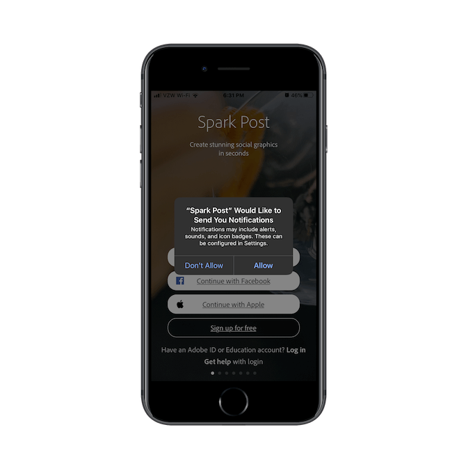
The second I entered the app, this request appeared on my screen. You can see behind the overlay that I hadn’t even had a chance to sign up yet.
Since there is nothing custom or specific about the push notifications request message, that could possibly be an issue when it comes to getting more Allows. Though it’s more likely the timing since users don’t even have a chance to see the app or why notifications would be relevant before allowing them.
If the issue instead is users turning off notifications after enabling them, then you’re going to look at one of three things:
- Content
- Timing
- Frequency
Here’s a recent roundup of push notifications I received from my installed apps: Uber Eats, Lyft, Airbnb, and Hotels.com:

It might be difficult—even with access to your data—to figure out what the actual culprit is for the unsubscribes. So, what I’d suggest you do is look at your push data over different time periods.
For example, look at the Airbnb notification sent just before midnight. If you suspect it’s the timing of the message, look at other late messages that were sent and compare them to ones sent earlier in the day. What’s the percentage of unsubcribes then? You could also study frequency issues in a similar manner.
As for content, you can look at the length of the message, the purpose, the formatting, and even the language it’s written in (for example, do emoji really get more attention and clicks)? That’s probably your best bet when you’re having issues with no clicks instead of unsubscribes.
Wrap-Up
With mobile apps, A/B testing isn’t going to be simple. But think about how expensive apps are for your clients and how difficult it can be to build up a user base, retain it, and actually make money from it, too.
A/B testing is the best way to get validated proof of what your users want from their experience and what will actually spur them on to engage and/or buy. So, if you’re not yet providing this as a service for your mobile app customers, give some serious thought to it. You’d greatly improve the return on their investment and create a new recurring revenue pathway for yourself in the process.

Suzanne Scacca
A former project manager and web design agency manager, Suzanne Scacca now writes about the changing landscape of design, development and software.
Comments
All articles
Topics
Latest Stories
in Your Inbox
Subscribe to be the first to get our expert-written articles and tutorials for developers!
All fields are required