
TL;DR
We’ve always placed the user experience first, here at Skroutz. Since a performant application is essential for a seamless journey, speed has always been at our core.
Our rapidly evolving environment -the number of development teams, the adoption of new technologies, the addition of new features etc.- gradually slowed us down.
We knew we had to take action.
For this, we formed a non-typical task-force team to speed us up. We identified the problems, chose our measurement tools and methods and took the plunge.
Measuring performance is not an easy task. It involves both user perception and strictly defined metrics and thresholds.
In order to improve the speed, we tried various solutions. Some worked. Some didn’t. Below you can read in short the key takeaways.
Assets. Our main goal was to optimize the number and timing of requests. By initially loading only the necessary above the fold images and fine tuning our lazy loading mechanisms, we noticed significant gains in terms of initial requests (almost half in our Product page and up to 30 less in our Listing) and therefore some worthy improvement in Speed Index metrics (in some cases up to ~4.5%).
HTML. Excessive DOM size was one of our most critical performance bottlenecks. Our Product pages (the most important section) could reach up to ~8k nodes in some cases, far from Google’s proposal of 1,5k.
We tried various solutions involving windowing (rejected), async loading product cards’ content and showing less user reviews (by risking losing valuable user generated content).
What did make a huge difference was timing: Loading the information when it actually needed to exist. This was achieved by implementing a mechanism that would notify each card when it was about to appear in the viewport. The only element needed beforehand was a single-node placeholder. In some cases the DOM nodes were reduced by 45%, which results in an increase of ~10 points in our overall Lighthouse score!
CSS. Although our styling architecture was in pretty good shape, we thought it might be worth trying critical CSS. The concept was to initially load only the necessary styles for rendering anything above-the fold. This would improve metrics such as First Contentful Paint & Largest Contentful Paint while making the loading feel faster. It turned out that the above metrics were too slightly improved compared to the effort needed to add it in our pipeline. In short, this didn’t work for us.
Javascript. Moving gradually from static to interactive pages caused code bloating, especially at the Javascript side. Our main JS file was including lots of libraries that were not used in every page. This is a problem, especially for mobile devices, due to the fact that JS runs in the main thread.
Our actions, directed to reduce our webpack bundle size in order to release main thread calculations for the initial load, and iterate over the Redux architecture to improve speed after user interaction, led to slightly better performance.
During this journey, we also started addressing some issues on new Web Vitals user-centric metrics. We mainly focused on visual stability, by eliminating any layout shifts.
After a year’s work, we made Skroutz.gr faster. And more stable.
If you are interested in more details, and you’re ready for a deeper technical dive, make yourself a coffee and keep on reading (it will take ~30 minutes to read).
Table of Contents
Speed: not a Metric, but a Users’ Issue
Evolution of Performance Metrics: from Speed Index to Core Web Vitals
› Pagespeed Insights (PSI)
› Core Web VitalsThe Problems of Skroutz.gr
› HTML
› CSS
› Javascript
› AssetsThe Journey: What Worked and What Didn’t
› Assets
› HTML
› CSS
› Javascript
› Core Web Vitals: Cumulative Layout Shift (CLS)
A Brief History
Skroutz.gr was always a quite fast and sophisticated web application.
Speed has always been a critical component for Skroutz.gr since we believe that for a modern web experience, it’s important to get fast and stay fast.
Historically, the biggest problem we were facing regarding speed (and the biggest blessing at the same time), was the really huge amount of content (DOM) in some of our most popular pages, which contains a lot of shops and user-generated content, like reviews, questions, etc. This problem becomes bigger and bigger as we add extra information for Products and Categories or extra services (we have developed a Marketplace functionality where users can buy directly from Skroutz.gr).
Back in 2016, the huge DOM of some pages was causing crashes due to memory restrictions in some devices (i.e. iPad), while at the same time the performance was poor, in terms of rendering and painting. To solve these issues at that time, we started requesting and rendering elements asynchronously.
However, since our last major redesign in 2016, lots of things have changed.
Facts like the rapidly growing number of development teams, the adoption of new technologies (i.e. React js, CSS Grid), the addition of more and more features in our pages, etc., led to worse rendering performance, despite the fact that today there are better and more powerful devices our applications are running on.
Rendering speed took a backseat.
On the other hand, one of the main questions we’re regularly asking ourselves here at Skroutz, is whether our website responds to our users’ expectations and what we can do in order to help them with their buying decisions. When it comes to user experience, speed matters.
Today, consumers are more demanding than they’ve ever been. When they weigh up the experience on a site, they aren’t just comparing it with their competitors, they’re rating it against the best in class services they use every day.
Being of “Moderate Speed” was not acceptable for us, so we decided to take action in order to resolve the issues.
We formed a non-typical task-force team, consisting of engineers, SEO-ers and product owners and we started working on, in order to improve our speed.
In the following, we describe things we did, how we measured our actions, what worked for us, what didn’t work, and some takeaways from our experience during the journey.
Speed: not a Metric, but a Users’ Issue
Imagine you’re walking through an unfamiliar city to get to an important appointment.
You walk through various streets and city centers on your way. But here and there, there are slow automatic doors
you have to wait for to open and unexpected construction detours lead you astray. All of these events interrupt
your progress, increase stress and distract you from reaching your destination.
People using the web are also on a journey, with each of their actions constituting one step in what would ideally be a continuous flow.
And just like in the real world, they can be interrupted by delays, distracted from their tasks and led to make errors.
These events, in turn, can lead to reduced satisfaction and abandonment of a site or the whole journey.
In both cases, removing interruptions and obstacles is the key to a smooth journey and a satisfied user [chromium blog].
When it comes to user experience, speed matters. A
consumer study
shows that the stress response to delays in mobile speed are similar to that of watching a horror movie or solving
a mathematical problem, and greater than waiting in a checkout line at a retail store [ref].
Website performance is crucial to a web application’s success.
Amazon found that each additional 1/10th of a second of load time corresponded with a 1% reduction in sales. Walmart found that for every second they improved their page load times they added an additional 2% to their conversion rate [ref]. EBay saw a 0.5% increase in “Add to Cart” count for every 100 milliseconds improvement in search page loading time [ref].
Besides conversion rates, you may know that Google uses the performance of a website as a ranking factor in search results as well!
In his book Usability Engineering (1993), Jakob Nielsen* identifies three main response time limits.
- 0.1 second — Operations that are completed in 100ms or fewer will feel instantaneous to the user. This is the gold standard that one should aim for when optimising your websites.
- 1 second — Operations that take 1 second to finish are generally OK, but the user will feel the pause. If all operations take 1 second to complete, a website may feel a little sluggish.
- 10 seconds — If an operation takes 10 seconds or more to complete, the user may switch over to a new tab, or give up on the website completely (this depends on what operation is being completed. For example, users are more likely to stick around if they’ve just submitted their card details in the checkout than if they’re waiting to load a product page).
* Since these limits published back in 1993, as internet speed have increased and we are now browsing the web at a lightning pace, there is a speculation that the upper limit is pretty smaller, close to 5 seconds or even lower.
Takeaway: Performance is important! It can mean the difference between making a sale, or losing a customer to the competition.
Evolution of Performance Metrics: from Speed Index to Core Web Vitals
Performance is a foundational aspect of good user experiences.
But what exactly is Performance?
And how do we put a page in the fast or in the slow bucket?
Users of the web expect that the pages they visit will be fastly rendered, interactive and smooth. Pages should not only load quickly, but also run well; scrolling should be stick-to-finger fast, and animations and interactions should be silky smooth.
Performance is more about user perception and less about the actual, objective duration. How fast a website feels like it’s loading and rendering has a greater impact on user experience than how fast the website actually loads and renders.
How fast or slow something feels like, depends a lot on whether the user is actively or passively waiting for this thing to happen. Waits can have an active and passive phase. When the user is active - moving the mouse,
thinking, being entertained, they are in an active phase.
The passive phase occurs when the user is passively waiting, like staring at a monochrome screen. If both the passive and active waits time were objectively equal, users would estimate that the passive waiting period was longer than the active. If a load, render, or response time can not be objectively minimized any further, turning the wait into an active wait instead of a
passive wait can make it feel faster.
Besides perception, as the web evolves over time, the metrics and the thresholds evolve too.
How we measure and assort a page today regarding their rendering speed, may be completely irrelevant tomorrow.
While a lot of things constantly change, there is something that remains the same: human perceptual abilities, which are critical in evaluating an experience.
But how do we practically evaluate whether a page is fast or not in Skroutz all these years?
There are 2 main phases regarding this.
We used to focus on low level timings, like the Time to First Byte (server response, networking), the Speed Index (visual display),
the First Paint etc.
Now, we try to incorporate more quality user metrics.
Let’s see the most important ones… starting from Google.
According to Google too, speed matters. For this, Google encourages developers to think broadly about how performance affects a user’s experience of their page and to consider a variety of user experience metrics.
To the time being, the following are some resources that we, at Skroutz, use to evaluate a page’s performance:
- Lighthouse, an automated tool and a part of
Chrome Developer Tools for auditing the quality (performance, accessibility, and more) of web pages.
- PageSpeed Insights, a tool that indicates how well a page performs on the Chrome UX Report and suggests performance optimizations.
- Web Vitals is the latest initiative by Google, to provide unified guidance for quality signals that are essential to delivering a great user experience on the web.
- Chrome User Experience Report, a public dataset of key user experience metrics for popular destinations on the web, as experienced by Chrome users under real-world conditions.
Google has long used page speed as a signal for rankings, and the new (and different) approach in this signal uses data measured directly by Chrome on users’ desktop and mobile devices. As a result, Google announced that in 2021 the Core Web Vitals metrics will join other user experience (UX) signals to become a ranking signal.
PageSpeed Insights (PSI)
Google’s PageSpeed Insights (PSI) reports on the performance of a page on both mobile and desktop devices, and provides suggestions on how that page may be improved.
PSI provides both lab and field data about a page. Lab data is useful for debugging performance issues, as it is collected in a controlled environment. However, it may not capture real-world bottlenecks. Field data is useful for capturing true, real-world user experience - but has a more limited set of metrics. See How To Think About Speed Tools for more information on the 2 types of data.
At the top of the report, PSI provides a score which summarizes the page’s performance. This score is determined by running Lighthouse to collect and analyze lab data about the page. A score of 90 or above is considered good. 50 to 90 is a score that needs improvement, and below 50 is considered poor.
Core Web Vitals
Core Web Vitals are the subset of Web Vitals that apply to all web pages, should be measured by all site owners, and will be surfaced across all Google tools.
Each of the Core Web Vitals represents a distinct facet of the user experience, is measurable in the field, and reflects the real-world experience of a critical user-centric outcome.
Although the metrics that make up Core Web Vitals is being evolved over time, the current set for 2020 focuses on three aspects of the user experience: loading, interactivity, and visual stability:
- Largest Contentful Paint (LCP): measures loading performance. To provide a good user experience, LCP should occur within 2.5 seconds of when the page first starts loading.
- First Input Delay (FID): measures interactivity. To provide a good user experience, pages should have a FID of less than 100 milliseconds.
- Cumulative Layout Shift (CLS): measures visual stability. To provide a good user experience, pages should maintain a CLS of less than 0.1.
The Problems of Skroutz.gr
Generally, when a user types a URL in her browser, the browser makes a GET request to a remote server, the server responds with some resources, which when they arrive at the browser, they are integrated together in order to render a visual.
For this procedure to deploy, besides networking timings and delays, one of the most critical components is the weight of the resources asked.
These resources are usually, the HTML (from where the DOM gets built), the CSS (from where the CSSOM gets built), probably one or more JS scripts, Images and Fonts (Assets). Let’s break down each one.
HTML
A large DOM tree can slow down page performance in multiple ways.
First of all, a large DOM tree often includes many nodes that aren’t visible when the user first loads the page, which unnecessarily increases data costs for the users and slows down load time. Furthermore, as users and scripts interact with the page, the browser must constantly recompute the position and styling of nodes, causing rendering lags. Last but not least, targeting elements (through CSS or JS) applies to a large number of nodes, which can overwhelm the memory capabilities of devices.
Skroutz’s main issue at the time being, was the excessive DOM size, especially at the Product pages.
Unfortunately, our Product pages are the most important sections of our application and have a lot of content, user generated or not. Even worse, Product pages with a lot of content (and excessive DOM) are the most popular ones, since the content regards many shops, a lot of product information, multimedia, many user reviews etc.
Although many sections were already coming asynchronously, they were still too heavy. At that time, our most heavy Product pages had ~8k nodes. This was far from Google’s Lighthouse proposal of 1,5K nodes total maximum.
Below is a graph of our top visited 3.000 Product pages, regarding Shops and Reviews numbers.
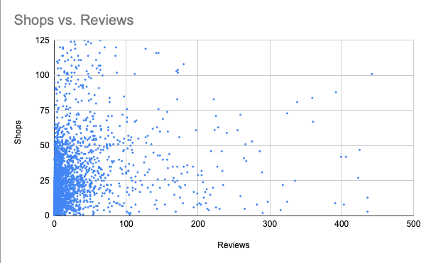
Shops & reviews of top 3.000 products
With the most popular pages having more than 30 shop cards and at least 30 user reviews each, it was clear that we had to find ways to lighten the weight without running the risk of getting hit by an SEO issue (rankings).
That was a quite difficult exercise to solve.
CSS
CSS is, besides HTML, the most critical component for a browser.
The browser can only paint the page once it has downloaded the CSS and built the CSS object model. For this reason, CSS is render blocking.
Browsers follow a specific rendering path: paint only occurs after layout, which occurs after the render tree is created, which in turn requires both the DOM and the CSSOM trees.
Our styling architecture was in pretty good shape (you can read our approach in detail here, which is close to the current state).
We bundle our CSS files depending on the viewport (mobile-first approach) and we further separate them in a few major sections in order for them to be easily handled from the browser (i.e. Books section, logged section etc).
As it was hype during this period, we thought we can try critical CSS, especially on mobile viewports to test if it could speed up the rendering process.
Javascript
When a browser runs many events, it’s going to do it on the same thread that handles user input (called the main thread).
By default, the main thread of the renderer process typically handles most code: it parses the HTML and builds the DOM, parses the CSS and applies the specified styles, and parses, evaluates, and executes Javascript.
The main thread also processes user events. So, any time the main thread is busy doing something else, a web page may not respond to user interactions, leading to a bad experience.
Loading too much Javascript into the main thread (via <script>, etc.) was the main issue for us, especially for mobile devices.
The size of our JS bundle (named skr_load.js) was 312KB (1.2MB) after compression!
The main issues regarding Javascript were the following:
- Lack of Tree shaking, many unused components and dead code
- Lots of application and library code were in the same big fat JS bundle
- Lots of libraries like lodash were fully imported instead of partially
- Heavy dependencies included in the abovementioned JS bundle still not used in any other page
Assets
According to HTTP Archive, as of November 2018, images makeup on average 21% of a total webpage’s weight.
So when it comes to optimizing a website, after video content, images are by far the first place one should start!
Optimizing images is more important than scripts and fonts.
And ironically, a good image optimization workflow is one of the easiest things to implement, yet a lot of website owners overlook this.
This was true for us too.
We found many images in different sections that got requested initially, although they weren’t rendered unless the users scrolled down a lot.
The Journey: What Worked and What Didn’t
Having had written down the total set of performance bottlenecks, it was the time for actions.
Although for most web pages it’s pretty straightforward what’s necessary for a better rendering performance, this was not true for us.
Because there is one magic word, regarding speed: diet!
In general, page speed could be improved by reducing the payload across all resources. By simply loading less code. Trimming all the unused and unnecessary bytes of JavaScript, CSS, HTML, and JSON responses served to users.
However, Skroutz.gr is a popular web application with more than 30 million sessions per month.
We had to be very careful in terms of user experience, since even a small change could add-up to a huge drop in sales.
Furthermore, the majority of our visitors come from organic searches, so we had to deploy that diet without running the risk to negatively impact our SEO performance.
Here is how we did it.
Assets (networking)
While, according to our initial analysis, the main bottlenecks were DOM size (HTML) and JS scripting, we opted for the low hanging fruits first.
Assets loading was the first and most obvious place to look for unnecessary initial calls that could easily be made async.
Images’ optimization was our best shot regarding assets, since we don’t have any non-safe webfonts or any other assets.
For the most part, images were loading on scroll and were adequately lightweight and optimized. But we had room for improvement.
Product page
In our Product pages, however, there were a few exceptions, mostly due to our -somewhat outdated- image lightbox.
Although UI-wise there are only 5 visible thumbnails on large screens (image below) and none on mobile, all images’ thumbs were loaded beforehand, along with the first high-res image of the carousel. The more the images, the bigger the problem. Note that our most popular Product pages, like mobile phones, could have anywhere from 20 to 30 images each.

Product page's gallery thumbnails
The lightbox was indeed outdated, but so did the structure of the list holding the thumbs. A brief refactor not only saved the redundant image requests, it also saved 3 DOM nodes per lightbox image (minus the 5 thumbs on desktop).
Most notably, we removed the <img> tags, which also held the data-attributes used to populate the lightbox. We moved the data-attributes to the parent <li> and used anchor tags only for the 5 visible thumbs, placing the images as background-image directly on them.
Background-image, unlike regular <img>, does not load unless visible*, thus saving the extra requests from mobile viewports without the need to have a different markup structure.
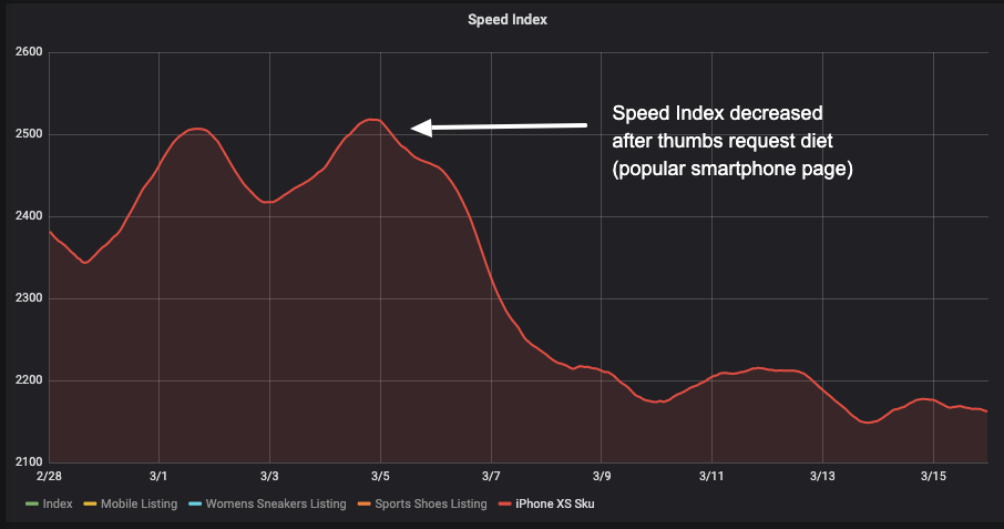
Taking into account some additional minor cuts (e.g. async load the 3 images of product suggestions, load first high-res lightbox image only after opening), image requests were reduced to almost half.
In numbers, one of our most popular phones with 25 images, instead of 39, now does 20 image requests, all being necessary above-the-fold images.
After deploying, Speed Index showed a decrease of ~4.5% (see image below, red line for the Product score).
Thumbnails "diet" results graph
Apart from the top (above the fold) section, we already used lazy loading on the product cards in the Product pages, but there was some room for improvement and this involved the reviews section at the bottom of the page.
Down there, we noticed that the user thumbnails were loaded immediately even though they were far down below the fold. After some code inspection, we realized that there was a lazy loading mechanism (using an external library) but it didn’t work properly.
This was caused by a CSS rule that was setting the user thumbnail as a background image on the appropriate element. Thumbnails were loaded immediately* and the lazy loading library didn’t have to do any work at all.
We fixed this by removing the specific CSS rule and replacing the old lazy loading mechanism with a newer one (using Intersection Observer).
The results on pages with 30 reviews were:
- 30 HTTP requests less
- 30 - 100kb less on page load
Test results (table below) showed a small improvement even though this can just be score fluctuations from Pagespeed. In any case, it was an easy fix that reduced HTTP calls and network traffic.
| User thumbnails load initially | User thumbnails load asynchronously | Difference |
|---|---|---|
| 60.4 | 63.1 | 4.5% |
Pagespeed scores for user thumbnails
* Images in stylesheets will trigger an HTTP request only after the render tree has been calculated and the corresponding elements are about to be rendered. However there are inconsistencies among browsers.
Listing page
In Skroutz.gr we have 2 types of Listing layouts: normal & tile.
- Normal (list) layout: every row has one product which translates to one image per row.
- Tile layout: every row has more than one product, which means more images per row (4 in desktop, 2 in mobile viewports).
In normal layout, we had an average Pagespeed performance score range from 80 to 90+ and in tile layout from 40+ to 50+.
Truth be told, tile rows are bigger (higher) than list rows so their ratio is not exactly 4:1 but generally speaking, tile lists load more images/products than normal lists.
In tile layout lists, we had more than 60 HTTP requests for images for about 800kb of data.
That’s a lot of requests and data we could shave off!
We tried solving this with the native HTML attribute “loading”.
This posed 2 problems:
First, browser coverage is somewhat low (~70%) mainly because of Safari not supporting the feature. (as of 07/2020)
Second, browsers implement native lazy load differently. The biggest difference is between Chrome and Firefox.
Chrome is playing it safe, loading a lot of images before being scrolled into view (they’re trying to find the sweet spot).
On the other hand, Firefox is really aggressive with lazy loading, only loading images that are 50% or more inside the viewport.
As we couldn’t rely on HTML for this, JS came to the rescue.
We created a React Higher Order Component (HOC) that utilises IntersectionObserver capabilities.
Using this HOC, we implemented lazy loading in Listing images that works in the same way in every browser that supports Intersection Observer API (almost 90% including Safari).
We now have control over the loading threshold and we don’t rely on every different native implementation of every browser.
Running tests with Pagespeed Insights on quite heavy Listing pages (like men’s jackets) yielded some really good results (~10 points improvement).
Below is the graph of a heavy Listing’s page Speed Index and the average pagespeed improvement.
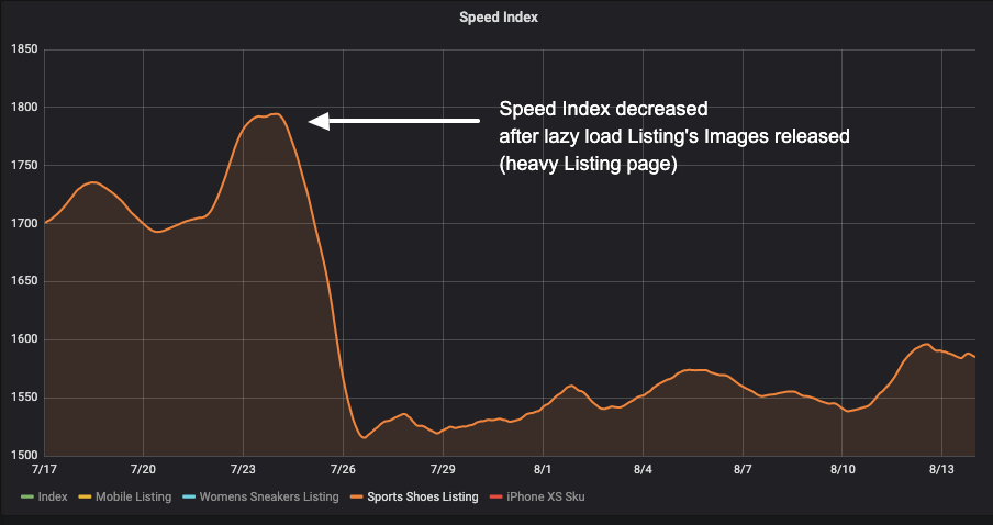
Speed index improvement graph
| Before lazy load | After lazy load | Difference |
|---|---|---|
| 48.5 | 59.5 | 22.6% |
Pagespeed score for tile layout list
HTML
As already mentioned above, the excessive number of DOM nodes was one of our most critical performance bottlenecks in our pages.
Product page
In Product pages there are rendered shops that sell the product. In some popular ones, due to the large number of shops selling the product, the DOM nodes exceed 8.000!
Undoubtedly, for our products pages this was the most challenging part, since click to shops is the most critical path to a buyer’s journey.
Google’s Lighthouse suggests that in order to optimize large lists, one should use a library called react-window. By using this library we could achieve to only render the list items in our viewport.
In other words, while a user is scrolling through the shops’ list, the actual items that are being rendered are the ones that currently exist in the viewport along with a few items before and after those that have been already displayed.
This eventually did not work for us, and the main disadvantage was that the product cards did not have a fixed height. Although the library provides a solution for dynamic list items, in our case, the shop cards have a lot of information that should be rendered. But the result wasn’t the expected one. Many shop cards failed to be rendered at the right time, mostly on “faster” scrolls and the overall experience seemed broken.
The solution was in another direction.
We had to load the information at the right time when it was actually needed to exist. It was crucial that the cards should maintain their fixed height while being loaded, in order to avoid layout shifts.
In order to achieve this we had to separate the primary information, from which the card’s height was defined, from the secondary one. We considered product links as the primary information because they designate the card’s height and price, shop location, ratings etc. as secondary.
The solution was to render a single node as a placeholder instead of a bunch of nodes that represent secondary information on the initial page load.
Next step was to implement a mechanism that would notify each card that would appear in the viewport and IntersectionObserver suited perfectly for this!
Last and final step, for each card displayed in viewport, we replaced the placeholder with the actual information.
By completing all the aforementioned steps, the number of the DOM nodes was reduced dramatically.
In some cases the DOM nodes were reduced by 45%, which results in an increase of ~10 points in our overall page score.
In addition to the abovementioned, we kept an eye to the users’ reviews section.
The reviews reduction experiment was part of our effort to reduce DOM elements in the Product page, without running the risk of dropping in organic results, from an SEO perspective.
User reviews are the most typical form of user-generated content (UGC). User reviews about a product is one of the most critical things that can impact purchasing decisions. Consumers are actively looking for content that is unique, relevant, and trustworthy. In fact, according to BrightLocal, 88 percent of consumers trust online reviews written by other consumers as much as they trust suggestions from their personal network [ref.].
Yet what many don’t know is that UGC is also good for SEO. Search engines such as Google and Bing rank websites based on whether the sites’ content is relevant and useful. Over 25% of the search results for the 20 largest brands in the world are linked to user-generated content [ref.].
In order to reduce reviews’ number at initial load, we had to carefully implement and deploy an experiment first to see if the SEO can be impacted.
We currently render the first 30 reviews with a “load more” button for loading the rest of them. Every Review has roughly 30 DOM elements which translates to 900 elements more or less on every Product page.
For the experiment, we divided two Product page groups, one with twelve (12) initial reviews and the other with seven (7).
First of all, we wanted to see how the reduced reviews impact the rendering performance.
Second, we kept an eye on the conversion rates and the users’ flow onsite.
Third, we were up at SEO performance, comparing the 2 groups having reduced reviews’ number with a control group (no change).
After running a number of Pagespeed index tests for every before and after state, we got the following results.
| 30 reviews (group 1) | 7 reviews (group 1) | Difference |
|---|---|---|
| 60.6 | 69.2 | 14.2% |
| 30 reviews (group 2) | 12 reviews (group 2) | Difference |
|---|---|---|
| 64.7 | 73.3 | 13.3% |
Review reduction experiment results on 2 groups of products
We had an improvement of almost 9 points for both groups which leads us to believe that:
- We probably reached the biggest improvement we can get from DOM elements reduction.
- There is no reason to reduce our initial reviews number to 7 since 12 yields the same improved scores.
Also, regarding the users’ flow and the conversion rates and sales, we didn’t record unusual fluctuations.
Last but not least, we didn’t notice statistically significant SEO performance changes, that would discourage us from exposing the change across the site.
CSS
Critical CSS was a really weird concept the first time we came around it.
The general idea is: Take all the CSS rules you need for rendering above-the-fold elements and put them in your HTML file.
The pros of this trick are that the browser will instantly read this “Critical CSS” and start rendering the above-the-fold elements with their applied rules instead of waiting for a CSS file to download and then do the rendering.
The rest of the CSS is downloaded when onload event is fired thus not blocking the browser from rendering.
Critical CSS affects metrics like First Contentful Paint & Largest Contentful Paint.
After some research for possible implementation methods and an experiment that ran in selected Product pages, we reached the following conclusions:
- The change in scores was minuscule (1-2 points) and probably was caused by fluctuations in Pagespeed Index results.
- The implementation of critical CSS for production needed a lot of effort. We would probably have to set up an automated job, generating all the critical CSS rules every time a change in our styles was pushed into master.
The combination of high effort & low gains made us stop focusing on this idea and pursue other ways to improve performance and lower rendering times.
Takeaway: Critical CSS didn’t work for Skroutz.gr!
Javascript
In order to optimize our JS performance, we worked on reducing the main bundle file that was causing overload of the main thread (initial request), and on Redux architecture for faster response on user’s inputs.
We finally came up with the following solutions:
Ways to reduce our webpack bundle size
After analysis we started by avoiding libraries’ global imports and enforcing this rule with eslint. For example, requiring only the needed specific lodash functions resulted in a 9% bundle reduction. Enforcing this rule with eslint made sure we won’t come across this issue again.
Then we used code splitting. With webpack you can split your bundle up into many smaller ones and only load the bundles needed by each page. We tried to split our code and ship it in different bundles, but unfortunately this didn’t work for us, because of the many shared heavy dependencies between our main pages.
It did not reduce overall bundle size (it even slightly increased it), so we decided not to proceed with it.
Redesign the state of one main page of our React Redux application into a normalised shape
This initiative was about improving the performance (response) after a user’s action on a page (i.e. filtering the results of a Listing), not for the initial request.
Keeping state normalised plays a key role in improving performance and avoiding unnecessary re-renders of the React components.
In a normalised state each type of data gets its own “table”, each “data table” should store the individual items in an object (with the IDs of the items as keys and the items themselves as the values), any references to individual items should be done by storing the item’s ID and ordering should be indicated by the use of arrays of IDs.
With this normalised shape, no changes in multiple places are required when an item is updated, the reducer logic doesn’t have to deal with deep levels of nesting and the logic for retrieving or updating a given item is now fairly simple and consistent [read more on this].
React hydration takes long
Another problem we found was the hydration on the client.
Hydration is the process by which React attempts to attach event listeners to the existing markup on client side, it is also an important process because it validates that the markup generated from the server and the markup on the client is the same, proof that SSR works as expected.
Hydration is a time consuming process that increases load time and delays TTI. The solution to that problem is progressive hydration, unfortunately due to our SSR implementation we couldn’t implement that.
However we can implement lazy hydration as a replacement but React is already considering including progressive hydration in its core soon.
Core Web Vitals: Cumulative Layout Shifts (CLS) issues
In late May 2020, while we had already progressed in our making-Skroutz-faster journey, Google announced they’ll be “Evaluating page experience for a better web”.
What this meant for us, is that we had to focus on enhancing page experience, according to Google’s Core Web Vitals metrics.
As Google announced, the above metrics will evolve over time. Therefore, it’s likely that we would be chasing a moving target here, but we wanted to see it, so we emphasized on CLS, a user-centric metric for measuring visual stability, that was our main issue at that time, according to Google’s Search Console.
There were 2 main areas that induced layout shifts: Image loads & user interactions.
Image loads
Although it is quite common for image loading to cause layout shifts (LS), it is also easy to solve, by defining image dimensions.
Our most affected page was the Product page with color variations (on desktop), which had two types of images causing LS when loading: main image and color variation thumbs.
The latter was easier to solve, by adding a fixed height placeholder on the container element.
Fixing the main image LS was trickier, because of its orientation-dependent, variable height. Predefining its height was not an option, at least not for all products. While predefined height on portrait images seemed to solve the problem, this wasn’t the case for landscape images.
We then tried preloading the main image. If the network is fast enough to fetch the image before page rendering starts, no LS is caused.
The above fixes eliminated LS that occurred on Product page initial load, which essentially zeroed out lab data CLS.
Although the initial CLS score caused by image loads was not that significant (~0.03) any gain that will keep our pages score < 0.1 (marked as fast by Google) is important.
User interactions
Google search console marked a large number of our URLs as poor, the issue being CLS. The marked issues concerned both Product & Listing pages on mobile viewports.
After some investigation, the cause was found.
CLS was caused by our sticky header.
Header gets sticky after users scroll past a certain point, after which fixed positioning is added. Apart from the header itself, the issue involved sticky navigation on the Product page and sticky filters on the Listing page.
While the issue was a bit more complex (e.g. paddings were added to other elements to keep everything in place) simply put, adding or removing these sticky elements from the static flow of the document caused a Layout Shift.
Even more, this LS kept adding up each time our header got stuck or unstuck, resulting in significant CLS scores.
A simplified description of the solution is that we explicitly declared the heights of the sticky element containers. The containers then functioned as placeholders, maintaining the sticky element heights, even when they got out of the static flow.
A similar problem occurred in our product cards, where the shop’s rating and location were displayed. This information is fetched asynchronously which means that in the initial render the content of that section is empty. Once the data is fetched and the section populated, the container’s height changes, causing the next cards to be pushed down.
The solution was simple in that case too, we just had to specify the height of the placeholder’s container.
After the above mentioned fixes, our pages got improved, being now marked as “good URLs” instead of “URLs need improvement”, as the images below show.
Yeah!
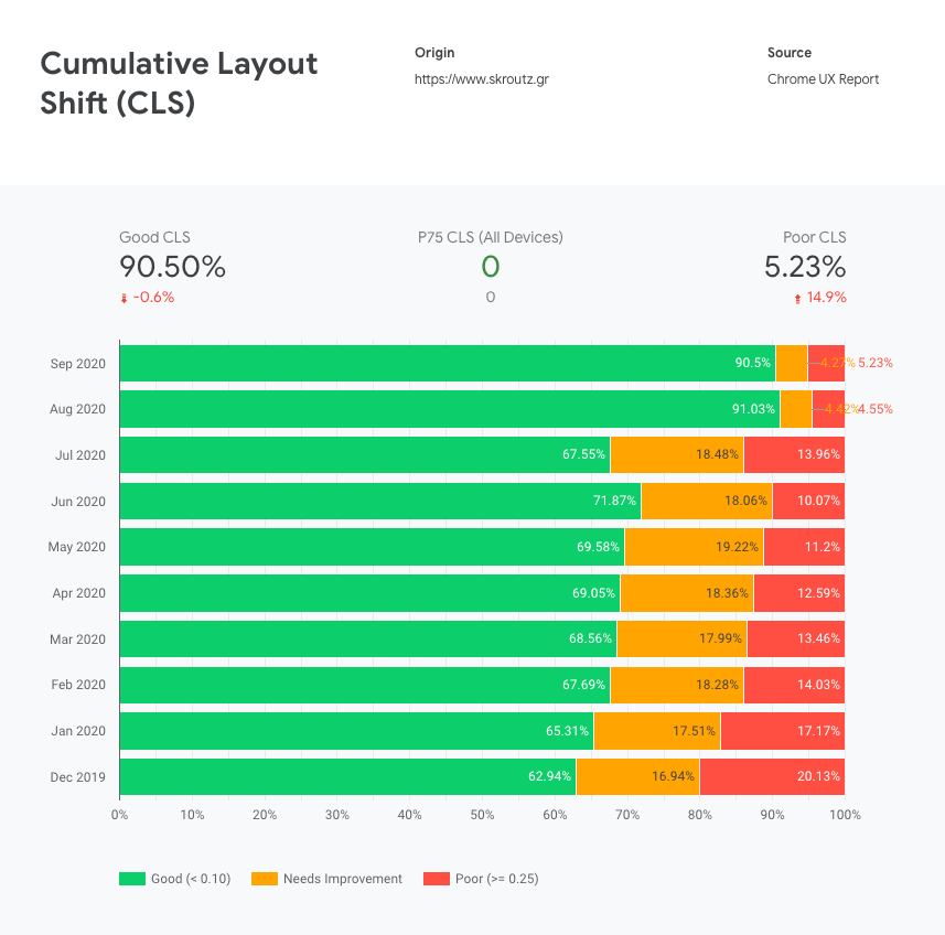
Skroutz's good CLS improved by 45%! (based on Chrome User Experience report)
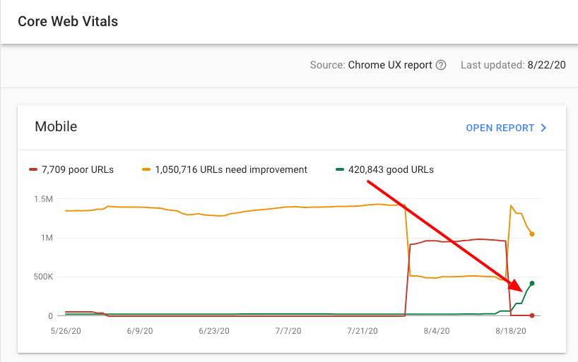
Good URLs rising after our CLS fixes (Google Search Console)
Onwards - Closing
After a lot and fun work for over a year, varied from things that were low-effort to a few that were advanced, we’ve done it.
We’ve made Skroutz.gr faster.
Performance is a feature at Skroutz. But it is also a competitive advantage. Optimized experiences lead to higher user engagement, conversions, and ROI.
Striving for speed is a never-ending journey. Although we achieved a better performance during the last year -and hopefully a better user experience for our visitors-, this is not the end of the story.
We are now in a training mode, we are setting-up a “speed mentality” to our Front-End engineers, especially for the latest and greatest things on rendering performance (Core Web Vitals). This post is part of the training!
We are also establishing an additional continuous monitoring system, that is a set of tools and methodologies that we will further apply to the existing ones, in order to have the new performance metrics under our daily radars.
We strive for fast pages and fast development. At the same time.
We have lots to do more! :)
Congratulations if you made it to the bottom of this huge post.
We hope you got some valuable points from our speed journey.
Have you tried optimizing your speed before?
Yes? No? Kinda?
Let us know, writing your experience and your findings in a comment below.
Best,
Skroutz Devs.
top image source: unsplash