Telerik UI for Blazor 2.18.0—Masked Textbox, Text Area, Progress Bar, RadioGroup & More!

The new Telerik UI for Blazor 2.18.0 comes with five new native components and many enhanced features to the Grid, TreeList, Scheduler and more. Check out everything that's new.
Hey Developer Folks! Exciting news today as we just released Telerik UI for Blazor 2.18.0, with an abundance of new native components including Masked Textbox, Text Area, Progress Bar, ChunkProgress Bar, and Radio Group, plus many new cool component features and enhancements! The Grid and TreeList components now allow easy column formatting, cell and row conditional styling and new events. The Scheduler component got enhanced with an option to render custom content and apply custom styling to its appointments, and on top of it all of Telerik UI for Blazor is now compatible with .NET 5.0 RC2!
Let’s explore the 2.18.0 release content and see in detail the new goodies you can incorporate in your Blazor Server and WebAssembly apps.
Blazor Masked TextBox Component
Masked Textbox UI Component Overview
The Telerik Masked TextBox component for Blazor allows you to get user input while ensuring the valid entry of standard formats, such as phone number, post code, social security number, credit card number, and also provides an option for custom formats such as company specific product code. The masked input provides multiple out-of-the box features related to configuring and customizing its visualization and behavior.
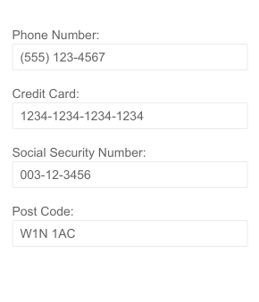
Telerik UI for Blazor Masked Textbox Component
Masked Textbox Configuration and Customizations
The Mask part of the Telerik component defines what user input is allowed and at which positions. It includes special built-in Rules that it recognizes as special characters when encountered in the Mask and determines how the user writes their input. In addition to the mask rules, you can also specify static symbols in the mask pattern known as literals. You can use them to show a more user-friendly format of the input, or to predefine some of the input for your user.
The Masked Textbox allows full customization by further providing options to specify literal, prompt character (defaults to underscore _ and provide hints to the user before they start typing), CSS class, placeholder, tab index and more.
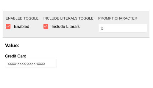
Telerik UI for Blazor Masked Textbox Customizations
Masked Textbox Label Options
You have options to specify whether the masked textbox Label should be rendered above the masked input or as a floating label using the MaskOnFocus parameter. If MaskOnFocus is set to false (default), the Label will always be above the input. When MaskOnFocus is set to true in combination with setting Label or Placeholder param values, you can easily achieve floating labels or placeholder interactivity.

Telerik UI for Blazor Masked Textbox Floating Label
Masked Textbox Component Events
The Telerik MaskedTextbox Blazor component exposes two events to let you handle and take actions based user input Blazor apps:
- OnChange - fires when the user presses Enter in the input, or when the input loses focus and can be used with two-way binding
- ValueChanged - fires upon every change (for example, keystroke) in the input and cannot be used with two-way biding
Blazor Text Area Component
TextArea UI Component Overview
The Telerik Blazor Text Area component is a nice addition to every application that requires wider text input. It allows the user to provide multiline text and is suitable for information such as address, short description, notes, comments etc. The TextArea component provides built-in features for auto resizing, floating label and events to respond to user actions.
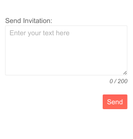
Telerik UI for Blazor Text Area Component
TextArea Component Auto Sizing
Using the AutoSize parameter, the Telerik TextArea UI component can be easily configured to automatically resize its height during keyboard input.
TextArea Component Floating Label
The ТextArea component provides an out-of-the box floating label—a placeholder with a floating animation upwards when the input gets focus. For cases when you prefer to use a standard label attached to the control, you can use the text area Id parameter and attach your own <label> tag.

Telerik UI for Blazor Text Area Floating Label
TextArea Component Customizations
In addition to the features mentioned above, there are many more text area configuration options you can take advantage of when using the component in your Blazor apps. These include defining placeholder, tab index, CSS class, title, width, enabling auto-complete and more.
TextArea Component Events
The Telerik TextArea component exposes two events to let you handle and take actions based user input Blazor apps:
- OnChange - fires when the user presses Enter to confirm the currently input value, or when the component loses focus and can be used with two-way binding
- ValueChanged - fires upon every change (for example, keystroke) in the input and cannot be used with two-way biding
Blazor Progress Bar Component
Progress Bar UI Component Overview
The Telerik ProgressBar component allows you to visually indicate the progress of operations in Blazor applications. The progress bar covers both scenarios: when you need to display what portion of the operation is completed or when its end is unknown to make the indicator indeterminate. It comes with multiple built-in features such as horizontal and vertical orientation, animations and options for label customization.

Telerik UI for Blazor Progress Bar Component
ProgressBar Component Label Customization Options
Indicating the visual progress of a task is complemented by adding a label alongside the visualization. As the design requirements may vary greatly from case to case, we ensured you have many handy options to let you easily set the label position, control its visibility or place custom content in it. The progress bar label includes Visible and Position parameters, as well as Templates to let you easily achieve the desired progress look in your Blazor app.
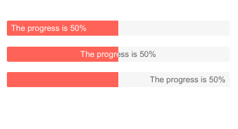
Telerik UI for Blazor Progress Bar Labels Position
Progress Bar Component Orientation
The progress bar component provides options for horizontal and vertical orientation for its progress status via its Orientation config option.

Telerik UI for Blazor Progress Bar Vertical Orientation
ProgressBar Indeterminate State
For operations when the estimated time of completion is unknown, or the progress can’t be represented as a specific value you can use the Indeterminate state of the ProgressBar. When setting the Indeterminate parameter to true, the ProgressBar is filled with a flowing motion animation to showcase that the task is running.

Telerik UI for Blazor ProgressBar Indeterminate State
Blazor Chunk Progress Bar Component
Chunk Progress Bar UI Component Overview
To further expand the options for visual indication of the completion level of tasks, we included a separate Chunk Progress bar component that is a perfect fit for operations with a predefined number of steps (chunks). The component includes vertical and horizontal modes, as well as indeterminate state.

Telerik UI for Blazor Chunk Progress Bar Component
Chunk Progress Bar Orientation
Just like the previously mentioned progress bar, here we have included two modes – horizontal and vertical chunk progress modes.

Telerik UI for Blazor Chunk Progress Bar Vertical Orientation
Chunk Progress Bar Indeterminate State
For operations when the estimated time of completion is unknown, or the progress can’t be represented as a specific value you can use the Indeterminate state of the ChunkProgressBar.
Blazor Radio Group UI Component
RadioGroup UI Component Overview
The Blazor Radio Button Group component allows the user to select a single option from a predefined list of choices represented by radio buttons. The RadioGroup component can be bound to primitive types or data models and customized by specifying layout order and label position. It comes with built-in keyboard navigation, allowing users to navigate between radio buttons and selecting options using just the keyboard.
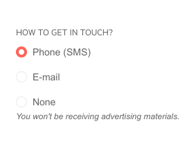
Telerik UI for Blazor Radio Group Component
RadioGroup Component Label Position & Layout
Depending on the application scenario, you can render the list of options in the RadioGroup component in a vertical or in a horizontal layout (defaults to vertical), and further define the labels position before or after the radio buttons (defaults to after the buttons). Both radio button group customizations can be easily done using the parameters Layout and LabelPosition.
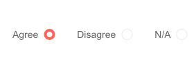
Telerik UI for Blazor Radio Group Label Position
Again, with a simple parameter (Enabled) you can enable or disable the entire component.
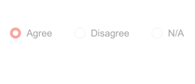
Telerik UI for Blazor Radio Group—Disabled State
RadioGroup Component Events
The Telerik RadioGroup UI component exposes two events to let you handle clicks and selection in Blazor apps: The standard ValueChanged and an OnChange event that lets you use two-way binding.
Blazor Grid and TreeList New Features
Grid and TreeList Column Display Format and Formatting of Cells and Rows
The Blazor Grid and TreeList components a new column DisplayFormat parameter to let you easily set a C# format string, so that it renders the values with the corresponding styling according to the current culture of the thread.
In the screenshot below, you can see the result of Telerik Grid Column DisplayFormat parameter for the Price column set to C and applied currency according to the current culture.
Check out more examples on how to apply column formatting in Blazor TreeList using the DisplayFormat parameter in the product documentation.
With the 2.18.0 release of Telerik UI for Blazor, applying conditional row and cell formatting for the Grid and TreeList has been significantly simplified through the OnRowRender and OnCellRender events.
The OnCellRender fires upon the rendering of the Grid data cells. It receives an argument of type GridCellRenderEventArgs and exposes the Item, Value and Class fields (the same is valid for TreeList OnCellRender event ):
- Item - an object you can cast to your model to obtain the current data item
- Value - an object that contains the value that is rendered in the Grid cell
- Class - the CSS class that will be applied to the cells
The OnRowRender Grid event fires upon the rendering of the Grid rows. It receives an argument of type GridRowRenderEventArgs and exposes the Item and Class objects (the OnRowRender TreeList event is similar):
- Item - an object you can cast to your model class to obtain the current data item
- Class - the CSS class that will be applied to the row element
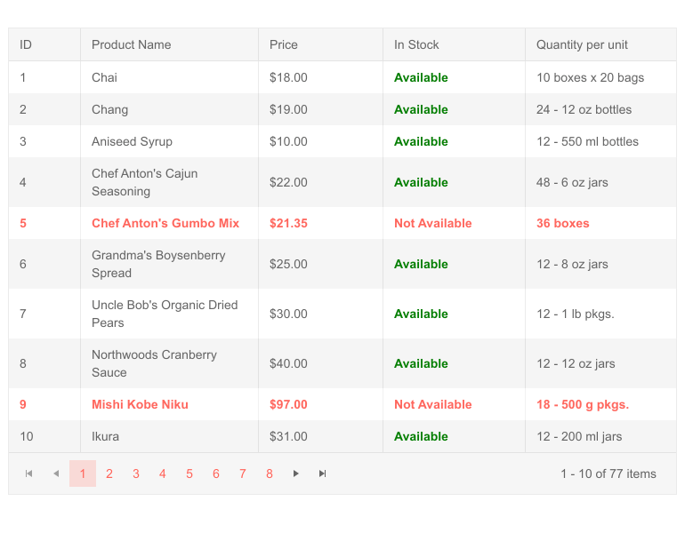
Telerik UI for Blazor Grid Formatting Attribute and Cell Formatting
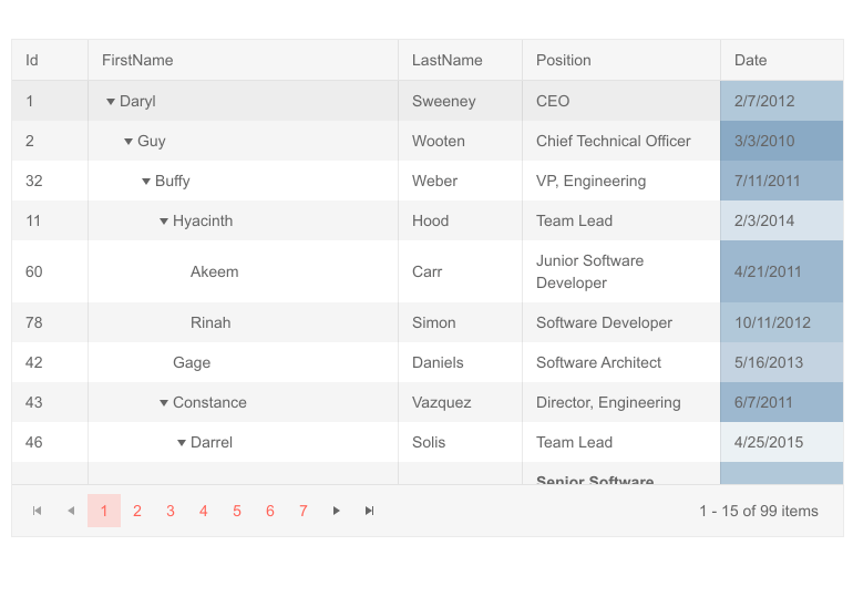
Telerik UI for Blazor TreeList Formatting Attribute and Cell Formatting
Blazor TreeList State Management
The new Telerik Blazor TreeList State Management feature will enable you to save, load and change all TreeList user-configurable elements: paging, sorting, filtering, column order, data grouping and more. Further flexibility of your application logic is provided by the tree list events OnStateInit and OnStateChanged, and the methods SetState and GetState.
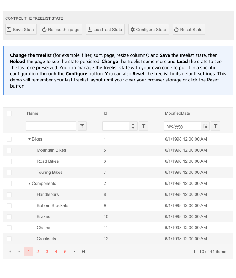
Telerik UI for Blazor TreeList State Management
You can programmatically set different aspects of the tree list from code, enable users to customize and save the way data is structured and visualized, or simply let them continue where they left off.
Check out the TreeList component persist state documentation article for further reference and more examples including how to start editing or inserting items, or how to get the column settings.
Blazor Scheduler Appointment Templates
The Telerik UI for Blazor Scheduler just got fancier with its templating option, which lets you render custom contents for its appointments. Using the Scheduler templates you can display any type of content within each appointment, such as icons, buttons, start and end time, and custom fields. Scheduler appointment templates work perfectly alongside other built-in appointment features—such as drag and resize handles, delete icon, arrows indicating if the appointment spans more than a day.
You have two scheduler templating options to choose from:
- ItemTemplate - controls the rendering of the regular appointments that are within the limits of one day
- AllDayItemTemplate - controls the rendering of all-day appointments in the All-Day row
To further customize the appointments appearance, you can use the OnItemRender event. It fires once for every appointment, when it is going to be rendered in the scheduler, including all-day appointments that span several days/slots, and lets you set the class that is rendered on the appointment element.
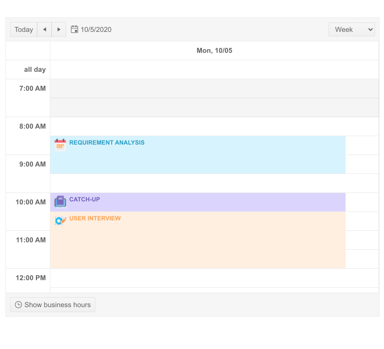
Telerik UI for Blazor Scheduler Appointment Templates
Blazor MultiSelect New Features
The new AutoClose parameter lets you choose the selection mode of the MultiSelect component. When set to true (the default) the dropdown list containing the items will automatically close after each user selection, otherwise the dropdown list will stay open until the user clicks elsewhere and focus is changed.
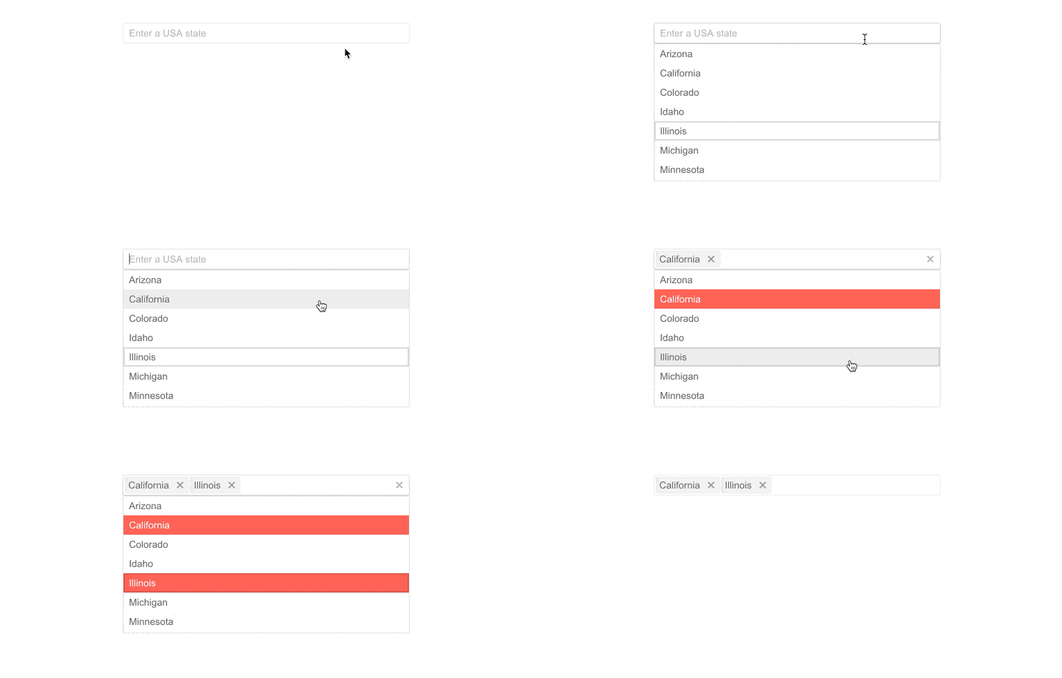
Telerik UI for Blazor Multiple Selection and AutoClose
Compatibility with .NET 5.0 Release Candidate 2
We are happy to announce that Telerik UI for Blazor 2.18 release is compatible with .NET 5.0 Release Candidate 2, and our goal is to provide full compatibility with the official release of .NET 5 later in November.
Download Telerik UI for Blazor 2.18.0
Head over to the Telerik UI for Blazor page, download a free trial of Telerik UI for Blazor 2.18.0, or if you are an active license holder you can grab the latest and greatest from the “Your Account” page or update your NuGet Telerik.UI.for.Blazor package reference to version 2.18.0. directly in your Blazor solutions.
Thank You from the Telerik Blazor Team at Progress!
As always, we are thankful to you for being involved and helping us grow and making Telerik UI for Blazor bigger and better. Keep telling us what’s working well, what needs to improve and which component or feature you’d like to see next in the dedicated Blazor feedback portal or in the comment section below!

Maria Ivanova
Maria Ivanova is a Manager of Product Management at Progress, for Telerik and Kendo UI components and developer tooling. She joined the company in 2019 as a Product Manager for Telerik UI web components and is passionate about developing impactful and innovative software products. Maria believes that to create great products, it's important to challenge the status quo, closely collaborate with customers, and embrace a spirit of experimentation. Follow her on Twitter or LinkedIn.
