50+ Native Blazor Components with the Telerik UI for Blazor R3 2020 Release!

It’s officially Telerik R3 2020 time and we are happy to share all the new components, features, and extensions that Telerik UI for Blazor has shipped over the last four months!
Telerik UI for Blazor just reached a new milestone of 50+ truly native Blazor components that are feature-rich and easy to customize, and supported by extensive developer resources including new online technical training on Blazor and Telerik UI for Blazor!
Following the earlier announced Editor, TreeList, Stock Chart and ContextMenu components, plus multiple Grid and Chart features, with the current 2.17 release we ship three new components—TileLayout, Loader and Switch, many new features like Grid Search and Column Menu, Visual Studio Dashboard Project Template, Linux installer, and more!
As always, we listened to your feedback and included in the release many of the most voted items. Read ahead and see the details of what’s new in Telerik UI for Blazor!
New Blazor TileLayout Component
TileLayout Overview
The new TileLayout is a container UI component consisting of tiles, where plain content and various other Blazor components can be added, such as Grid, Charts, ListView, or components from your app. The TileLayout allows the end users to reorganize and resize the contained tiles inside of it in order to create a layout that best suits their needs. The TileLayout is a great match for Blazor apps that need to provide a flexible and customizable layout and especially dashboard-like applications.
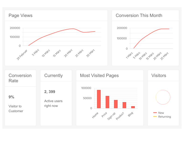
Telerik UI for Blazor TileLayout Component
In this code sample you can see how easy it is to add the TileLayout tag and generate a tiled layout:
<TelerikTileLayout>
    <TileLayoutItems>
        <TileLayoutItem HeaderText="Tile 1"></TileLayoutItem>
        <TileLayoutItem HeaderText="Tile 2"></TileLayoutItem>
        ...
    </TileLayoutItems>
</TelerikTileLayout>
In essence, the TileLayout component is a two-dimensional grid-based sandbox surface that enables you to display content in tiles. The dimensions are easily configurable through the following properties: Width, Height, Columns, ColumnWidth, RowHeight, RowSpacing and ColumnSpacing as shown in the example below (you don’t have to set them all, the Columns is the main setting):
<TelerikTileLayout Class="CustomClass"
                    Columns="5"
                    ColumnWidth="350px"
                    RowHeight="235px"
                    RowSpacing="30"
                    ColumnSpacing="30"
                    Width="900px"
                    Height="1000px">
    <TileLayoutItems>
        <TileLayoutItem HeaderText="Tile 1"></TileLayoutItem>
        <TileLayoutItem HeaderText="Tile 2"></TileLayoutItem>
        ...
    </TileLayoutItems>
</TelerikTileLayout>
TileLayout Items
Each tile layout item has configurable dimensions (ColSpan and RowSpan), body content, specified through the <Content> tag, header text and header template that cover both simple cases with plain text, and more advanced with components in it.
<TelerikTileLayout>
    <TileLayoutItems>
        <TileLayoutItem Class="CustomItemClass"
                         ColSpan="1"
                         RowSpan="1"
                         HeaderText="Item Header">
            <Content>
                <p>Item content</p>
            </Content>
            <HeaderTemplate>
                <p>Item header template</p>
            </HeaderTemplate>
        </TileLayoutItem>
        ...
    </TileLayoutItems>
</TelerikTileLayout>
TileLayout Items Resizing
The Tile Layout component allows resizing of its items and can be turned on by its Resizable parameter. Resizing of each item can be done effortlessly by dragging its right-hand side, bottom, or bottom-right-hand corner, which will update its RowSpan or ColSpan respectively.
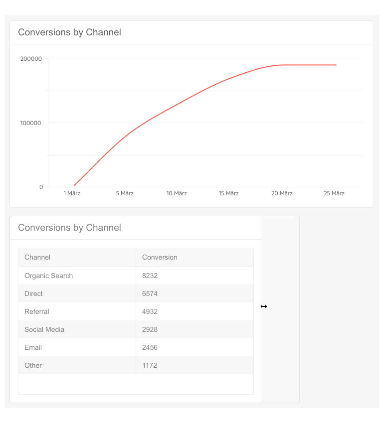
Telerik UI for Blazor TileLayout – Resizing Tiles
TileLayout Items Reordering
Along with the resizing of tile items, the component will also allow their reordering via its Reorderable parameter. When reordering is enabled, the user can drag each tile header to reorder the items.
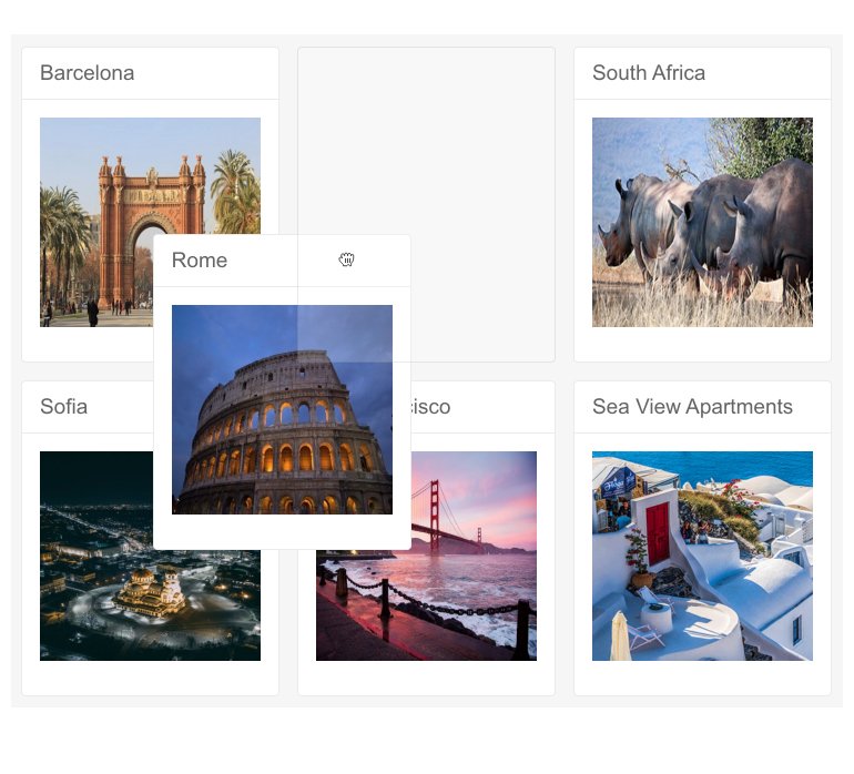
Telerik UI for Blazor TileLayout – Items Reordering
TileLayout State Management
For scenarios when users need to re-shape a layout and be able to continue to use it later, we implemented state management mechanism for the TileLayout. As tile layout items can be moved around and resized to fit users’ preferences, their respective RowSpan, ColSpan and Order parameter values change. By using the exposed GetState() and SetState(state) methods you can save and load TileLayout items order and dimensions.
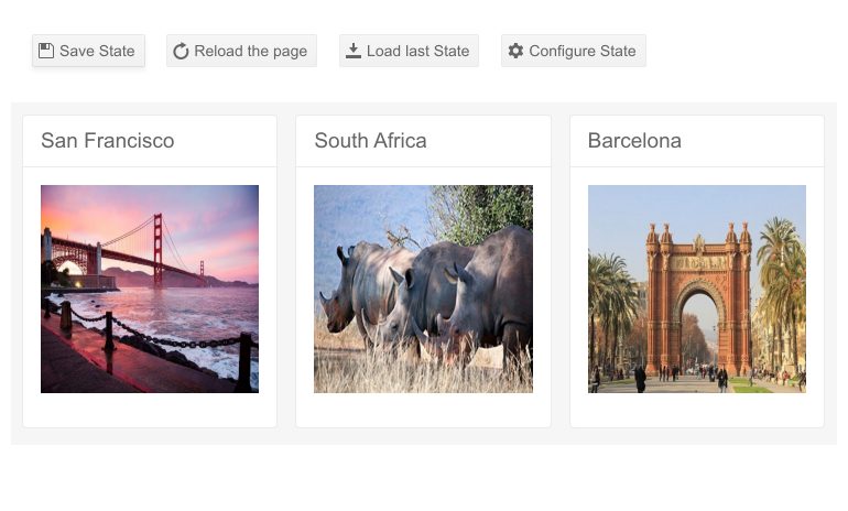
Telerik UI for Blazor TileLayout – State Management
TileLayout Events
The component currently exposes two events, that let you further control the business logic when items are resized or reordered (for example, to save the current state):
- OnResize - raised after an item is resized
- OnReorder - raised after an item is reordered
New Blazor Loader Component
Loader Component Overview
The Loader UI component is essential in every use case where you need to indicate to users in your Blazor app that a process is in progress. Example of such operations can be loading data, submitting a form or performing a large volume of updates. The Loader provides multiple built-in options for configuring its animation, size and colors.

To add the Telerik UI for Blazor Loader component, simply add the TelerikLoader tag as shown in the code snipped below:
<TelerikLoader Class="loader-indicator"></TelerikLoader>
Loader Component Customization
The Loader component comes in different flavors, shapes and sizes. The Type property lets you set one of the available options: Pulsing (default), InfiniteSpinner and ConvergingSpinner.
<TelerikLoader Class="loader-indicator" Type="LoaderType. InfiniteSpinner"></TelerikLoader>
Using the ThemeColor property of the Telerik Loader component for Blazor, you can easily set its color to one of the predefined colors from the Theme Builder.
<TelerikLoader Class="loader-indicator" Type="LoaderType.Pulsing" ThemeColor="@ThemeColors.Success"></TelerikLoader>

Telerik UI for Blazor Loader Component Colors
In addition to the colors, you can also adjust the Loader size, so that it fits your app scenario. The possible out-of-the box Loader sizes include: small, medium and large.
<TelerikLoader Class="loader-indicator" Type="LoaderType. InfiniteSpinner" Size="LoaderSize.Large"></TelerikLoader>
Loader Component Integration
The Loader can be easily integrated with other Blazor UI components to indicate that an operation is executing. Check out an example on how to integrate a Loader indicator with a Button component.

Telerik UI for Blazor Loader Component Options
New Blazor Switch Component
Switch Overview
The Switch UI component allows the user toggle between checked and unchecked states. Originally coming from performing a toggle of states on mobile devices, it has turned to a standard in all types of application. The component comes with configurations for its labels (for both on and off states), events and built-in keyboard navigation and localization.
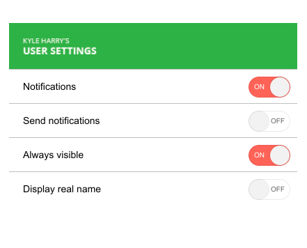
Telerik UI for Blazor Switch Component
To add the Telerik Switch in your Blazor apps, add the TelerikSwitch tag and provide a value using one-way data binding (Value property) or two-way data binding (@bind-Value property) as shown in the code sample below:
<TelerikSwitch @bind-Value="@isSelected"/>

@code {
    private bool isSelected { get; set; }
}
Switch Labels and Features
You can easily set custom Switch labels for its On and Off states with its OnLabel and OffLabel properties, as shown in the code snippet below:
<TelerikSwitch @bind-Value="@isSelected" OnLabel="Yes" OffLabel="Nope" />

@code {
    private bool isSelected { get; set; }
}
The Switch component additionally offers features that let you easily customize it such as: Class (CSS class), Enabled, TabIndex and Width. Like the rest of Telerik UI for Blazor components, the Switch supports and integrates seamlessly into Blazor's Forms and Validation infrastructure.

Telerik UI for Blazor Switch Component - Labels
Switch Component Events
To help you handle business logic in your Blazor apps, a couple of events are exposed for the Switch component:
- ValueChanged -fires every time the Value parameter changes (two-way binding)
- OnChange - fires after Value Parameter has changed and the ValueChanged event has fired (one-way binding)
Switch Component Built-In Localization
The Switch component labels can be almost auto-magically translated to any language! Thanks to the built-in localization support in Telerik Blazor, UI components react to the current culture automatically, so you can easily translate UI components messages.
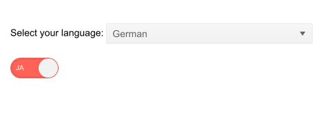
Telerik UI for Blazor Switch Component – Built-In Localization
Switch Component Built-In Keyboard Navigation
Telerik UI for Blazor Switch component comes with built-in support for keyboard navigation, so the end users can change focus on the control and invoke actions such as toggle state by just using keystrokes.
New Blazor Grid Features
Grid Column Menu
Simplify the access to common column actions on your Grid data with the new Column Menu feature. Your Blazor app users will have a convenient way to apply sorting, filtering, and toggle the visible and lock states of the columns from a central spot.
Column menu enablement is as simple as adding and setting to true a single Grid property ShowColumnMenu. In addition, you could easily customize the enabled features in the Column Menu through the GridColumnMenuSettings tag.
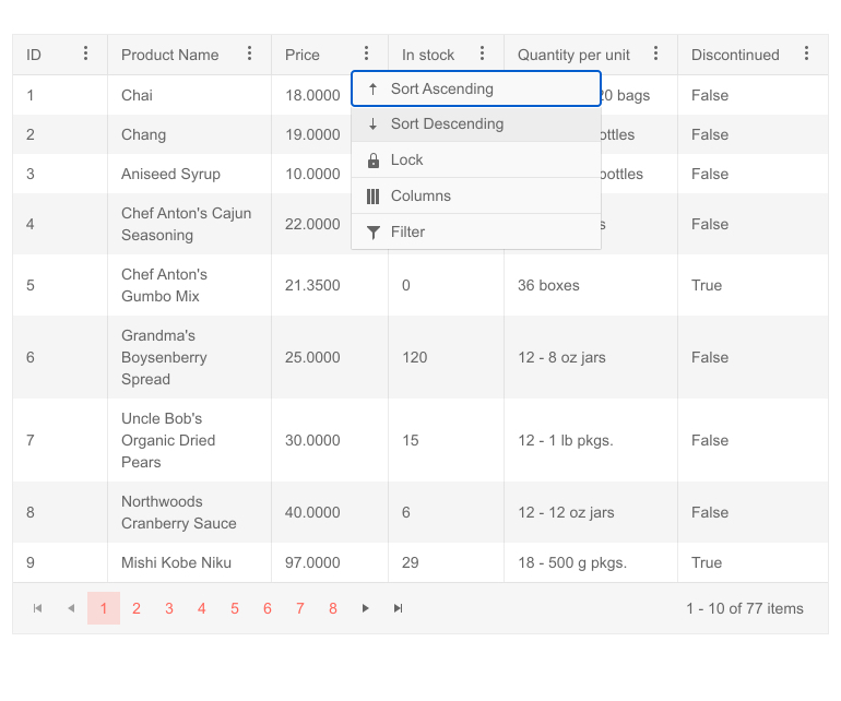
Telerik UI for Blazor Grid Column Menu
Grid Search Box
In addition to the current Grid filtering options, we implemented another built-in search option, so users can easily filter only relevant records in the Grid.
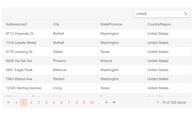
Telerik UI for Blazor Grid Search Box
To add a search text box to your Grid, simply plug inside its toolbar a GridSearchBox tag. Additionally, you can configure which fields to be searchable and specify DebounceDelay value (delay between the last keystroke and filtering).
<GridToolBar>
        <GridSearchBox DebounceDelay="200"></GridSearchBox>
</GridToolBar>
Grid Multi-Column Sorting
With the new Grid SortMode property you can enable data sorting based on multiple grid columns. The SortMode accepts two values:
- Single (default value) - only one sort criteria can be applied to the data
- Multiple - sorting on multiple columns. Sorting on a column and then sorting another one applies both sort criteria to the data (in the order specified)
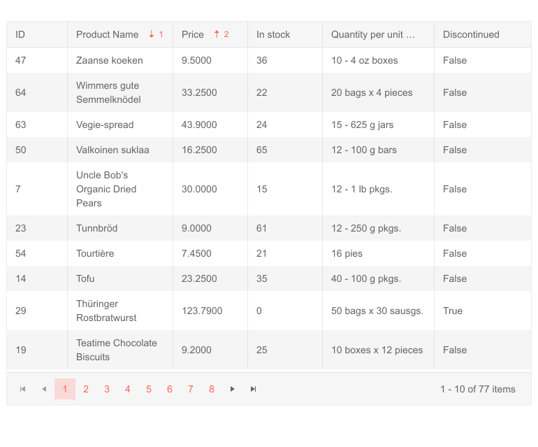
Telerik UI for Blazor Grid Multi-Column Sorting
Grid Footer Template for Aggregates
You can display aggregate results in the Grid footer template for each data bound column—commonly referred to as Grand Total. In the footer you can show aggregate values of each column, as well as custom content. The footer template will be always visible regardless of the vertical scrolling of the Grid.
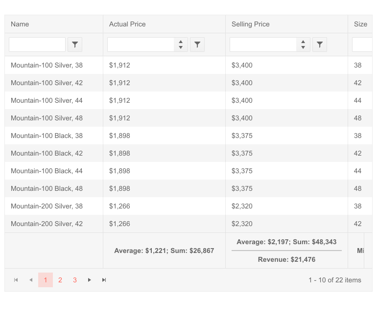 Telerik UI for Blazor Grid Footer Template for Aggregates
Grid Column Visible Property
With the new Grid column Visible property, you can easily programmatically show/hide Grid columns permanently or based on a condition.
In a basic scenario, when a column needs to stay hidden at all times, you simply set the column property Visible to false. However, you can also use the Visible parameter for cases when you need to provide conditional visibility of a column, toggle column visibility or determine whether to show a column based a result from a bool method. Check out more code samples on how to control column visibility in Blazor Grid here.
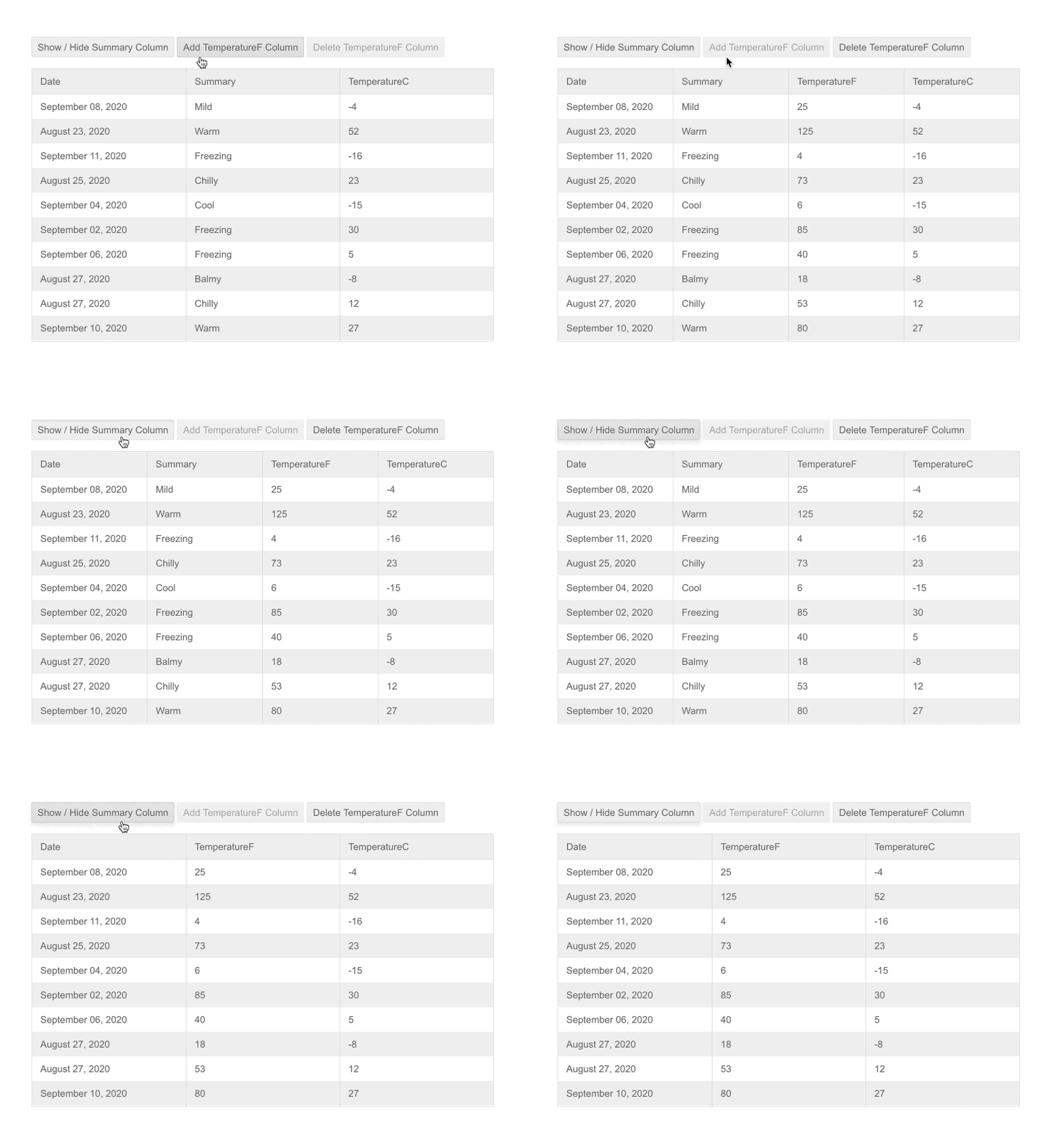
Telerik UI for Blazor - Grid Column Visible Property
New Blazor TreeList Features
TreeList Search Box
Enable your users to quickly search and find relevant data rows in the TreeList with the new built-in feature Search Box.
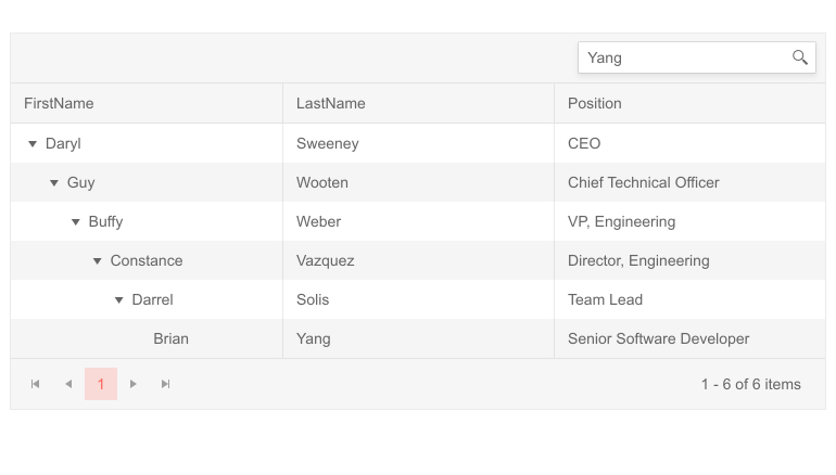 Telerik UI for Blazor TreeList Search Box
The search feature will add a search text box inside the TreeList toolbar and allow you to configure which columns will be searchable.
TreeList Column Visible Property
Similarly to the Grid, you can toggle column visibility with the TreeList component using the new column Visible property.
TreeList Multi-Column Sorting
The TreeList can now be sorted based on multiple criteria. With the new SortMode property you can enable data sorting based on single (SortMode="@SortMode.Single") or multiple tree list columns (SortMode="@SortMode.Multiple").
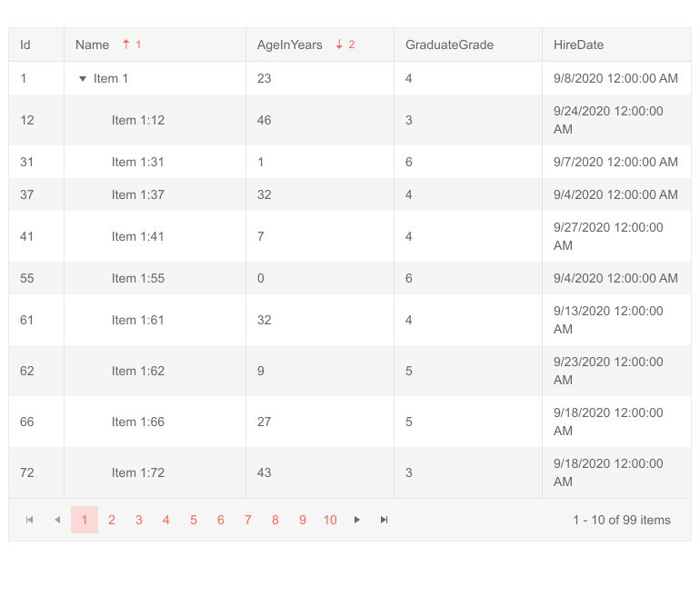
Telerik UI for Blazor TreeList Multi-Column Sorting
Visual Studio Extensions and Installers
Visual Studio Extensions for Mac
With the latest release, the Telerik Blazor Visual Studio Extensions are also available for Visual Studio for Mac. With them you can create new projects and add Telerik Blazor components to existing Blazor projects with just a few clicks.
Visual Studio Dashboard Project Template
The new Visual Studio Dashboard Project Template will come handy for everyone building dashboard-like Blazor applications. The template offers a predefined layout and UI building blocks that you can use directly or customize according to your scenario.
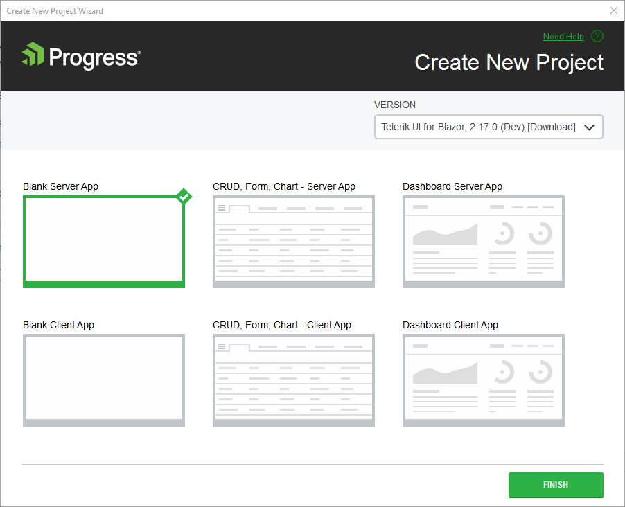
Telerik UI for Blazor dashboard Project Template
Once you update your Telerik UI for Blazor version with the latest package, you can create a new project and choose the new Dashboard project template (available for both server and client apps) from the Create New Telerik Project Wizard.
Linux Installer
Telerik UI for Blazor can be installed on any platform—now even on Linux.
New Blazor Online Technical Training
Telerik UI for Blazor now comes with a technical online training available for both accounts with active trials and license holders. The training is part the Progress Telerik Video Learning Platform and covers multiple topics related to application development for both Blazor as a framework and Telerik UI for Blazor components.

The course provides a great way to onboard team members on Blazor and Telerik UI for Blazor and boosts developer productivity with hands-on experience for building a real-world application, along with multiple how-to topics and code examples. Its format and syllabus allow learning at your own pace and referring to topics of interest when needed.
To access the Telerik UI for Blazor online training, visit our learning portal with all Progress Products Virtual Classroom Courses or jump directly to Telerik UI for Blazor Online Training.
Updated Demos and Documentation
As we know how important the documentation and examples are for developers, we continuously dedicate efforts to improve the resources related to Telerik UI for Blazor. In R3 2020 we completely revamped the demos and documentation with the goal to make your journey better and faster.
Take a look at the Blazor components demos and documentation and let us know what you think in the embedded feedback forms on both portals!

Telerik UI for Blazor Demos Hub
Telerik Blazor R1 2021 Roadmap
We will continue to expand the Telerik UI for Blazor suite and we already have exciting plans for the upcoming 2021 releases. If you want a sneak peek of what’s coming, we encourage you to keep an eye on the Telerik UI for Blazor Roadmap Page. Not only will you get an insider’s look at our features pipeline, but you’ll continue to have the opportunity to help us improve with your valuable feedback. Your input helps make the Telerik UI for Blazor bigger and better for everyone.
Download the Latest Version of Telerik UI for Blazor
We would like to thank for the continuous support and encourage you to download a free trial version of Telerik UI for Blazor, or if you are an active license holder you can just grab the latest and greatest from the Your Account page! Share your thoughts with us on our dedicated Blazor feedback portal and help us shape the future of UI for Blazor.
Blazor Twitch Demo & Telerik Web Products R3 2020 Webinar
Join the live webinar dedicated to Telerik Web Products R3 2020 release webinar on Monday, September 28, 2020, starting at 11:00 am ET as Ed Charbeneau and Sam Basu present the major updates in detail.
And in case you need more of Telerik UI for Blazor join the Blazor demo session on Twitch, starting at 12:30 pm ET to see the newly released components and features in action and get ideas on how to use them in your Blazor projects.
Happy Blazor Coding from Your Telerik Blazor Team at Progress!

Maria Ivanova
Maria Ivanova is a Manager of Product Management at Progress, for Telerik and Kendo UI components and developer tooling. She joined the company in 2019 as a Product Manager for Telerik UI web components and is passionate about developing impactful and innovative software products. Maria believes that to create great products, it's important to challenge the status quo, closely collaborate with customers, and embrace a spirit of experimentation. Follow her on Twitter or LinkedIn.
