The New Financial Portfolio Demo using Kendo UI for Angular

Welcome to the Financial Blog post series, Part I! Here at Progress, we love attractive and alluring components. My team specifically loves attractive Angular components. Recently we built a demo Angular app that shows off a number of our gorgeous components working together to create this Financial Portfolio Demo App:
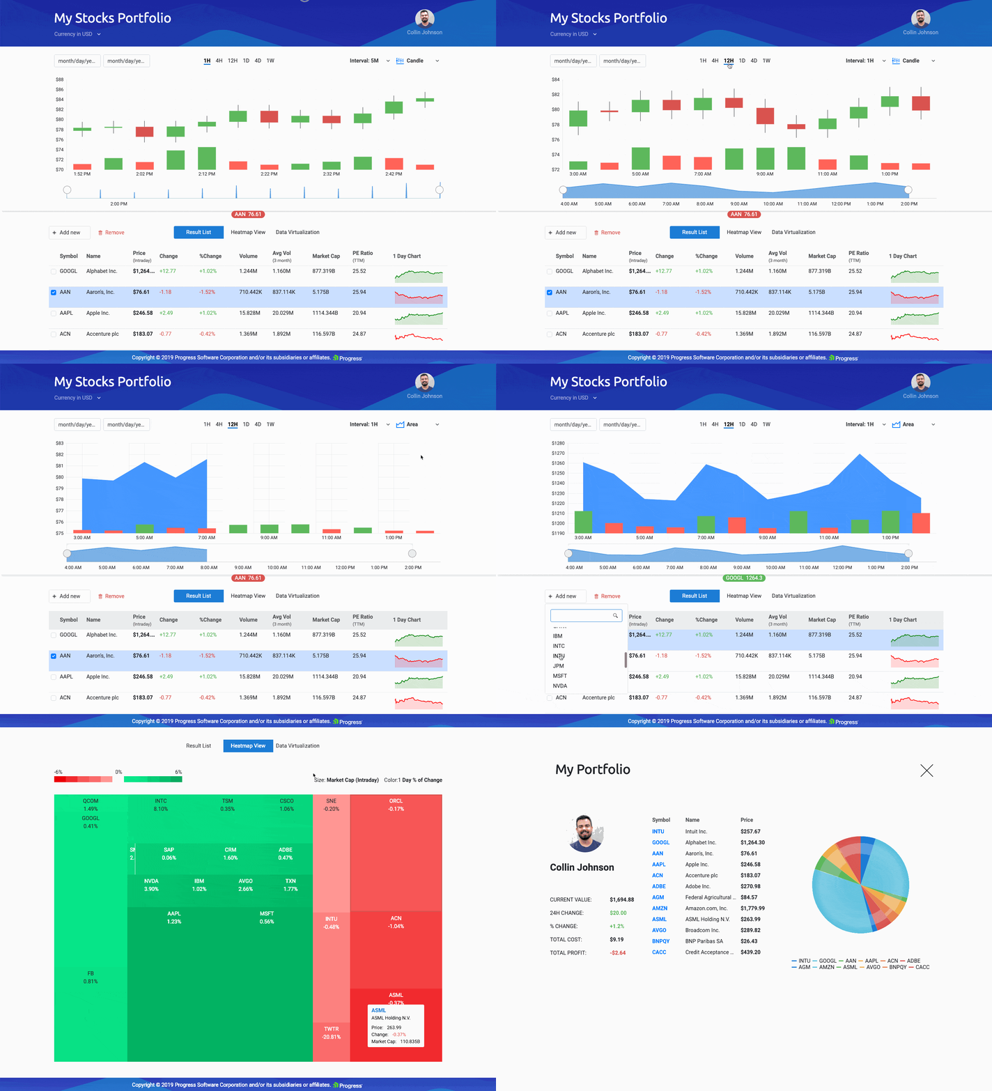
In this series I am going to walk through the Angular components that make up this app and delve into the Kendo UI components that each one uses! We will go through the Angular Stock Chart Component, along with other chart components, inputs, buttons, and of course, our infamous Grid Component to build out a Financial Portfolio application, capable of keeping you up-to-date with the stocks of your choice!
I’ve broken the application into five major Angular Components:
- Stock Chart
- Stock List
- User Profile
- Real Time Data
- Heatmap
To make the reading experience more bite-sized, in this first post, I will cover the Stock Chart and Stock List components (and the child components they employ)—check out part II for the rest to be covered!
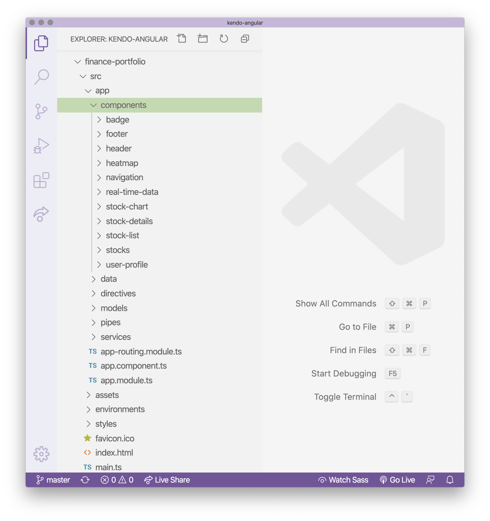
Following Along
You can pull down the code and follow along—everything is available on GitHub and GitHub Pages!
- Clone the repo https://github.com/telerik/kendo-angular/tree/master/examples-standalone/finance-portfolio
- Go into the root of the application
cd kendo-angular/examples-standalone/finance-portfolio/ - Run
npm installandnpm start - Go to
http://localhost:4200in your web browser
As you can see in the opening GIF, the app shows you the stock information you are interested in with our Kendo UI Stock Chart component. This component comes ready out-of-the-box with features to choose date ranges and time ranges for the stocks you want to look at. You can also toggle the type of chart you are viewing—Candle, Line, or Area.
Our Financial Portfolio application also shows the stocks in a Stock List, a Heatmap, and Stocks moving in real time as well as a user profile page. This demo is fully loaded with so many features! Let’s dive into this incredible demo by component (Angular component, that is).
Stock Chart & Stock Details Angular Components
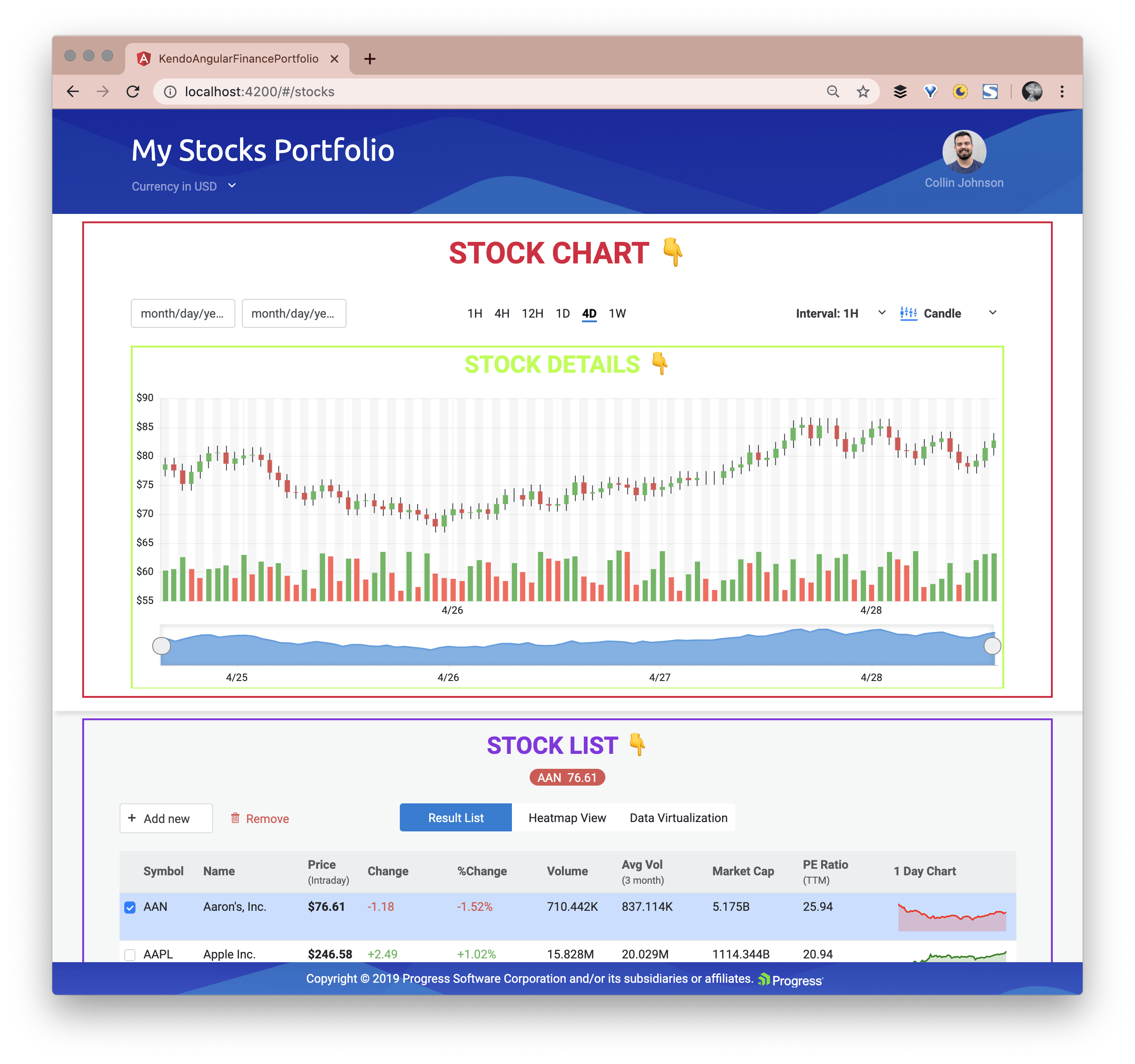
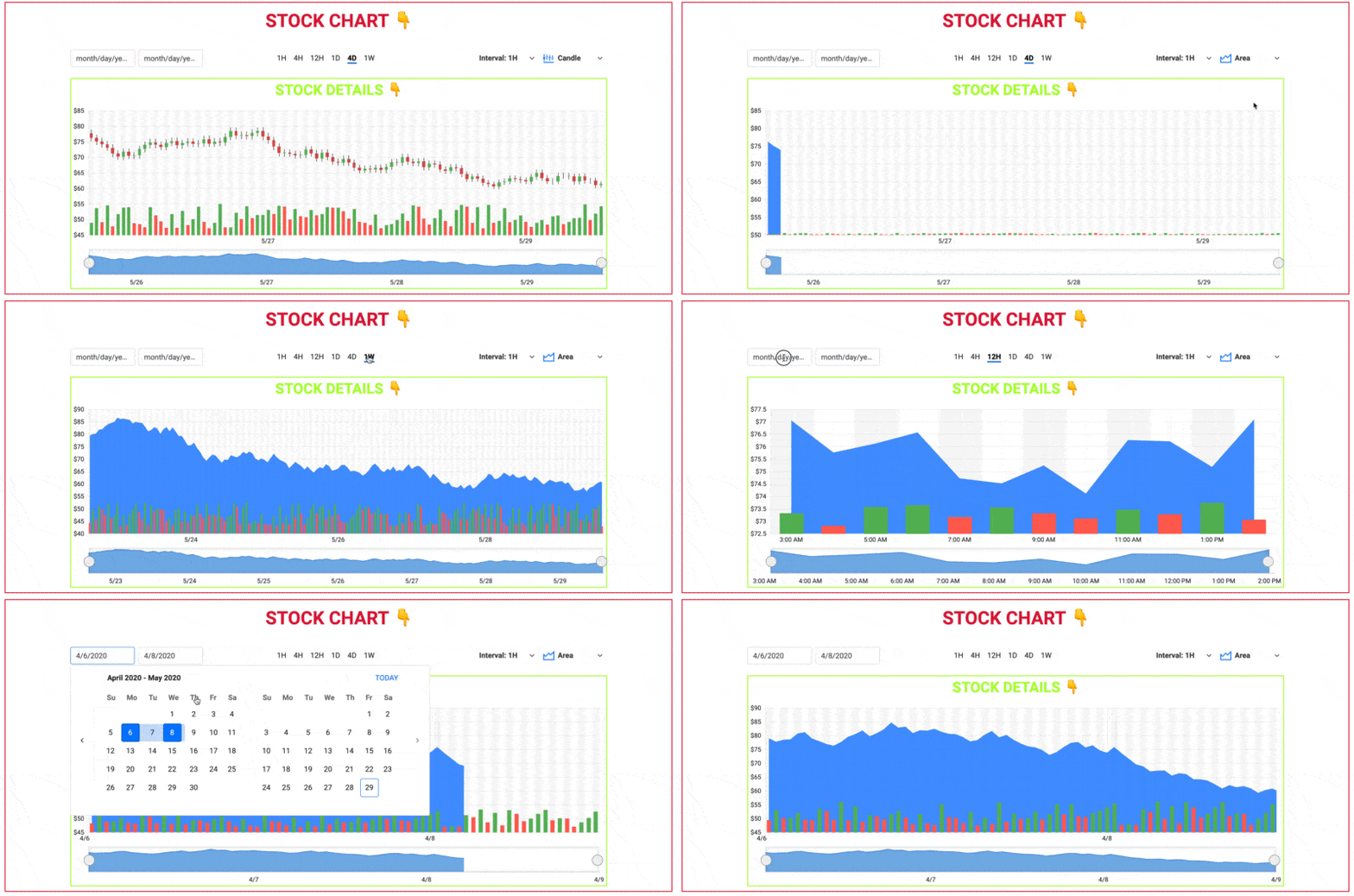
Stock Chart with Stock Details and the Stock List are all visible by default on the dashboard (landing page). I’ve given them titles and outlines here, so you can see where those Angular components visually are:
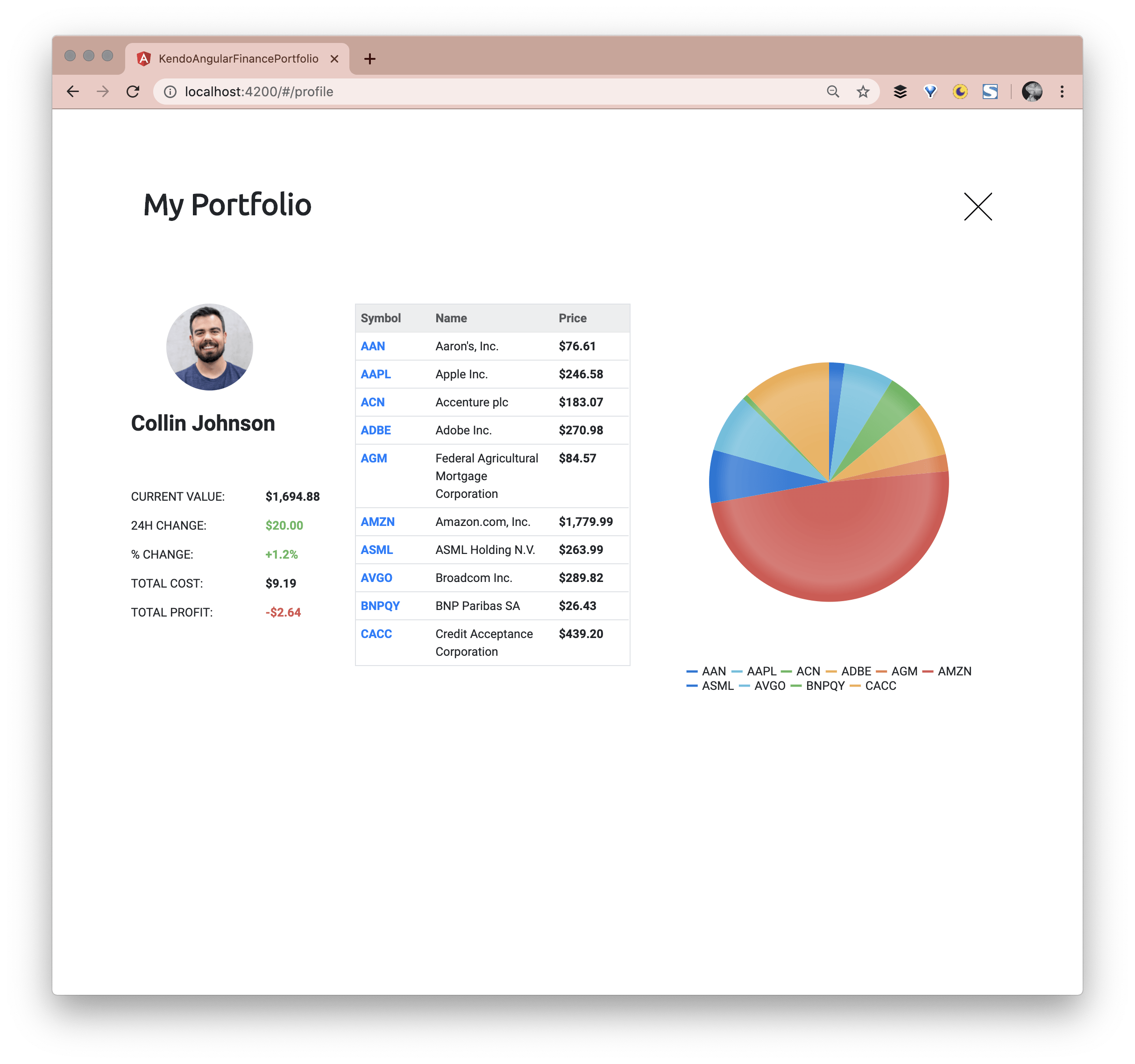
The User Profile is accessible when the avatar in the top right is selected:
Both the Heatmap and the Real Time Data views are available because of the Navigation Component. The Navigation Component is used inside the Stocks List Component:

This navigation is created using the Kendo UI Button Group, Kendo UI Buttons and of course uses Angular routing with
the routerLink and
routerLinkActive directives. Here is the
Heatmap view and the Real Time Data view:
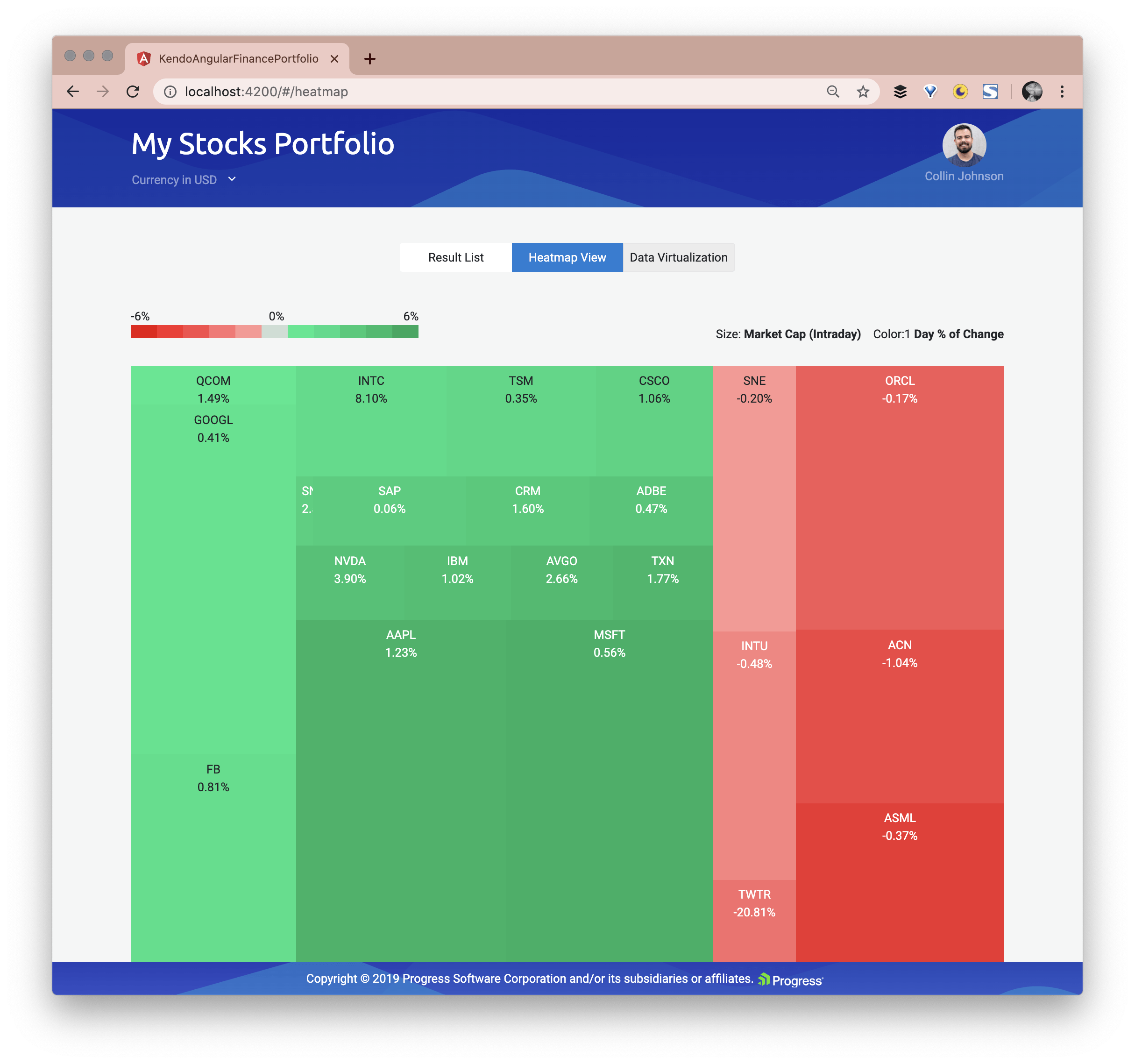
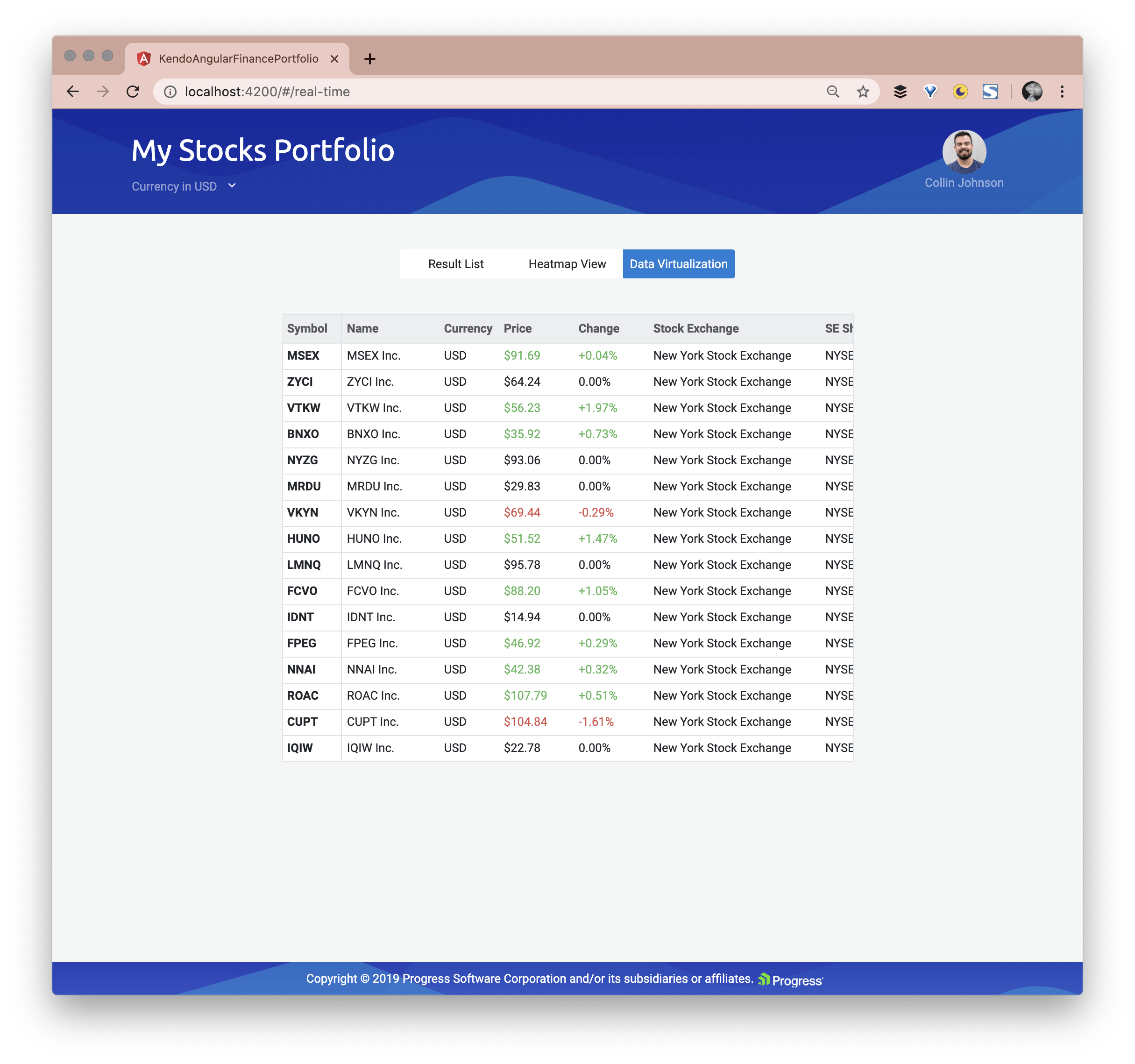
Now that we have an overview of the larger Angular Components that make up this application, let’s look deeper into the Angular Components to see what Kendo UI Components are being used to make this Portfolio happen.
The Kendo UI Stock Chart
The first thing a user sees on the landing page is the Stock Chart which primarily implements the Kendo UI Stock Chart Component.
The StockChart is a specialized control for visualizing the price movement of a financial instrument over a certain period of time.
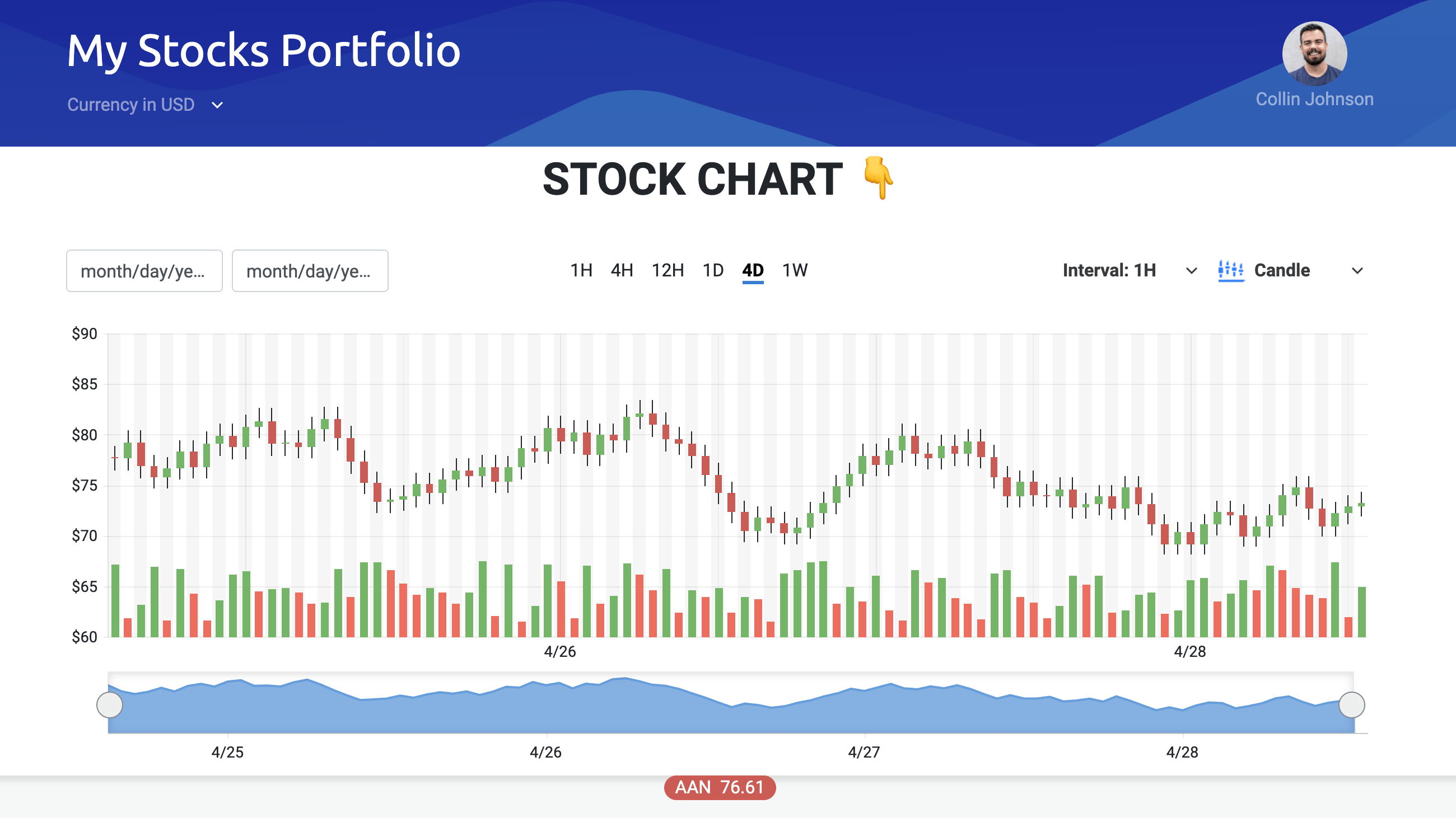
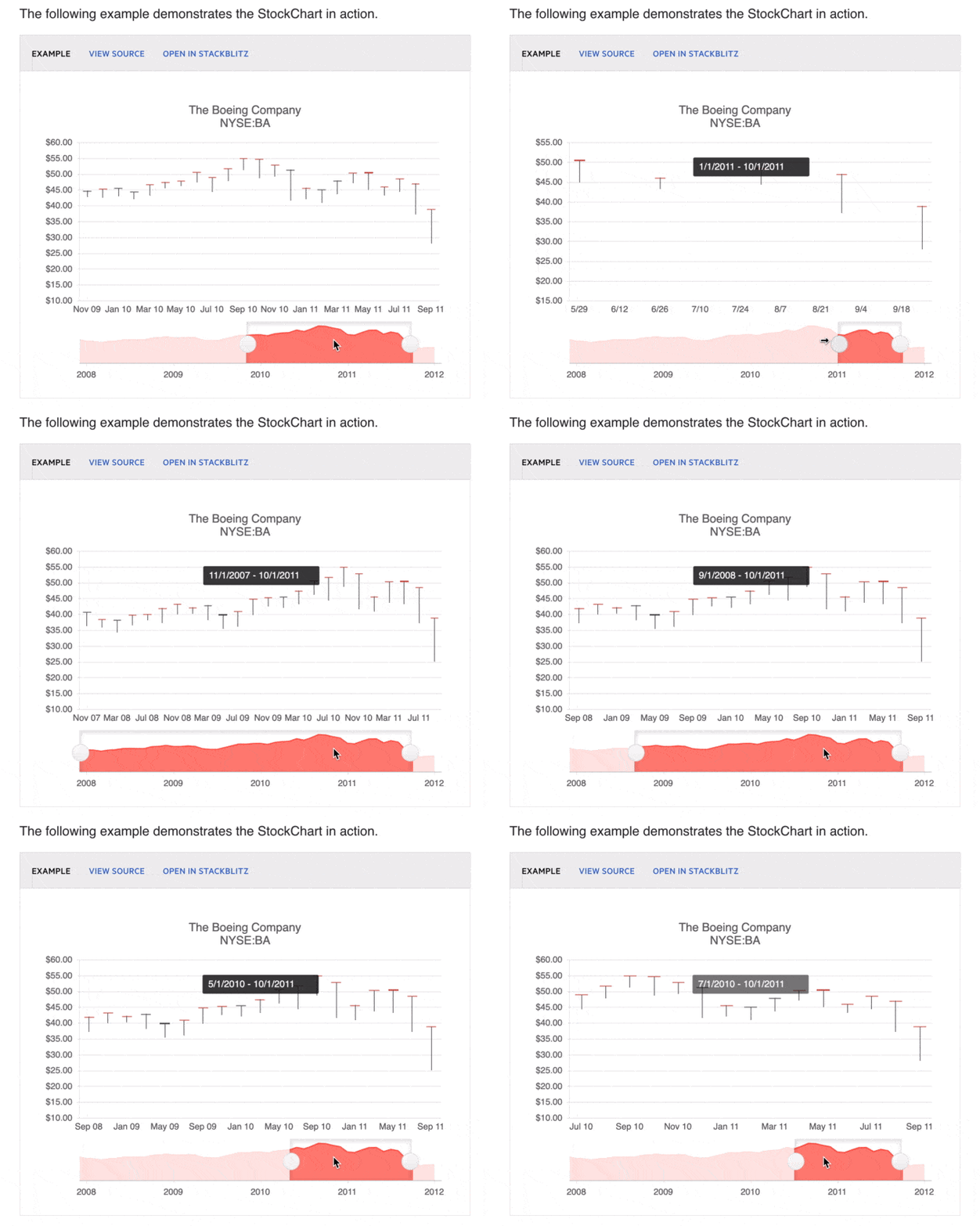
The Stock Chart Component extends the basic Kendo UI Chart, plus has additional features for viewing financial information over a certain period of time. There is a navigator pane that allows you to select a specific chunk of time:

Creating a Stock Chart with least amount of Flexing 💪
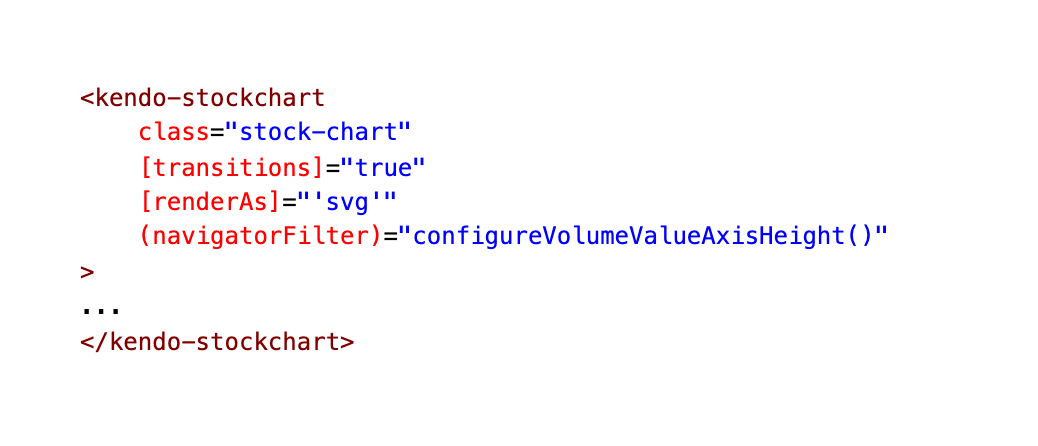
Our Stock Chart Component also has a child Angular Component called Stock Details. This is where our much talked about Kendo UI Stock Chart is actually implemented! If you want to see the full code, expand the block below, or check out the screenshot for the abbreviated version.
stock-details.component.html
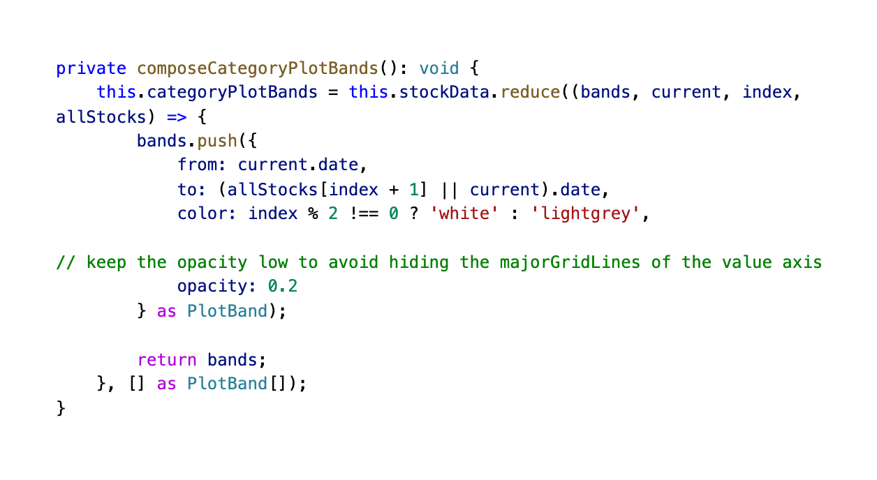
Setting up Plotbands
Here is the markup and functionality for our Stock Chart's Plot Bands!
The Chart plot bands allow you to highlight a specific range of an axis. To display plot bands, set the axis
plotBandsoption to an array ofPlotBand.
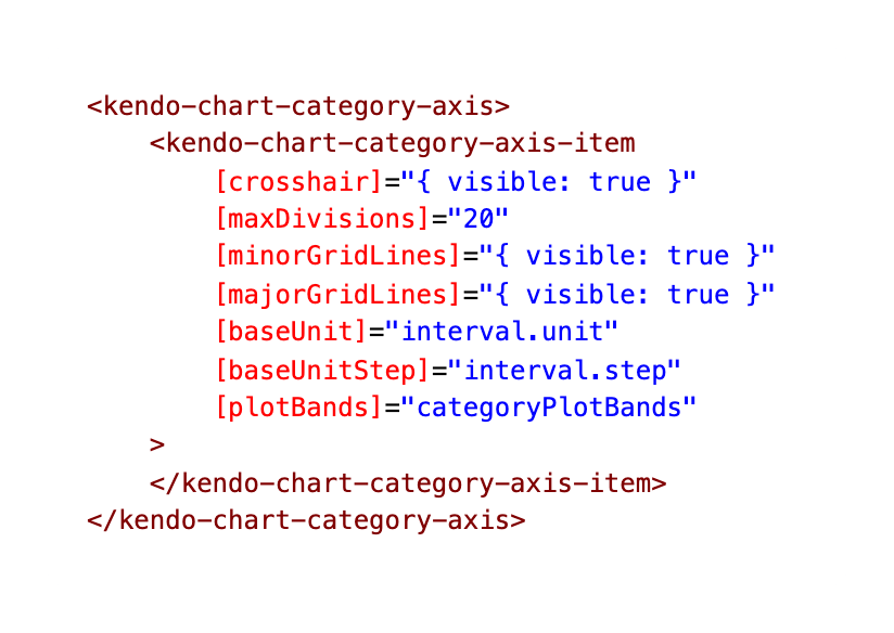
Giving our Stock Chart Two X Axes
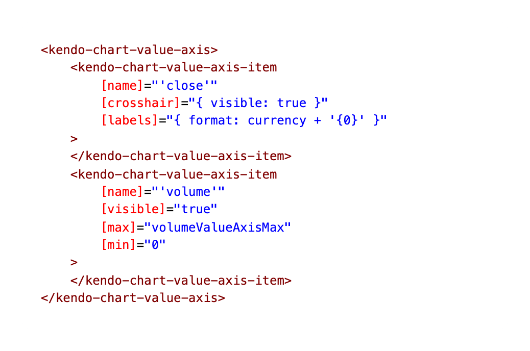
The Chart axes provide a value scale for the plotted data series.
Here we are setting up the axes for our chart. There are two types of axes—category and value.
Category axes are declared through the kendo-chart-category-axis-item configuration components and placed in a kendo-chart-category-axis collection.
Value axes are declared through the kendo-chart-value-axis-item configuration components and placed in a kendo-chart-value-axis collection.
Limiting Displayed Range by Setting Min and Max
We are binding the range.start and range.end to these inputs as well as setting a
min and max. Learn more about date
range input customizations here in our docs.
Data for our Chart
The Angular Stock Chart component is pulling its stock data from this local file:
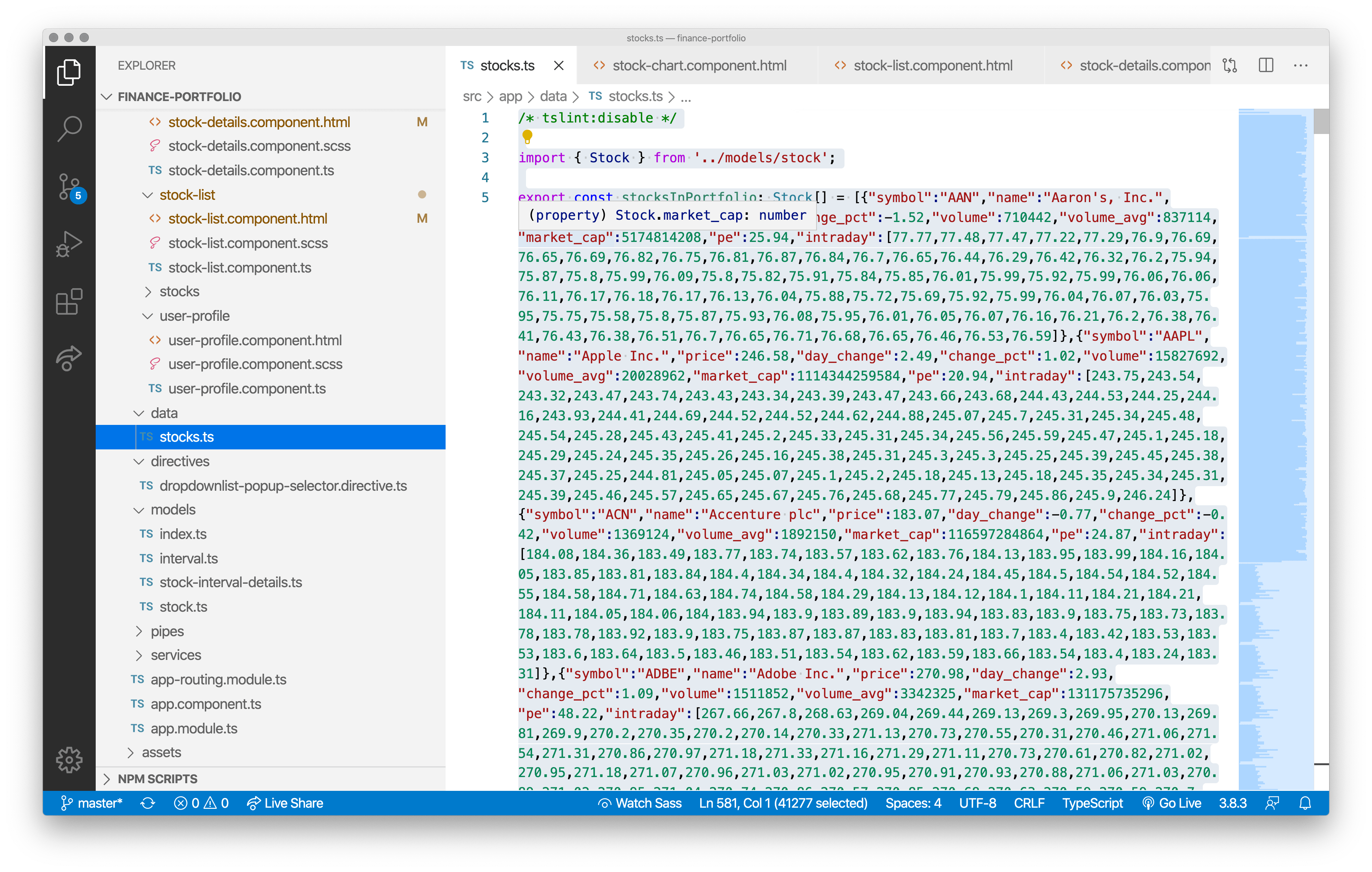
It is always easier to control a demo app when you can go wireless, so our team believed this was the best move for this particular demo. You can easily swap out the local data for a live Stock API, though.
Passing in Configurable Items to the Stock Details Component
The Kendo UI Stock Chart is being controlled by multiple UI components which pass in things like the chart type and interval:
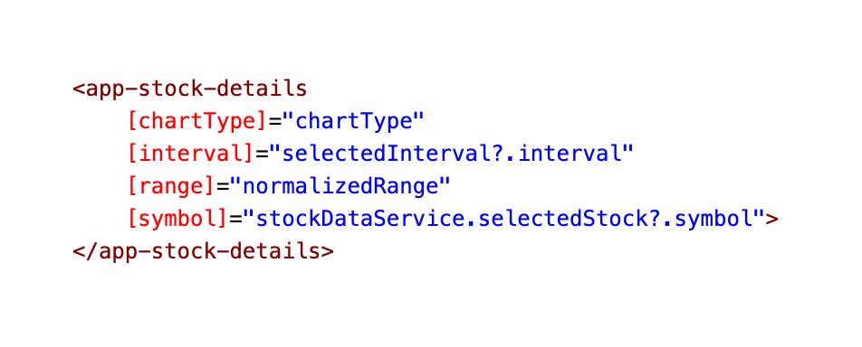
These Kendo UI components—Date Range, Date Input & Drop Down List—are allowing us to customize the stock chart to see the stocks during an exact time frame. If you want to see the full code, expand the block below.
stock-chart.component.html
Modifying the Timeframe Displayed in Our Stock Chart 📅
Kendo Date Range & Date Input
The DateRange Component holds the start and end date inputs and has a fancy date range popup for selecting these.
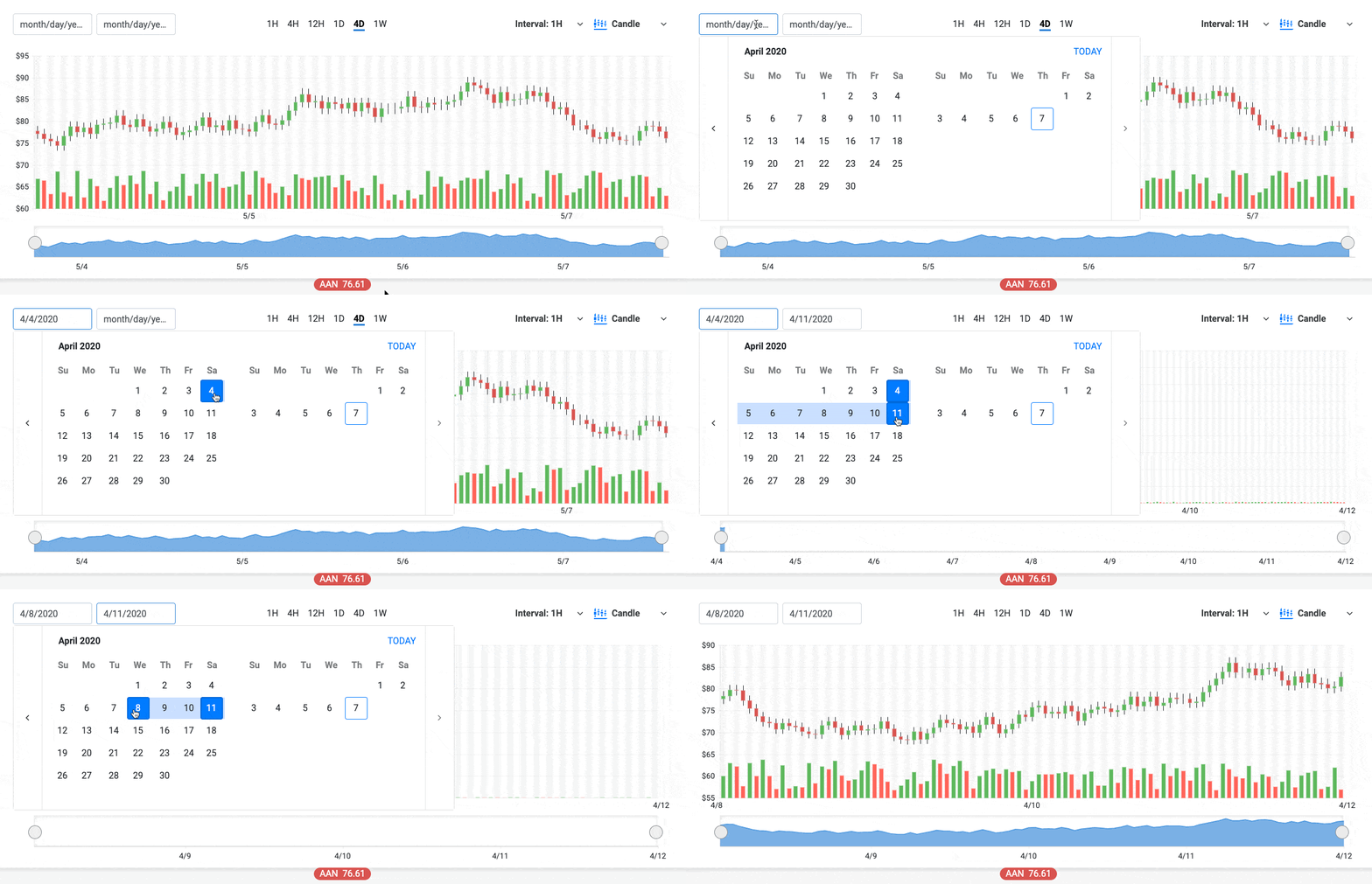
You can see in the markup that our kendo-daterange has two kendo-dateinputs. One is for the
kendoDateRangeStartInput
directive and the other is for the
kendoDateRangeEndInput
directive.
There are quite a few things you can customize and control on these directives. One thing, for instance, is
autoCorrectOn that we are utilizing on change.
autoCorrectOn: Specifies the auto-correction behavior. If the start date is greater than the end date, the directive fixes the date range to a single date either on input change or on blur (see example). By default, the component does not perform any auto-correction.
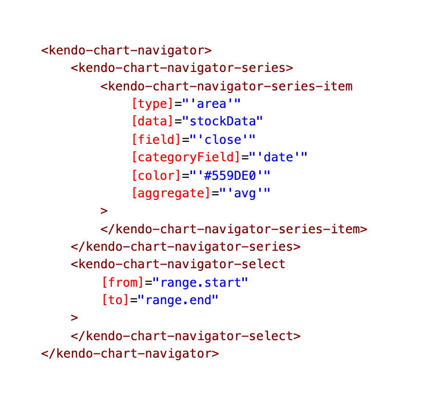
Setting up the Navigator
Out-of-the-box, the stock chart has a navigator pane for scaling the span of time displayed and the whole chart looks something like this:
For more details on the Stock Chart, check out our docs: https://www.telerik.com/kendo-angular-ui/components/charts/stock-chart/
You can check out the exact line of code on GitHub: stock-details.component.html
Toggling Chart Types Within the Kendo UI Stock Chart 🔥
Kendo Drop Down List
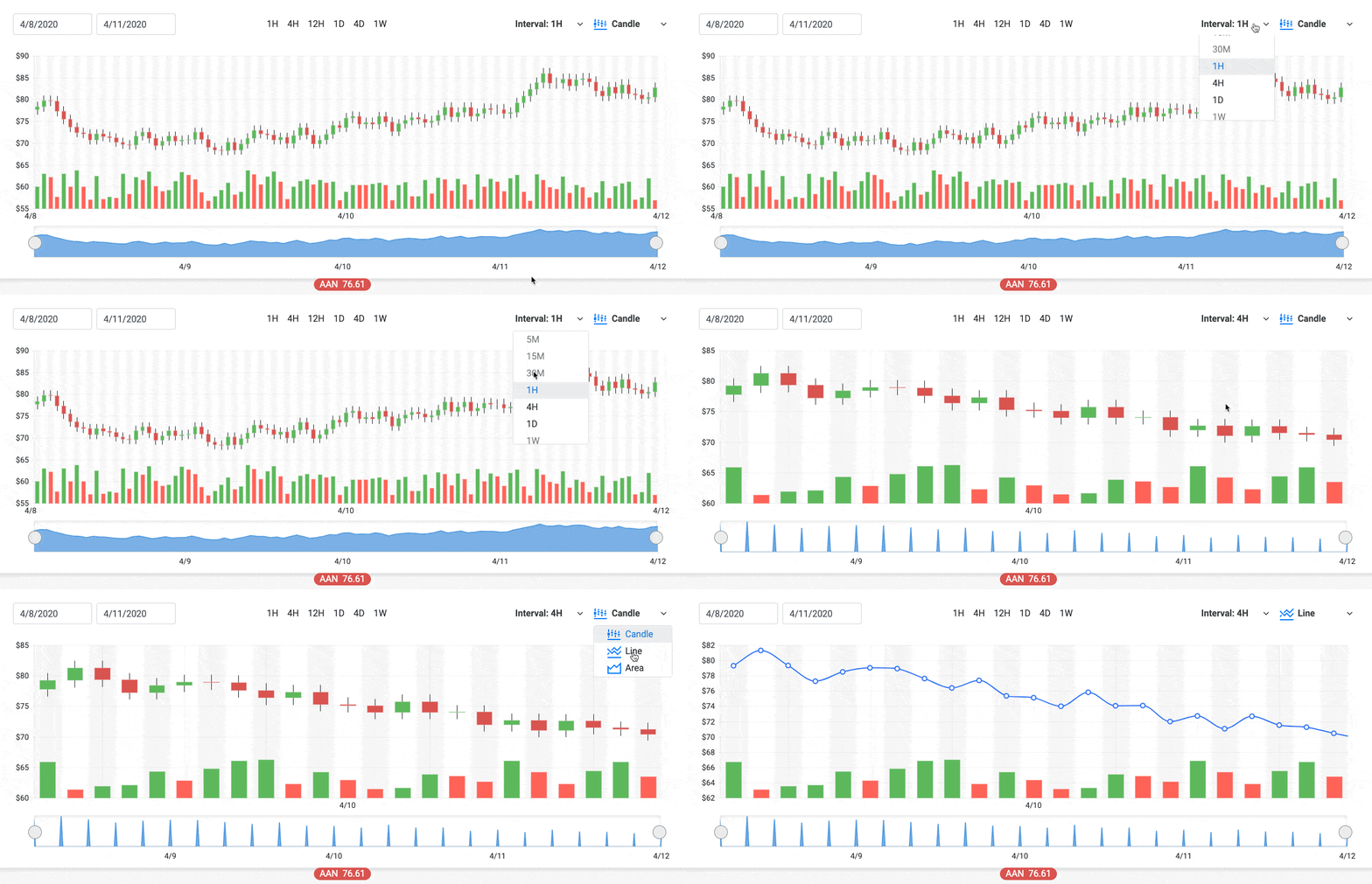
As we mentioned before, we have a dropdown that is allowing us to toggle the chart type. But how are we toggling
between the graph types within the Stock Chart? Well, the chart type drop down, is setting the variable
chartType to
either ‘candle,’ ‘line’ or ‘area.’
You can check out the exact line of code on GitHub: stock-chart.component.html
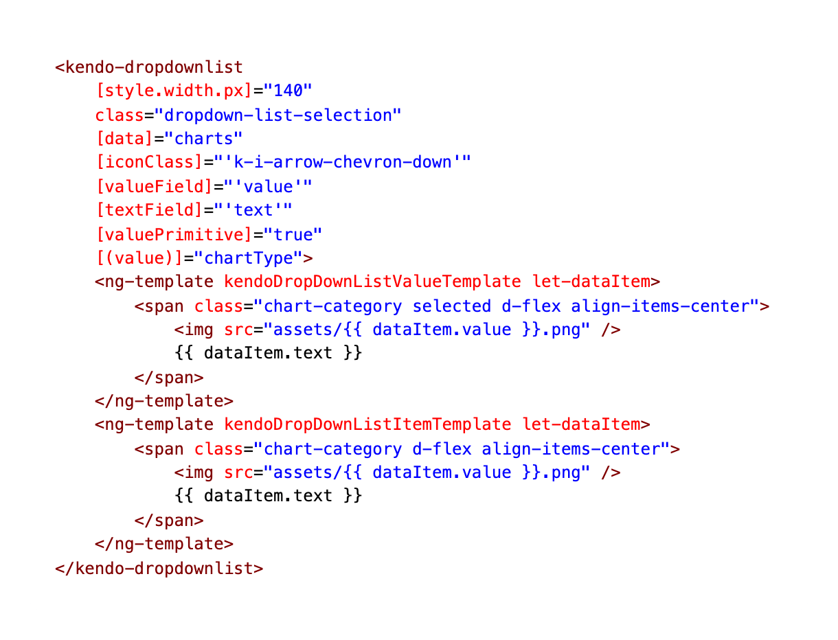
We are also using the Angular element
ng-template (Angular
templates not our own templates) to customize the content of our drop downs.
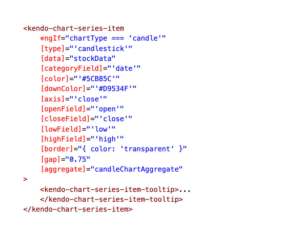
If Chart Type Candlestick
If the chartType is set to ‘candle’ then this is the markup the Stock Chart will use:
You can check out the exact line of code on GitHub: stock-details.component.html
Creating the Tooltip for the Candlestick Chart
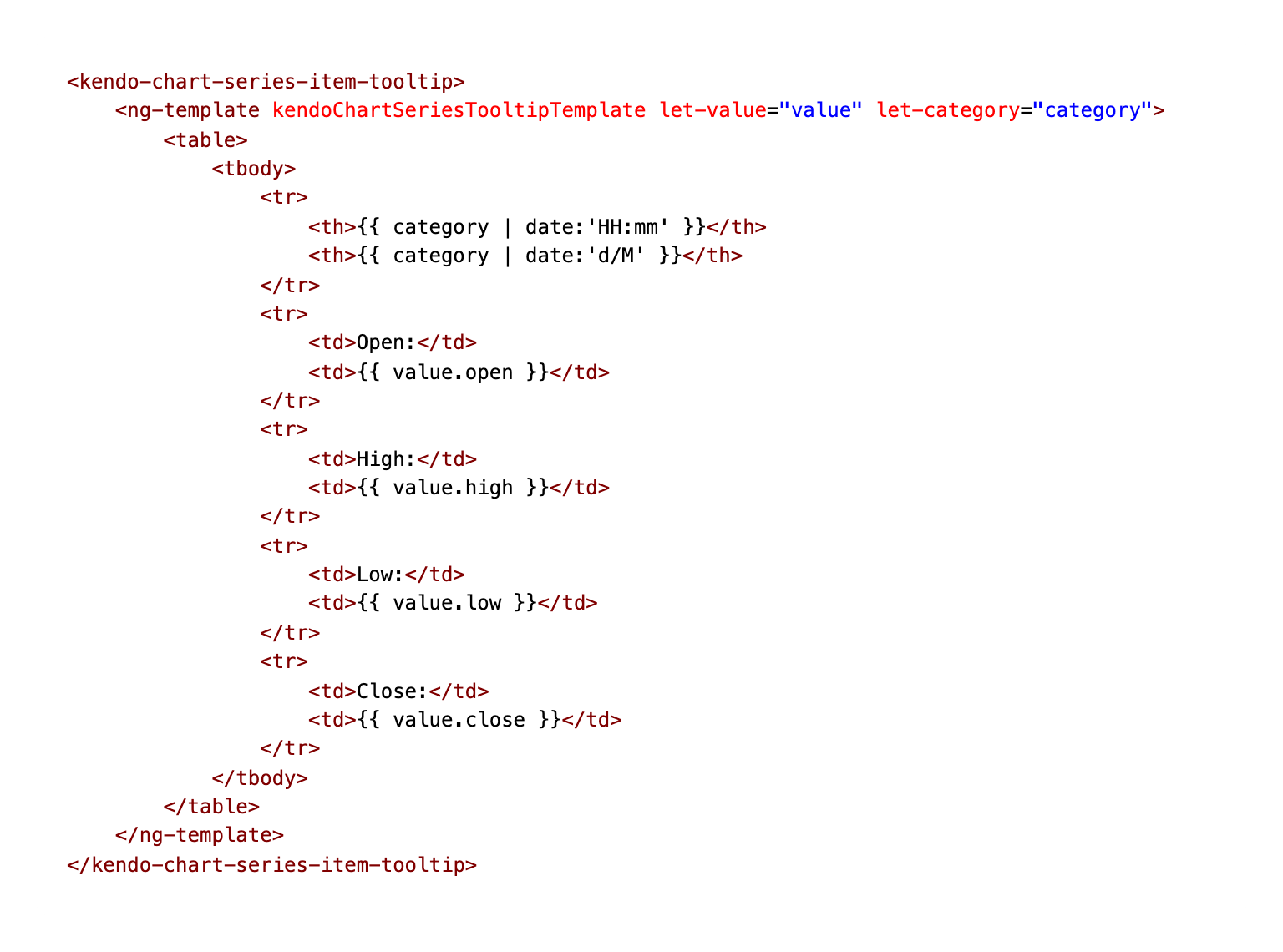
We are also using ng-template again to customize the tooltip’s template for the candlestick chart:
You can check out the exact line of code on GitHub: stock-details.component.html
If Chart Type Line
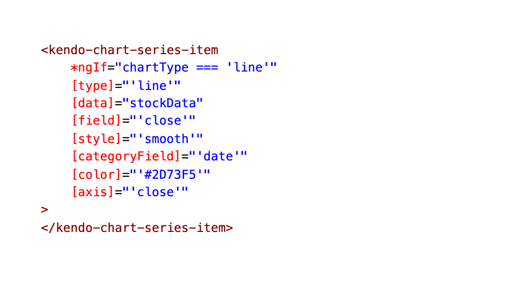
If the chartType is set to ‘line’ the Stock Chart will use this markup:
You can check out the exact line of code on GitHub: stock-details.component.html
If Chart Type Area
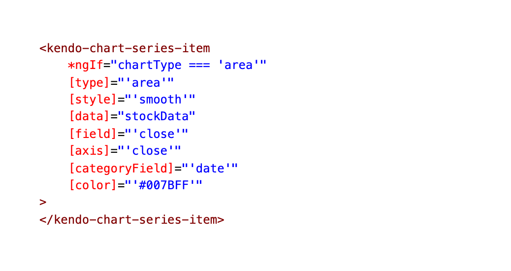
Otherwise, if the chartType is set to ‘area’, the Stock Chart will use this Area Chart.
You can check out the exact line of code on GitHub: stock-details.component.html
Displaying Two Charts at Once with Kendo UI
→ Always display the Columns, no matter the Chart type
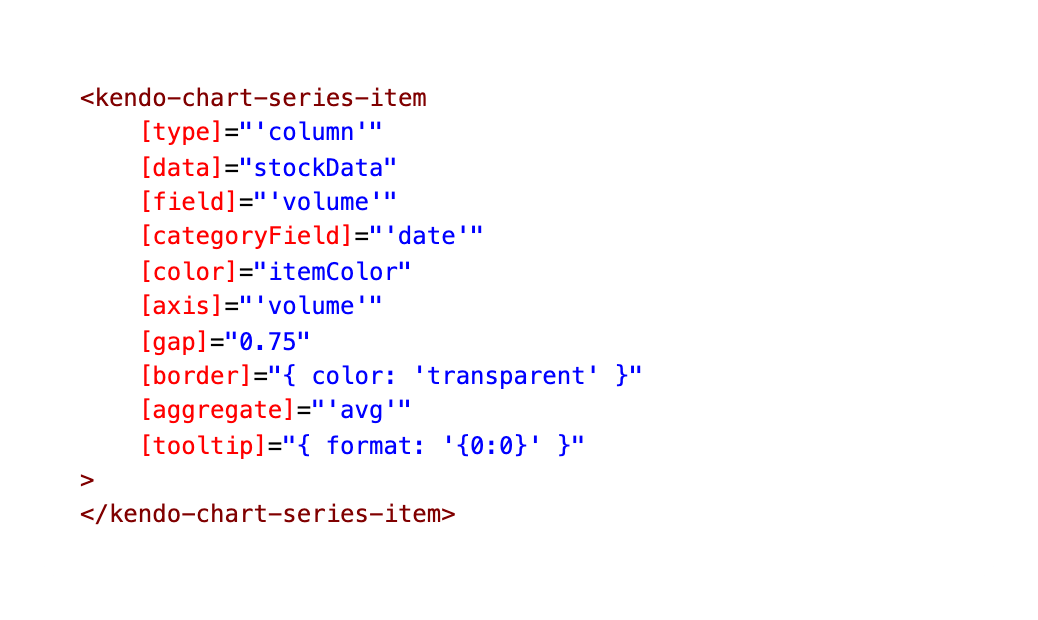
You might have noticed in the Stock Chart demo, there are always two different types of charts displaying at one time. Here you can see the Area Chart as well as columns.

This is because we are giving the chart this column series set to display at all times, along with one of the other three mentioned above.
You can check out the exact line of code on GitHub: stock-details.component.html
Wrap-up
So we’ve covered the Stock Chart in all its glory, including the ability to toggle between chart types and how to display multiple charts at the same time! I will be covering the rest of the Financial Portfolio in a future post, including the User Profile page, Real Time Data and Heatmap Components! For now, you can clone the demo app and check out the source code here:
Financial Stocks Portfolio on GitHub PagesFinancial Stocks Portfolio Repo on GitHub

As always, we love love love feedback here on the Kendo UI team! Please let us know if this demo app was useful to you and what kind of other demo apps you’d like to see!
Kendo UI for Angular Feedback Portal
Alyssa is the Angular Developer Advocate for Kendo UI. If you're into Angular, React, Vue or jQuery and also happen to love beautiful and highly detailed components, check out Kendo UI. You can find the Kendo UI for Angular library here or just jump into a free 30 day trial today. Happy Coding!

Alyssa Nicoll
Alyssa is an Angular Developer Advocate & GDE. Her two degrees (Web Design & Development and Psychology) feed her speaking career. She has spoken at over 30 conferences internationally, specializing in motivational soft talks, enjoys gaming on Xbox and scuba diving in her spare time. Her DM is always open, come talk sometime.
