I’m actually not super happy with the results of this experiment, but I wanted to share it anyway because it was very easy and fun to play with fonts. And somebody asked me how to do it and I told her I’d write a blog post about it :)
background: the original handwritten font
Some background: I have a font of my handwriting that I’ve been use in my zines for a couple of years. I made it using a delightful app called iFontMaker. They pitch themselves on their website as “You can create your handmade typeface in less than 5 minutes just with your fingers”. In my experience the ‘5 minutes” part is pretty accurate – I might have spent more like 15 minutes. I’m skeptical of the “just your fingers” claim – I used an Apple Pencil, which has much better accuracy. But it is extremely easy to make a TTF font of your handwriting with the app and if you happen to already have an Apple Pencil and iPad I think it’s a fun way to spend $7.99.
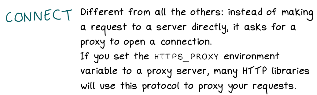
Here’s what my font looks like. The “CONNECT” text on the left is my actual handwriting, and the paragraph on the right is the font. There are actually 2 fonts – there’s a regular font and a handwritten “monospace” font. (which actually isn’t monospace in practice, I haven’t figured out how to make an actual monospace font in iFontMaker)
the goal: have more character variation in the font
In the screenshot above, it’s pretty obvious that it’s a font and not actual handwriting. It’s easiest to see this when you have two of the same letter next to each other, like in “HTTP’.
So I thought it might be fun to use some OpenType features to somehow introduce a little more variation into this font, like maybe the two Ts could be different. I didn’t know how to do this though!
idea from Tristan Hume: use OpenType!
Then I was at !!Con 2020 in May (all the talk recordings are here!) and saw this talk by Tristan Hume about using OpenType to place commas in big numbers by using a special font. His talk and blog post are both great so here are a bunch of links – the live demo is maybe the fastest way to see his results.
- a live demo: Numderline Test
- the blog post: Commas in big numbers everywhere: An OpenType adventure
- the talk: !!Con 2020 - Using font shaping to put commas in big numbers EVERYWHERE!! by Tristan Hume
- the github repo: https://github.com/trishume/numderline/blob/master/patcher.py
the main idea: OpenType lets you replace characters based on context
I started out being extremely confused about what OpenType even is. I still don’t know much, but I learned that you can write extremely simple OpenType rules to change how a font looks, and you don’t even have to really understand anything about fonts.
Here’s an example rule:
sub a' b by other_a;
What sub a' b by other_a; means is: If an a glyph is before a b, then replace the a with the glyph other_a.
So this means I can make ab appear different from ac in the font. It’s not
random the way handwriting is, but it does introduce a little bit of variation.
OpenType reference documentation: awesome
The best documentation I found for OpenType was this OpenType™ Feature File Specification reference. There are a lot of examples of cool things you can do in there, like replace “ffi” with a ligature.
how to apply these rules: fonttools
Adding new OpenType rules to a font is extremely easy. There’s a Python library
called fonttools, and these 5 lines of code will apply a list of OpenType
rules (in rules.fea) to the font file input.ttf.
from fontTools.ttLib import TTFont
from fontTools.feaLib.builder import addOpenTypeFeatures

ft_font = TTFont('input.ttf')
addOpenTypeFeatures(ft_font, 'rules.fea', tables=['GSUB'])
ft_font.save('output.ttf')
fontTools also provides a couple of command line tools called ttx and
fonttools. ttx converts a TTF font into an XML file, which was useful to me
because I wanted to rename some glyphs in my font but did not understand
anything about fonts. So I just converted my font into an XML file, used sed
to rename the glyphs, and then used ttx again to convert the XML file back into a ttf.
fonttools merge let me merge my 3 handwriting fonts into 1 so that I had all the glyphs I needed in 1 file.
the code
I put my extremely hacky code for doing this in a repository called
font-mixer. It’s like 33 lines of code and I think it’s pretty straightforward. (it’s all in run.sh and combine.py)
the results
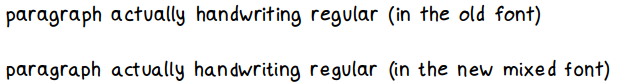
Here’s a small sample the old font and the new font. I don’t think the new font “feels” that much more like handwriting – there’s a little more variation, but it still doesn’t compare to actual handwritten text (at the bottom).
It feels a little uncanny valley to me, like it’s obviously still a font but it’s pretending to be something else.
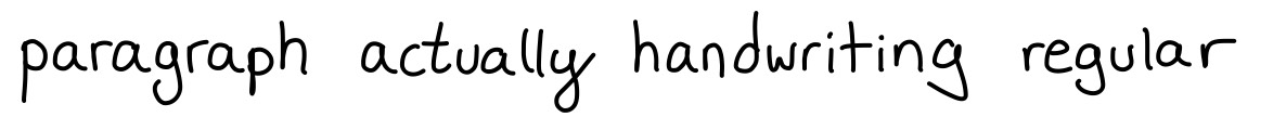
And here’s a sample of the same text actually written by hand:
It’s possible that the results would be better if I was more careful about how I made the 2 other handwriting fonts I mixed the original font with.
it’s cool that it’s so easy to add opentype rules!
Mostly what was delightful to me here is that it’s so easy to add OpenType rules to change how fonts work, like you can pretty easily make a font where the word “the” is always replaced with “teh” (typos all the time!).
I still don’t know how to make a more realistic handwriting font though :). I’m still using the old one (without the extra variations) and I’m pretty happy with it.