Telerik UI for Blazor 2.16.0—Editor, TreeList, Stock Chart, Context Menu Components and More!

Today we shipped a new version of Telerik UI for Blazor and we are happy to introduce four new Blazor components as well as Grid, Chart and Menu enhancements! You can now take advantage of the newly released Editor, TreeList, Stock Chart and Context Menu, as well as new exposed Grid events to give you flexibility to apply custom logic when interacting with data rows in Blazor applications!
Let’s explore the 2.16.0 release content and see in detail the new goodies you can incorporate in your Blazor Server and WebAssembly apps!New Blazor Components
Blazor Editor Component
Editor Overview
The new HTML Editor Component enables users to create rich text content and delivers out-of-the box features for text management such as creating, editing, and formatting text, paragraphs, lists, and other HTML elements. In addition to the built-in toolset it also allows you to create custom commands and easily integrate them into its Toolbar.
Telerik UI for Blazor Editor Component
Editor Toolbar
The various Editor command buttons are organized in a Toolbar and include various text formatting options such as font family, font size and style, text alignment, creating lists, tables, inserting hyperlinks and images and more! To ease the configuration of the Toolbar you have two toolset config options to choose from:
- Default—the default set of the most commonly used editor commands
- All—all available editor commands

Telerik UI for Blazor Editor Toolbar
Editor Built-In Toolset
The Editor component comes with multiple built-in tools grouped into the following categories:
- Inline Tools—add an inline HTML element such as an <a>, <img>, <strong> and <em>, or control their rendering related to formatting font family and size, and text formatting with bold, underlined or strikethrough styles.
- Block Tools—add block HTML element such as <h1>, <h2>, <p> and <ul>, or control their rendering related to alignment, formatting, indenting, undo and redo.
- Table Tools—add an HTML <table> element or control its rendering, such as add/remove columns and rows, merging and splitting cells.
You can invoke the built-in Editor toolset from outside the component or from custom tools, by referencing the component and calling its ExecuteAsync method.
Editor Toolset and Toolbar Customization
You can customize the predefined toolset available for the Editor by adding and removing tools, and even create your own custom tools and plug them in as an available command in the Editor Toolbar.
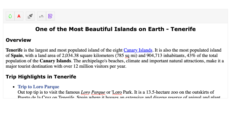
Telerik UI for Blazor Editor Custom Tools
Editor Modes
The Editor comes with two configuration modes that affect the way the component content is styled:
- Iframe (the default)—the content area is an editable <iframe> element and does not inherit the CSS rules from the current page.
- Div—the content area is an editable <div> element and the styles from the parent page are automatically applied to the content.
Editor Event
The Editor component exposes the ValueChanged event to let you easily handle Editor content in Blazor apps. The event fires after a user changes the content and the update interval has elapsed (100ms by default), and then provides you with the updated content.
Blazor TreeList Component
TreeList Overview
The Tree List component is the perfect match for visualizing hierarchical data in a tabular fashion and is definitely one of the release highlights. It comes with many built-in functionalities like data binding, item selection, several ways for data editing, sorting, filtering, paging, multiple column options, templates toolbar, loading data on demand and more! In fact, the component is so feature-rich that it deserves a separate blog post, however in the sections below we’ll try to highlight its key capabilities.
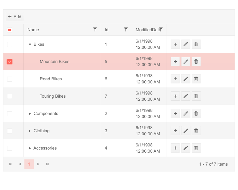
Telerik UI for Blazor TreeList Component
TreeList Data Binding
The Blazor TreeList can be bound to flat and hierarchical data, plus you have the benefit of loading data on demand for cases when you work with large volume of data records and want to optimize performance.
TreeList Rows Selection
The TreeList supports the following modes of row selection:
- None (default value)—Disabled row selection
- Single Row Selection—Click on a row or use checkbox
- Multiple Row Selection—hold down the Ctrl or Shift key to extend the selection, or use checkbox selection
The single and multiple rows selection articles provide more examples and details on using the TreeList selection features.
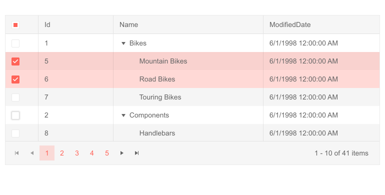
Telerik UI for Blazor TreeList Multiple Rows Selection
TreeList Paging and Sorting
The TreeList component offers built-in paging capability that can be enabled with a couple of property settings to enable paging and provide the number of records per page.
Similarly, tree list sorting can also easily be turned on by setting a single param to true. This would allow users to click on column headers and sort the data according to the column's data type, with an arrow indicator in the column title displaying the sorting direction or disable sorting for columns that make exception to the general rule.
TreeList Bound Column Options
The TreeList comes with a ton of properties on its data bound columns:
- Expandable—when set to true, the column shows an expand/collapse arrow in front of the value and denotes hierarchy. Needs to be set for at least one column of your Tree List to showcase the hierarchical nature of the data.
- Field—the name of the field in the data source that the column will render as a string (case-sensitive).
- Title—the text that is rendered in the column header.
- Editable—you can set this property to true or false to allow or prevent editing of this field. To edit data, you will also need a CommandColumn.
- Filterable—enables users to filter a particular column.
- Locked—defines whether the column is locked (frozen, pinned).
- Sortable—enables users to sort by a particular column.
- Reorderable—specifies whether users can drag to reorder this column.
- Resizable—specifies whether the user can resize this column.
- Width—defines the width of the column.
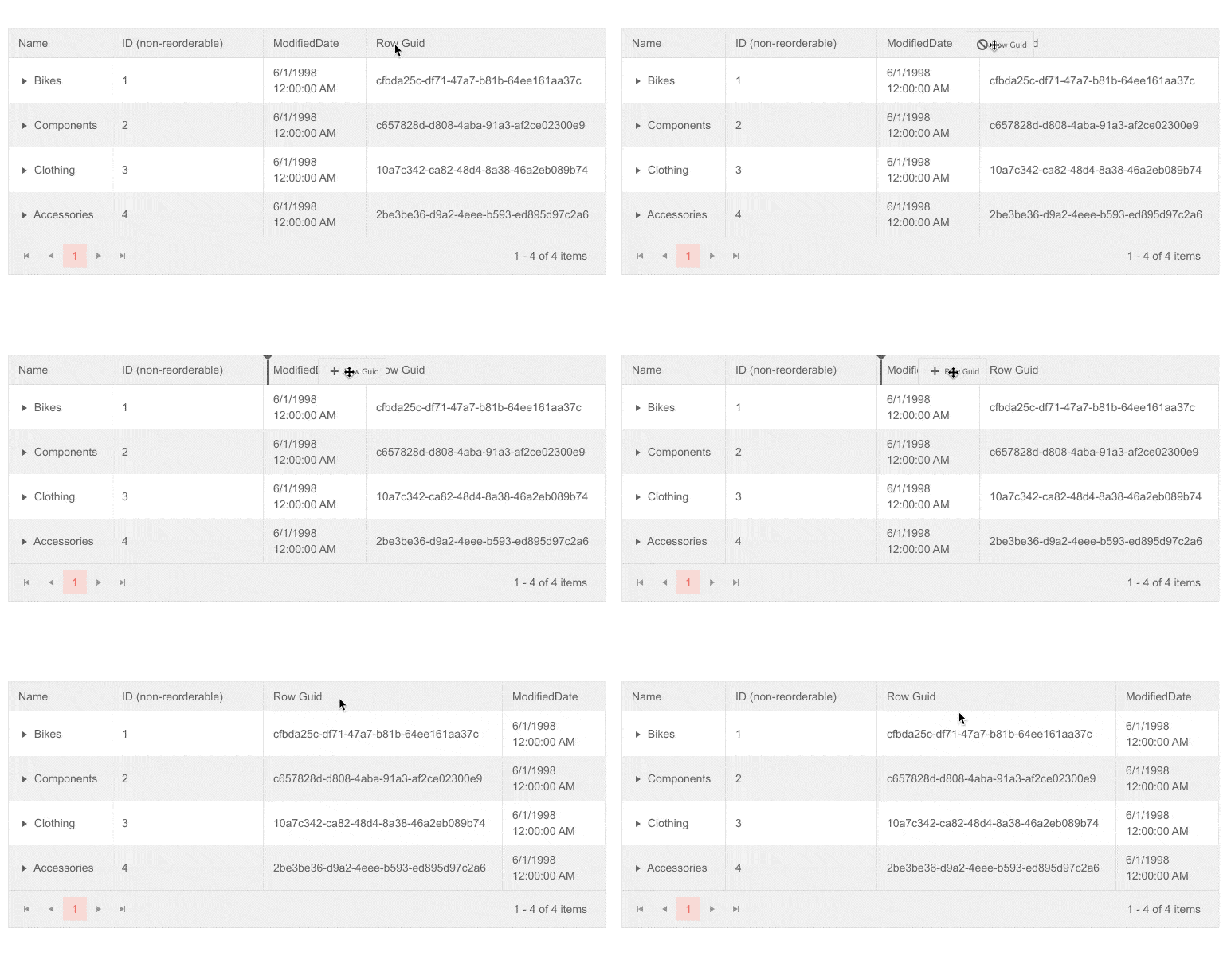
Telerik UI for Blazor TreeList Reorder Columns
TreeList Command Columns
The command column of a TreeList allows you to initiate inline or popup editing, or to execute your own commands. Examples on how to further add command columns for Editing, Saving, Cancelling and custom command for TreeList can be found in the documentation article.
TreeList AutoGenerated Columns
In case you need to generate a TreeList column for each public property of your data model, you can benefit greatly from using the TreeList AutoGenerated column option. This would let you directly map your model properties to columns by setting the AutoGenerateColumns parameter to true, saving you time from defining each column manually.
TreeList Column Virtualization
When working with data sets containing large number of columns in your Blazor applications, there are cases when you may want to improve the TreeList performance.
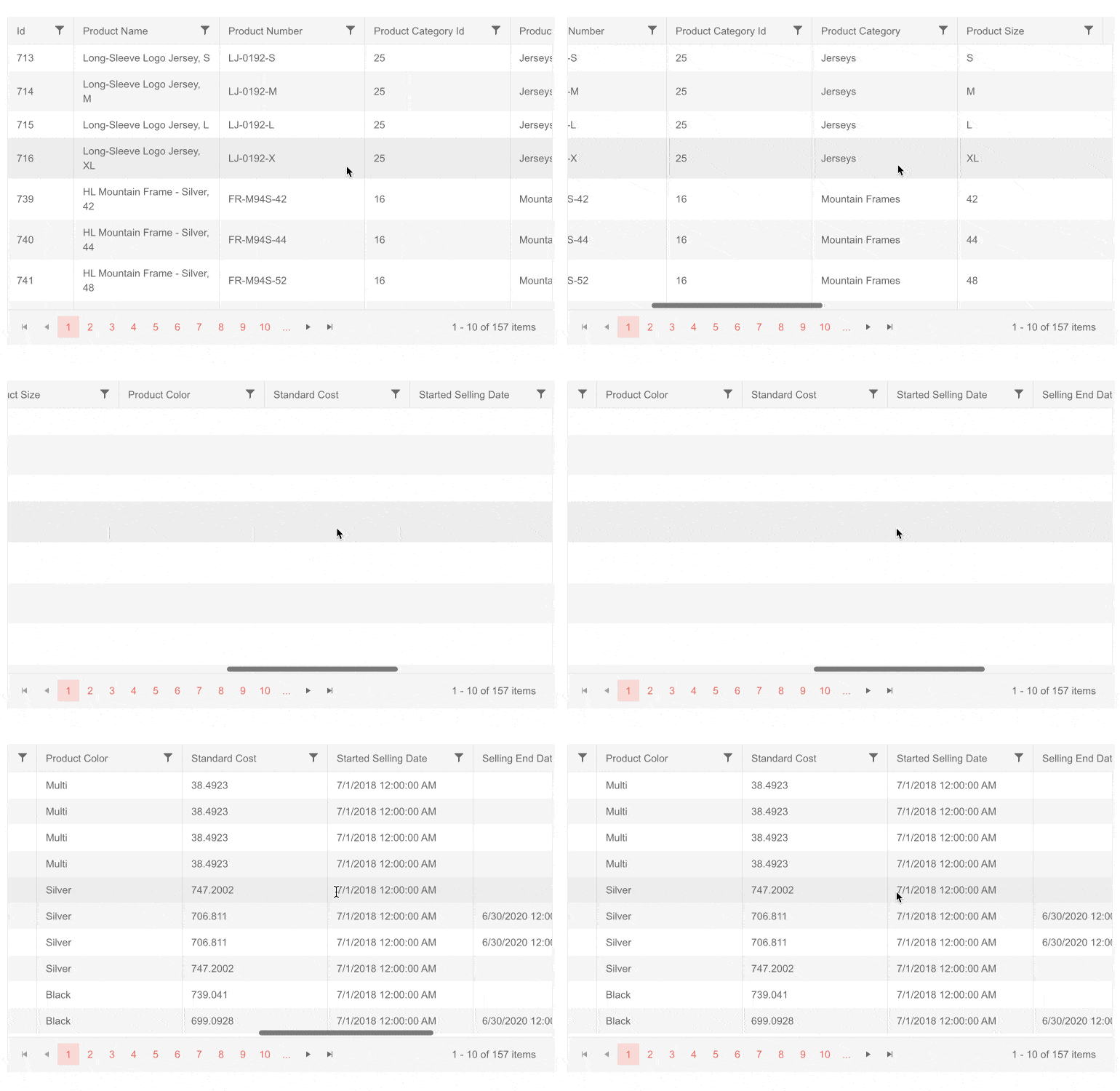
Telerik UI for Blazor TreeList Column Virtualization
Using the TreeList Column virtualization feature you can easily boost the speed and responsiveness of data interaction, since only columns and their corresponding data from the currently visible viewport will be rendered.
TreeList Filtering
The TreeList component offers two built-in options for filtering of its data:
- Filter Row—a row of filter options is rendered below the column headers
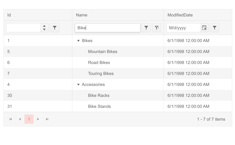
Telerik UI for Blazor TreeList Filter Row
- Filter Menu—the column headers render a button that shows a popup with filtering options
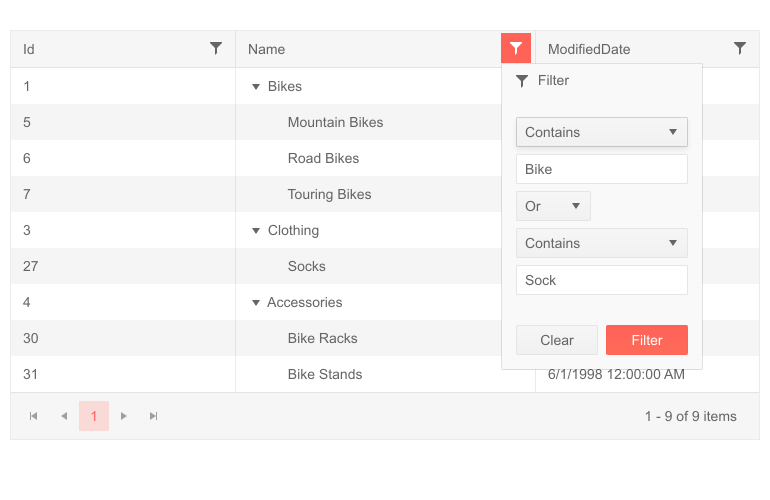
Telerik UI for Blazor TreeList Filter Menu
TreeList Editing
There are multiple ways to implement editing of data, and depending on your scenario you can pick of the available options:
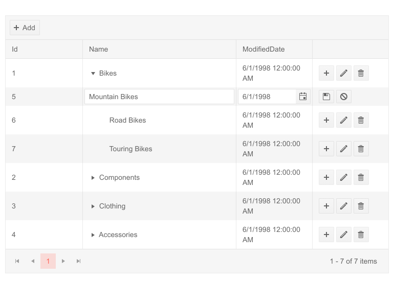
- Inline Editing—users can edit treelist values by clicking an Edit command button on a row, and all its editable columns open up for changes. By clicking a Save command button changes are submitted to the data access layer.
Telerik UI for Blazor TreeList Inline Editing
- InCell Editing—users can click the treelist cell and type a new value, changes are applied to the data source when they focus is removed from the input.
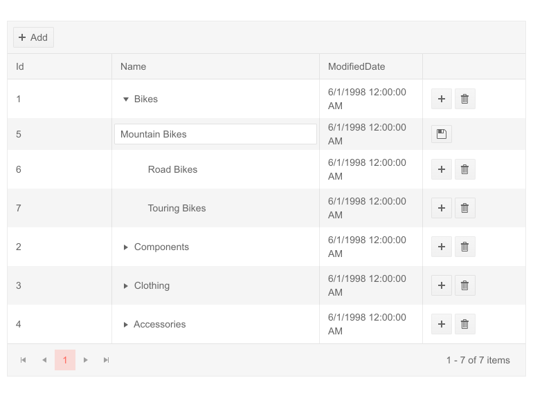
Telerik UI for Blazor TreeList InCell Editing
- Popup Editing—lets users click an Edit command button on the treelist row, and a popup shows up with all its editable columns open up for changes. By clicking a Save command button in the dialog changes are submitted to the model.
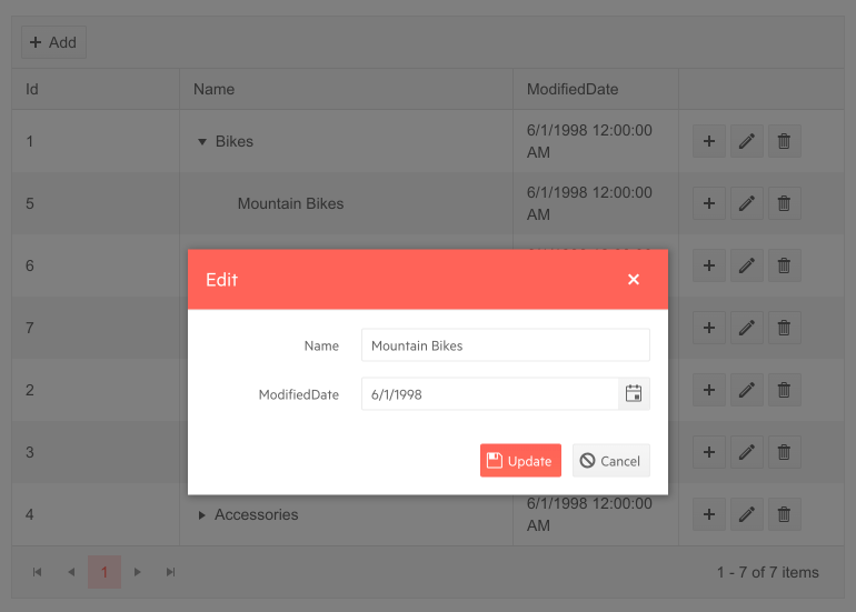
Telerik UI for Blazor TreeList Popup Editing
Customizing TreeList with Templates
The TreeList can be completely customized using one of the available templates, enabling you to specify the rending of:
- Columns (cells)—the rendering of each cell (column). You can, for example, change string formats or add your own components.
- Editing of a cell—when a cell is in edit mode, it will render this template where you can use custom editors, components and logic.
- Rows—the entire rendering of the <tr> element of the row, so you can fully customize the TreeList behavior and rendering. It can be convenient if you want to use templates for most or all of the columns, as it requires less markup than setting individual templates for many columns.
- Filter Row and Filter Menu—customize the design and logic behind the built-in filters depending on the selected TreeList filtering mode: filter row or filter menu.
- Column header—the Title of the column.
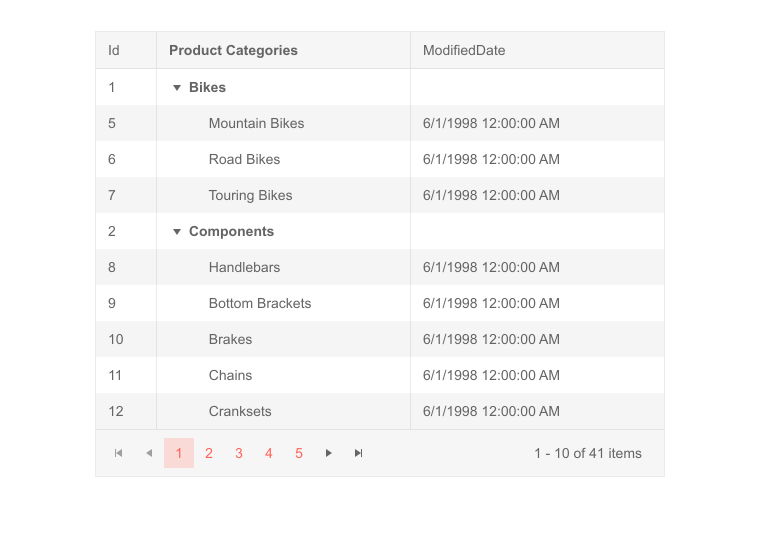
Telerik UI for Blazor TreeList Column and Column Header Templates
TreeList Toolbar
The Tree List component comes with a neat toolbar in its header that lets you organize in a nice layout the built-in commands (such as Add Item) and any custom commands which you can add to it as buttons. You can further add your own HTML and components to create a more complex Toolbar layout to match your business needs.
TreeList Localization and Globalization
The Tree List control has built-in localization and globalization support. Thus, it is no effort to translate UI texts into any language and automatically apply the formatting of numeric and date input fields based on a specific culture in your Blazor app.
Blazor Stock Chart Component
StockChart Overview
The new Stock Chart component will let you visualize the movement of financial units such as stock/market prices for specific date and—open and close rates, the various changes that have happened to the price during the day, minimum and maximum values reached during the day, and the trends of those prices over time.
You can use a variety of chart types and control all aspects of the chart's appearance—from colors and fonts, to paddings, margins, custom tooltips and templates. In addition to that the Telerik Stock Chart provides a Navigator to widen or shorten the defined period of time and zoom in on particular part of the chart, and a crosshair feature that makes available the precise values in data-dense charts.
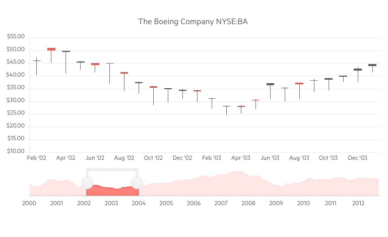
Telerik UI for Blazor Stock Chart
Stock Chart Data Binding
The Stock Chart is a data-bound component. All you need to do is provide a List of models, that contain both data point values and x-axis dates to the Data property of chart series, and set a few chart series properties to the corresponding model with values.
Stock Chart Series Types
The Stock Chart component supports several different chart series to cover any app scenario you may have—Area, Column, Candlestick, Line and OHLC (open-high-low-close). Code examples and usage for all of them can be found Telerik UI for Blazor documentation.
Stock Chart Navigator
The Stock Chart Navigator allows the user to scroll and zoom through data over a certain period of time. The Navigator can be used will all types of stock charts and allows customizations such as setting a specific range of the Navigation upon initialization, slider direction, label customizations and on mouse wheel rotation. You can also choose what type of series it will use to visualize the overall trend.

Telerik UI for Blazor Stock Chart Navigator
Stock Chart Crosshairs
The Stock Chart has another useful feature, the so-called Crosshairs, which represents perpendicular lines to the axes and allow app users to view the exact value of a point at the current cursor position. You can customize their color, opacity and width via the chart category axis settings.
Stock Chart ToolTips
Like all other Telerik UI for Blazor Charts, the Stock chart supports three options for fully customizable tooltips:
- Specific to each <StockChartSeries>
- Common tooltip settings for all series
- Shared tooltip for all categories
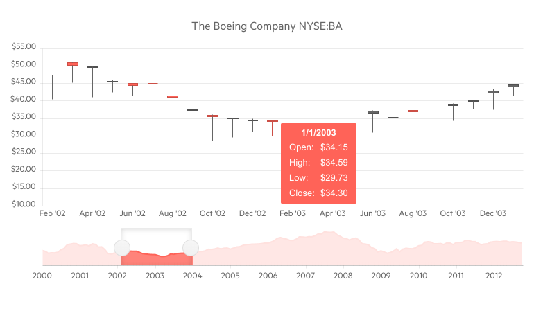
Telerik UI for Blazor Stock Chart with Tooltip
Stock Chart Event
The OnSeriesClick click event gives you further flexibility as it exposes full details related to a chart data point and lets you implement custom logic in response to a user click.
Blazor Context Menu Component
ContextMenu Overview
The ContextMenu component lets you provide users with an easily accessible shortcut menu of frequently used commands in Blazor applications. It comes with multiple built-in features such as data binding, styling, nesting items, customization with templates, keyboard navigation, and seamless integration with other UI components such as the Grid.
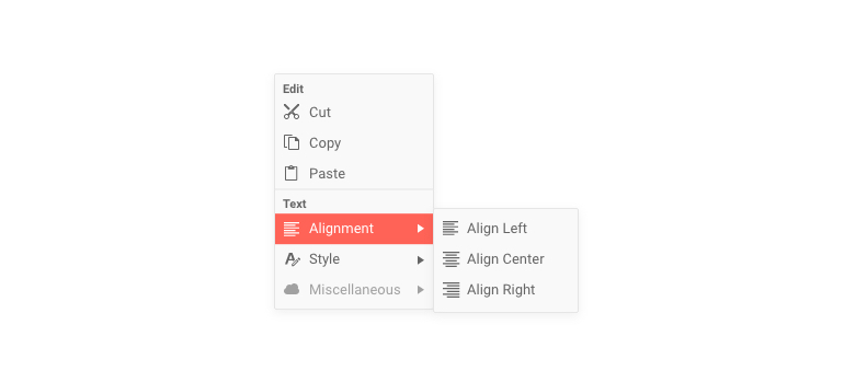 Telerik UI for Blazor Context Menu
ContextMenu Data Binding
The ContextMenu component can be bound to either:
- Hierarchical data—separate collections of items and their child items
- Flat data—a single collection of items with defined parent-child relationships
Еach context menu item property from the list: Id, ParentId, HasChildren, Items, Text, ImageURL/Icon/ImageClass, URL, Separator, Disabled can be set through the corresponding fields in their data binding.
Styling ContextMenu with Icons
You can put an image, icon class or a font icon for each item in the Context Menu to illustrate its purpose for your end users.
Customizing ContextMenu with Templates
You can easily customize the ContextMenu and its items appearance and behavior using one of the template options:
- Item Template—the rendering of each individual context menu item so you can render more than the built-in text and icon fields
- Content Template—lets you control the rendering of the entire popup
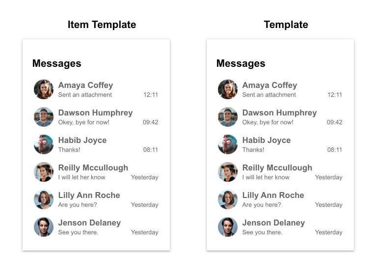
Telerik UI for Blazor ContextMenu Templates
ContextMenu Integration
One of the most common scenarios for integration of the Context menu component would be with a Telerik Blazor Grid. To do so, you will simply need to use the Grid's OnRowContextMenu event to get the current row model and show the context menu, then use the context menu's OnClick event to handle the desired operation. A code example with such an integration can be found in the official documentation.
Furthermore, the component has a simple, yet powerful parameter called Selector that makes the task of attaching the context menu to one or more targets easy. By using the ShowAsync method, you can also adjust the ContextMenu content—i.e. which menu items should be displayed/active based on which element the user clicked. Check out the code sample showing how to change ContextMenu items based on the target data.
ContextMenu Navigation
Besides being used as a shortcut for commands, the ContextMenu items can also be used for navigation between the different pages in your Blazor application. The component can generate the needed links for you through its UrlField when data binding. All you have to do is provide a collection of models that describe the pages you want the user to navigate to and populate its UrlField with the corresponding data from the model (alternatively you can provide a Url property in the model).
ContextMenu Onclick Event
The OnClick event fires when the user clicks or taps on a context menu item and it is suitable for cases when to react to user selection without using navigation to load new content automatically.
Blazor Component Enhancements
New Blazor Grid Events
With each release of Telerik UI for Blazor, we try to give love and extend the functionalities of the Grid. In the current release we worked on expanding the possibilities from a programming point of view and exposed several new events and features, so you have control over user interaction with the Grid and its custom data operations.
Blazor Grid Grouping with OnRead
When you use the Grid built-in grouping or other out-of-the box feature, it hides the complexity of the internally performed data operations from you. Still there are cases when you need to perform grouping yourself in code (and/or on the server-side service), and you can now use the OnRead event with grouping. For a detailed explanation on what you need to take into consideration, as well as some data preparation that needs to take place, check out the example on how to set up the grid to use grouping with manual data source operations, and how to use the Telerik DataSource extensions to prepare grouped data.
Blazor Grid Expand/Collapse Rows Events
- OnRowExpand event fires as a response to the user expanding the DetailTemplate (parent-child records) of the Grid and comes in handy when you need to load Grid detailed data on demand
- OnRowCollapse event fires as a response to the user collapsing the DetailTemplate of the Grid and provides you easy access to the model of the clicked row
Blazor Grid ContextMenu Event
The OnRowContextMenu event fires as a response to:
- user right-clicking on a Grid row
- clicking the Context Menu keyboard button
- long-touch on mobile devices
The Grid OnRowContextMenu event is used to integrate the Context menu with Grid Rows. Its event handler receives a GridRowClickEventArgs object which provides the model of the clicked row and exposes an EventArgs property. You can use the event arguments to determine the keyboard key or the position of the mouse cursor when the user took an action.
Blazor Chart Series
In the Telerik UI for Blazor 2.16 release we added two chart type series to facilitate financial and pricing analysis: OHLC and Candlestick.
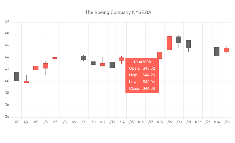
Telerik UI for Blazor Candlestick Chart
OHLC and Candlestick are price charts that display the high, low, open, and closing prices of a security, derivative or price for a specific period. Both are widely used by financial analysts or traders and helps them easily determine if closing price was higher or lower than the opening price.
Though they the two chart types show the same amount of information, they do it in a slightly different way. While OHLC charts show the open and close via left and right facing horizontal lines, candlesticks show the open and close via a real body.
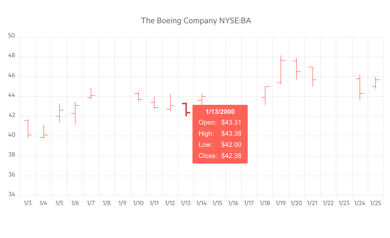
Telerik UI for Blazor OHLC Chart
Blazor Menu Enhancements
Last but not least in this release we added two addition features to the Menu component:
- Separator—lets you define a line in the Menu component by setting it to true. This would allow you to distinguish logically grouped items between two separators.
- Disabled—lets you disable menu items by setting it to true (these menu items are still rendered but will not be clickable).
New Telerik Blazor Release, New Demos Look!
We are excited that the Telerik UI for Blazor demos have brand new fresh look! As the number of components and related demos and code examples continuously grow, we redesigned our demos, so you can easily navigate and search specific features. Plus, we gave them brand new fancy styling.
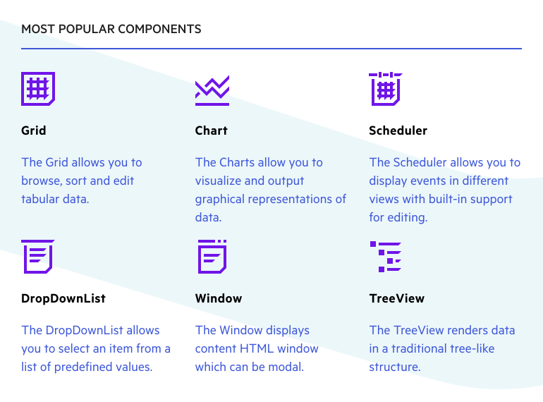
Updated Telerik UI for Blazor Demos Hub Page
Download Telerik UI for Blazor 2.16.0
To see in action all that’s mentioned in the release blog post, head over to the Telerik UI for Blazor page, download a free trial of Telerik UI for Blazor 2.16.0, or if you are an active license holder you can grab the latest and greatest from the “Your Account” page or update your NuGet Telerik.UI.for.Blazor package reference to version 2.16.0. directly in your Blazor solutions.
Thank You!
As always, we are thankful to you for being involved and helping us grow and making Telerik UI for Blazor bigger and better. Keep telling us what’s working well, what needs to improve and which component or feature you’d like to see next in the dedicated Blazor feedback portal or in the comment section below!
From the entire Telerik UI for Blazor team at Progress, we thank you for your continuous support 

Maria Ivanova
Maria Ivanova is a Manager of Product Management at Progress, for Telerik and Kendo UI components and developer tooling. She joined the company in 2019 as a Product Manager for Telerik UI web components and is passionate about developing impactful and innovative software products. Maria believes that to create great products, it's important to challenge the status quo, closely collaborate with customers, and embrace a spirit of experimentation. Follow her on Twitter or LinkedIn.

