Recently I released Coverage.py 5.2, which included a dark-mode for the HTML report, contributed by Vince Salvino. I hadn’t seen a dark-mode implementation for HTML before, so it piqued my interest.
Now I’ve implemented a dark mode for this site. There is no manual control for it, it uses the “prefers-color-scheme” CSS media query to follow the current operating system setting. If you use a Mac in dark mode, Chrome or Safari should show you this site in dark mode.
Implementing it was fun, as fiddling with this site always is. It’s a good chance to learn new things. In this case, CSS variables were new to me.
The article “prefers-color-scheme: Hello darkness, my old friend” by Thomas Steiner was very helpful. Luckily, for this simple site I could skip over many parts of Thomas’ comprehensive treatment of the considerations.
One of the trickier things in dark mode is adjusting color palettes, but this site pretty much has no colors, so that wasn’t a problem. I did have to be careful to keep the text at sufficiently high contrast ratios.
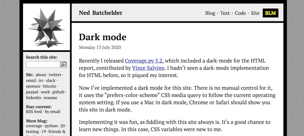
Here’s how it looks in light mode (the classic, unchanged):
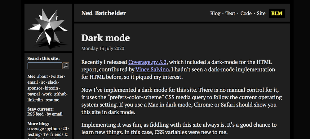
And in dark mode:
A big challenge was re-rendering the star in the upper left. I’ll have to switch from POV-Ray to Blender one of these days...
I don’t use dark mode myself, so I’m not sure if I got the vibe right. Let me know if there’s something I should adjust.


Comments
Works fine for Firefox under Ubuntu MATE, too. Switching backwards and forwards between the standard TraditionalGreen and Ambiant-MATE-Dark themes causes this page to follow along.
I would say the opposite, the text needs to be at a low enough contrast to be readable. I have a comatic aberration, which smears out light sources, making high contrast text hard to read. So I would strongly prefer to dial down the text brightness of the text, maybe to something like #B0B0B0.
W3C made a mistake making prefers-color-scheme a binary choice, with no indication of contrast. There is prefers-contrast, but no browsers support that yet, and websites won't necessarily use it.
prefers-color-scheme also works in Firefox under KDE Plasma (on openSUSE Tumbleweed) when I select the Breeze Dark KDE color scheme, though not in Chromium.
However, when I try to post a comment here in dark mode, the preview is an unreadable white on Yellow.
About the contrast: do you have resources about that? I'm not sure how best to design a scheme that works well for everyone, but I'm interested to find out more.
- https://uxmovement.com/content/why-you-should-never-use-pure-black-for-text-or-backgrounds/
- https://jessicaotis.com/academia/never-use-white-text-on-a-black-background-astygmatism-and-conference-slides/
Most places I see only talk about low contrast decreasing readability, but for me it's pretty much the opposite, to a point. There are guidelines for minimum contrast, but there doesn't seem to be any for maximum contrast.
It gets worse with pupil dilation, so a lighter background helps a bit. And the smearing gets more visible with lighter light sources on darker backgrounds, so white on black is pretty much unreadable.
The text here is readable, but it does take extra effort for me. It gets easier when I reduce the text brightness.
Add a comment: