The code that accompanies this article can be found here.
One of the main tasks of data scientists is to visualize the data. This can happen during two phases of developing a solution. First, when we start working on a project, we need to understand the data. Before we can use some fancy machine learning or deep learning model, we need to understand the data we are dealing with. This is done through exploratory data analysis. During this process, we usually create a lot of graphs and plots, that can help us see how data is distributed and what is going on. You know what they say – a picture is worth a thousand words. Also at the end of the project, data scientists usually have to explain to the client why their solution is good and how it will impact the client’s business. Here it is important to use data visualizations that are in general more understandable than complicated mathematical formulas.
Are you afraid that AI might take your job? Make sure you are the one who is building it.
STAY RELEVANT IN THE RISING AI INDUSTRY! 🖖
The Python Package Index has many libraries for data visualization. In this article, we focus on the two most popular libraries – Matplotlib and Seaborn. Matplotlib was created back in 2003 by late John D. Hunter. His main idea was to simulate data visualization that existed in MATLAB. You can watch Mr. Hunter’s full speech about the evolution of Matplotlib at the SciPy Conference here. As he tragically passed away in 2012, Matplotlib became a community effort making it one huge library. At the moment we are writing this it has more than 70000 lines of code. Seaborn is a library that is built on top of Matplotlib for making statistical graphics in Python. Apart from that, it is closely integrated with Pandas data structures.
Data and Imports
First, let’s import all the necessary libraries that we use in this guide. Apart from mentioned visualization libraries we import Pandas and NumPy for data importing and handling:
import pandas as pd
import numpy as np
import matplotlib.pyplot as plt
import seaborn as sb
%matplotlib inline
Data that we use in this article is from PalmerPenguins Dataset. This dataset has been recently introduced as an alternative to the famous Iris dataset. It is created by Dr. Kristen Gorman and the Palmer Station, Antarctica LTER. You can obtain this dataset here, or via Kaggle.

This dataset is essentially composed of two datasets, each containing data of 344 penguins. Just like in Iris dataset there are 3 different species of penguins coming from 3 islands in the Palmer Archipelago. Also, these datasets contain culmen dimensions for each species. The culmen is the upper ridge of a bird’s bill. In the simplified penguin’s data, culmen length and depth are renamed as variables culmen_length_mm and culmen_depth_mm.

Let’s load the data and see what it looks like:
data = pd.read_csv('./data/penguins_size.csv')
data.head()
Note that the dataset is located in the data folder of our Jupyter notebook. Also, we are loading a simpler dataset. Here is the output:

Object Hierarchy in Mathplotlib
In general, the idea behind Mathplotlib is twofold. On one hand, this library supports general potting actions like ‘contour this 2D array’. On the other hand, it supports specific plotting actions, like ‘make this line orange’. This makes Matplotlib such a cool library, you can use it in its general form most of the time and yet you are able to use specific commands when needed. This makes it a somewhat hard library for understanding and usage. That is why we start from the understanding of the hierarchy of the objects in this library.
At the top of the hierarchy, we can find the pyplot module. This module contains Matplotlib’s “state-machine environment” and at this level, simple methods are used to plot data in figures and axes. One step below we can find the first level of the object-oriented interface. Here the pyplot abstractions are used only for a few functions (ie. figure creation). This means that the user explicitly creates and keeps track of the figure and axes objects. At the lowest level, using which the user has the most control, pyplot module is not used at all and only an object-oriented approach is used. In this guide, most of the time, we use the highest level of the hierarchy, meaning we rely on the pyplot and Seaborn modules.

Every single plot is composed of several important parts, that you can find in image above:
- Figure – This is the base object and it contains the whole figure, ie. the whole plot. It is a ‘parent object’ to Axes, Canvas and other smaller objects like titles and legends (also known as artists).
- Axes – When we think of the term ‘plot’, this is what we think of. In general, this is the part of the image with the data space and it controls data limits. It is the entry point for working with the object-oriented interface of Matplotlib.
- Axis – Note the difference between Axes and Axis objects. They are the number-line-like objects and they take care of setting the graph limits and generating the ticks on each axis.
- Artist – This term refers to everything you see on a figure (including the Figure object itself).
In this article, we will use Matplotlib as a base. As we mentioned, it is hard to utilize everything that exists in this library in an easy manner. That is why most of the time we use Seaborn library that is built on top of Matplotlib. The combination of these two libraries gives us big visualization power.
Seaborn Styles
Before we dive into different types of plots that we can provide with these libraries, there is just one more thing we need to mention. When we start working with some data, it is useful to pick a color scheme and style of the graphs. The human psyche reacts differently to different colors. Also, if you need to present data to a client, it is useful to use colors that they are comfortable with. We can set this up using Seaborn styles, context and color palette. In a nutshell, this is the purpose of Seaborn – to make our plots look dashing. To set the style of the plots we use set_stlyle function. There are four styles that we can use: white, dark, whitegrid, darkgrid.
sb.set_stlye(name_of_the_stlye)
Seaborn contexts are used to define how the plot looks. These are ‘pre-build packages’ and they affect the size of the labels, lines, and other elements of the plot, but not the overall style, which as we saw is controlled by the set_style function. Context has four options as well: notebook, paper, poster and talk.
sb.set_context(name_of_the_context)
Finally, the Seaborn palette is used to control the colors of the charts. You can set it using the function set_palette and it has many options:
Accent, Accent_r, Blues, Blues_r, BrBG, BrBG_r, BuGn, BuGn_r, BuPu, BuPu_r, CMRmap, CMRmap_r, Dark2, Dark2_r, GnBu, GnBu_r, Greens, Greens_r, Greys, Greys_r, OrRd, OrRd_r, Oranges, Oranges_r, PRGn, PRGn_r, Paired, Paired_r, Pastel1, Pastel1_r, Pastel2, Pastel2_r, PiYG, PiYG_r, PuBu, PuBuGn, PuBuGn_r, PuBu_r, PuOr, PuOr_r, PuRd, PuRd_r, Purples, Purples_r, RdBu, RdBu_r, RdGy, RdGy_r, RdPu, RdPu_r, RdYlBu, RdYlBu_r, RdYlGn, RdYlGn_r, Reds, Reds_r, Set1, Set1_r, Set2, Set2_r, Set3, Set3_r, Spectral, Spectral_r, Wistia, Wistia_r, YlGn, YlGnBu, YlGnBu_r, YlGn_r, YlOrBr, YlOrBr_r, YlOrRd, YlOrRd_r, afmhot, afmhot_r, autumn, autumn_r, binary, binary_r, bone, bone_r, brg, brg_r, bwr, bwr_r, cividis, cividis_r, cool, cool_r, coolwarm, coolwarm_r, copper, copper_r, cubehelix, cubehelix_r, flag, flag_r, gist_earth, gist_earth_r, gist_gray, gist_gray_r, gist_heat, gist_heat_r, gist_ncar, gist_ncar_r, gist_rainbow, gist_rainbow_r, gist_stern, gist_stern_r, gist_yarg, gist_yarg_r, gnuplot, gnuplot2, gnuplot2_r, gnuplot_r, gray, gray_r, hot, hot_r, hsv, hsv_r, icefire, icefire_r, inferno, inferno_r, jet, jet_r, magma, magma_r, mako, mako_r, nipy_spectral, nipy_spectral_r, ocean, ocean_r, pink, pink_r, plasma, plasma_r, prism, prism_r, rainbow, rainbow_r, rocket, rocket_r, seismic, seismic_r, spring, spring_r, summer, summer_r, tab10, tab10_r, tab20, tab20_r, tab20b, tab20b_r, tab20c, tab20c_r, terrain, terrain_r, twilight, twilight_r, twilight_shifted, twilight_shifted_r, viridis, viridis_r, vlag, vlag_r, winter, winter_r
sb.set_palette(name_of_the_palette)If you are not sure if palette you’ve picled is suitable for you, you can always print colors with palplot function. For example:
sb.palplot(sb.color_palette('Oranges_r', 11))
Ok, now we know what are the major components of one Matplotlib graph and we know how to control its style using Seaborn. Now, let’s start plotting.
Plots
Between these libraries, we have many options for plotting data. However, in order to have a more systematic approach, we divide plots into five groups. Each group has a specific purpose.

Distribution Plots
This type of plot is used to show the distribution of the data, meaning it shows a list of all the possible values of the data. They are often used for univariate data analysis when we observe one variable and it’s nature. Seaborn also has an option for 2D distribution plots, which we can use to observe the distribution of two variables simultaneously.
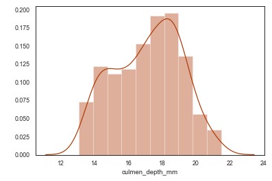
The first distribution plot that we explore is distplot. It plots a univariate distribution of a variable and it is good for plotting histograms. Let’s check the distribution culmen_depth_mm variable in the PalmerPenguins dataset.
sb.distplot(data['culmen_depth_mm'])
Also, we can use rugplot to plot datapoints in an array as sticks on an axis.
sb.rugplot(data['culmen_depth_mm'])
Using Seaborn we can also plot KDE plot using kdeplot function. Kernel density estimation (or KDE) is a way to estimate the probability density function of a random variable. This function uses Gaussian kernels and includes automatic bandwidth determination. KDE plot is already included at the distplot but we may want to use it separately.
sb.kdeplot(data['culmen_depth_mm'])
Apart from that, we can use FacetGrid from Seaborn for plotting conditional relationships, for which we may pick KDE plot. For example, let’s plot relationship between spicies and culmen_depth_mm variables from the dataset:
sb.FacetGrid(data,hue="species",height=5)\
             .map(sb.kdeplot,"culmen_depth_mm")\
             .add_legend()
plt.ioff()
When we are talking about distributions and relationships, we need to mention Jointplot. This type of lot is used to visualize and analyze the relationship between two variables, but also to display individual distribution of each variable on the same plot.
sb.jointplot(x="culmen_length_mm",y="culmen_depth_mm", data=data)
This can also be extended with the KDE plot, all we have to do is use kind parameter of jointplot function.
sb.jointplot(x="culmen_length_mm",y="culmen_depth_mm", data=data, kind='kde')
In the end, we may want to print relationships of all variables. This can be done with the pairplot function. It is one very useful trick for exploratory data analysis.
sb.pairplot(data)
Continuous & Categorical Variables Relationships
This group of plots is all about the relationship between continuous and categorical variables. For example, if we want to get more information about the distribution of cullmen_depth_mm variable in relationship with species variable, we would use one of these plots. Let’s start with stripplot function. This Seaborn method draws a scatterplot with one categorical variable.
sb.stripplot(x="species",y="culmen_depth_mm",data=data,hue="species")
Similar to stripplot function, swarmplot (also called beeswarm) draws scatterplot but without overlapping points. It gives a better representation of the distribution of values.
sb.swarmplot(x="species",y="culmen_depth_mm",data=data,hue="species")
Probably the most commonly used plot for this purpose is boxplot. This plot draws five important distribution points, ie. it gives a statical summary of the variable. The minimum and the maximum, 1st quartile (25th percent), the median and 3rd quartile (75th percent) of the variable are included in the graph. Also, using this plot you can detect outliers. The main problem of this plot is that it has a tendency to hide irregular distributions.
sb.boxplot(x="species",y="culmen_depth_mm",data=data,hue="species")
Sometimes it is useful to use boxplot for each variable, something like this:
data.boxplot(by="species",figsize=(10,8), color='orange')
Another neet trick is to use the boxplot with stripplot.
box_strip_combo_fig=sb.boxplot(x="species",y="culmen_depth_mm",data=data)
box_strip_combo_fig=sb.stripplot(x="species",y="culmen_depth_mm",data=data,hue="species")
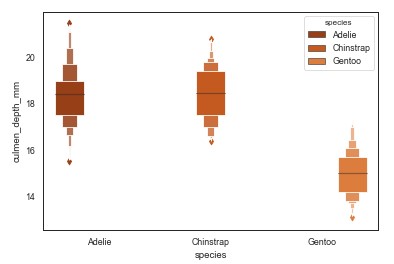
In order to use boxplot benefits on large datasets, sometimes we can use boxenplot, which is basically extended boxplot.
sb.boxenplot(x="species",y="culmen_depth_mm",data=data,hue="species")
A good alternative to boxplot is violinplot. It plots the distribution of the variable, along with its probability distribution. The interquartile range, the 95% confidence intervals, the median of the variable is displayed in this chart. The biggest flaw of this plot is that it tends to hide how values in the variable itself are distributed.
sb.violinplot(x="species",y="culmen_depth_mm",data=data,hue="species")
In some special cases, we may want to use pointplot. This plot gives one point that represents the corresponding variable. It is useful for comparing continuous numerical variables.
sb.pointplot(x="species",y="culmen_depth_mm",data=data,hue="species")
Continuous Variables Relationships
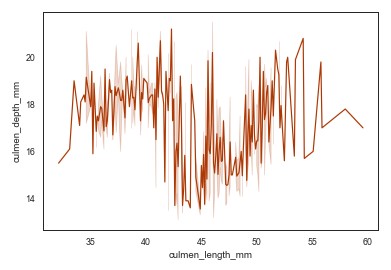
During exploratory data analysis sometimes we want to visualize relationships of two continuous variables. We can do so with two plots: scatterplot and lineplot. Let’s use them to represent relationship between culmen_length_mm and culment_depth_mm features.
sb.scatterplot(x="culmen_length_mm",y="culmen_depth_mm", data=data)
sb.lineplot(x="culmen_length_mm",y="culmen_depth_mm", data=data)
Statistical models
In general, we use these plots to display the statistical nature of the data. We can do so on the complete dataset, just to get familiar with it, or we can use residplot and lmplot. We utilize Pandas and Seaborn interoperability for the first task:
data.describe().plot(kind="area",fontsize=20, figsize=(20,8),table=False)
plt.xlabel('Statistics')
plt.ylabel('Value')
plt.title("Statistics of PalmerPengins Dataset")
The residplot draws residuals of linear regression, meaning it displays how far each data point was off the linear regression fit.
sb.residplot(x="culmen_length_mm",y="culmen_depth_mm", data=data)
The lmplot does the same thing, but it also displays confidence intervals. It has many parameters that can help you customize this plot. One of the most useful ones is the logistic parameter. When set to true, this parameter will indicate that the y-variable is binary and will use a Logistic Regression model.
sb.lmplot(x="culmen_length_mm",y="culmen_depth_mm", data=data)
Heatmaps
The final type of plot that we investigate is the so-called heatmap. The heatmap displays any type of matrix by painting higher values with more intense color. It is often used for correlation analysis when we need to decide which features from the dataset we want to pick for machine learning.
sb.heatmap(data.corr(),vmin=-1,vmax=1,annot=True)
Conclusion
In this article, we covered necessary functions from Matplotlib and Seaborn that you can use to visualize your data. Data visualization is a lot about the feeling of which plot and which color should be used with some data to get more insight. One might say that it is more art than it is science. If you want to study it further here are some sources:
Thank you for reading!

Nikola M. Zivkovic
CAIO at Rubik's Code
Nikola M. Zivkovic a CAIO at Rubik’s Code and the author of book “Deep Learning for Programmers“. He is loves knowledge sharing, and he is experienced speaker. You can find him speaking at meetups, conferences and as a guest lecturer at the University of Novi Sad.
Rubik’s Code is a boutique data science and software service company with more than 10 years of experience in Machine Learning, Artificial Intelligence & Software development. Check out the services we provide.


All, I have created a Jupyter notebook of my attempt to follow along with the tutorial. I could use help addressing some issues I encountered which I have annotated in the notebook at https://github.com/cnorona1/jupyter-tutorials/tree/master/ultimate-python-data-visualization.
Hi Charles,
Thank you for reading the article and noticing errors in it, I necessary made changes. It means a lot to me to get the feedback like this.
Also, you can find my notebook with complete code here https://github.com/NMZivkovic/ultimate_python_data_visualization_guide for full transparency.
Best,
Nikola