Grab Your Users' Attention with the WPF RadCallout in Action

Need to display meaningful information, be it alerts, hints, tips, etc? Then greet the hero of R2 2020 Release of Telerik UI for WPF—the RadCallout control.
Remember how we all thought that buttons are everywhere? Well, while developing the hero of today’s talk, I changed my mind about that. I started seeing Callouts everywhere, but there was no other like our star—one of the shiniest accents of the R2 2020 release of Telerik UI for WPF. Everybody, please welcome the brand-new RadCallout. 🥳
I’m sure that all of you have already met a callout in your lives, at least once. Some of you may not know that it’s referred to as a callout. Others might relate it to the thought or speech bubbles used in comic strips. All golden Microsoft Office fans surely still remember Clippit. The cute cartoon paperclip, seen in versions 2000 through 2003, and its helpful callouts. But what’s so special about ours? Let’s call out the RadCallout and find out.
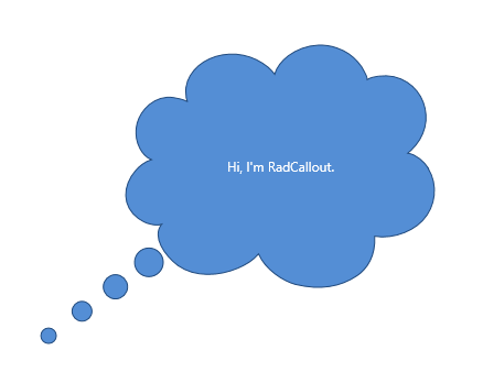
What do you see? A tiny, fluffy, cloudy text box with a small tail that you can point to different locations. Pretty simple, huh, yet so satisfying and unbelievably (at first sight) powerful. Let me guide you through its superpowers.
Unlimited Box Shapes Variety
I could not help but start exactly with this one. Since the callout control is a content control, designed to display a piece of meaningful information, be it alerts, hints, tips, etc., I believe the shape of it is the part responsible for the best representation. You can’t warn your users that if they don’t change their expiring password, they may not be able to log in ever again, in the shape of a heart for example, can you? Let’s cut the small talk and explore the shape options that the RadCallout offers.
The control comes with five built-in shape types, plus one very special option. The CalloutType is an enumeration and it allows the following values—Rectangle, RoundedRectangle, Ellipse, Cloud, Kaboom (the one jazzy, glaring shape with the many lines connecting to form numerous triangular edges).
The last option is intentionally out of the list of built-in shapes—it's the Custom shape option. The one responsible for the heading of this section, the one giving you the un-limitedness. Using it, you need to provide a custom geometry. I really love it, because it allows you to get into your stride and build a very cool and unique shape for your callout.
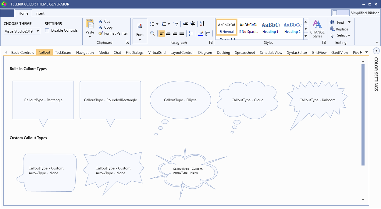
Explore them all and play with the themes and colors in the Color Theme Generator application. Like the rest of the controls from the Telerik UI for WPF, the Callout control comes with a set of themes you can use to create a consistent and modern looking user experience.
P.S. The last one of the custom callout types is catchy, isn’t it? And since I like you, I’ll show you how it’s done:
<telerik:RadCallout

Width="250" Height="170"

Margin="10 0" CalloutType="Custom"

MeasurePathWithInfinity="False" Stretch="Fill" ArrowType="None"

Geometry="M590.7,100.7c.5-3.1,1.1-6.2,1.8-9.3a2.0,2.0,0,0,0-.7-2.4c-7.4-5.7-15.8-9.0-25.4-8.2-10.5,1-18.5,6.0-23.2,15.7-3.7,7.8-3.8,16-2,24.3a2.3,2.3,0,0,0,1.7,1.7c2.1.8,4.3,1.7,6.3,2.7a30.7,30.7,0,0,1,7.2,4.7,6.4,6.4,0,0,1-1.9-.3,86.4,86.4,0,0,0-17.4-3.3c-8.5-.6-16.8.1-24.6,3.6-9.3,4.2-15.8,11-18.3,21.1-2,7.9-.8,15.5,2.4,22.9,3.7,8.0,9.6,14.2,16.8,19.2,2,1.4,4.1,2.6,6.1,3.9,5.2-3,10-6.1,15.5-7.8a7,7,0,0,1-1.2,1.3,110.6,110.6,0,0,0-8.0,7.8c-7.5,8.8-11.2,19-10.1,30.7,1.5,16.1,13.5,30.8,29.7,36.0a47.3,47.3,0,0,0,30.4-.5,44.6,44.6,0,0,0,9.6-4.2,60,60,0,0,1-2.4-18.3,11.0,11.0,0,0,1,1,2.1c1.2,3,2.2,6.1,3.7,9.1a48.5,48.5,0,0,0,14.8,18.5c9.7,7.2,20.5,9.9,32.4,7.1,12.4-2.9,21-10.4,25-22.7a36.1,36.1,0,0,0,.5-19.4c-.7-3.1-1.9-6.1-2.9-9.2h0c.8-.5,1.3.1,1.8.6,1.6,1.7,3.2,3.4,4.8,5.3a2.9,2.9,0,0,0,2.8,1.3A71.5,71.5,0,0,0,686.7,231c10-3.7,18.2-9.8,24.1-18.9,7.5-11.7,9.4-24.6,6.6-38.2-3.4-16.1-12.3-28.2-27.0-35.8a53.1,53.1,0,0,0-23.6-5.5c-1.3,0-2.6,0-3.9,0a1.9,1.9,0,0,1,1.0-1.1c3.6-1.2,7.3-2.6,11.1-3.7,1.3-.4,2.0-.9,2.1-2.3.1-2.3.5-4.7.6-7.1.4-9.6-1.2-18.8-6.3-27.1-8.0-13.1-20-19.4-35.4-18.5-8,.4-15.2,3.3-22,7.5-8.5,5.3-15.5,12.4-21.6,20.5-.4.6-.9,1.2-1.7,2.2A13.1,13.1,0,0,1,590.7,100.7Zm-63.8,17.7L477,72.3a13.9,13.9,0,0,0-1.5-1c1.0-.5,1.6.3,2.2.8q10.5,7.7,21.0,15.4l34,25a6.3,6.3,0,0,0,2.4,1.2c-.2-.7-.4-1.4-.6-2.2-2.1-6.3-3-12.8-1.2-19.3,2.4-9,8.2-15.1,16.8-18.4,13.3-5.1,25.8-3,37.5,5.1.6.4,1.2.9,2.3,1.6,1.8-21.2,3.3-42.1,5.5-63,1.3,20.5,2.7,41.1,4.1,62.2,1-.8,1.6-1.3,2.2-1.8,8.1-7,17.4-12,28.1-13.5,15.8-2.2,29.7,1.7,40.9,13.3,7.7,8,11.2,17.9,11.5,28.9.0,3-.3,6.0-.5,9.0-.0.8-.1,1.7-.2,2.9,1.1-.4,2-.8,2.8-1.2l78.2-35.9c.9-.4,1.9-.7,2.9-1.0a30.6,30.6,0,0,1-2.6,1.9q-37.2,21.6-74.5,43.1c-.8.4-1.6,1-2.7,1.6a9.8,9.8,0,0,0,1.4.5c18.6,3.7,31.1,15,38,32.3a59.9,59.9,0,0,1,0,45.6c-5.6,14.1-15.8,24-30.1,29.3a60.4,60.4,0,0,1-17.0,3.7c-.8.0-1.6.1-2.8.3.5.7.9,1.3,1.3,1.7q21.2,25.6,42.6,51.2a10.1,10.1,0,0,1-2-1.2Q695.6,271,674,250.7l-4.8-4.4c-.7.8-.4,1.7-.4,2.5a38.8,38.8,0,0,1-4.8,19.8,39.8,39.8,0,0,1-21.0,18,44.7,44.7,0,0,1-35.7-.7,38.3,38.3,0,0,1-15.4-12.5c-.3-.4-.6-.9-1-1.3a3.9,3.9,0,0,0-.7-.4c-5.7,27.5-11.1,55.0-17.1,82.5,2.6-28.3,5.2-56.6,7.8-85.2a10.6,10.6,0,0,0-1.5.6c-11,7.2-22.7,8.2-34.9,4-16.4-5.7-28.1-16.7-34.6-33a37.3,37.3,0,0,1,0-29c.5-1.3,1.2-2.5,2-4.3l-61.9,17.3c-.0-.1-.1-.2-.1-.4l63.2-27-3.5-2a55.6,55.6,0,0,1-18.8-16.6c-13-18.6-6.8-43.2,13.3-53.6a44.4,44.4,0,0,1,21.5-4.8c.7,0,1.4,0,2.1,0,.1,0,.2-.1.6-.2C527.5,119.2,527.2,118.8,526.8,118.4Z">

    <telerik:Label Content="CalloutType - Custom, ArrowType - None" FontSize="10" Margin="0 0 0 15"/>

</telerik:RadCallout>
Customization Capabilities
Don’t be shy and always aim beyond the basic settings like spacing, background and border color. Of course, the RadCallout allows it. Adjust everything you wish to end up with the perfect callout for your app. Don’t just change text color and style, or the vertical and horizontal offsets.
Be brave, play with the properties which determine the look and feel of the connection point for the callout body—the arrow. Check out the following properties:
- ArrowBasePoint1—the first base point of the arrow geometry
- ArrowBasePoint2—the second base point of the arrow geometry
- ArrowAnchorPoint—the anchor point of the arrow geometry
So far, so unclear, but let me try to explain.
The above properties for customizing the arrow of the RadCallout’s geometry are all of type Point, representing relative coordinates (between 0 and 1). For example, X = 0 and Y = 0 means the top-left point of the callout body and X = 1, Y = 1 - the bottom-right point. In the following figures you can see the default values of the properties [0.25, 0.5], [0.75, 0.5] and [0.5, 1.25].
Important thing! The width and height of the callout applies only to the body of the geometry, without the arrow. Why? Because this makes it very easy to keep a fixed size of the main shape, while making bigger arrows which exceed the shape size. How to make those bigger arrows—simply set big Y of the ArrowAnchorPoint. To make the arrow included in the callout size, you can set MeasurePathWithInfinity property to False.
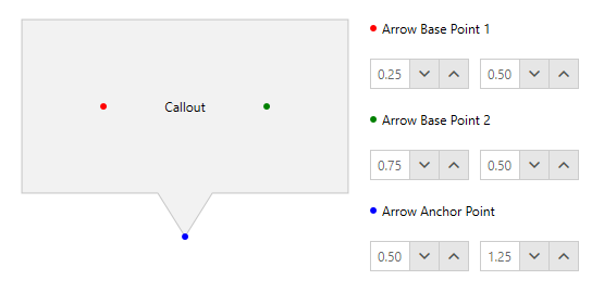
Default Arrow Point Coordinates
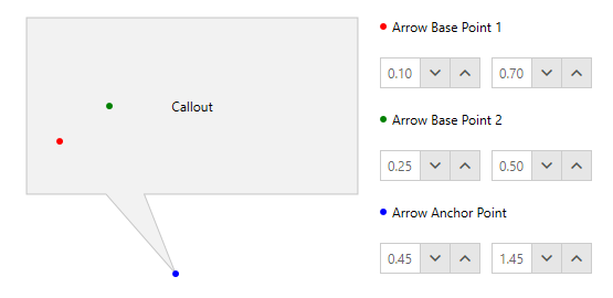
Custom Arrow Point Coordinates
The Red, Green and Blue points in the figures are not part of the control. Demonstrative purpose only.
Usage Options
XAML Usage
We’ve already stepped into the possible ways of using the RadCallout in a WPF app. In the above code snippet with the custom geometry, I demonstrated the XAML declaration of the control. The choice of a parent container in this case is completely in your hands—choose the best one for displaying your content in the most relevant way.
Now, I want to dig deeper into the other possibility. Showing the callout in an animated Popup, using the CalloutPopupService class.
Popup Usage
Want to show the callout above your application content and enable interaction via actions such as clicking, hover, keyboard navigation, etc.? Sure, then the CalloutPopupService class will be of great help as it provides the needed methods and events to do so. Use it for showing the callout, closing a given callout, closing all callouts at once and disabling the popup animation. Believe me, this is just a brief intro into this wonderful option. This service class goes together with the CalloutPopupSettings class.
The CalloutPopupSettings class has a really long list of powerful properties that you could benefit from to completely configure the popup up to your liking. You can choose whether the popup will be auto centered, or auto closed, should it move with the parent placement target window, should it show in the intended placement position in case of exceeding the monitor boundaries.
Of course, I should’ve started with the Placement options, represented by the PlacementMode enumeration, allowing the following values—Absolute, Relative, Bottom, Center, Right, AbsolutePoint, RelativePoint, Mouse, MousePoint, Left, Top, Custom.
Animation configuration options are also worth mentioning as they greatly contribute to the customization capabilities of the control. I’ll even put them in a separate section, coming right up… or actually down. 🤔
Whoa, that was a long list represented quickly… 😵 (for such a tiny at first sight control).
Callout Popup Animations in Action
If you are already intrigued by the popup service, make sure to play around with the animations to achieve the best experience for the end users. I will be more than glad to guide you through it.
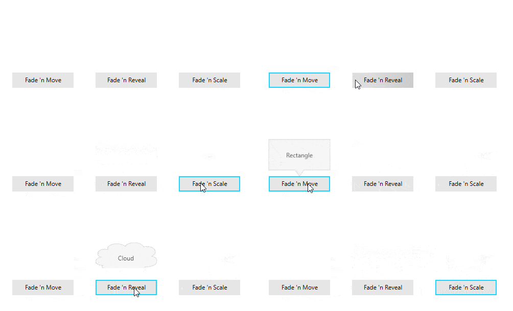
When setting up the animation of your callout popup, you can choose from the CalloutAnimation enumeration. It allows the following values: None, Fade, Move, FadeAndMove, Reveal, FadeAndReveal, Scale, FadeAndScale.
You can specify different animation types for the callout popup by using the ShowAnimationType and CloseAnimationType properties. Also, you can be the one in control for the durations of these animations, as well as their delays.
In case you’ve missed the blog post for the R2 2020 release of Telerik UI for WPF, I’ll drop the GIF, showing the animations in action:
From Intro to Epilogue in a Blink
This has already started to look like a whole introduction of a book, so I think it’s time to close the curtains on this lovely blog. But… before this.
When using the RadCallout (I’m sure you will), think of it as your best helper for making it easy to highlight important information. Use it to alert customers to a special discount, highlight a testimonial or add weight to particularly important text content. Spotlight free shipping, discounts, price matching and more. Draw attention to unique selling points and important product details and benefits. Whatever you like. Just use it wisely to make your application content stand out.
Speaking of wisdom, the best thing would be to benefit from the outstanding possibility to integrate the Callout control with other UI controls from the Telerik UI for WPF such as Maps, Charts, Tooltip, Slider, etc. For some of those integrations (as well as others), make sure to check the documentation and the awesome control examples in our WPF demos application.
Share Your Feedback
We will never get tired of encouraging you to share your thoughts with us by dropping us a comment below, or using the Feedback portal about UI for WPF, because we highly value your honest feedback. It really matters!
In case you haven’t already done so, do not hesitate to try out the latest:

Viktoria Grozdancheva
Viktoria is a Senior Front-end Developer with 5+ years of experience designing and building modern UI for desktop and mobile platforms on Microsoft/Telerik technology stacks. Her spare time is dedicated to friends and family and discovering new pieces of the world. Find her on Twitter and LinkedIn.
