
Recently in my day job I needed to use a NumberPicker which is a control I have not had reason to use for quite a long time. The experience was quite a frustrating one and in this post we’ll look at some of the issues with it, and some work-arounds.
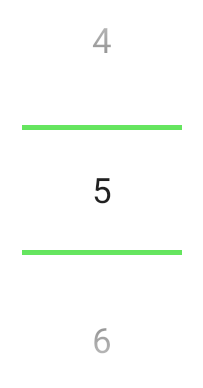
A NumberPicker is a control for selecting a number from a limited range. It is used within TimePicker but is also a standalone widget in its own right. There are various forms of rendering it which depend on the theme of your app. I’ll focus on the Material-themed variant (shown on the left) which will be used if your app’s theme derives from R.style.Theme_Material (which the Material Components themes do). It is a vertical list of the numbers in the defined range and the user can either swipe on the list to scroll it to the desired number, or they can tap on the areas above and below the dividers to increment or decrement the value. Also they can long press the same ares to perform repeated increment or decrement which will continue until the long press ceases.
NumberPicker first appeared in Android 3.0 (Honeycomb – API 11). The seasoned Android developers reading this will be groaning at the memory of Honeycomb because it was a rushed release to make Android works on larger devices – specifically tablets because Apple had launched the iPad, and Google wanted to be able to compete with that. NumberPicker is actually a sad reflection of the rushed nature of Honeycomb which has never seen much love since.
NumberPicker actually works quite well, albeit with some caveats which we’ll come to shortly, but the real problems arise when we come to try and style it.
The first indication that there are issues with the implementation of NumberPicker is how we define the range of numbers that it will display. This is easy enough using the setMinValue() and setMaxValue() methods, but these are not exposed as XML attributes so we cannot specify them within our XML layouts – we have to set them programmatically. Compare this to a control such as ProgressBar where we can specify the progress range wither programmatically or in the layout XML.
We can also override the actual strings displayed using the setDisplayedValues() method with an array of Strings. This enables us to use both a non-contiguous range (such as 5, 10, 15, 20, …) or even text values (such as “Jan”, ‘Feb”, “Mar”, …). This allows for some nice flexibility in how we present things to the user but, once again, we can only do this programmatically. It would be really useful if we were able to specify a string-array resource in XML, but this is not supported.
Things become even trickier when it comes to styling and themeing a NumberPicker. The style that gets applied by default through the Material theme is defined in @style/Widget.Material.NumberPicker and this has a parent of @style/Widget.NumberPicker. This default style is applied through the theme attribute android:numberPickerStyle, so we should be able to create our own style and apply it by overriding android:numberPickerStyle in our theme.
Unfortunately this is hampered by the limited number of styleable attributes that are exposed for NumberPicker. If we take a look at these in the AOSP sources we can see that there are 11 attributes specific to NumberPicker but some of these are private (the ones with the internal prefix). Leaving 6 attributes that we can actually override, which allow some limited control of the divider appearance and positioning, plus the background colour and the drawable used to show the pressed state of the increment and decrement virtual buttons. This is pretty limited.
If we do need to override any of these in a custom style then things become a little tricky unless we have the luxury of minSdkVersion="24" or later. In theory we should be able to create a custom style by using @style/Widget.Material.NumberPicker as the parent:
If we do this with minSdkVersion of less than 24 we’ll get lint errors:
Error: @android:style/Widget.Material.NumberPicker requires API level 24
The usual solution for this would be to move that to values-v24, and use a backwards compatible fallback:
Instead of using @style/Widget.Material.NumberPicker for pre-24 devices we use @style/Widget.NumberPicker instead – which is the parent style that @style/Widget.Material.NumberPicker uses. However if we try and compile that we get an error:
What went wrong:
Execution failed for task ':app:processDebugResources'.
> A failure occurred while executing com.android.build.gradle.internal.tasks.Workers$ActionFacade
    > Android resource linking failed
      AAPT: error: resource android:style/Widget.NumberPicker is private.
      error: failed linking references.
So we cannot use @style/Widget.NumberPicker as a parent because it is private. We could duplicate this in our own project to get the desired behaviour, but then we would run in to a further issue when we try to apply that in our theme. We should be able to do this:
Doing that will give us another lint error:
Error: android:numberPickerStyle requires API level 24
So we cannot even use a theme attribute to override the style on pre-API 24 devices. The only option is to have our custom style on API 24 and later devices, and go with system defaults on earlier devices.
It feels like NumberPicker really is the forgotten widget. It feels like a great candidate for pulling in to either the AppCompat or Material Components libraries to make the theming available on earlier API levels, but sadly this has not been done. NumberPicker remains a framework component which has a very rushed-feeling API surface, which has never been updated for modern use. Perhaps the reason for this is that it really does need a fair amount of work to properly fix it up.
I really didn’t want this post to be simply pointing out the shortcomings of NumberPicker. I did end up using it for the purpose I intended but wanted to document some of the issues I encountered to help save the time of anyone else travelling the same path.
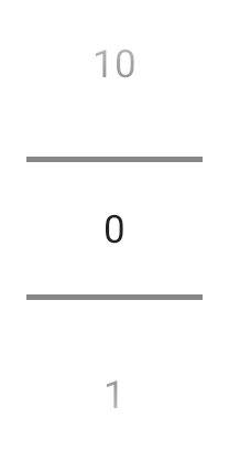
One of the main things that I wanted to do was control the colour of the divider bars. By default they look like this:
If applying a custom style were an option we could override the selectionDivider attribute in the style and use a different drawable. However, number_picker_divider_material (which is the drawable used) is one area of NumberPicker which has received some love and attention and it uses a theme attribute to define the colour used – ?attr/colorControlNormal. So we can set this in our theme to colour the dividers as we wish.
Supposing we don’t want to do this for our entire theme because it may affect the appearance of other controls, then we can use a theme overlay instead:
A theme overlay is defined by declaring an empty string as the parent attribute. When this is applied it uses whatever is the current theme and overrides only those attributes that it has. So it we can switch between different themes (such as day & night themes) and irrespective of the current theme the colorControlNormal attribute is overridden. We can apply this in our layout:
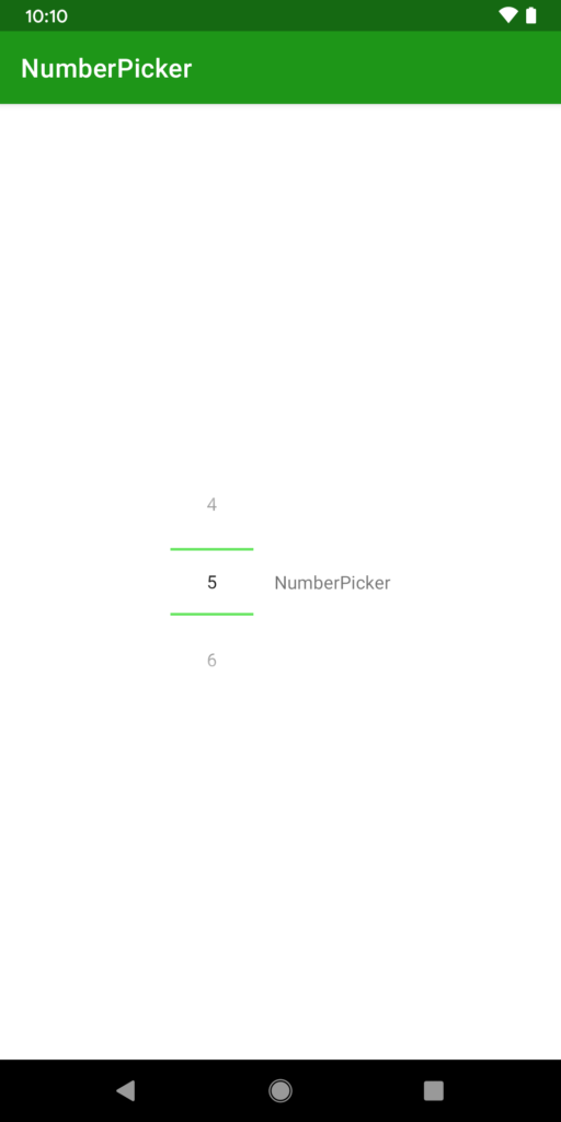
By doing this the overlay is only applied to the NumberPicker and that gets the overriden value of colorControlNormal:
Sadly the same is not true for textAppearance and NumberPicker is hard-coded to use the Material Body1 style. If it had been updated to use the theme attribute of ?textAppearanceBody1 instead of being hard-coded then we could use a theme overlay to override that, but sadly it is not the case.
For those that need to customise the text appearance, the best option that I have found is this the Material NumberPicker library. It is worth understanding that it is a wrapper around the framework NumberPicker which adds some API surface improvements such as the ability to specify the number range in XML, and also apply some custom text formatting. It does this by searching for the child EditText views that NumberPicker uses and setting the typeface, size, and colour of the text. Unfortunately it does not support TextAppearance which would be nice. It also does not define a theme attribute from which it will read a style making it non-themeable – so you cannot define a common style across your entire app – you have to style each instance individually.
While Material NumberPicker provides some decoration around NumberPicker it really does not change the fact that NumberPicker itself is in desperate need of some love and attention to make it a useable and themeable component in modern Android development. Of course its lifespan, along with many other Android widgets, may be limited due to the advent of Jetpack Compose, but Compose is not production ready at the time of writing.
The source code for this article is available here.
© 2020, Mark Allison. All rights reserved.
Copyright © 2020 Styling Android. All Rights Reserved.
Information about how to reuse or republish this work may be available at http://blog.stylingandroid.com/license-information.

Thanks, nice article. We faced exactly the same problem. We even need to support back to API level 16. We ended up reworking the whole NumberPicker control ourselves. Very sad to see such controls not being updated for quite some time.