Telerik UI for Blazor 2.15.0 Includes New ButtonGroup, ToggleButton, Grid Updates and More

The latest release of Telerik UI for Blazor features new native components in ButtonGroup and ToggleButton, updates to the Grid, Chart, Treeview and More. Read on for all the highlights.
It is June and here comes another release of Telerik UI for Blazor that brings two new native Blazor components—Button Group and Toggle Button—multiple new features to the Grid, Chart, TreeView, Textbox and more. Let’s dive into the new 2.15.0 release and see in detail the new goodies including new Grid Custom Filtering, Grid Row-Click Events, support for dynamic ExpandoObject, and binding to DataTable, all ready to be plugged and played in your Blazor Server and WebAssembly apps!
New Blazor Components
Blazor Button Group Component
ButtonGroup Overview
The ButtonGroup component is a UI container for buttons, which lets you select single or multiple button instances, and respond to the selection and click events. The buttons within the ButtonGroup fill up the container, match the styling according to the chosen theme and provide the common button features like images and icons, as well as other parameters and attributes.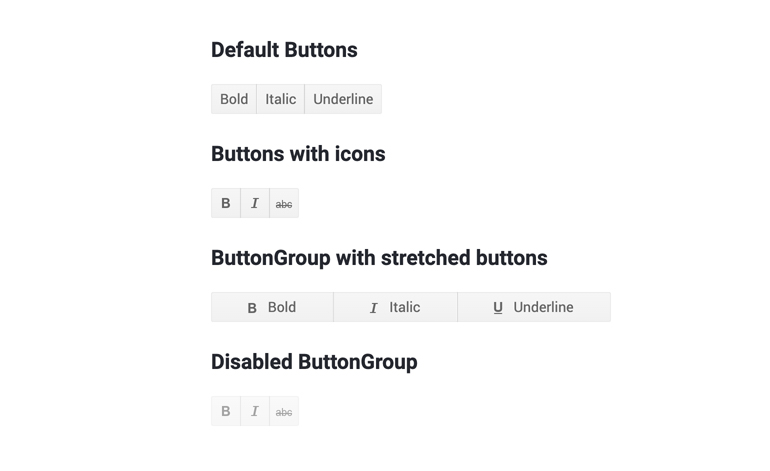
Telerik UI for Blazor ButtonGroup Component
To use the Blazor ButtonGroup component in your Blazor applications, you need to add the TelerikButtonGroup tag, and inside it add the corresponding <ButtonGroupToggleButton> or <ButtonGroupButton> tags that denote each button, as shown in the example below:
ButtonGroup Selection
Using the SelectionMode setting of the ButtonGroup component, you can enable single or multiple selection of its ButtonGroupToggleButton instances.
ButtonGroup Customization and Styling
You can customize and style the ButtonGroup and its individual buttons using various styles, images, sprites, font icons and conditional formatting. Check out an example of how to completely transform a button group look.
ButtonGroup Events
The buttons in the ButtonGroup component provide two handy button/toggle button events:
- OnClick fires when the user clicks or taps the button. You can use it to invoke async logic such as fetching data or calling a service.
- SelectedChanged fires when the user changes the state of the button by clicking it (or by using Space or Enter). You can use it to call local view-model logic (applicable for a ButtonGroupToggleButton)
ButtonGroup Keyboard Navigation
The ButtonGroup component has built-in keyboard navigation allowing end users to easily navigate in Blazor applications, focus and click on buttons using their keyboard.Blazor Toggle Button
ToggleButton Overview
The ToggleButton lets you perform a toggle actions (such as on/off) on the two states of the component..jpg?sfvrsn=2c381f1b_0)
Telerik UI for Blazor ToggleButton Component
To add a Telerik UI for Blazor ToggleButton to your Blazor app, use the <TelerikToggleButton> tag.
ToggleButton Styling
You can use an image, sprite or font icon in the toggle button so that you customize its look and make it easier for users to interpret its purpose.
ToggleButton Events
The ToggleButton component exposes the following events to let you handle clicks and selection in Blazor apps.
- OnClick fires when the user clicks or taps the button. You can use it to invoke async logic such as fetching data or calling a service
- SelectedChanged fires when the user changes the state of the button by clicking it (or by using Space or Enter). You can use it to call local view-model logic
ToggleButton Keyboard Navigation
Like most of the Telerik UI for Blazor components, the ToggleButton has built-in keyboard navigation allowing end users to easily focus and click on buttons using their keyboard.
Blazor Components Enhancements
With every new version that we ship with Telerik UI for Blazor, we aim to give our love to the Blazor Grid component, and in the 2.15 release we added several features requested via our feedback portal.
Blazor Grid Component New Features
Grid Custom Filter
When working with data one thing is sure—it grows, and users needs to be able to quickly find their relevant records. And because filters do not always come in their simple form such as show me records for data smaller than DateTime.Now, in this release we added the flexibility to let you customize data filtering..jpg?sfvrsn=880bd1ec_0)
Telerik UI for Blazor Grid Custom Filter Menu—Apply Multiple Operands
You can apply as many logical operands as needed and implement any custom filtering criteria that is defined by your project requirements using the filter menu template.
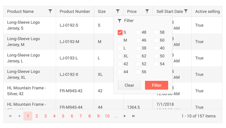
Telerik UI for Blazor Grid Custom Filter Menu—Apply Multiple Checkbox with Filter Menu Template
In addition to the Grid custom filter menu, you can also implement custom filtering on Grid rows using the filter cell template.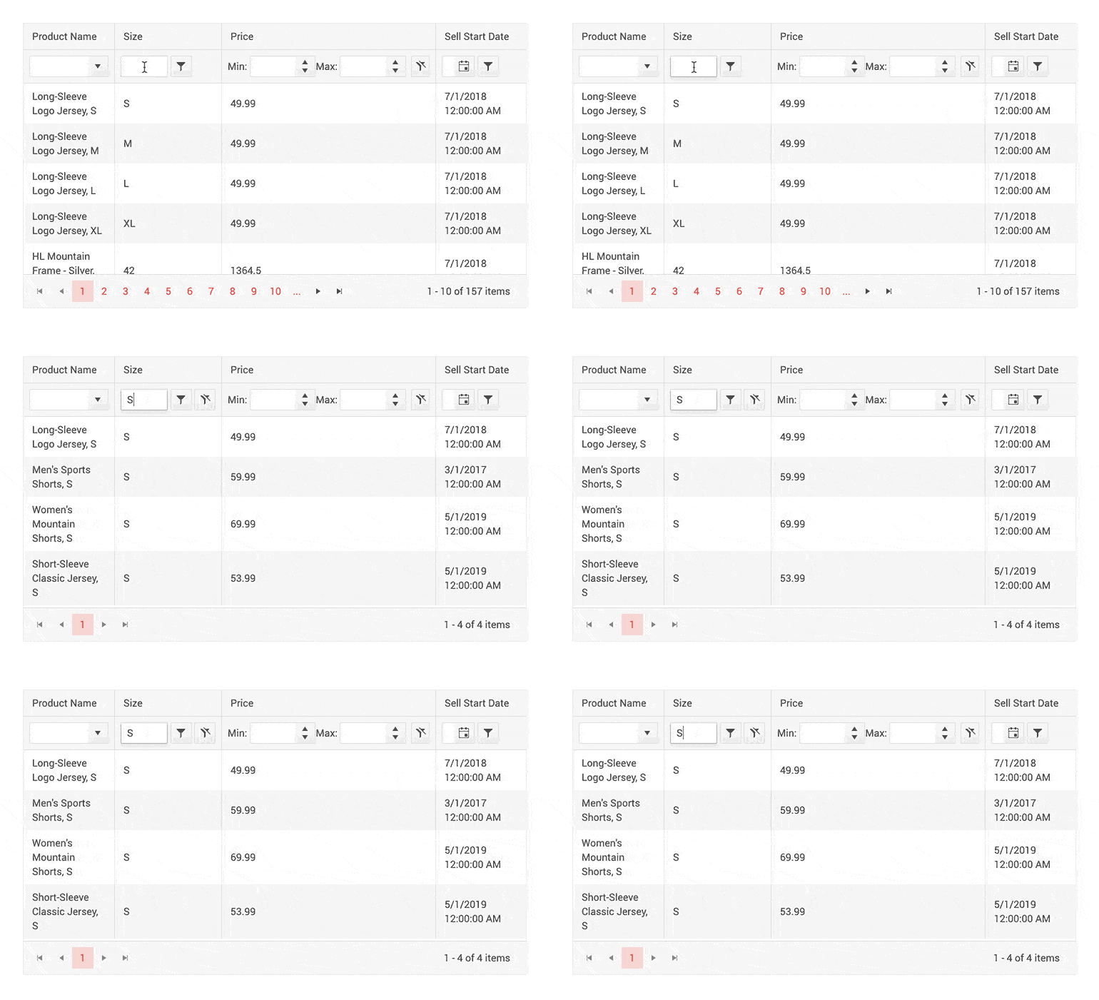
Telerik UI for Blazor Grid—Custom Row Filter
Code examples on how to customize filtering using the <FilterMenuTemplate> and <FilterCellTemplate> templates can be found on our dedicated custom filtering demos for menu and rows.
Grid Row Click Events
We have exposed two new events in the Grid, so that you can implement custom business logic in your code that handles user clicks on Grid rows.
OnRowClick and OnRowDoubleClick events fire when user clicks and double-clicks a Grid row, respectively. Their event handlers receive the GridRowClickEventArgs object, providing the model of the clicked row in the Item field giving you flexibility to show details, load data on demand, display related data and perform various custom actions to the clicked rows.
Grid Support for ExpandoObject
Don’t have a strongly typed model of your data—no problem, the Telerik UI for Blazor Grid can easily accommodate dynamic data types. Checkout our sample repo on how to bind Grid to ExpandoObject in Blazor apps.
Bind Grid to DataTable
For those of you that have backend returning DataTable, you can now bind the Grid to DataTable data and have all the cool Grid built-in features with ease—sorting, paging, filtering and even editing.
Check out an example of how to bind the Grid in Blazor applications to a DataTable.
Blazor TextBox Component New Features
Textbox Additional Parameters
The latest updates to the Textbox component allow you to easily customize multiple elements of the text input, such as: AutoComplete, Placeholder, Name, Title and TabIndex.
Textbox Password
The Textbox component now has new parameter, Password, which when set to true gives you the option to mask the characters in the input and give it a proper password look.
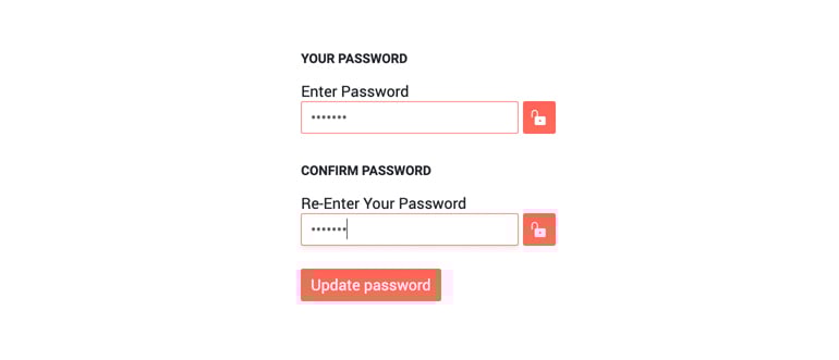
Telerik UI for Blazor Textbox Password Property
Blazor TreeView Component New Features
TreeView Selection of Nodes
The TreeView component node selection can be configured by setting the SelectionMode parameter to a member of the TreeViewSelectionMode enum, which takes one of the three options:
- None—disable the node selection (default)
- Single
- Multiple (using Ctrl or Shift key)
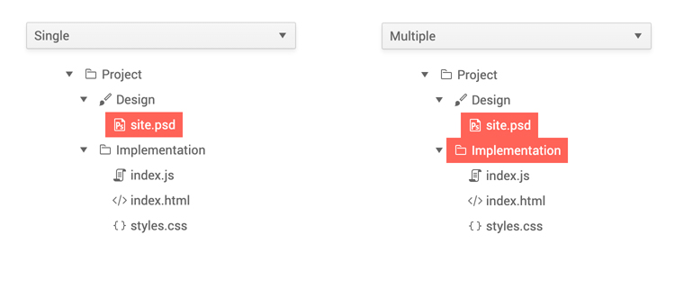
Telerik UI for Blazor TreeView Selection of Nodes
TreeView Node Click Events
Two new events have been added to the component to enable flexibility when selecting and working with the TreeView nodes:
- OnItemClick—fires when the user clicks (or presses Enter) on a node (item) of the TreeView.
- SelectedItemsChanged—the SelectedItemsChanged event fires when the selection is enabled and the user clicks on a new item.
Blazor Chart Components New Features
Chart Tooltips
You can enrich your Blazor charts with three out-of-the box Chart tooltip-ing options for data points:
- Specific tooltip for each <ChartSeries>
- Common tooltip for all chart series
- Or a shared tooltip which provides summarized information of all data points from the hovered category
To enable specific tooltips for the data points of each individual series, you need to include the <ChartSeriesTooltip> tag inside the <ChartSeries> tag, and set its Visible parameter to true.
To enable the same tooltip for all chart series, add the <ChartTooltip> tag inside the <TelerikChart>, and set its Visible parameter to true..jpg?sfvrsn=cbc8c2c5_0)
Telerik UI for Blazor Chart Single Tooltip
To enable the shared tooltip in Telerik UI for Blazor Charts, add the <ChartTooltip> tag inside the <TelerikChart> tag, and set its Shared and Visible parameters to true..jpg?sfvrsn=cf5be124_0)
Telerik UI for Blazor Chart Shared Tooltip
Telerik UI for Blazor Chart tooltips allow full customization of their appearance: background, color etc. and the content that is rendered in the tooltip via templates/ shared templates.
Both the chart tooltip Template and SharedTemplate allow you to define custom business logic, render HTML and give you access to the context parameter. In the Template it provides information about the current data point such as: CategoryIndex, SeriesIndex, SeriesName, DataItem, FormattedValue, and in the SharedTemplate it exposes Category (renders the name of the Category) and Points (a collection of data for each series data point in this category).
Click Event on a Chart Element
And to make things more interactive, the Telerik UI for Blazor Chart component exposes events that let you handle user clicks on chart series.
Check out the OnSeriesClick event with Telerik UI for Blazor charts.
Download Telerik UI for Blazor 2.15.0
To see in action all that’s mentioned in the release blog post, head over to the Telerik UI for Blazor page, download the 2.15.0 version of Telerik UI for Blazor to spice up your Blazor applications. Keep telling us what’s working well, what needs to change and what you’d like to see next in the dedicated Blazor feedback portal or in the comment section below!
Thank You!
As always, the entire team working on Telerik UI for Blazor at Progress is thankful to you for being involved and helping us grow and making Telerik UI for Blazor bigger and better.

Maria Ivanova
Maria Ivanova is a Manager of Product Management at Progress, for Telerik and Kendo UI components and developer tooling. She joined the company in 2019 as a Product Manager for Telerik UI web components and is passionate about developing impactful and innovative software products. Maria believes that to create great products, it's important to challenge the status quo, closely collaborate with customers, and embrace a spirit of experimentation. Follow her on Twitter or LinkedIn.
