
Adding Custom Views to the Library in Xcode 12
What do you prefer: creating user interfaces visually or in code?
This question has split the Apple developer community for years. Could this year’s WWDC finally mark the end of that?
Last year, Apple made a huge step forward in UI development with the introduction of SwiftUI: For the first time, the visual approach and the coding approach spoke the same language. It doesn’t matter if you add a button in code or by dragging it to the design canvas – both representations are always in sync.
This made it possible for a developer who prefers the visual approach and another one who prefers the code approach to work on the same project without any conflict. Yet, one important thing was still missing: The ability to simply drag and drop your own views onto the canvas.
With WWDC 2020, Apple has closed this gap – the feature is finally here! So let’s dive right in and see how to add your custom views in SwiftUI to the Xcode library!
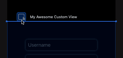
Here’s our sample project that we’re going to refer to:
Step 1: Create Custom Views in SwiftUI
In order to add custom views to the library, we first need a project. In this example, we’re going to create a simple app showcasing all our team members in a neat list.
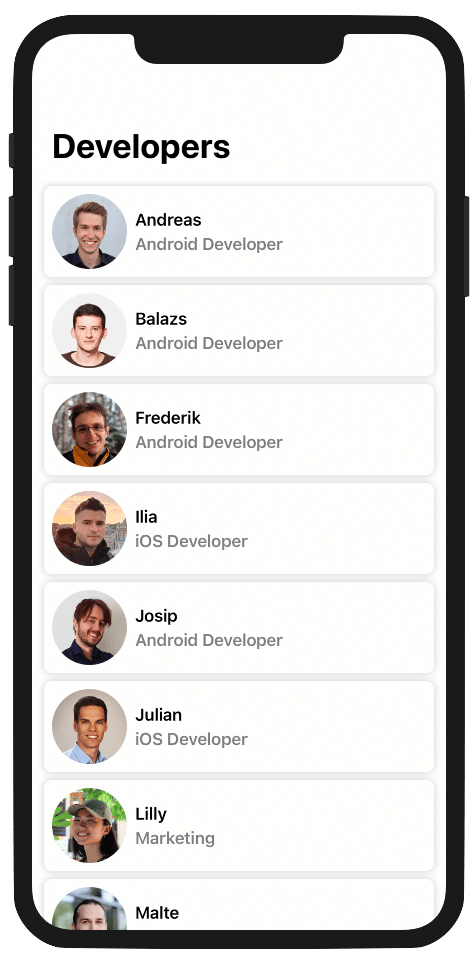
We start with creating a new custom view called Row which we will later use for displaying an indiviual team member. It consists of a profile image, a title (for the team member’s name) and a subtitle (for the job description).
struct Row: View {
    var title: String
    var subtitle: String
    var image: Image

    var body: some View {
        HStack(spacing: 8) {
            image
                .resizable()
                .frame(width: 75, height: 75, alignment: .center)
            VStack(alignment: .leading, spacing: 4) {
                Text(title)
                Text(subtitle)
                    .opacity(0.5)
            }
            .font(.headline)
            Spacer()
        }
        .padding(8)
    }
}
This view simply adds several (sub)views and lays them out the way we want. But what’s still missing is the “card look”: the rounded rectangle frame around it and the subtle shadow.
To keep our Row view highly reusable and customizable, we don’t add the code for that to the view itself. Instead, we create a view modifier .card() for that which we can apply not only to a row, but to other views as well.
struct Card: ViewModifier {
    let cornerRadius: CGFloat

    func body(content: Content) -> some View {
        content
            .background(Color(.systemBackground))
            .cornerRadius(cornerRadius)
            .shadow(color: Color.primary.opacity(0.2), radius: 4)
    }
}

extension View {
    func card(cornerRadius: CGFloat = 8) -> some View {
        modifier(Card(cornerRadius: cornerRadius))
    }
}
With these components, we can now build a TeamMemberCell view, which combines the two things together:
struct TeamMemberCell: View {
    let teamMember: TeamMember

    var body: some View {
        Row(title: teamMember.name, subtitle: teamMember.position, image: teamMember.image)
            .card(cornerRadius: 8)
    }
}
Finally, we create a TeamList which creates a TeamMemberCell for each of our team members and arranges them in a vertical, scrollable stack. You can see how we did that in our sample project. We’ll skip that part in this article.
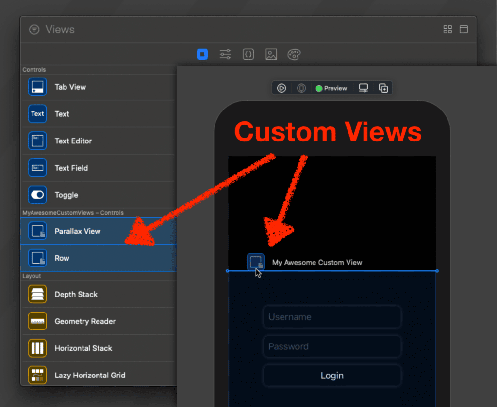
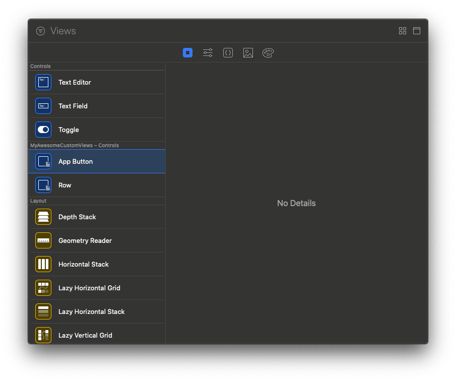
Step 2: Add Items to the Xcode View Library
All we’ve done so far isn’t new and could be accomplished with Xcode 11 as well. Now comes the cool part: Instead of composing the TeamMemberCell in code, we want to be able to assemble it with drag & drop in the design canvas. Before we can do that, we first need to let Xcode know about the custom views and modifiers we want to add to the view library.
For that, the new API LibraryContentProvider was introduced in Xcode 12. The following example adds the Row view and the .card() modifier to the library, alongside another custom view AppButton and a custom .loading modifier. (Feel free to check out the code for the latter two in our sample project.)
struct ViewProvider: LibraryContentProvider {

    @LibraryContentBuilder var views: [LibraryItem] {
        LibraryItem(Row(title: "", subtitle: "", image: Image("")))
        LibraryItem(AppButton(Text(""), action: {}))
    }

    func modifiers<V: View>(base: V) -> [LibraryItem] {
        [
            LibraryItem(base.card(cornerRadius: 8)),
            LibraryItem(base.loading(false))
        ]
    }

}
As you can see, we need to make a type conform to the LibraryContentProvider protocol to add new items to the Xcode library. However, we can’t just make our views and modifiers conform to that protocol (which we first assumed). Instead, we need to create a separate structure (which we called ViewProvider) that implements this protocol. In its view property, we return all our custom views that we want to add to the library, wrapped in a LibraryItem. Similarly, we return all view modifiers that we want to have in the library from the modifiers function.
Note: For the views property, we use the LibraryContentBuilder function builder similar to how ViewBuilder can be used to add multiple views as children of a VStack, HStack or ZStack. That’s why there are no array brackets around the library items.
In our ViewBuilder example, we chose the easiest way to create each LibraryItem by using the initializer with only a single parameter. That works, but we can also customize how that library item appears in Xcode by providing more context. Let’s take a closer look at the LibraryItem initializer:
LibraryItem(
    Row(title: "", subtitle: "", image: Image("")), // the code to create the view
    visible: true,                                  // whether it's visible in the Xcode library
    title: "My Awesome Team Member Row",            // the custom name shown in the library
    category: .control,                             // a category to find you custom views faster
    matchingSignature: ""                           // the signature for code completion
)
First of all, we can define what code snippet should be added to the SwiftUI code when using the LibraryItem. We can further specify whether the item should only be visible for code completion or also appear when using the design canvas. Since the default value for the visible attribute is true, we usually omit this parameter. It is also possible to define a custom title, as well as a category (including .effect, .layout, .control and the default .other). The category will be used for sorting the views and modifiers and also change their color in the Xcode library. A matching signature can also be added to determine which shortcut should trigger the code completion for the given modifier or view.
Step 3: Compose Views with Xcode 12
After building the project once, Row, AppButton, .card and .loading are available in the Xcode library, alongside all the native views! We can now use them to visually compose our TeamMemberCell.
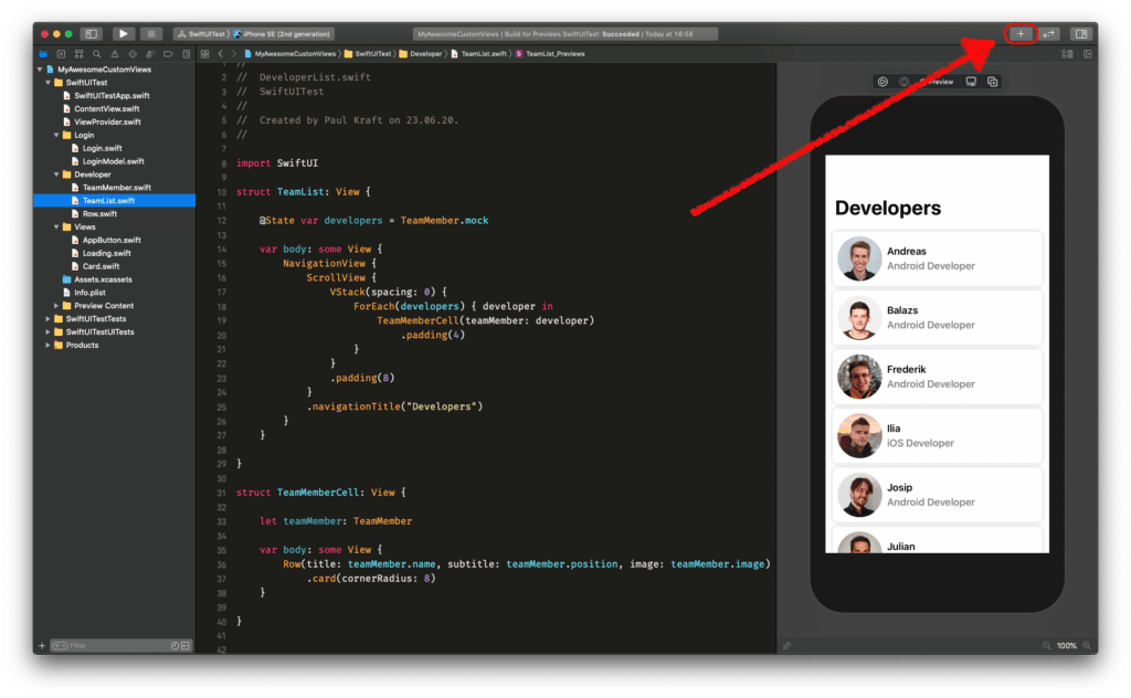
With the design canvas open, you can add any of our custom views and modifiers to it by clicking the [+] button and simply dragging the respective item over to the canvas.
Ain’t that cool?! 😎
Note: We noticed that the library items sometimes don’t show up in the Xcode library immediately. This is probably because Xcode 12 is still in Beta and will hopefully be resolved soon. If it doesn’t work for you right from the beginning, don’t give up! Quit and reopen Xcode, clean, build, change a little bit of code – and we promise it’ll work eventually. 😉
Conclusion
By providing the same tooling for custom views and modifiers as provided for native components in addition to many other changes to the whole toolchain, SwiftUI finally feels like a first-class citizen when it comes to UI development on iOS. It was a long way to go, but in the year 2020, visual user interface development with Xcode is feature-equivalent to creating SwiftUI views in code.
