What’s New in Telerik UI for Xamarin DataGrid Control?

With R2 2020 release of Telerik UI for Xamarin we have implemented three powerful new features for the RadDataGrid that allow you to customize the content template and edit template of cells. These options are available for all columns provided by the DataGrid control.
We love to listen to your feedback and the filtering capabilities of the DataGrid TemplateColumn was one of the most requested features by you, so we pulled it off just in time for our new major release! The feature is now part of the DataGrid features set.
In this blog post I will get you familiar with the new DataGrid Columns features CellContentTemplate, CellEditTemplate and the new filtering option—FilterControlTemplate.
Customize the ContentTemplate of Cells
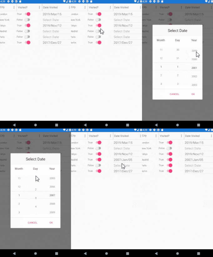
This feature enables users to customize the look of the content of the cell using their own DataTemplate and at the same time the RadDataGrid will be able to execute operations like grouping, sorting and filtering over that column. This is possible since the meta information that comes with the type of the column is still available for the grid component.

Below is the source code used for the above GIF.
Sample business model definition:
public class City

{

    public string Name { get; set; }

    public int Population { get; set; }

    public DateTime? Visited { get; set; }

    public bool IsVisited { get; set; }

}
The ViewModel:
public class ViewModel
{
    public ViewModel()
    {
        this.Items = new ObservableCollection<City>
        {
            new City{Name = "London", Visited = new DateTime(2019,03,15), IsVisited = true, Population = 8982000},
            new City{Name = "New York", Visited = null, IsVisited = false, Population = 8399000},
            new City{Name = "Tokyo", Visited = new DateTime(2019,11,12), IsVisited = true, Population = 9273000},
            new City{Name = "Madrid", Visited = null, IsVisited = false, Population = 6642000},
            new City{Name = "Paris", Visited = null, IsVisited = false, Population = 2148000},
            new City{Name = "Berlin", Visited = new DateTime(2017,12,27), IsVisited = true, Population = 3769000},
        };

    }
    public ObservableCollection<City> Items { get; set; }
}
Next, we have the DataGrid XAML Definition with CellContentTemplate property set to TextColumn, BooleanColumn and DateColumn. The CellContentTemplate of the DateColum uses RadDatePicker for Xamarin control.
<telerikDataGrid:RadDataGrid x:Name="dataGrid"
                            ItemsSource="{Binding Items}"
                            AutoGenerateColumns="False"
                            UserEditMode="Cell">
    <telerikDataGrid:RadDataGrid.BindingContext>
        <local:ViewModel/>
    </telerikDataGrid:RadDataGrid.BindingContext>
    <telerikDataGrid:RadDataGrid.Columns>
        <telerikDataGrid:DataGridTextColumn PropertyName="Name"
                                            Width="100"
                                            SizeMode="Fixed"
                                            HeaderText="City">
            <telerikDataGrid:DataGridColumn.CellContentTemplate>
                <DataTemplate>
                    <Label Text="{Binding Name}"
                            VerticalOptions="Center"/>
                </DataTemplate>
            </telerikDataGrid:DataGridColumn.CellContentTemplate>
        </telerikDataGrid:DataGridTextColumn>

        <telerikDataGrid:DataGridBooleanColumn PropertyName="IsVisited"
                                                HeaderText="Visited?">
            <telerikDataGrid:DataGridColumn.CellContentTemplate>
                <DataTemplate>
                    <StackLayout Orientation="Horizontal">
                        <Label Text="{Binding Source={x:Reference switch}, Path=IsToggled}"
                                VerticalOptions="Center"/>
                        <Switch IsToggled="{Binding IsVisited}"
                                x:Name="switch"
                                VerticalOptions="Center"/>
                    </StackLayout>
                </DataTemplate>
            </telerikDataGrid:DataGridColumn.CellContentTemplate>
        </telerikDataGrid:DataGridBooleanColumn>

        <telerikDataGrid:DataGridDateColumn PropertyName="Visited"
                                            HeaderText="Date Visited">
            <telerikDataGrid:DataGridColumn.CellContentTemplate>
                <DataTemplate>
                    <telerikInput:RadDatePicker Date="{Binding Visited}"
                                                DisplayStringFormat="yyyy/MMM/dd"
                                                VerticalOptions="Center"/>
                </DataTemplate>
            </telerikDataGrid:DataGridColumn.CellContentTemplate>
        </telerikDataGrid:DataGridDateColumn>
    </telerikDataGrid:RadDataGrid.Columns>
</telerikDataGrid:RadDataGrid>
Customize the EditTemplate of Cells
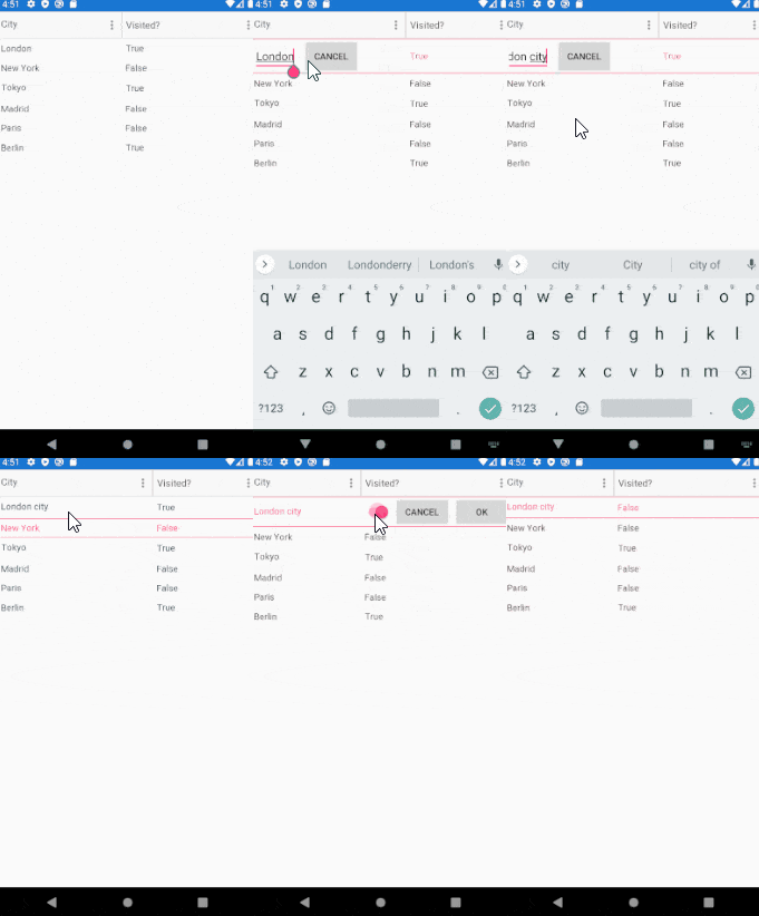
RadDataGrid now allows you to modify the template of a cell when it goes into edit mode. This can be easily done with the CellEditTemplate property which is shared between all existing column types.

Demo: Let's use the same Business Model and ViewModel as in the CellContentTemplate Example. Here is the DataGrid XAML definition used with CellEditTemplate property set:
<telerikDataGrid:RadDataGrid x:Name="dataGrid"
                            ItemsSource="{Binding Items}"
                            AutoGenerateColumns="False"
                            UserEditMode="Cell">
    <telerikDataGrid:RadDataGrid.BindingContext>
        <local:ViewModel/>
    </telerikDataGrid:RadDataGrid.BindingContext>
    <telerikDataGrid:RadDataGrid.Columns>
        <telerikDataGrid:DataGridTextColumn PropertyName="Name"
                                            HeaderText="City">
            <telerikDataGrid:DataGridColumn.CellEditTemplate>
                <DataTemplate>
                    <StackLayout Orientation="Horizontal">
                        <Entry Text="{Binding Item.Name, Mode=TwoWay}"
                               Margin="5"
                               ReturnCommand="{Binding CommitEditCommand}"/>
                        <Button Text="Cancel" Command="{Binding CancelEditCommand}" />
                    </StackLayout>
                </DataTemplate>
            </telerikDataGrid:DataGridColumn.CellEditTemplate>
        </telerikDataGrid:DataGridTextColumn>

        <telerikDataGrid:DataGridBooleanColumn PropertyName="IsVisited"
                                               HeaderText="Visited?">
            <telerikDataGrid:DataGridColumn.CellEditTemplate>
                <DataTemplate>
                    <StackLayout Orientation="Horizontal">
                        <Switch IsToggled="{Binding Item.IsVisited, Mode=TwoWay}" />
                        <Button Text="Cancel" Command="{Binding CancelEditCommand}" />
                        <Button Text="OK" Command="{Binding CommitEditCommand}" />
                    </StackLayout>
                </DataTemplate>
            </telerikDataGrid:DataGridColumn.CellEditTemplate>
        </telerikDataGrid:DataGridBooleanColumn>
     </telerikDataGrid:RadDataGrid.Columns>
</telerikDataGrid:RadDataGrid>
New Filtering Feature—FilterControlTemplate
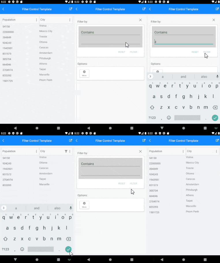
The Xamarin DataGrid extends the functionality of the TemplateColumn of the component and will now support filtering. You can define a custom template for the filtering UI as well as custom filtering logic. And not only for TemplateColumn, The FilterControlTemplate property can be applied to all DataGrid columns.

The source code of the FilterControl Template Demo can be found in our SDK Browser application/Examples/DataGridControl/FilteringCategory section.
Tell Us What You Think
We would love to hear what you think about the new DataGrid features. If you have any ideas for new features to add, do not hesitate to share this information with us on our Telerik UI for Xamarin Feedback portal.
Don’t forget to check out the various demos of the control in our SDK Sample Browser and the Telerik UI for Xamarin Demos application.
Real-World Xamarin App Examples
Discover the power of Telerik UI for Xamarin with several fully functional, real-world Xamarin.Forms application examples.
Examples source code can be checked in the Telerik Xamarin.Forms Samples GitHub repo.
Happy coding with our controls and stay with us! We would love to share more with you in an upcoming blog post about Date Picker, Time Picker, TimeSpan Picker and Telerik Mobile Blazor Bindings for Xamarin.

Dobrinka Yordanova
Dobrinka Yordanova is a Technical Support Engineer, part of the Progress Telerik UI for Xamarin & UWP team in Sofia, Bulgaria. She holds a master's degree in Computer Systems and Technologies. Her passion is traveling around the world and exploring multicultural environments. In her spare time she likes making sushi, playing console games and hanging out with friends.
