What's New in Telerik UI for ASP.NET MVC R2 2020

Check out everything that's new in our latest release for Telerik UI for ASP.NET MVC, including new Form, TileLayout and Stepper components, improvements to Grid and Scheduler, floating labels and much more.
The R2 2020 release for Telerik UI for ASP.NET MVC is here! Check out the latest additions of components like the Form, Stepper, TileLayout, Textbox and new features like Grid data source server-side remote grouping, Scheduler virtualization of resource groups, floating labels for inputs and more!
With the second release for the year we are excited to share all new components and features that you can plug into your projects and create modern and engaging MVC applications. As always, we listened to your feedback and included in the release many of the most voted items and features. Read ahead and see what’s new in Telerik UI for ASP.NET MVC R2 2020!
New UI for ASP.NET MVC Components
New UI for ASP.NET MVC Form Component
One of the highlights of the R2 2020 release is the new Form component, which turns creating and customizing forms into a smooth and enjoyable experience. You can easily
achieve the required form look by using default or custom editors, specifying orientation, displaying the editors in groups and columns, and taking advantage of the built-in validation.
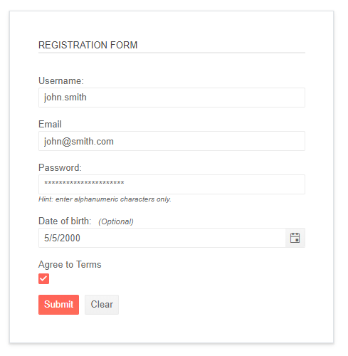
Telerik UI for ASP.NET MVC Form Component
The Form component allows you to customize the appearance and behavior of its items. By default, the Form will render default editors based on the data type provided in the model, but you can also use custom field editors. In the image below you can see how the Form component uses various other Telerik UI for ASP.NET MVC editors within it.
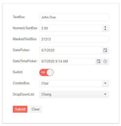
Telerik UI for ASP.NET MVC Form with Custom Editors
The Form component offers grid layout and two modes of orientation – horizontal or vertical – which let you organize form fields in the needed style, and display form fields in logical grouped sections.
Another great thing about the Form component is that it has built-in validation, which is triggered on form submission, but can also be configured to display a validation message when a field is focused by a user, then blurred without setting its value.
You can also enable a validation summary message that shows a list of all validation errors that have occurred in the form and customize the validation error message using the templates feature.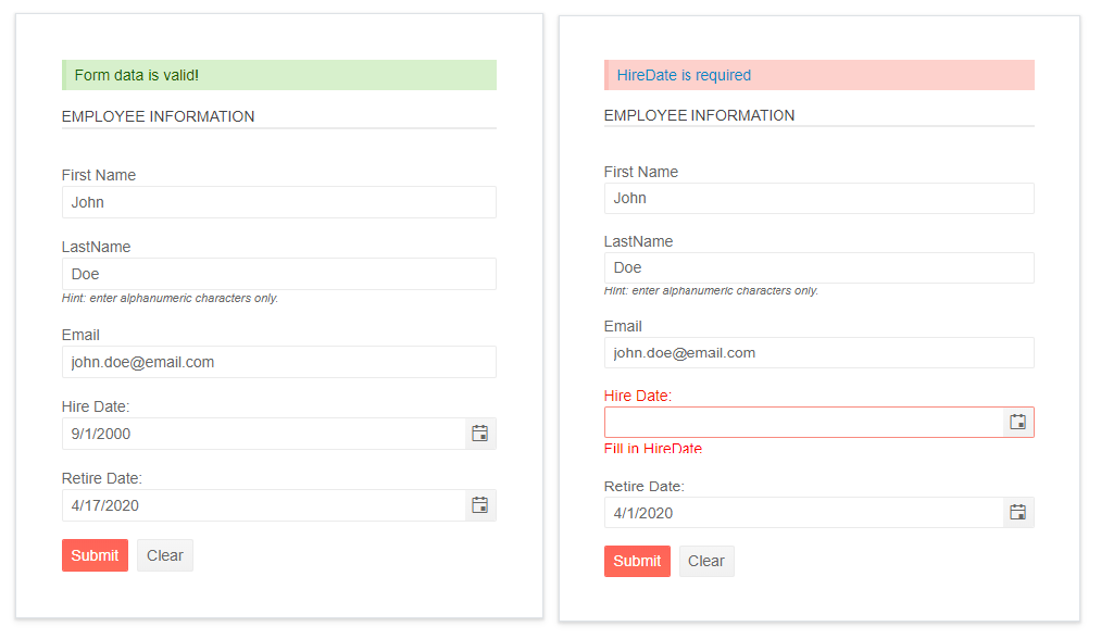
Telerik UI for ASP.NET MVC Form Built-In Validation
New UI for ASP.NET MVC Tile Layout Component
The new TileLayout is perfect match if you need to create dashboard-like applications. It is a container UI component, which allows the end users to rearrange and resize the contained tiles inside it in order to create layout that serves their needs the best.
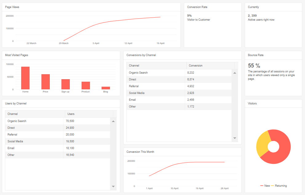
Telerik UI for ASP.NET MVC Tile Layout Component
In essence, the TileLayout component is based on a CSS Grid two-dimensional grid-based sandbox surface that enables you to display content in tiles. For each tile you can configure its dimensions, header and body content which can be some summary information, plain text or a complex template with components in it.
The Tile Layout container items can be resized and reorganized with drag and drop.
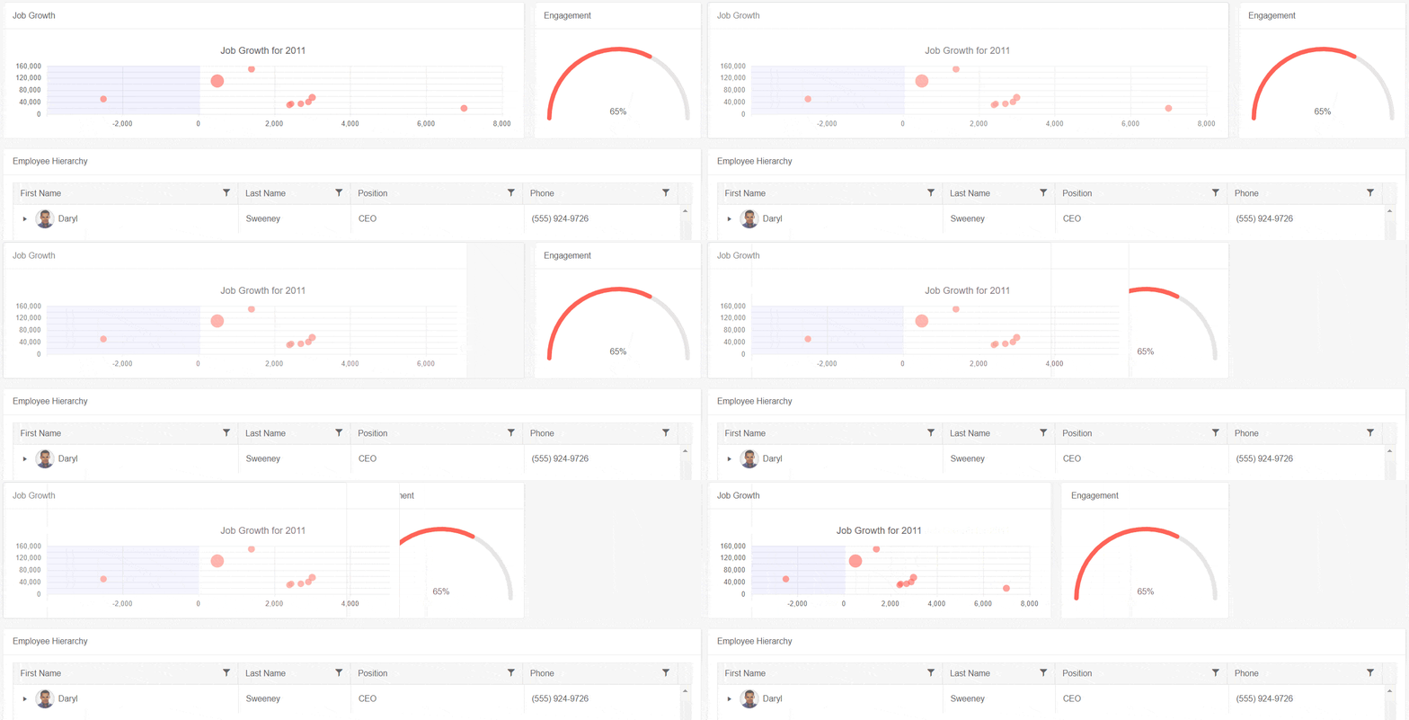
Telerik UI ASP.NET MVC TileLayout Resizing
New UI for ASP.NET MVC Stepper Component
The new ASP.NET MVC Stepper is a UI component that navigates users through a sequence of logical steps or workflows. The Stepper is perfect match to walk users through processes like registration, application, purchase or booking.

Telerik UI for ASP.NET MVC Stepper – Horizontal
You can configure the number and name of steps, mark a step as selected or add icon. In addition to that, the UI for ASP.NET MVC Stepper provides a set of modes that define the way the user will interact with the Stepper. You can configure the Stepper logical steps sequence – whether users have to follow it, or whether they can jump to any step irrespective of the steps sequence.

Telerik UI for ASP.NET MVC Stepper – Vertical
The Stepper component has both horizontal and vertical orientations and allows full customization of its labels, indicators and steps.
Like all other Telerik UI for ASP.NET MVC components, the Stepper has built-in keyboard navigation, accessibility and right-to-left support.
Telerik UI for ASP.NET MVC Stepper RTL Support
New UI for ASP.NET MVC Textbox Component
With the new TextBox component you easily convert an <input> element in your ASP.NET MVC applications into a styled textbox.
The Textbox provides multiple configuration options such as value, placeholder, floating label, change event (that fires each time a new value is set by the user) and comes with built-in accessibility and right-to-left support. Telerik
UI for ASP.NET MVC Textbox Component
UI for ASP.NET MVC Component Enhancements
Data Source Remote Grouping
Boost your Grid performance with data source remote (server-side) grouping and handle large volumes of data with ease. The data Grid works seamlessly with large data sets, because records are processed on the server and the data for each group is loaded only when the user expands the group.
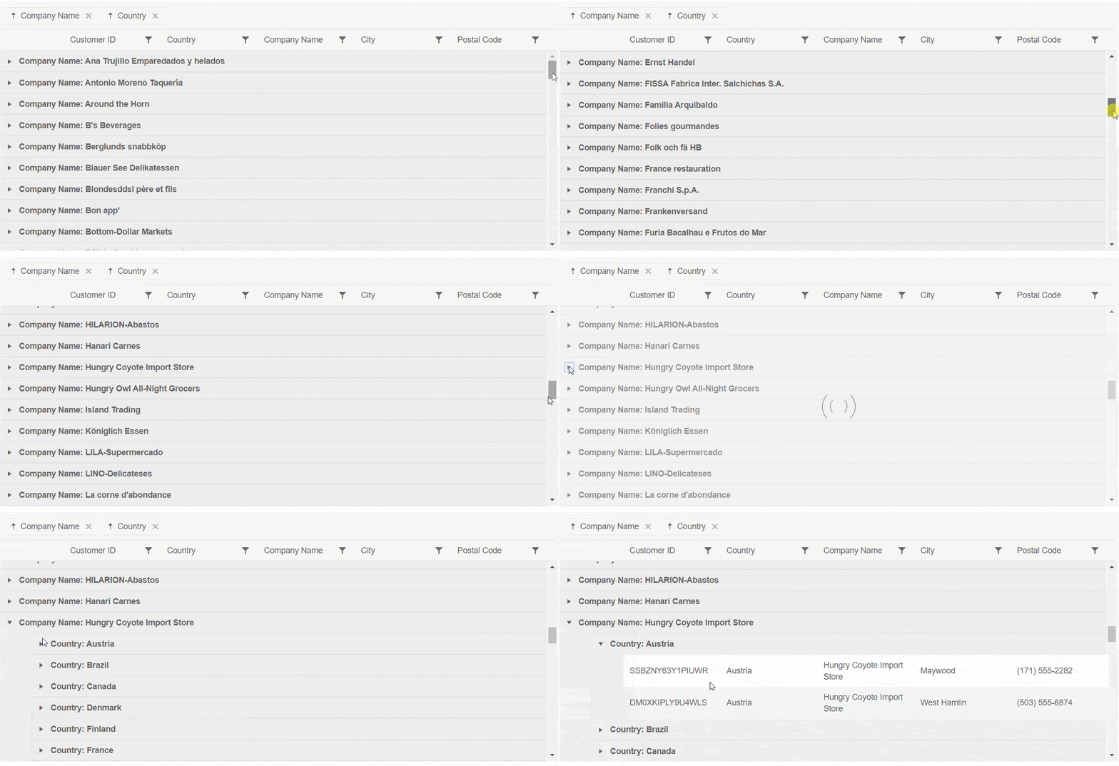
Telerik UI for ASP.NET MVC Data Source Remote Grouping
Scheduler Enhancements
The Scheduler component is another favorite and widely used MVC component that we enhanced with the R2 2020 release.
Virtualization of Scheduler Resource Groups
The Scheduler virtualization feature is a great way to boost the performance of heavy loaded resource groups and subgroups. When enabled, you can achieve up to a five times reduction of the rendering time and users can scroll smoothly through a heavy loaded Scheduler.
Check out the Scheduler examples of vertical resource grouping with and without virtualization with two groups and three subgroups and see the difference yourself.
Scheduler Search Bar
Users can easily find appointments from their schedule using the new Search events feature of the Scheduler component. Simply start typing and the Scheduler automatically filters only the matching events.
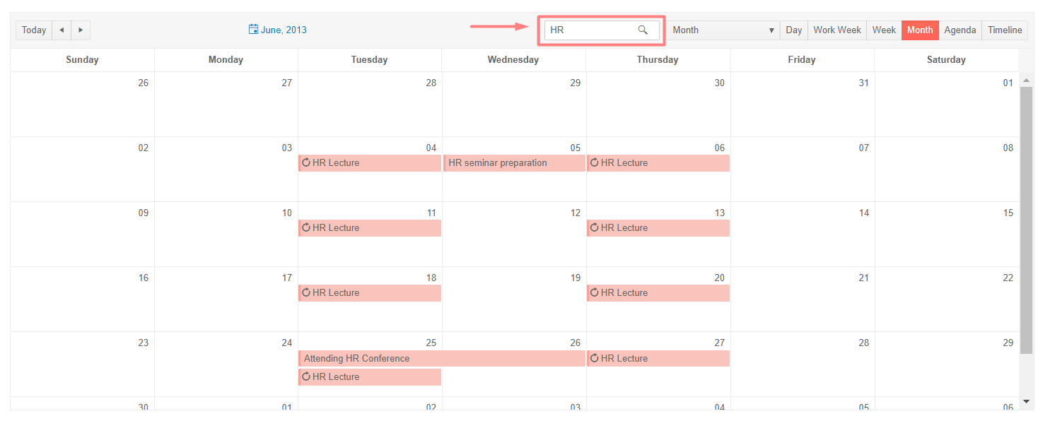
Telerik UI for ASP.NET MVC Scheduler Search Box
Integration with iCalendar
You can easily integrate the Scheduler component with other appointment management applications such as Google or Apple calendar by utilizing a third-party library (in this case ical.js) that supports the iCalendar standard. Checkout the UI for ASP.NET MVC Scheduler iCalendar import/export demo.
Setting Working and Non-Working Days
Using the new WorkDays configuration, you can easily set specific days as working/non-working in the Scheduler calendar. Based on the configured days in WorkDays, the Week and TimelineWeek views of the Scheduler will display working days in white, and the non-working days in light grey background colors.
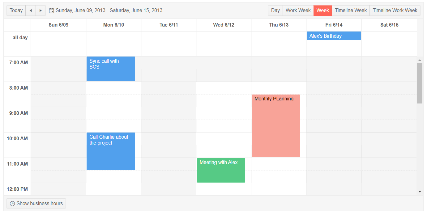
Telerik UI for ASP.NET MVC Non-Working Days
Floating Labels for Inputs
You can now add fancy Floating Labels to the Textbox, Masked Textbox and Numeric Textbox components.

Telerik UI ASP.NET MVC Floating Label for Numeric Textbox
Floating labels reside inside the inputs they describe in rest mode and float nicely once the user starts typing into the corresponding element.
New Rendering for Calendar, DatePicker, TimePicker and DateTimePicker
In R2 2020 we introduce new rendering property called ComponentType that provides two separate modes (classic and modern) for the Telerik UI for ASP.NET MVC Calendar, DatePicker, TimePicker and DateTimePicker components.
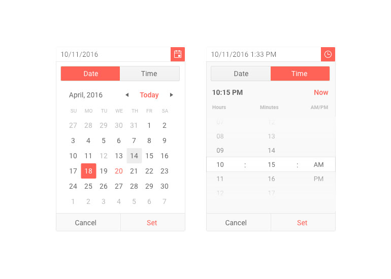
Telerik UI for ASP.NET MVC Date and Time Pickers New Rendering
All existing applications will continue to work with the default classic mode, and if you want to take advantage of the new rendering simply set the property ComponentType to modern.
Theming a Specific Component
The Telerik UI for ASP.NET MVC suit has 20+ built-in themes such as Default (our own styling), Material (based on the Material Design guidelines) and Bootstrap (which looks like the Bootstrap styling to integrate better). You can easily customize any of out-of-the-box themes, or create a new theme to match your colors and branding by using Progress ThemeBuilder.
We added a convenient option to style specific component directly within the component demos.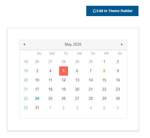
Launch ThemeBuilder from any ASP.NET MVC component demo page
By clicking on the "Edit in Theme Builder" button in a specific component demo, the Telerik ThemeBuilder tool launches, preloads the particular component and lets you customize it. Note that despite the theming of a specific component, depending on the
settings you need to change, there may still be modifications on the application level.
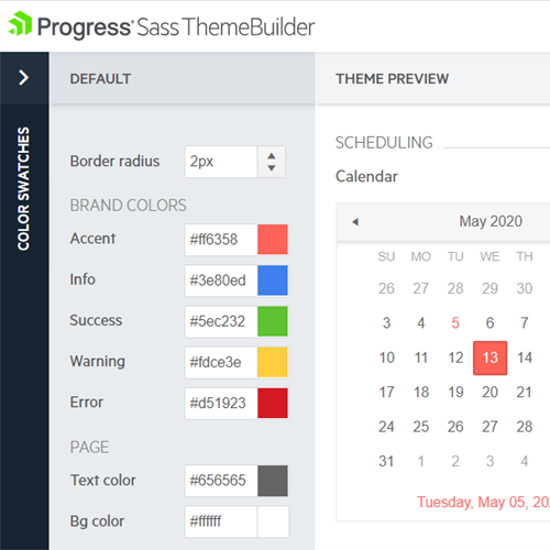
Style specific components with Telerik ThemeBuilder
Download the Latest from Telerik UI for ASP.NET MVC
We would like to thank you for your continuous support and encourage you to download a free trial version of Telerik UI for ASP.NET MVC, or if you are an active license holder you can just grab the latest and greatest from the Your Account page!
Share your thoughts with us on our feedback portal and help us shape the future of UI for ASP.NET MVC.
Sign-up for Telerik R2 2020 Webinar
Be sure to sign up for the Telerik R2 2020 release webinar on Thursday May 21, 2020 @11:00 am – 12:00 pm ET for a deeper look at all the new Telerik components and features in the release.
Happy ASP.NET MVC Coding!

Maria Ivanova
Maria Ivanova is a Manager of Product Management at Progress, for Telerik and Kendo UI components and developer tooling. She joined the company in 2019 as a Product Manager for Telerik UI web components and is passionate about developing impactful and innovative software products. Maria believes that to create great products, it's important to challenge the status quo, closely collaborate with customers, and embrace a spirit of experimentation. Follow her on Twitter or LinkedIn.
