Telerik UI for Blazor: 40+ Native Components with Telerik R2 2020 Release!

Learn about the latest of our 40+ components, plus new features, Visual Studio extensions and more in Telerik UI for Blazor.
It’s officially Telerik R2 2020 time and we are happy to share all the new components, features, Visual Studio and Visual Studio Code extensions that Telerik UI for Blazor has shipped over the last four months! A year after we officially released the first version of Telerik UI for Blazor, we now have reached a new milestone of 40+ native Blazor product-ready components that work in both WebAssembly (WASM) and Server-side Blazor apps.
Following to the previously announced MultiSelect, Upload, Tooltip, ListView, Pager and Checkbox components, along with 15+ Grid enhancements, with this release we've got a lot to offer. That includes shipping two new components in Blazor Drawer and DateRangePicker, new features like Export Blazor Grid to Excel, Calendar Range Selection, Visual Studio Convert Wizard, Mac installer, compatibility with Blazor WebAssembly release candidate and more! As always, we listened to your feedback and included in the release many of the most voted items and features. Read ahead and see what’s new in Telerik UI for Blazor!
Compatibility with Blazor WebAssembly Release Candidate
We are happy to share that Telerik UI for Blazor is compatible with Blazor WebAssembly release candidate and we promise to be fully compatible with the official release shortly after it is announced by Microsoft later this month.
New Blazor Drawer Component
Drawer Component Overview
The UI for Blazor Drawer component is a dismissible or permanently visible panel for navigating in responsive web applications. It allows for switching the content of different sections of the page.
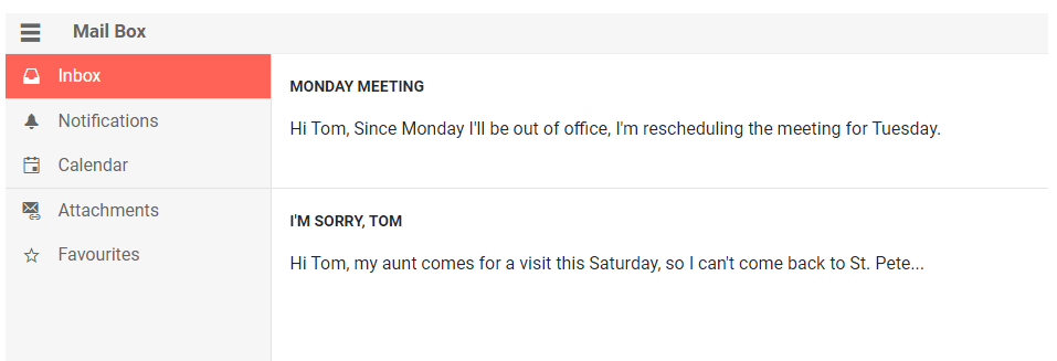
Telerik UI for Blazor Drawer Component
To use the Telerik UI for Blazor Drawer, all you have to do is add the <TelerikDrawer> tag, populate its Data property, and place the desired content in the <Content> tag.
<TelerikDrawer @ref="@Drawer" Data="Data" MiniMode="true" Mode="@DrawerMode.Push" @bind-SelectedItem="SelectedItem">
    <Content>
        Place your content here…such as @SelectedItem?.Text
    </Content>
</TelerikDrawer>
Drawer Navigation
The Drawer can be used as a menu allowing navigation between pages in Blazor apps. To use the Drawer for such a scenario you need to add the Drawer to the MainLayot.razor of your app, place the @Body tag in the <Content> tag of the Drawer and provide a collection of models that describe the pages you want the user to navigate to.
Check out the example on using Drawer as navigation between Blazor pages.
Drawer Positioning
Depending on the Blazor app requirements you may need to position the Drawer left or right in relation to the page content. This can easily be achieved with just setting the Drawer Position parameter to either DrawerPosition.Right or DrawerPosition.Left.

Telerik UI for Blazor Positions – Left and Right
Drawer Display Modes
To give you further flexibility the Drawer component provides the following modes for displaying its content:
- Overlay (DrawerMode.Overlay) - the Drawer expands on top of the container content and displays a grayed overlay over it.
- Push (DrawerMode.Push) - the Drawer expands side by side to the container content by shrinking its width.
Drawer Mini Mode
When the Drawer is in a collapsed state, you can enable its “mini mode” or “mini view” which means that when the Drawer is minimized, it will display only the item icon.
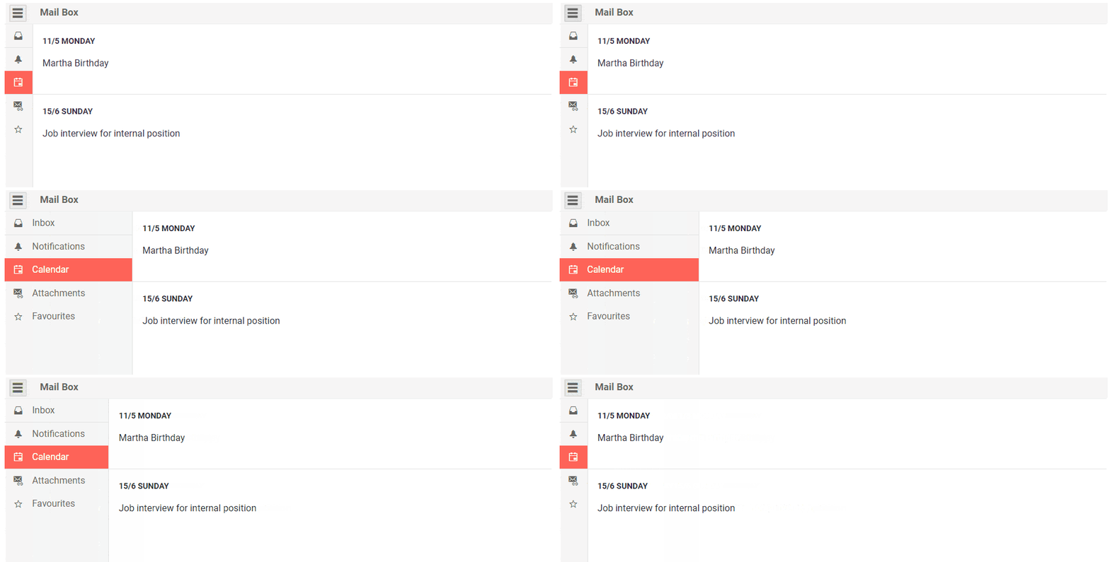 Telerik UI for Blazor Drawer Mini Mode
To enable it you have to set the MiniMode parameter to true as shown in the code sample below (in its default false the Drawer will not be visible when collapsed).
<TelerikDrawer @bind-Expanded="DrawerExpanded"
               Data="@Data"
               MiniMode="true"
               Mode="DrawerMode.Push"
               @bind-SelectedItem="@selectedItem"
               @ref="@DrawerRef">
    <Content>
        @if (!DrawerExpanded)
        {
            <TelerikButton Icon="@IconName.Menu" OnClick="@ToggleDrawer"></TelerikButton>
        }
        <div class="text-info m-5">
            Select an item to load content for it<br />
            Content for the @selectedItem?.Text
        </div>
    </Content>
</TelerikDrawer>

@code {
    public TelerikDrawer<DrawerItem> DrawerRef { get; set; }
    public DrawerItem selectedItem { get; set; }
    public bool DrawerExpanded { get; set; } = true;
    public IEnumerable<DrawerItem> Data { get; set; } =
        new List<DrawerItem>
        {
            new DrawerItem { Text = "Counter", Icon = IconName.Plus},
            new DrawerItem { Text = "FetchData", Icon = IconName.GridLayout},
        };

    async Task ToggleDrawer()
    {
        await DrawerRef.ToggleAsync();
    }

    public class DrawerItem
    {
        public string Text { get; set; }
        public string Icon { get; set; }
    }
}
Customizing Drawer with Templates
The Drawer is, by default, a data-bound component and renders an entry for each item in its Data collection. You can customize its appearance via the templates it offers:
- ItemTemplate so you can control the rendering of each individual list item
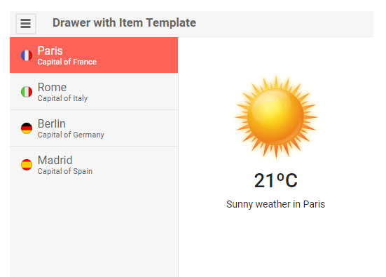
Telerik UI for Blazor Drawer Item Template
- Full drawer template - so you can choose what the Drawer renders on your own without a data source the component uses - this will let you add login components, user profile picture, and any other content and functionality you need, from headers/footers to hierarchical structures for navigation (such as a TreeView)
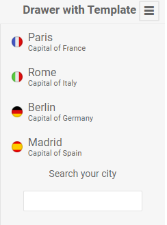
Telerik UI for Blazor Drawer Template
Drawer Events
The Drawer component exposes SelecteditemChanged and ExpandedChanged events to let you handle user interactions and component state changes:
- SelecteditemChanged - fires every time the user clicks on a new Drawer item
- ExpandedChanged - fires every time the component's state is changed.
Drawer Keyboard Navigation
The Drawer component has built-in keyboard navigation allowing end users to easily navigate, focus and click on Drawer items using their keyboard.
New Blazor Date Range Picker Component
DateRangePicker Overview
The new Blazor DateRangePicker component allows users to select date periods directly from a calendar popup or edit date ranges from start and end date inputs. The date interval is visualized in real time in an animated dropdown. The values of the date inputs and calendar are synchronized to enable further change of the chosen date range.
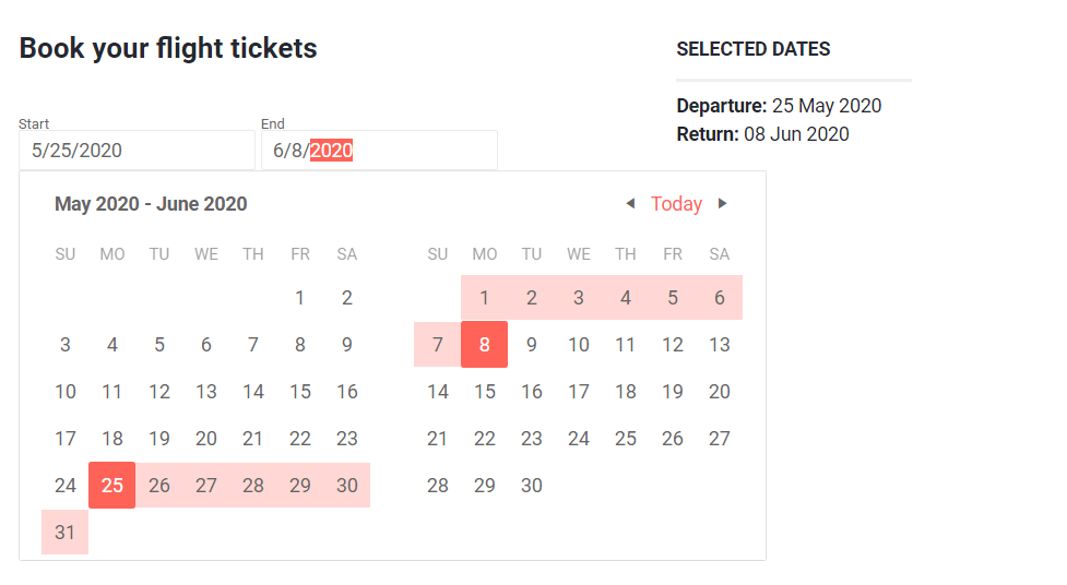
Telerik UI for Blazor DateRangePicker Component
To add a date range selection in your Blazor application, simply add the TelerikDateTimePicker tag and configure the component with relevant Min, Max, Format values.
<TelerikDateTimePicker Min="@Min" Max="@Max" @bind-Value="@selectedTime"
                       Format="dd MMM yyyy HH:mm:ss" Width="250px"></TelerikDateTimePicker>

@code {

    private DateTime? selectedTime = DateTime.Now;

    public DateTime Min = new DateTime(1990, 1, 1, 8, 15, 0);

    public DateTime Max = new DateTime(2025, 1, 1, 19, 30, 45);

}
DateRangePicker Events
You have several events available for capturing and handling changes to the date range values in the DateRange picker component:
- OnChange - fires when the user presses Enter in the input, or when the input loses focus
- StartValueChanged and EndValueChanged - both events fire when the user selects a new range
- ViewChanged - fires when the user changes the view (for example switch from days in a month, to months in a year)
DateRangePicker Disabled Dates
When working with date ranges you can also define certain dates as disabled i.e. preventing users from selecting them as start and end date of the interval. However, these dates can still be part of the period selection.
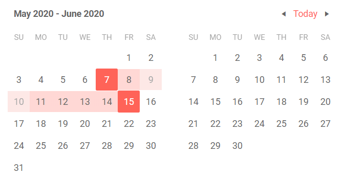
Telerik UI for Blazor DateRangePicker Disabled Dates
To disable specific dates just set them in the DisabledDates list of values in the TelerikDateRangePicker as shown in the example below.
  <TelerikDateRangePicker @bind-StartValue="@StartValue" @bind-EndValue="@EndValue"
                  DisabledDates="@disabledDates">
  </TelerikDateRangePicker>

@code {

    List<DateTime> disabledDates { get; set; } = new List<DateTime>()

    {
        DateTime.Today.AddDays(2),
        DateTime.Today.AddDays(3)
    };

    public DateTime StartValue { get; set; } = DateTime.Today;
    public DateTime EndValue { get; set; } = DateTime.Today.AddDays(8);

}
DateRangePicker Globalization and Localization
The UI for Blazor DateRangePicker has built-in localization and globalization which allows automatic culture-aware formats of the client, so users see the dates that are standard for their country/region. For example by setting format to “d,” people in different locations will see different formats: MM/dd/yyyy (for US) or dd/MM/yyyy (for UK). Month names and button texts are easily translatable to any language.
DateRangePicker Keyboard Navigation
The built-in keyboard navigation in the DateRange Picker component brings flexibility to users to perform interaction with the component with keyboard only.
Blazor Component Enhancements
Export Blazor Grid to Excel
Users in Blazor applications can now easily export Grid data to Excel with a click of a button. The exported file will preserve the Grid settings, so that filtering, sorting, paging, grouping, column order and column size are applied to data in the xlsx document.
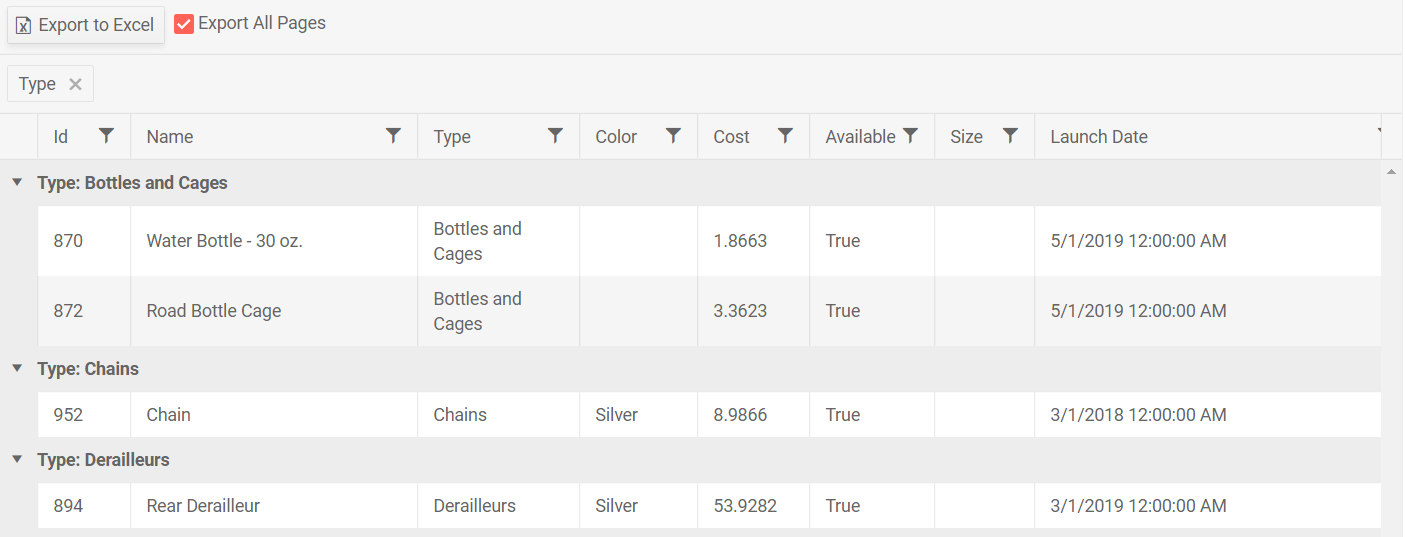
Export Telerik Blazor Grid Data to Excel
To enable the Grid Excel export, add a command button with the ExcelExport command name to the toolbar.
<GridToolBar>
    <GridCommandButton Command="ExcelExport" Icon="@IconName.FileExcel">Export to Excel
    </GridCommandButton>
</GridToolBar>
Additionally, you can specify whether to export current or all pages of the Grid, plus the resulting file name as shown in the example below.
<GridExport>
        <GridExcelExport FileName="telerik-grid-export" AllPages="@ExportAllPages" />
</GridExport>
Calendar Range Selection
In this release we enhanced the Calendar control with option to select range of dates in Blazor applications (in addition to the existing single and multiple selection of dates).
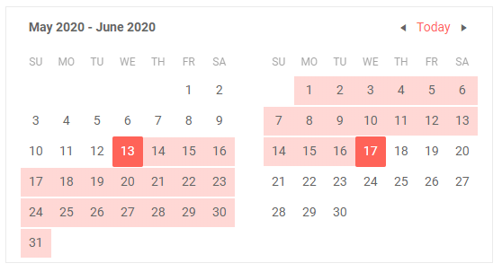
Telerik UI for Blazor Calendar Range Selection
To enable the selection of date ranges you have to set the calendar SelectionMode to Range, and to retrieve the selected dates by users in the application you can either use two-way binding for the RangeStart (representing the first date of the selection) and the RangeEnd (the last date of the selection) parameters, or handling the RangeStartChanged and RangeEndChanged events.
Convert Blazor Project to Telerik Blazor Project
With this release, we added new handy Visual Studio extension for quickly adding Telerik UI for Blazor components in existing Blazor applications (both server and WebAssembly).
The extension can be started from both the main Extensions menu in Visual Studio -> Telerik > Telerik UI for Blazor > Convert to Telerik Application, or by directly right-clicking your existing Blazor project and selecting Telerik UI for Blazor > Convert to Telerik Application.
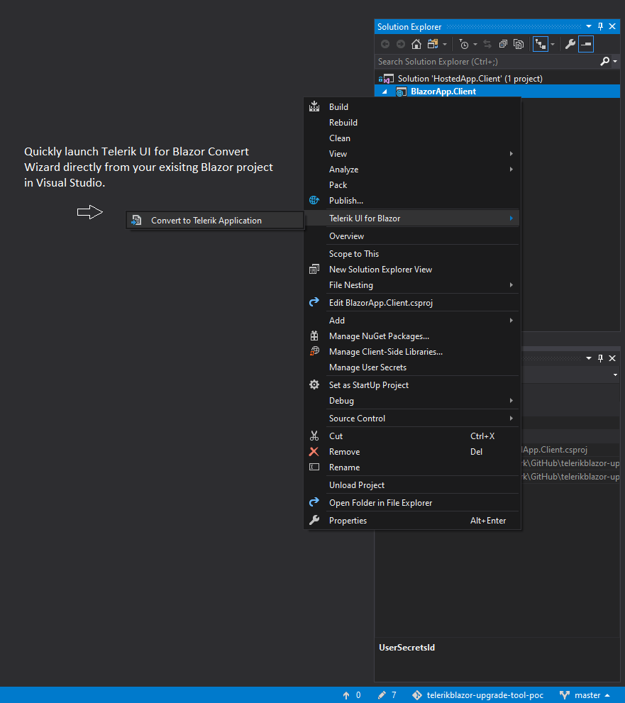
Telerik UI for Blazor Convert Wizard Launch
The new VS wizard does all the needed work – from getting the required Telerik Blazor packages in your project and adding client assets, to ensuring you can smoothly integrate any Telerik Blazor component in your app.
Install Telerik UI for Blazor on Mac
In addition to the existing Telerik UI for Blazorinstaller for Windows (.msi file), with this release we automated the installation for Mac users.You can now easily setup and enjoy the Telerik UI for Blazor components via the new Mac installer (.pkg file).
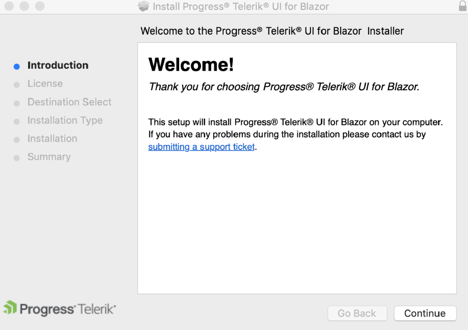
Telerik UI for Blazor macOS Installer
The automated UI for Blazor installer for both Windows and macOS platforms provides the necessary Nuget package files, offline version of Telerik Blazor component demos that you can run and inspect in your IDE, document processing Nuget package files, and shortcuts to our online demos.
Telerik Blazor R3 2020 Roadmap
We will continue to expand the Telerik UI for Blazor suite and we already have exciting plans for the upcoming 2020 releases. If you want a sneak peek of what’s coming, we encourage you to keep using the Telerik UI for Blazor Roadmap Page. Not only will you get an insider’s look at our features pipeline, but you’ll continue to have the opportunity to help us improve with your valuable feedback. Your input helps make the Telerik UI for Blazor bigger and better for everyone.
Download the Latest Version of Telerik UI for Blazor
We would like to thank everyone for the continuous support and encourage you to download a free trial version of Telerik UI for Blazor, or if you are an active license holder you can just grab the latest and greatest from the Your Account page! Share your thoughts with us on our dedicated Blazor feedback portal and help us shape the future of UI for Blazor.
Sign-up for Telerik R2 2020 Webinar
Be sure to sign up for the Telerik R2 2020 release webinar on Thursday May 21, 2020 @11:00 am – 12:00 pm ET for a deeper look at all the new Telerik components and features in the release.
And in case you need more Telerik UI for Blazor, we have lined up another great deep-dive webinar on Tuesday, June 2, 2020 starting at 11am ET. During the webinar, "Blazor in-depth: Full-Stack C# with Telerik UI for Blazor and Entity Framework," you'll learn how to use a variety of Telerik UI for Blazor controls to build a full-fledged app in no time. Stay tuned.
Happy Blazor Coding!

Maria Ivanova
Maria Ivanova is a Manager of Product Management at Progress, for Telerik and Kendo UI components and developer tooling. She joined the company in 2019 as a Product Manager for Telerik UI web components and is passionate about developing impactful and innovative software products. Maria believes that to create great products, it's important to challenge the status quo, closely collaborate with customers, and embrace a spirit of experimentation. Follow her on Twitter or LinkedIn.
