CSS Animation Timelines: Building a Rube Goldberg Machine

Multi-stage animations can help bring websites to life, but they can be difficult to write and maintain in CSS. Because of this, heavy JavaScript libraries are often added to make creating these animations easier. Lately I’ve been using custom properties to plan out pure CSS timelines for complex animations.
I often use these sorts of animation sequences for showing hidden content. In the example below, the background, heading, description and button fade in and slide down in sequence:
Each element needs to perform its transition at a precise time in relation to the its siblings. In the past I would’ve written the CSS for this animation sequence like this:
.section {
  transition-duration: 0.1s;
  /* ... Other Section CSS ... */
}

.section__title {
  transition-duration: 0.2s;
  transition-delay: 0.1s;
  /* ... Other Title CSS ... */
}

.section__description {
  transition-duration: 0.2s;
  transition-delay: 0.3s;
  /* ... Other Description CSS ... */
}

.section__button {
  transition-duration: 0.2s;
  transition-delay: 0.5s;
  /* ... Other Button CSS ... */
}

.section.is-open {
  /* Change CSS values to trigger a transition */
}

.section.is-open .section__title,
.section.is-open .section__description,
.section.is-open .section__button {
  /* Change CSS values to trigger a transition */
}

Code language: CSS (css)There are a few issues with this code that makes it difficult to read and update:
- It specifies that the heading transition starts after 0.1 seconds. But what I really want is to specify that the heading transition starts after the background transition ends.
- If we change the speed of one animation step, we’ll need to manually update the timing of the rest of the sequence.
- Our transition delays and durations are mixed in with our styling CSS, making it more difficult to scan and understand the sequence of animations.
Writing CSS Timelines
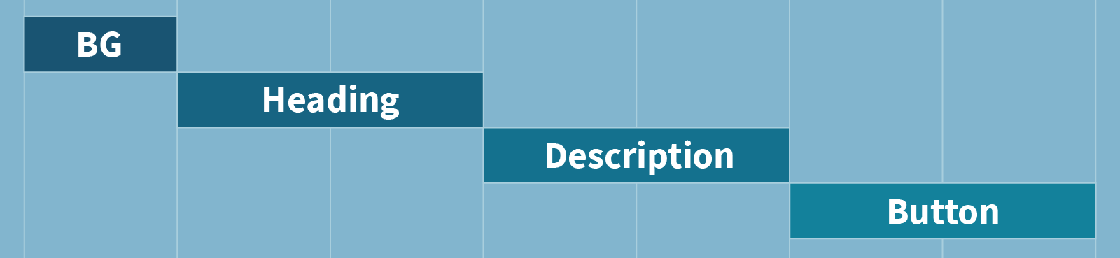
Let’s step back and reconsider our approach by visualizing a timeline of the animation sequence we’re creating. First the background (BG) animates, then the heading, then the description, and finally the button.
Using variables, we can write CSS to match the timeline above and solve all three of the issues with our previous code.
- Transition delays are defined relative to previous animation steps instead of being set to specific times.
- Since each transition delay is relative to the previous animation step’s timing, changing one step’s speed updates the whole sequence.
- The CSS for our timeline is all in one place instead of scattered throughout our CSS file.
Here’s an example of how we could achieve this in CSS. (The examples in this article are using CSS custom properties, but the same technique could be achieved using SASS or LESS variables if you need to support IE11.)
First, let’s set the duration of each step of our animation:
:root {
  --background-duration: 0.1s;
  --title-duration: 0.2s;
  --description-duration: 0.2s;
  --button-duration: 0.2s;
}
Code language: CSS (css)
Next, we calculate when each animation step should begin (their transition-delays). We can do this by adding the previous animation step’s start time and duration. This gives us the time that the previous animation step ended:
:root {
  --background-delay: 0s;
  --title-delay: calc(
    var(--background-delay) + var(--background-duration)
  );
  --description-delay: calc(
    var(--title-delay) + var(--title-duration)
  );
  --button-delay: calc(
    var(--description-delay) + var(--description-duration)
  );
}
Code language: CSS (css)
Finally, we can reference those properties to set the transition timing of our elements:
.section {
  transition-duration: var(--background-duration);
  /* ... Other Section CSS ... */
}

.section__title {
  transition-duration: var(--title-duration);
  transition-delay: var(--title-delay);
  /* ... Other Title CSS ... */
}

.section__description {
  transition-duration:  var(--description-duration);
  transition-delay: var(--description-delay);
  /* ... Other Description CSS ... */
}

.section__button {
  transition-duration:var(--button-duration);
  transition-delay: var(--button-delay);
  /* ... Other Button CSS ... */
}
Code language: CSS (css)
This technique makes it easier to understand and change the animation timeline. Changing the speed of one transition automatically ripples throughout the whole animation sequence without any manual work.
Adding a Base Speed
I find this a lot easier to work with, but there’s still a problem: it’s difficult to change the overall speed of the animation sequence. If I decide the whole sequence should be faster or slower, I’ll need to change the speed of each animated element.
By making all of the durations relative to a --base-speed variable, we can easily speed up or slow down the whole sequence. This also simplifies debugging, since you can view the sequence in slow motion by changing one value.
:root {
  --base-speed: 0.2s;

  --background-duration: calc(var(--base-speed) / 2);
  --title-duration: var(--base-speed);
  --description-duration: var(--base-speed);
  --button-duration: var(--base-speed);
}
Code language: CSS (css)
I added some sliders to the animation so you can control the CSS timeline by updating the base speed or individual elements’ relative speeds. (Move the sliders to the right to slow things down.)
Building a Rube Goldberg Machine
This technique can be scaled up to build some truly complex animations. I decided to build a CSS and SVG Rube Goldberg machine to put it to the test:
I built this animation using SVG imagery, but the underlying strategy remains the same. Each element’s delay is calculated by adding the previous animation’s start time and duration. For this more complicated example I had to use a few new tricks:
- In some cases I wanted the next animation step to start slightly before the previous step ended. In that case I multiplied the previous duration by a fraction or decimal.
- I used CSS keyframe animations in addition to transitions. These were timed using
animation-delayandanimation-duration. - When the SVG is wider than the viewport, I added a horizontal panning transition to the entire SVG. I used the duration of all animation steps added together to make sure this was timed correctly.
Here’s what this CSS timeline ended up looking like:
:root {
  --base-speed: 0.5s;

  --domino-speed: calc(var(--base-speed) * 1.5);
  /**
   * Dominos hit the next domino before finishing their
   * transition. We start the next domino's transition
   * when they actually hit.
   */
  --domino-hit-speed: calc(var(--domino-speed) * 0.25);
  /**
   * The final domino falls all the way down instead of
   * resting on another domino. Since it has further to
   * go, its duration lasts longer so it appears to be
   * going the same speed.
   */
  --last-domino-speed: calc(var(--domino-speed) * 10 / 9);

  --domino-1-delay: 0s;
  --domino-2-delay:
    calc(var(--domino-1-delay) + var(--domino-hit-speed));
  --domino-3-delay:
    calc(var(--domino-2-delay) + var(--domino-hit-speed));
  --domino-4-delay:
    calc(var(--domino-3-delay) + var(--domino-hit-speed));
  --domino-5-delay:
    calc(var(--domino-4-delay) + var(--domino-hit-speed));
  --domino-6-delay:
    calc(var(--domino-5-delay) + var(--domino-hit-speed));

  --ball-and-string-speed: calc(var(--base-speed) * 2);
  --ball-and-string-delay: calc(
    var(--domino-6-delay) + var(--domino-speed) * 0.2
  );

  --car-speed: calc(var(--base-speed) * 4);
  --car-delay: calc(
    var(--ball-and-string-delay) +
    var(--ball-and-string-speed) * 0.25
  );

  --_8-ball-speed: calc(var(--base-speed) * 5);
  --_8-ball-delay:
    calc(var(--car-delay) + var(--car-speed) * 0.9);

  --domino-7-delay:
    calc(var(--_8-ball-delay) + var(--_8-ball-speed) * 0.9);
  --domino-8-delay:
    calc(var(--domino-7-delay) + var(--domino-hit-speed));
  --domino-9-delay:
    calc(var(--domino-8-delay) + var(--domino-hit-speed));
  --domino-10-delay:
    calc(var(--domino-9-delay) + var(--domino-hit-speed));
  --domino-11-delay:
    calc(var(--domino-10-delay) + var(--domino-hit-speed));
  --domino-12-delay:
    calc(var(--domino-11-delay) + var(--domino-hit-speed));

  --last-ball-speed: calc(var(--base-speed) * 3);
  --last-ball-delay:
    calc(var(--domino-12-delay) + var(--domino-hit-speed));

  --total-duration:
    calc(var(--last-ball-delay) + var(--last-ball-speed));
}
Code language: CSS (css)
Once again, I’ve separated out the animation timeline from the rest of the styles, allowing me to change the timeline without digging through a bunch of other CSS rules.
This complex animation sequence was built entirely with CSS. All it takes to play the entire sequence is toggling a single class!
I’ve just started experimenting with this technique and I’m excited to keep exploring the possibilities and building more animations on the web!
Paul Hebert is a hybrid designer and developer at Cloud Four. When he's not designing and developing websites he enjoys bouldering, drawing, cooking, gardening, and eating too much cheese.