
Heads up! This post is a bit outdated.
What is Bridgetown
According to their website, Bridgetown is:
A Webpack-aware, Ruby-powered static site generator for the modern Jamstack era.
You may think of JavaScript when you hear the term "static site generator", but one of the oldest, and most popular static site generators is Jekyll, and it is also built with Ruby. The Jekyll project is over 10 years old, and remains a popular tool. Bridgetown seems to be a fresh take on Jekyll, and brings a nice balance of Ruby and JavaScript.
It is also worth pointing out that Bridgetown is pre version 1.0 at the time of writing. The stability notice on their README is worth keeping in mind:
Given Bridgetown's strong inherited bones (see background below) and our continued emphasis on good testing, we're pretty confident Bridgetown is ready to use today. But…you might want to exercise a bit of extra caution using this in production. 🙂 We are already (after all, the Bridgetown website is built with Bridgetown), but YMMV.
Tutorial
Let's create our first static site with Bridgetown!
Prerequisites
Make sure you have Ruby, Bundler, Node, and Yarn installed. These are the versions I am using:
➜ ruby -v
ruby 2.6.6p146 (2020-03-31 revision 67876) [x86_64-darwin19]

➜ bundler -v
Bundler version 2.1.4

➜ node -v
v13.11.0

➜ yarn -v
1.22.4
Install Bridgetown
gem install bridgetown -N
Create new project
bridgetown new bridgetown_tailwind
cd bridgetown_tailwind
yarn start
You can now view your site live at http://localhost:4000/
Tailwind
Let's add TailwindCSS to our new site:
yarn add -D tailwindcss postcss-import postcss-loader
yarn tailwind init
This will create a tailwind.config.js file at the root of our directory.
We will want to run PurgeCSS on our files, so update tailwind.config.js to be:
module.exports = {
  purge: {
    mode: 'production',
    content: ['./src/**/*.html'],
  },
  theme: {
    extend: {},
  },
  variants: {},
  plugins: [],
}
Next, we need to update our Webpack config file to use PostCSS.
In webpack.config.js, change:
{
  test: /\.(s[ac]|c)ss$/,
  use: [
    MiniCssExtractPlugin.loader,
    "css-loader",
    {
      loader: "sass-loader",
      options: {
        sassOptions: {
          includePaths: [
            path.resolve(__dirname, "src/_components"),
            path.resolve(__dirname, "src/_includes"),
          ],
        },
      },
    },
  ],
},
to:
{
  test: /\.(s[ac]|c)ss$/,
  use: [
    MiniCssExtractPlugin.loader,
    "css-loader",
    {
      loader: "sass-loader",
      options: {
        sassOptions: {
          includePaths: [
            path.resolve(__dirname, "src/_components"),
            path.resolve(__dirname, "src/_includes"),
          ],
        },
      },
    },
    {
      loader: "postcss-loader",
      options: {
        ident: "postcss",
        plugins: [
          require("postcss-import"),
          require("tailwindcss"),
          require("autoprefixer"),
        ],
      },
    },
  ],
},
Lastly, we need to import Tailwind into our stylesheet.
Open ./frontend/styles/index.scss and replace the default styles with:
@import 'tailwindcss/base';
@import 'tailwindcss/components';
@import 'tailwindcss/utilities';
If we run yarn start again, we should see Tailwind styles being applied!
Update styles
This step is optional but we can update some of our styles if we want.
Here is what I did:
// frontend/styles/index.scss

body {
  display: flex;
  min-height: 100vh;
  flex-direction: column;
}

main {
  flex: 1;
}
<!-- src/_layouts/default.html -->

<!doctype html>
<html lang="en">
  <head>
    {% include head.html %}
  </head>
  <body class="min-h-screen {{ page.layout }} {{ page.page_class }}">
    {% include navbar.html %}

    <main class="text-gray-700">
      {{ content }}
    </main>

    {% include footer.html %}
  </body>
</html>
<!-- src/_layouts/home.html -->
---
layout: default
---

<div class="w-full px-5 py-12 bg-red-500">
  <h1 class="mb-4 text-6xl text-white">Home</h1>
</div>

<div class="mx-auto">
  <div class="px-5 py-12">
    {{ content }}
  </div>
</div>
<!-- src/_layouts/page.html & src/_layouts/post.html -->
---
layout: default
---

<div class="w-full px-5 py-12 bg-red-500">
  <h1 class="mb-4 text-6xl text-white">{{ page.title }}</h1>
</div>

<div class="mx-auto">
  <div class="px-5 py-12">
    {{ content }}
  </div>
</div>
<!-- src/_includes/navbar.html -->

<header class="text-gray-700 body-font">
  <div class="container flex flex-col flex-wrap items-center p-5 mx-auto md:flex-row">
    <a class="flex items-center mb-4 font-medium text-gray-900 title-font md:mb-0" href="/">
      <svg xmlns="http://www.w3.org/2000/svg" fill="none" stroke="currentColor" stroke-linecap="round" stroke-linejoin="round" stroke-width="2" class="w-10 h-10 p-2 text-white bg-red-500 rounded-full" viewBox="0 0 24 24">
        <path d="M12 2L2 7l10 5 10-5-10-5zM2 17l10 5 10-5M2 12l10 5 10-5"></path>
      </svg>
      <span class="ml-3 text-xl">Bridgetown + TailwindCSS</span>
    </a>
    <nav class="flex flex-wrap items-center justify-center text-base md:ml-auto">
      <a href="/about" class="mr-5 hover:text-gray-900">About</a>
    </nav>
  </div>
</header>
<!-- src/_includes/footer.html -->

<footer class="text-white bg-red-500 body-font">
  <div class="container flex flex-col items-center px-5 py-8 mx-auto sm:flex-row">
    <p class="mt-4 text-sm sm:py-2 sm:mt-0">© 2020 Andrew Mason</p>
    <span class="inline-flex justify-center mt-4 sm:ml-auto sm:mt-0 sm:justify-start">
      <a class="ml-3" href="https://twitter.com/andrewmcodes">
        <svg fill="currentColor" stroke-linecap="round" stroke-linejoin="round" stroke-width="2" class="w-5 h-5" viewBox="0 0 24 24">
          <path d="M23 3a10.9 10.9 0 01-3.14 1.53 4.48 4.48 0 00-7.86 3v1A10.66 10.66 0 013 4s-4 9 5 13a11.64 11.64 0 01-7 2c9 5 20 0 20-11.5a4.5 4.5 0 00-.08-.83A7.72 7.72 0 0023 3z"></path>
        </svg>
      </a>
    </span>
  </div>
</footer>
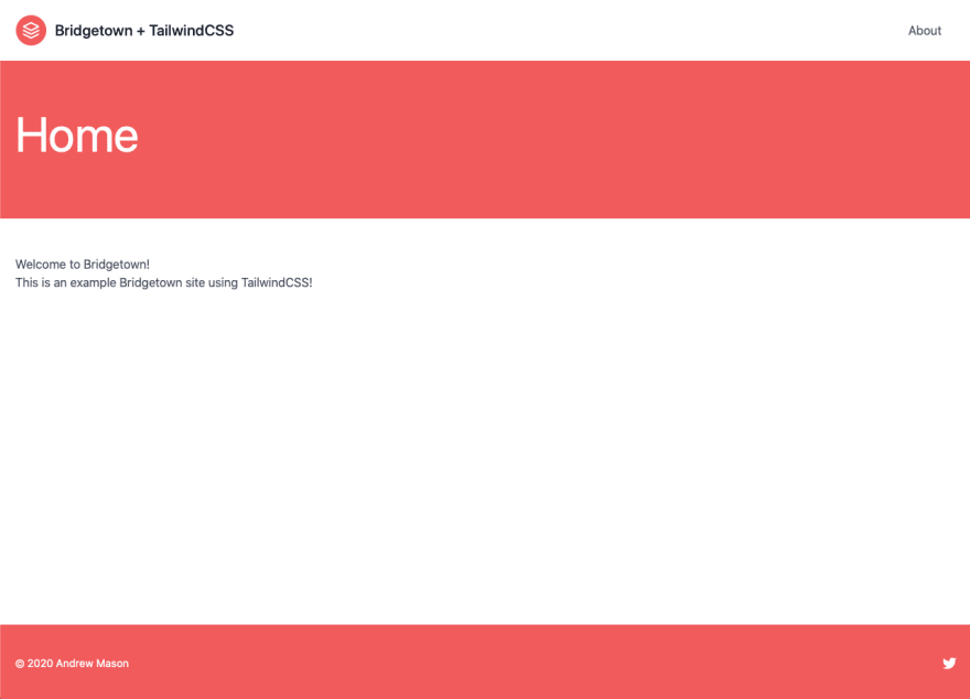
If you added these styles, your homepage should now look like:
Deployment with Netlify
- Login to Netlify
- Select
New Site from Git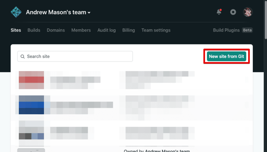
- Choose your Git provider
- Select your repo
- Set your
Build Commandtoyarn deploy - Set your
Publish directorytooutput/
- Click
Deploy site
Your site will deploy and you should be able to view it at the preview link that Netlify provides!
Summary
If you have had Ruby/Rails/Jekyll experience, you should feel right at home with Bridgetown. Bridgetown also removes the barrier to entry for integrating webpack and all the goodies the JavaScript community has to offer.
Even though the library is still pre 1.0, I think it would still be worth your time to check out Bridgetown and see what you think!
You can find the code for this tutorial here or view demo.
Happy coding!


Top comments (2)
Cool, thank you for sharing!
This was a treat. Thank you Andrew.