I recently learned Flexbox, now it's time to give a practical demonstration for you people, the lovely DEV Community.
A layout is a website's house😂
Let's build this blog layout.
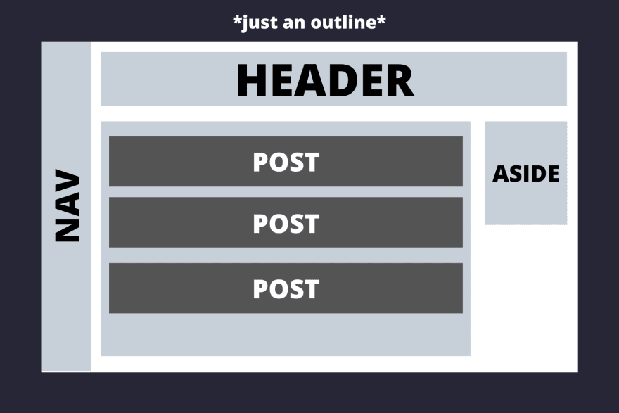
Now let's think of this step by step.
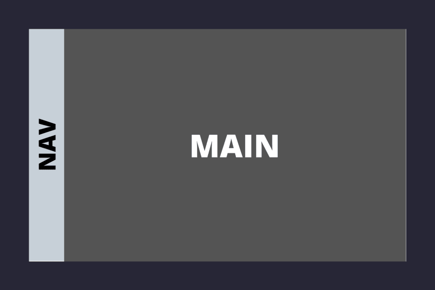
Nav covers approximately 1/10th area of the whole screen vertically and the rest of it goes to the main area.
<body>
<nav>NAV</nav>
<main>MAIN</main>
</body>
Styles -
*{
    padding: 0;
    margin: 0;
}
body{
    display: flex;
    flex-direction: row;
    height: 100vh;
    width: 100vw;
}
nav{
    flex-grow: 1;
}

main{
    flex-grow: 10;
}
First, on the body we add display: flex, this is necessary as flexbox has to be activated on the parent container, to layout the elements inside it using flexbox.
Now there are two main ways flexbox can be aligned, row or column. Row is horizontal, column is vertical.
In this case, we want them horizontally aligned so we add flex-direction: row
Now talking about flex-grow, it defines how much the item will grow relative to the other elements in the flex container.
We want the main area to take up 10x space compared to the nav so we add flex-grow: 10 to main and flex-grow: 1 to nav.
Another point to keep in mind, the flex properties of the parent container concerns only its direct children, not the elements inside the children elements.
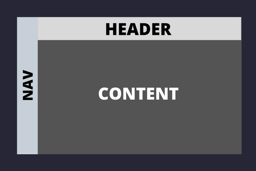
Now moving on to the main area, this is what we want to do -
Now, what would we do to achieve it?
Both header and content are children of the main, we need to turn flexbox on, on main element.
header and content are aligned vertically, i.e. in a column with header taking up about 1/8th space and rest of it to the content container.
<body>
    <nav>NAV</nav>
    <main>
        <header>HEADER</header>
        <section class="content">CONTENT</section>
    </main>
</body>
/* styles */
main{
    flex-grow: 10;
    display: flex;
    flex-direction: column;
}
header{
    flex-grow: 1;
}
.content{
    flex-grow: 8;
}
When you see the first layout image, you'll notice the posts area and aside are under the .content area, so now we gotta turn up the flex on .contents
container. This is how we want it to be -

        <section class="content">
            <section class = "posts">
            POSTS
            </section>
            <aside>ASIDE</aside>
        </section>
.content{
    flex-grow: 8;
    display: flex;
}

.posts{
    flex-grow: 5;
}
aside{
    flex-grow: 1;
    height: 40vh;
}
Again, following the same drill that we've in the previous parts of this layout added display: flex to .contents and then decided what proportions should its children be in by using flex-grow.
Now moving onto the last part of this layout,
the individual posts under the .posts container. I think this is the simplest one out of all others in this tutorial till now.

Now .posts will be our parent flex container.
            <section class = "posts">
                <section class="post">POST</section>
                <section class="post">POST</section>
                <section class="post">POST</section>
            </section>
.posts{
    flex-grow: 5;
    display: flex;
    flex-direction: column;
}

.post{
    flex-grow: 1;
}
All we gotta do is turn up the flex on .posts and specify flex-direction to column. We specif flex-grow: 1 on .post to indicate that each post should take up equal space, there are other ways to do this too, by using justify-content and align-items but I find flex-grow to be the most intuitive.
Now that we're done with our layout, here's the final code -
<body>
    <nav>NAV</nav>
    <main>
        <header>HEADER</header>
        <section class="content">
            <section class = "posts">
                <section class="post">POST</section>
                <section class="post">POST</section>
                <section class="post">POST</section>
            </section>
            <aside>ASIDE</aside>
        </section>
    </main>
</body>
*{
    padding: 0;
    margin: 0;
}
body{
    display: flex;
    flex-direction: row;
    height: 100vh;
    width: 100vw;
}
nav{
    flex-grow: 1;
}

main{
    flex-grow: 10;
    display: flex;
    flex-direction: column;
}
header{
    flex-grow: 1;
}
.content{
    flex-grow: 8;
    display: flex;
}

aside{
    flex-grow: 1;
    height: 40vh;
}

.posts{
    flex-grow: 5;
    display: flex;
    flex-direction: column;
}

.post{
    flex-grow: 1;
}
Conclusion
Once you understand flexbox, building layouts in it comes to you almost intuitively. The best tip to get better at it is to practice.
Top-down approach works very well with Flexbox, first think of your major containers, how are they related and then the content inside them, step by step.
There's much more to flexbox that hasn't been explored in this post like justify-content, align-items, flex-basis, flex-shrink etc. Go on explore!
Side note - Of course for a normal layout, there would be padding, margin, and colors involved which were forgone in this post for the sake of focusing solely on flexbox.


Top comments (10)
Have always been using CSS Grid and never thought I should take a look on flexbox. But after reading your tutorial and seeing how easy it is I shall use that in my next project. Thank you for this detailed and compact tutorial.
glad you found it helpful!
You dissect the case so well. Kudos
thank you!
Great and very well explained article. Thanks for sharing!
you're welcome!
I have never found such a clear explanation of flex box. Thank you so much ❤️💕.
Could you please create a post about justify-content, align-items, flex-basis, flex-shrink etc.
Thanks 😊
I am so glad you found this post helpful. I'll definitely look into making a blog about the topics that you mentioned :)
you're welcome!
that was explained really well !! really helpful post !!