I'm currently coding a web application based on the minecraft universe.
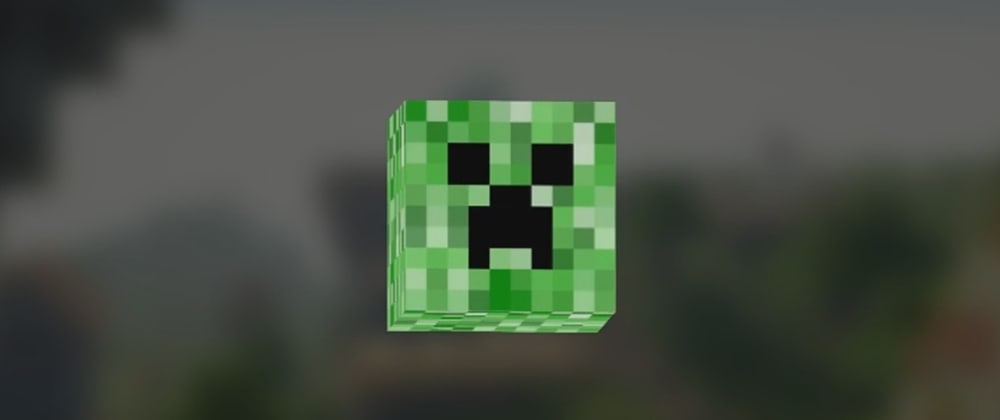
In my first article on dev.to (it's a honor), I share with you how I built this cool animation with a 3D creeper's head with no libraries, only CSS and vanilla JS.
This tutorial is divided in 2 parts:
- Modeling the creeper head
- Animating the model with javascript
For this tutorial, I use the ES6 syntax and CSS variables.
Modeling the 3D creeper's head
The first step in this work is to model the creeper's head. In my case, it is pretty easy, similar to model a cube. I used these two assets:
- the face of the creeper,
face.png - the side of his head,
side.png
Each side of the cube is represented by a img tag and is nested in a div element, here #creeper.
<div id="creeper">
    <img src="face.png" class="side front" />
    <img src="side.png" class="side back" />
    <img src="side.png" class="side top" />
    <img src="side.png" class="side bottom" />
    <img src="side.png" class="side left" />
    <img src="side.png" class="side right" />
</div>
By default in CSS, you can position HTML nodes in a 2D space, based on the X and Y axis. So everything is flat.

In my case, I want to model a 3D object in my web page. So we need to change the default behavior of CSS! To do that, just indicate in the CSS that you want to place your elements in a 3D space:
:root {
    --size-creeper: 128px;
}
#creeper {
    width: var(--size-creeper);
    height: var(--size-creeper);
    /* the magic happens here */
    transform-style: preserve-3d;
}
So now, I can place precisely every child element of #creeper based on the X, Y and Z axis. Here an example to place the top side of the cube:
.side {
    position: absolute;
    width: var(--size-creeper);
    height: var(--size-creeper);
}
.top { transform: rotateX(90deg) translateZ(calc(var(--size-creeper) / 2)); }
The following isometric view can help you understanding how the objects are located in the 3D space and how you can play with the rotation, the translation and the scale:

I add an animation to the #creeper element to see if everything is correctly positioned! For more details, you can go through the code:
Animating the creeper's head
You can find some awesome animations on codepen.io. One of the last creations I've seen is this one: https://codepen.io/jhojann/pen/weKBxV?page=3. I'm gonna take some inspiration from this creation to animate my creeper head based on the mouse's position. Let's write some javascript code! I imagine the signature of my function something like this:
const animate = (element, options = {}) => {
    ...
}
-
elementis the HTML element you want to animate -
optionswill be useful if you want to change the parameters of the animation.
Let's code this function. The first thing I want is the exact position of the centered origin point of my creeper head. To get theses values, I use getBoundingClientRect on #creeper:
const characterRect = element.getBoundingClientRect()
const originX = elementRect.left + elementRect.width / 2
const originY = elementRect.top + elementRect.height / 2
Cool, so now, we have the exact origin point of the head. Next step is to bind the cursor's position with the rotation on X and Y axis. I assume that when the cursor is positioned exactly on the origin point, the rotation on the X and Y axis should be equal to 0deg. For the listener, I have something like this:
// define default params
options = Object.assign({}, { maxAngleX: 30, maxAngleY: 30 }, options)
// Re-maps a number from one range to another.
const map = (value, low1, high1, low2, high2) => low2 + (high2 - low2) * (value - low1) / (high1 - low1)
const follow = e => {
  try {
    const width = document.body.clientWidth
    const height = document.body.clientHeight
    // Support of smartphone/tablet
    const clientX = e.clientX || e.touches[0].clientX
    const clientY = e.clientY || e.touches[0].clientY
    const decY = map(clientY - originY, -height / 2, height / 2 , -options.maxAngleY, options.maxAngleY)
    const decX = map(clientX - originX, -width / 2, width / 2 , -options.maxAngleX, options.maxAngleX)
    element.style.transform = `rotateX(${-decY}deg) rotateY(${decX}deg)`
  } catch(e) {}
}
So now, let's bind mouse and touch events with this the my function handle:
document.body.addEventListener('mousemove', handle)
document.body.addEventListener("touchmove", handle, false)
Last step is to call our animate function when the page is loaded:
document.addEventListener('DOMContentLoaded', _ => {
    followCursor(document.querySelector('#creeper'))
})
This is the final result (move the cursor the see the animation):
I hope you enjoyed this article. I'm also open-minded any improvement. I'm not a designer, just a guy who likes coding and creating cool stuff!


Top comments (3)
Wow great article, i came across a similliar article today, now checking yours, makes me try out 3D objecting :D
Will definetly try to do a 3D object for the first time :D
Thanks ;)
You should try yes. We use to see everything in 2D on the web, adding the Z dimension allow us to be more creative!
I have managed to finish my project, and i have used your approach with the cursor tracking(didn't have much opportunities to do it except in 2D), so thought your was the best one to try out :D
Am planning to post the approach i did and of course with the props to mention your approach as well in the post :)