
In this post, we'll explore how to do two things: 1) create live chat message bubbles in Android that are similar to WhatsApp and iMessage and 2) customize Stream Chat's UI Components.
We'll customize Stream Chat Android's built-in UI components by plugging in a custom message view. This allows us to focus on the text rendering, while Stream does everything else.
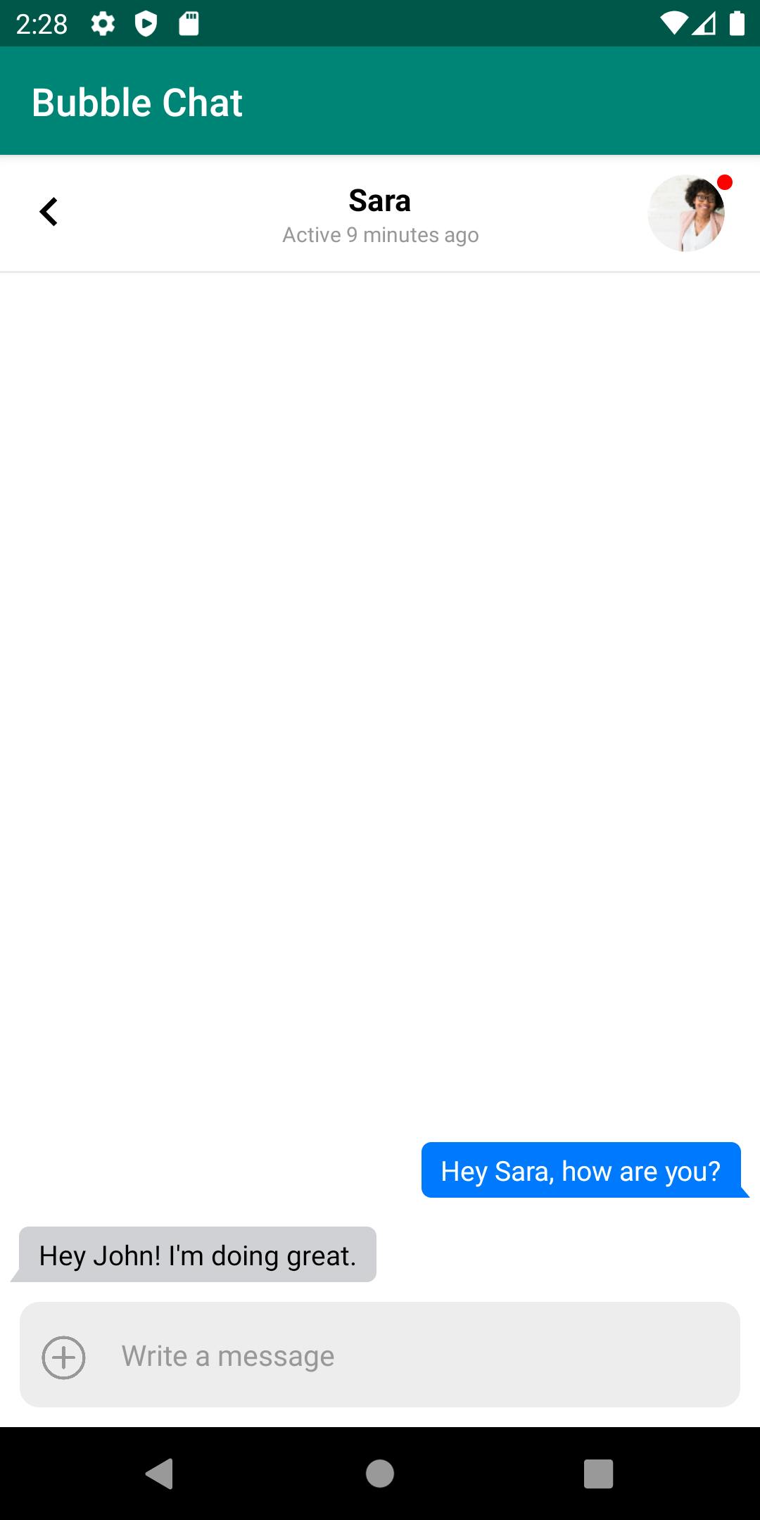
The source code is available here. Once we're finished, we'll have a chat experience that looks like this:

Prerequisites
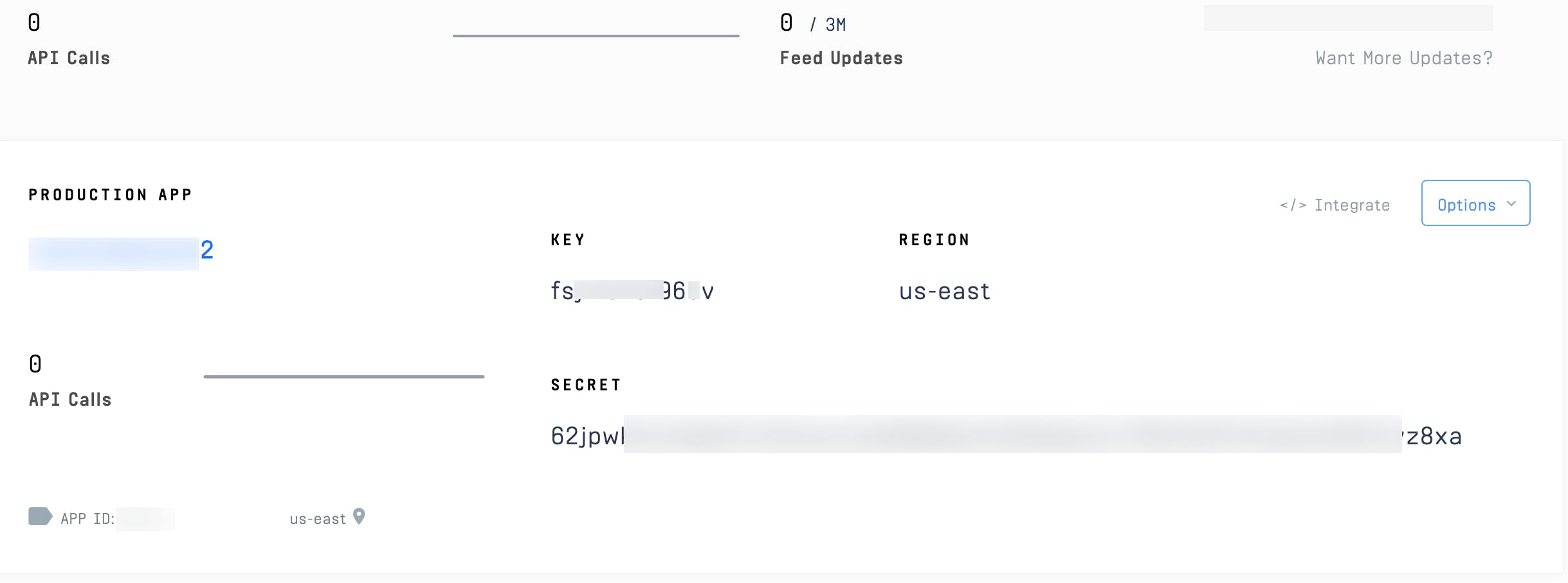
This post assumes a working knowledge of Android and Kotlin. If you're unfamiliar with either or both, it may be useful to check out a getting started guide. If you'd like to run the code, you'll also need a Stream account. Please register here. Once you're registered, you'll see a Stream app with an App ID, API Key, and API Secret:
We won't be going through how to create the backend to receive our tokens in this tutorial; please refer to this repo for token generation. You can also use Stream's CLI; if you look in MainActivity.kt, you'll see placeholders to fill in run the application.
Let's build!
Listing Channels
First, we'll create a view which displays a list of channels for a user to select:

This view is mostly taken care of by Stream's UI Components. To list our channels, the MainActivity.kt will leverage Stream's ChannelList, and we'll configure it to load all of the channels for our user. Here's the code:
// com/example/bubblechat/MainActivity.kt:13
class MainActivity : AppCompatActivity() {
    override fun onCreate(savedInstanceState: Bundle?) {
        super.onCreate(savedInstanceState)

        // setup the client using the example API key
        // normally you would call init in your Application class and not the activity
        StreamChat.init("<STREAM_API_KEY>", this.applicationContext)
        val client = StreamChat.getInstance(this.application)
        val extraData = HashMap<String, Any>()
        extraData["name"] = "<USERNAME>"
        extraData["image"] = "<PROFILE_IMAGE_URL>"
        val currentUser = User("<USER_ID>", extraData)
        // User token is typically provided by your server when the user authenticates
client.setUser(First, we initialize our StreamChat instance with our API key. We configure it with the user who'll be using our application. To keep things simple, we'll just declare who's logged in and their frontend token. In a real application, you'd want to perform authentication with a backend that generates this token.
We also give the user an id, a name, and an image(profile image). Once we've done this, we can declare the layout as "activity_main".
Now, the view needs a view model; in this case, we'll simply use the default, Stream-provided "ChannelListViewModel". This is great, as it does all the work to interact with Stream's API. We simply need to configure it to filter for our user's channels.
The last thing we do is set a "click listener" on each channel. We boot a ChannelActivity, which is where we'll customize the chat messages. Before we look at the code for ChannelActivity let's look at the layout:
<!-- layout/activity_main.xml -->
<?xml version="1.0" encoding="utf-8"?>
<layout xmlns:android="http://schemas.android.com/apk/res/android"
    xmlns:app="http://schemas.android.com/apk/res-auto"
    xmlns:tools="http://schemas.android.com/tools">

    <data>
        <variable
            name="viewModel"
            type="com.getstream.sdk.chat.viewmodel.ChannelListViewModel" />
    </data>

    <androidx.constraintlayout.widget.ConstraintLayout
        android:layout_width="match_parent"
android:layout_height="match_parent"We use a ConstraintLayout to hold our ChannelListView and associated ProgressBars. Since the view is mostly taken care of by Stream, we just need to configure when it is that our ProgressBars show and what our padding and margin are.
Now, we're ready to view a specific channel!
Viewing a Channel
Once a user clicks a channel, our ChannelActivity starts. Here is the code:
// com/example/bubblechat/ChannelActivity.kt:14
class ChannelActivity : AppCompatActivity() {
    private var viewModel: ChannelViewModel? = null
    private var binding: ActivityChannelBinding? = null

    override fun onCreate(savedInstanceState: Bundle?) {
        super.onCreate(savedInstanceState)

        val channelType = intent.getStringExtra(EXTRA_CHANNEL_TYPE)
        val channelID = intent.getStringExtra(EXTRA_CHANNEL_ID)
        val client = StreamChat.getInstance(application)

        binding = DataBindingUtil.setContentView(this, R.layout.activity_channel)
        binding!!.lifecycleOwner = this
First, we get our channel information off of the Intent from our ChannelActivity.newIntent call, in MainActivity.kt, and, then, below, we set our content view activity_channel and viewModel:
<!-- layout/activity_channel.xml -->
<?xml version="1.0" encoding="utf-8"?>
<layout xmlns:android="http://schemas.android.com/apk/res/android"
    xmlns:app="http://schemas.android.com/apk/res-auto"
    xmlns:tools="http://schemas.android.com/tools">

    <data>
        <variable
            name="viewModel"
            type="com.getstream.sdk.chat.viewmodel.ChannelViewModel" />
    </data>

    <androidx.constraintlayout.widget.ConstraintLayout
        android:layout_width="match_parent"
android:layout_height="match_parent"You'll notice this was another ConstraintLayout with some views and progress bars; we use Stream's UI Components to build the majority of the view. ChannelHeaderView gives us a nice header with a channel image and channel name (from the parent). MessageListView displays our messages, and MessageInputView gives us a helpful default message input.
We use the built-in Stream view model and feed that to each view. However, we customize the MessageListView view by providing a custom message view "factory", BubbleMessageViewHolderFactory. This "factory" hooks into Stream's code to provide a custom view for each message. This class is straightforward since all we're going to do is instantiate our bubble message class, BubbleMessageViewHolder:
// com/example/bubblechat/BubbleMessageViewHolderFactory.kt:6
class BubbleMessageViewHolderFactory : MessageViewHolderFactory() {
    override fun createMessageViewHolder(
        adapter: MessageListItemAdapter?,
        parent: ViewGroup?,
        viewType: Int
    ): BaseMessageListItemViewHolder {
        return BubbleMessageViewHolder(R.layout.bubble_message, parent)
    }
}
Now that we're hooked into the view rendering, we can customize our messages to look like iMessage or WhatsApp!
Rendering Custom Bubble Messages
We're ready to declare our custom bubble view. To hook into Stream's components, we need to be a subclass of BaseMessageListItemViewHolder. Here is the basic class definition:
// com/example/bubblechat/BubbleMessageViewHolder.kt:20
class BubbleMessageViewHolder(resId: Int, viewGroup: ViewGroup?) :
    BaseMessageListItemViewHolder(resId, viewGroup) {
    private val header: Space = itemView.findViewById(R.id.space_header)
    private val text: TextView = itemView.findViewById(R.id.tv_text)
    private val username: TextView = itemView.findViewById(R.id.tv_username)

    private lateinit var channelState: ChannelState
    private lateinit var messageListItem: MessageListItem

    // to be defined...
}
We're passed a viewGroup resource from the factory (we will be using "bubble_message"). Then, this view is referred to by itemView. From this, we grab our message header (which will just be spacing, in our case), our text view that will hold the message, and our username view. We also have a MessageListItem and ChannelState, which contain data for our Stream message and channel, respectively. Let's check out our view:
<!--- layout/bubble_message.xml -->
<?xml version="1.0" encoding="utf-8"?>
<androidx.constraintlayout.widget.ConstraintLayout xmlns:android="http://schemas.android.com/apk/res/android"
    xmlns:app="http://schemas.android.com/apk/res-auto"
    android:layout_width="match_parent"
    android:layout_height="wrap_content">

    <Space
        android:id="@+id/space_header"
        android:layout_width="match_parent"
        android:layout_height="@dimen/stream_message_header_space_height"
        app:layout_constraintEnd_toEndOf="parent"
        app:layout_constraintStart_toStartOf="parent"
        app:layout_constraintTop_toTopOf="parent" />
This view is quite simple, as it defines the three pieces we referenced before: the header spacing, the username, and the text. Notice there's no bubble logic here. To get the correct colors and shapes, we'll use drawables and some logic in our class to define how the message will look; this layout is simply the scaffolding for us to fill in.
Implementing this abstract class requires us to implement setStyle and bind. We'll ignore setStyle for this tutorial since we'll be defining all of our styles outright.
You can check out
MessageViewListStyleto see all the ways you can customize the components without building your own class; with that said, in this post, we want to explore how to do it ourselves!
Let's dive in! The bind method is where we configure how the message looks:
// com/example/bubblechat/BubbleMessageViewHolder.kt:29
override fun bind(
    _context: Context,
    channelState: ChannelState,
    messageListItem: MessageListItem,
    _position: Int
) {
    this.channelState = channelState
    this.messageListItem = messageListItem

    when (this.messageListItem.type) {
        MESSAGEITEM_MESSAGE -> {
            configMessage()
        }
MESSAGEITEM_DATE_SEPARATOR -> {We're given a ChannelState and MessageListItem, which has everything we need to figure out our display. First, we check the type of message. Stream has a few different message types, which represent different things. For example, you may get a message type that indicates a user is typing or a date separator. In our case, we'll focus on two, the actual messages and date separators; we'll ignore any other message type and remove them from rendering, entirely.
Let's focus on the actual messages to start; we'll look at how to render the date separators after. Here is our configMessage method:
// com/example/bubblechat/BubbleMessageViewHolder.kt:53
private fun configMessage() {
    configText()
    configUsername()
    configSpacing()
}
We do three things: 1) configure the actual text display, 2) decide if we need to show a username 3) determine how much spacing we have between messages.
First, let's see how we configure the actual text and render our bubble message:
// com/example/bubblechat/BubbleMessageViewHolder.kt:84
private fun configText() {
    text.text = messageListItem.message.text

    val params = text.layoutParams as ConstraintLayout.LayoutParams
    if (messageListItem.isMine) {
        params.horizontalBias = 1f
        text.setTextColor(Color.WHITE)
        text.setPadding(dpToPixel(10f), dpToPixel(5f), dpToPixel(15f), dpToPixel(5f))
        if (isBottom()) {
            text.setBackgroundResource(R.drawable.bubble_right_tail)
        } else {
            text.setBackgroundResource(R.drawable.bubble_right)
        }
} else {We set the TextView's text, then decide if it's "our" message or "theirs". If it's "ours", we display the message on the right, in blue. If it's "theirs", it goes on the left, in grey. To set the justification of the message, we use horizontalBias; setting it to 1 sets the message to the right, and 0 sets the message to the left. We'll also set the text color based on the background since blue needs white text and grey needs black. Padding is also set differently for the two cases, since the message will have the "tail" on the right or left, depending on who's message it is.
Since we're replicating iMessage's style, they don't render the tail unless it's the bottom message. Conveniently, Stream gives us position information and makes it easy to check message placement within a group of messages:
// com/example/bubblechat/BubbleMessageViewHolder.kt:116
private fun isBottom(): Boolean {
    return messageListItem.positions.contains(MessageViewHolderFactory.Position.BOTTOM)
}
If the message is the bottom message, it means it's the only message or the last in a group of messages by the same user. If it's either of those, we add a tail; if it's not, we just do a simple bubble. We'll also set the background of the text view to a "drawable". Let's look at "our" message drawables; here's the drawable with a tail:
<!-- drawable/bubble_right_tail.xml -->
<?xml version="1.0" encoding="utf-8"?>
<layer-list xmlns:android="http://schemas.android.com/apk/res/android">
    <item android:left="20dp">
        <rotate
            android:fromDegrees="-40"
            android:pivotX="100%"
            android:pivotY="100%"
            android:toDegrees="0">
            <shape android:shape="rectangle">
                <solid android:color="#007AFF" />
            </shape>
        </rotate>
    </item>
<item android:right="5dp">We're doing a bit of a smart trick by defining layer-list with two items. One is a regular rectangle with rounding, the other is a rotated rectangle that is covered by the standard rectangle. We pad the regular rectangle out to give a small gutter, so the edge of the rotated rectangle sticks out. This gives us a beautiful "tail" for the message bubble.
While we chose to keep it simple here with just rectangles, if you'd like a more stylized tail, such as the one you see in iMessage, you can use vector drawables to convert an SVG to a drawable.
For messages that don't need a tail, we define a simple shape with some spacing for the tail gutter:
<!-- drawable/bubble_right.xml -->
<?xml version="1.0" encoding="utf-8"?>
<layer-list xmlns:android="http://schemas.android.com/apk/res/android">
    <item android:right="5dp">
        <shape>
            <solid android:color="#007AFF" />
            <corners android:radius="8dp" />
        </shape>
    </item>
</layer-list>
Messages for "theirs" is the same pattern but mirrored and grey:
<!-- drawable/bubble_left_tail.xml -->
<?xml version="1.0" encoding="utf-8"?>
<layer-list xmlns:android="http://schemas.android.com/apk/res/android">
    <item android:right="20dp">
        <rotate
            android:fromDegrees="35"
            android:pivotX="0%"
            android:pivotY="100%"
            android:toDegrees="0">
            <shape android:shape="rectangle">
                <solid android:color="#D1D1D6" />
            </shape>
        </rotate>
    </item>
<item android:left="5dp">Nice! Now we have some good looking bubbles:
Now we can add the username, if necessary, and space the messages correctly. First, we'll look at configUsername:
// com/example/bubblechat/BubbleMessageViewHolder.kt:66
private fun configUsername() {
    if (channelState.members.size == 2 || messageListItem.isMine || !isTop()) {
        username.visibility = View.GONE
        return
    }

    username.text = messageListItem.message.user.name

    val params = username.layoutParams as ConstraintLayout.LayoutParams
    if (messageListItem.isMine) {
        params.horizontalBias = 1f
        params.rightMargin = 40
    } else {
        params.horizontalBias = 0f
        params.leftMargin = 40
    }
}
First, we decide if we show the username at all. There are three cases where we want it gone. If it's a 1-on-1 chat, if the message is "ours", or if it's not the top of a group of messages (otherwise, we'd have usernames on every message within a grouping). This logic means we only label groups of messages from other people in group chats.
If we have that case, we set the text of the username TextView to the user's name. We set the bias and margin depending on if it's on the right or the left.
Now we can space our messages depending on their placement in a group of messages:
// com/example/bubblechat/BubbleMessageViewHolder.kt:109
private fun configSpacing() {
    if (!isTop()) {
        header.layoutParams.height = 5
    }
}
This is simple since our default spacing is in our layout resource. We simply shrink the height if we're not the top message. Now you'll see the nice spacing and appropriate tails with usernames in our group chats:

All that's left is to deal with our date separator messages, and we're done! These MessageListItems come with no user and just a date. These are used to provide a horizontal separator between messages that are spaced out in time. These messages are automatically created by Stream when it decides the time between messages has been too long, and it'd be nice to group them. For example, if you message back a day later, you can break up the view with a date marker to inform the user of roughly when messages have come in. Here's configDate:
// com/example/bubblechat/BubbleMessageViewHolder.kt:59
private fun configDate() {
    username.visibility = View.GONE
    text.text = DateFormat
        .getDateTimeInstance(DateFormat.MEDIUM, DateFormat.SHORT)
        .format(messageListItem.date)
}
This is straightforward since our default text view has no styling and the correct spacing. We just need to turn off the username view and add the date. Now we have a convenient date separator:

And we're done! We now have custom bubble messages hooked into Stream.
Final Thoughts
Replicating iOS style messages on Android is relatively simple with drawables. Stream makes it even simpler with it's out of the box UI Components and Android SDK. You can start with Stream default views and customize them or build your own. If you want full control, you can ignore the UI Components and use the lower level Stream libraries directly. It's easy to peel back the layers when you need it!
For in-depth details you might want to check out our interactive tutorial on how to use the Stream Chat SDK for Android in-app messaging. You'll learn how to build everything that is required for real-time chat – typing indicators, reactions, threads, etc.
Happy coding! 💬
