As you may all know, a new virus named a coronavirus (COVID-19) is affecting a lot of people all over the world. The symptoms are ranging from the common cold to severe acute respiratory syndrome. Read more about COVID-19 from WHO.
Update: DataScience+ developed an interactive dashboard with Shiny to monitor the spread of COVID-19 across the world. Hope you find it useful.
In this post, I will show how the COVID-19 is distributed across the world by doing a map visualization of the confirmed cases by country. I would like to thank Johns Hopkins CSSE for providing the datasets. The data is across many sources, but Johns Hopkins CSSE complied in one single file. Find more about the dataset on their Github page.
I should note that form making the figure below, I was mostly based in the post named “Bubble map with ggplot2” by Yan Holtz published at The R Graph Gallery. It is a great post which I highly recommend to read if you want to make map visualizations.
First I load the libraries needed for this post:
library(tidyverse)
library(ggplot2)
library(readr)
library(maps)
library(viridis)
Get the data from Github of Johns Hopkins CSSE. The data is in wide format, and I will select only the last column which is the date when I wrote this post.
## get the COVID-19 data
datacov <- read_csv("time_series_19-covid-Confirmed.csv")
## get the world map
world <- map_data("world")
# cutoffs based on the number of cases
mybreaks <- c(1, 20, 100, 1000, 50000)

ggplot() +
 geom_polygon(data = world, aes(x=long, y = lat, group = group), fill="grey", alpha=0.3) +
 geom_point(data=datacov, aes(x=Long, y=Lat, size=`3/3/20`, color=`3/3/20`),stroke=F, alpha=0.7) +
 scale_size_continuous(name="Cases", trans="log", range=c(1,7),breaks=mybreaks, labels = c("1-19", "20-99", "100-999", "1,000-49,999", "50,000+")) +
    # scale_alpha_continuous(name="Cases", trans="log", range=c(0.1, 0.9),breaks=mybreaks) +
    scale_color_viridis_c(option="inferno",name="Cases", trans="log",breaks=mybreaks, labels = c("1-19", "20-99", "100-999", "1,000-49,999", "50,000+")) +
    theme_void() +
    guides( colour = guide_legend()) +
    labs(caption = "Data Repository provided by Johns Hopkins CSSE. Visualization by DataScience+ ") +
    theme(
      legend.position = "bottom",
      text = element_text(color = "#22211d"),
      plot.background = element_rect(fill = "#ffffff", color = NA),
      panel.background = element_rect(fill = "#ffffff", color = NA),
      legend.background = element_rect(fill = "#ffffff", color = NA)
    )
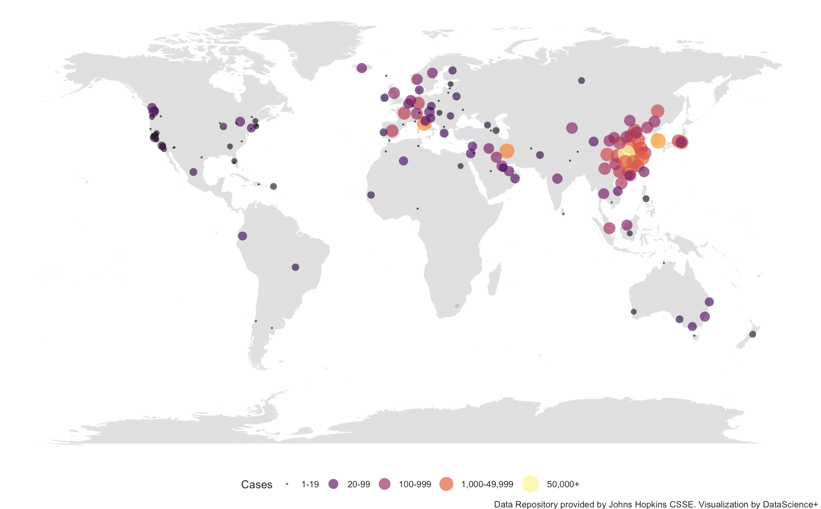
The geom_polygon make the map in the figure and geom_point the points which refer to the countries.