
Parallel to my goal of learning to code for a career change, I’m motivated to learn how to build my own web-comic/illustrated/animated/multimedia-art-and-storytelling-experiences. You know, c o n t e n t. Anyone doling out advice about how to learn to code mentions, at some point, the importance of building your own projects that interest you. For me, that means this sort of thing.
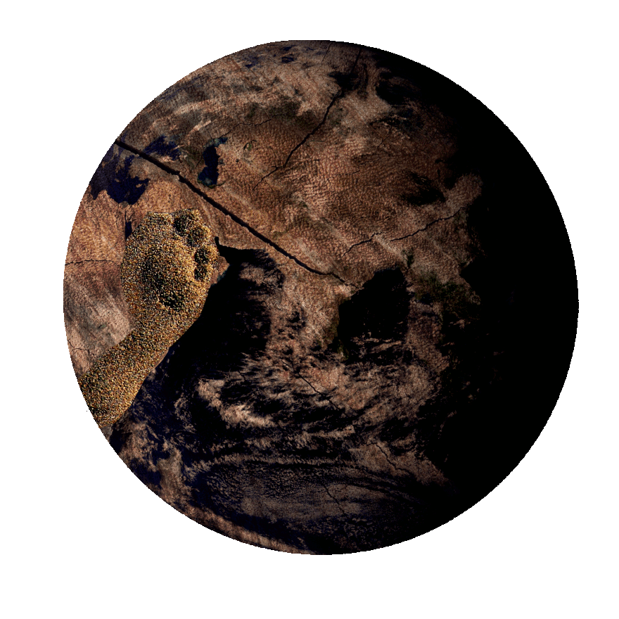
I’ve been working on this comic off and on for half a year, in between free code camp and javascript tutorials and group projects. I wish that I’d worked twice as many hours and finished it in half the time, but I have to acknowledge that the original concept (a short story with half a dozen pen drawings for illustrations) simply grew out of hand very quickly. And, since it took so long to get to a point that I felt good about calling it ‘done’, I can look back to the start of the project and see a consistent escalation in my grasp of the HTML, CSS, and JS required to complete it. And that is satisfying in its own right.
When I started this comic, I only knew a fraction as much about HTML and CSS. I didn’t know any JS to speak of. Now I can debug the legion of positioning errors and faulty margins and broken z-indices that plagued me back then. This article is about things that I learned as I built it, and what I want to build next.
Easy-Peasy Parallax
Parallax is hot in web design, and has been for a minute, and it has always looked amazing in animation. Back when I started this comic I knew that I wanted to employ parallax, and I spent a fair amount of time finding the right JS snippet to borrow and figuring out how to integrate it into my site. Unfortunately, it never really worked smoothly, and I couldn’t even get close to understand how it worked, and I’d rather not use JS in my projects if I’m just crossing my fingers and hoping it does some magic.
Then, I read about background-attachment: fixed, which was one of the single most satisfying discoveries that I made during the entire project. It turns out that you can use a CSS background image to achieve parallax with almost no effort. Just remember to set a height on the background.
Blend Modes
Blend modes are used in digital art to combine images to come up with creative color and texture effects. Discovering that CSS has two properties to work with them (background blend mode and mix blend mode) was the biggest single breakthrough of the project for me. I used them all over, and the comic wouldn’t look half as interesting without them.
On the other hand, blend modes turned out to be one of the worst aspects in regards to translating to other browsers. Even Firefox and Edge, both of which basically display my comic as I intended while I built it in Chrome, do not display the blending modes in the same way, rendering some pages illegible.
For future comics, I’ll have to figure out how I can display completely different panels, basically, but as I researched how to go about doing that I found that it isn't kosher to try to detect what browser the user has. That makes the use of blend modes a big question mark for me. I’ll probably use them in comics and other creative projects where I can ask the user to try out Chrome for a good experience, but not on my website or other projects where it is my responsibility to put the UX first. As it is, some of the panels in my comic simply don't display anything in Edge and some other browsers, which sucks.
Testing is Hard
Up to now, I never tried to comprehensively test a project across all devices and browsers. I did some responsive design, but when it came to different CSS properties and their compatibility I didn’t realize just how sticky things got. As far as I can tell at the moment, there are a few paid services that will emulate different browsers and devices, but even then it isn’t as certain as actually experimenting with the project on, say, a 2012 Android browser on a device from that year with its respective OS version.
I’m curious what I’ll find out as I continue to learn about this...I mean, if you work for a big coding company that creates designs for lots of clients, is there some guy who lives in a closet full of cell phones and laptops from every year and infinite VMs to try it on everything? How does anyone get this part of a project done correctly?
Image Optimization
After the rough draft, the comic took nearly a minute and a half to load, because my media folder weighed in at 120mb or more. I was using JPG and PNG formats, with a couple of GIFs. I left each image at the highest possible quality, most of them measuring two or three times as wide as they would need to display on most computers, because I have a natural abhorrence of my lovely illustrations being pixelized. (Side note: Is 'pixelized' a real word, and if not, why not?)
By the time I pushed the last commit, I learned a lot about image optimization and put a few key points into practice. The most important part was using WebP format, which I had never heard of until recently. You can easily convert your images in a free image editor like Gimp, or at https://squoosh.app/ . I am shocked by how much quality they retain while the size shrinks down to a fraction of the older formats, and just doing this step cut my load time down from a roughly minute and a half to maybe 8 seconds.
I also stretched the limits of my JS comprehension to figure out a lazy loading solution, which shaved off a few more seconds from the initial load time. I used this excellent tutorial by Kevin Powell, so that I could have some understanding of what I was doing. Incidentally, his solution used Intersection Observer, which, again, I’d never heard of until last week, and since then I’ve been using it for all sorts of scroll effects and animations.
As exciting as this all was, the WebP format has some unfortunate drawbacks. Safari doesn’t support them, and neither does IE. Once again, this made me struggle to decide exactly how much effort I wanted to put into making the comic work for every user on every platform. I was expecting to run into some CSS features like filters that wouldn’t work as well in other settings, but simply not having any images show up in a web comic is a bit lame.
This led me down another rabbit hole, namely the <picture> element with its fallback images, giving browsers the option to load traditional, larger files like JPGs, or the WebP files if they can handle them. Now that it is all said and done, I am still not sure if the time I spent on the research and implementation of this approach was really worth it; the comic still looks mostly unpresentable on Safari and IE, despite all of that extra effort.
And it didn’t end there, unfortunately. Using <picture> is a good approach for the HTML side of the project, but I used plenty of images as the background of <div>'s in the CSS. Thankfully, this same excellent CSS-Tricks article also went on to describe Modernizr. I downloaded some code from them that allowed my comic to detect if the user’s browser supports WebP images, generated a class to reflect that, and gave me the ability to show the necessary file type.
In the end, I learned A LOT about file types and optimization, the <picture> element, and lazy loading, and at least the comic loads in 4 or 5 seconds. If I had to do it again, I would definitely optimize my files, and I might take the time to edit them down to sizes that don’t waste bandwidth, but I probably wouldn’t use the <picture> element, because it was a lot of work that didn’t do much to open up the comic to other browsers, and I’m pretty sure it broke my lazy loading snippet, which is currently in a sort of limbo state of console logs giving me contradictory information that I can’t wrap my mind around.

And in conclusion...
I ended up with an interesting comic, and I learned a lot, and I can tell that the projects I'm working on now are WAY better because of all the experience that I built up with vanilla CSS and JS. I might come back to 'gods' in a year and patch all of the remaining issues, or maybe I'll leave it be and let it remind me of where I was in my personal coding journey at the start of 2020.

Top comments (0)