How to Use the Print Media Query & When
When would I even need this?
I actually had to style the e-commerce pages of a site recently because the site needs to allow its customers the ability to print out a nice and neat receipt page. Just like with all projects, consider what your client's users will use the page for. Most of the time they will not need to print out these web pages, but I'm sure if you have ever attempted to print out a DIY project from the web you were most likely annoyed at all of the superfluous content that wasted both your paper and printer ink. It's something to consider, and it's relatively easy to make work.
How do I use it?
The Print media query is as simple as they come:
@media only print {/*code to do something*/}
The 'only' part of this query ensures your styles within the media query brackets will *ONLY be used for print modeThe styles within these brackets should target any elements that are hard to read, or make the document break up into pages in a weird way.
Hit Ctrl + P on your keyboard after each change you save to test the print view
Simple Example:
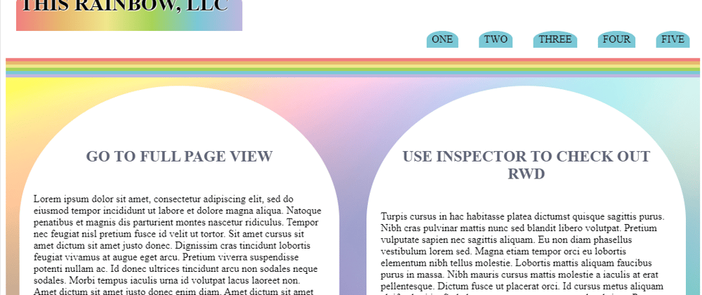
Original Print:

Updated with print media query:
Here is the simple code for this example:
@media only print {

  /*reset all font sizes so that they don't break in Print Mode*/

  h1, table, thead tr, tfoot {

    font-size:1em;

  }

  /*set the width of each table cell to 1/4 width, since there are 4 cells per row*/

  td {

    width:calc(100% / 4);

  }

}
See the simple example here:
Notes on a more complex example:
In my project below, I first made an edit specific to Codepen, because codepen won't allow you to print but the first page. So this is good to know if you want to design a web page and have it fit all onto one page:
`body {
/these are the pixel dimensions of a standard A4 piece of paper/
max-height:3508px;
max-width:2480px;
/this is a style choice you do not need it/
text-align:center;
}`
The code above sets the maximum printable area to one standard sized A4 printer paper.
I hid the following styles because the user will not need this information once the page is printed out. They neither need the top level navigation, nor do they need the footer elements.
nav, footer {

    display:none;

  }
On a normal web page, the background image style of the main div tag would show up in the Print View, but it doesn't here. To hide it I set the background to transparent.
main div {

background:transparent;

}
Next, I wanted to make sure the text was full width as the row of text is much harder to read than top to bottom. So, I set my printer styles as such:
` main {
display:block;
}
main div {
width:100%;
margin:0 auto;
padding:0;
background:transparent;
/if you do not remove these they will show up in print, yuck/
box-shadow:none;
border-radius:none;
}
.logo {
/if this were a normal web page the background gradient would need to be turned off, or not, whatever/
background:transparent;
/if you do not remove these they will show up in print, yuck/
border-radius:0;
box-shadow:none;
}`
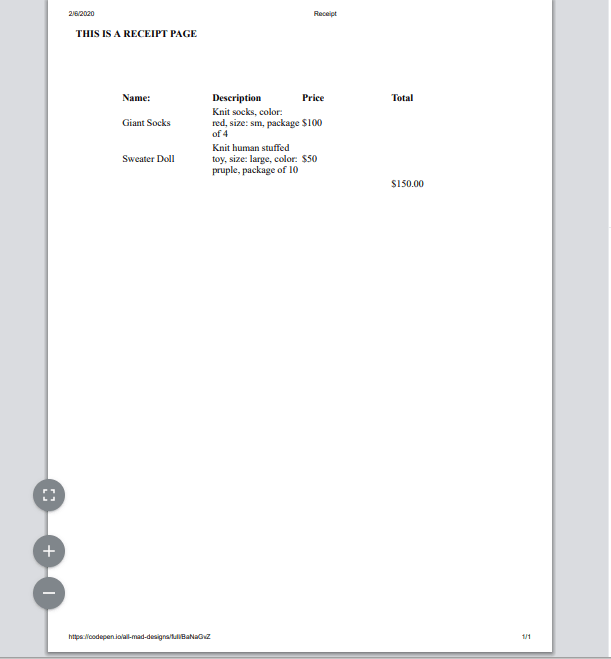
So, now you end up with a very basic one page print out with just the main body content and the logo:

One last thing, if you have hover (or other) effects and try to print the page, the hover effects will show up in the print view. So, I removed these as well:
nav p:hover, .logo:hover, main div:hover {

  box-shadow:none;

  transform:translate(0, 0);

}
Check it out on Codepen
When you do, be sure to:
- Open in Full Page
- Hit CTRL + P to see the printer friendly version of the page
- Check out the page in Responsive Design Mode in your Browser.
DISCLAIMER:
Codepen has some limitations for this experiment I have done. It is not capable of fully acting as a real web page when using the "Full Screen Mode", so some features behave differently than a standard web page would.
The first major issue with this experiment is that background images aren't showing in the Print Window by default. Browsers usually show background images in the print view, and thus for legibility you might need to remove them using the print media query. Of course, many browsers also give the user the ability to remove background colors and images in the print settings, but this presents UX Design issues. Issues like; does the user know about this feature? And what happens to the legibility of the text if they remove the background images & colors?

If you don't believe me, check out this page (Right click and open in a new tab) Starbucks.com page:
You can see the image graphic in the background of the section with the hummingbird is a background image if you check it out in inspector. Now, go ahead and hit CTRL + P. You can see the background image appears in the Print Window.
Codepen will only allow you to print one page.
I'm aware this design is kinda ugly 😟. I used light colors, border radius, and box-shadows on purpose because these are some features that will show up in the print window and they will look even worse, I also didn't want to use a ton of images so I made use of shapes and colors. Another thing you might notice at the bottom of the stylesheet, is that I tested out the use of 2 other media query properties for the first time instead of designing mobile first.


Top comments (0)