
React-bootstrap's documentation is incredibly helpful. Probably some of the best I've come across. However, as a newbie, getting to the point of implementation and testing can seem a little confusing at times. If you'd prefer to read the technical side without the introduction, skip to 'The Bar' section.
The Need
My experience with designing user interfaces is quite small. Before The Flatiron School, at my job at an IT consulting firm, I created terminal/command prompt tools for mostly automation or limited user/technician interaction. While you can thoughtfully place prompts, colors (which quickly become too much.), and information, there aren't many options to make it a more desirable interaction.
In my previous projects, I dabbled with a bit of CSS. Putting bits of code together to make something like this:
And others to create more reactive star ratings like this:

My next attempt was using the Bootstrap gem to create a navbar:
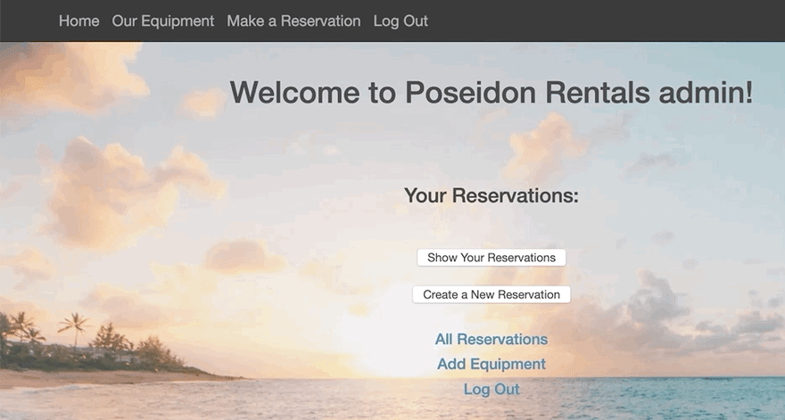
It was simple and served it's purpose entirely at the time.
For the latest attempt, I wanted a navbar that felt a little more fluid and enjoyable, especially since a user has to stare at it throughout the app. After trying other components with React-Bootstrap, it was an easy decision to give their styled navbar a try. Once implemented, following the documentation to fulfill your needs is rather simple. There are a plethora of options you can test and use to make a professional and attractive Navbar. So, on to the good part, how I quickly implemented it.
The Bar
The Navbar component itself is simple and pretty much covered on the Navbar documentation. Here's the code I used for interest and reference:
import React from 'react';
import { connect } from 'react-redux';
import { Navbar } from 'react-bootstrap';
import NavDropdown from 'react-bootstrap/NavDropdown'

const NavBar = () => {
  return (
    <Navbar bg="black" variant="dark" sticky="top">
      <Navbar.Brand>
      <img
        src="./logo.png"
        width="30"
        height="30"
        className="d-inline-block align-top"
        alt=" "></img>
      </Navbar.Brand>
        <NavDropdown bg="black" title="Menu" id="collasible-nav-dropdown" style={{ color: "#5299d3" }}>
        <NavDropdown.Item style={{ color: "#5299d3" }} href="/">Home</NavDropdown.Item>
        <NavDropdown.Item style={{ color: "#5299d3" }} href="/welcome">Admin</NavDropdown.Item>
        <NavDropdown.Item style={{ color: "#5299d3" }} href="/users">Users</NavDropdown.Item>
        <NavDropdown.Item style={{ color: "#5299d3" }} href="/lessons">Lessons</NavDropdown.Item>
        <NavDropdown.Item style={{ color: "#5299d3" }} href="/challenges">Challenges</NavDropdown.Item>
      </NavDropdown>
    </Navbar>
  );
};
export default connect()(NavBar);
To import the component, it's as you would expect in a React app: import NavBar from './components/Navbar';
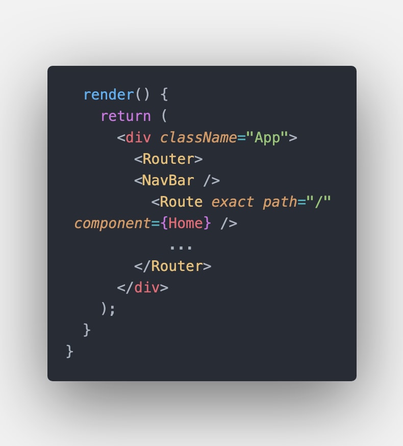
Which I included in the App.js component, which is where I also implemented react-router-dom to route the component pages: import { BrowserRouter as Router, Route} from 'react-router-dom'
Integrating the navbar into the rest of the components threw me off a bit. Ultimately I found the simplest was also the best solution (Other routes replaced with '...' for presentation purposes):
Conclusion
With this navbar version, I was able to add a simple logo, dropdown menu, and the app's universal font I previously chose. While I decided to have the navbar remain at the top as the user scrolls, the transparency keeps the fluid aesthetic across the app.
Attribution
Cover Photo by Alexander Andrews on Unsplash


Top comments (3)
Thanks for the article, Dylan.
The nav code screenshot seems narrow, though.
Thanks! Should be readable now.
Thank you for the update~