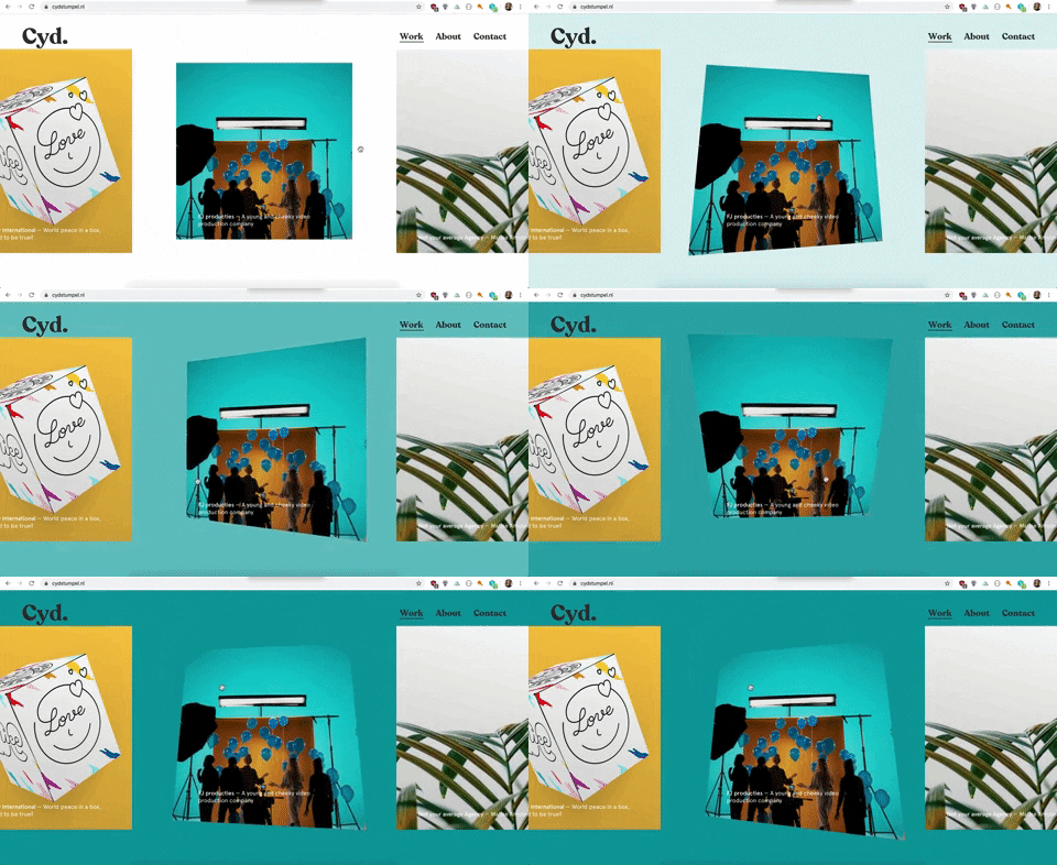
If you want to go beyond the standard hover, focus and click animations you've interacted with the right article! This is all about turning user input into better animations.
Event listeners
There are A LOT of event listeners in JavaScript, some of them you've probably heard of, most of them you'll probably never need or use. My favourite events to use are touch/mouse and scroll events. I am also trying to understand the devicemotion events but haven't come very far, if anyone has any reading tips let me know please!
In the first example I'm using the mouseover event to determine the mouse's position (x y coordinates) on the screen.
Example 1 Skewing on mouseover
An example of how I used this on my portfolio:

The HTML is quite basic:
<div class="skew">
  <div class="skew__item">
    <img src="https://pbs.twimg.com/media/BcvmxibIYAAH8a3.jpg" />
    <!-- TIP: always use an image you really enjoy
    looking at for codepens 😻 -->
  </div>
</div>
The JavaScript gets a bit more complicated:
const skewItemContainer = document.querySelector('.skew');
// Get the container element to add the mouseover
// event and css variable to
const skewItem = document.querySelector('.skew__item').getBoundingClientRect();
// getBoundingClientRect() returns an object with the
// coordinates and width, height etc of an element

const imageCenterX = skewItem.left + skewItem.width / 2;
const imageCenterY = skewItem.top + skewItem.height / 2;
// Calculating the center coordinates for the image

// Add the event to the container around the image
// (more room to mouseover == more better😎)
skewItemContainer.addEventListener("mousemove", function(e) {
  // the event, e, is an object with a lot of
  // information, I only use clientX and clientY
  // for this animation

  const clientX = e.clientX;
  const clientY = e.clientY;
  // Get x and y positions of the
  const xCalc = (clientX - imageCenterX) * 0.000001;
  // increasing 0.000001 will make the animation more pronounced
  const yCalc = (clientY - imageCenterY) * 0.000001;
  // Subtracting the X & Y coordinates by the image
  // center ensures that the center of the image
  // (where ever it may be positioned on the page) is 0, 0 🧐

  skewItemContainer.style.setProperty("--x-translate", `${xCalc}`);
  skewItemContainer.style.setProperty("--y-translate", `${yCalc}`);
  // using setProperty to add css variables to the container element
});
Okay I lied a little bit, I'm not actually using the skew() transformation function, I'm using matrix3d(), it gives you more control. This matrix3d transform is complicated AF, I found out you could create a skew like effect by continuously trying different values.
.skew {
  position: relative;
  display: flex;
  justify-content: center;
  align-items: center;
  flex-direction: column;
  // Centering the element with flexbox ❤️
  background: black;
  width: 100vw;
  height: 100vh;
  overflow: hidden;
  --x-translate: 0;
  --y-translate: 0;
  // creating defaults for the css variables
  &:hover {
    .skew__item {
      transform: matrix3d(1, 0, 0.00, var(--x-translate), 0.00, 1, 0.00, var(--y-translate), 0, 0, 1, 0, 0, 0, 0, 1);
      // By adding the transform only on hover you
      // make sure that when the user hovers out it
      // will return to it's non transformed standard
      // position, which saves you some code ;)
    }
  }
  &__item {
    width: 60vw;
    max-width: 500px;
    transition: 0.4s cubic-bezier(0.64, 0.57, 0.67, 1.53);
    img {
      width: 100%;
      height: 100%;
      object-fit: cover; // ❤️❤️❤️❤️ object-fit
    }
    &:hover {
      transition: 0.4s ease-out;
      // adding a different animation on hover than
      // hover out makes animations more playful
    }
  }
}
Example 2 Scaling up on scroll
An example of how I used this on my portfolio:

In the codepen I used three videos, this is absolutely not necessary! In the code examples here I'll show you how to do it with just one video.
Big shout out to the company I work at (Matise) who created this video and the design shown in the video. 👏
<section class="scale-video">
  <video class="video" autoplay muted loop playsinline src="https://cdn.matise.nl/content/uploads/2018/03/20092418/02_bbbSingleProduct.mp4"></video>
</section>
<section class="row">
  <h1>Scroll!!</h1>
</section>
const videoContainer = document.querySelector('.scale-video');
const video = document.querySelector('.video');
// Create variables for the container and the video for easy access

window.addEventListener('scroll', function(e) {
  let scrollY = window.scrollY  / window.innerHeight * 5;
  // Create a calculation to base the scale amount on

  // Create min and max values for the scaling:
  if (scrollY <= 0.3) {
    scrollY = 0.3;
    // We don't want the video to become smaller than (scale(0.3))
  }
  if (scrollY >= 1) {
    scrollY = 1;
    // We don't want the video to become bigger than (scale(1))
  }
  videoContainer.style.setProperty('--scale', `${ scrollY }`);
  // Set css variable on the video container
});
:root {
  // setting defaults can also be done on the root pseudo class
  // https://tympanus.net/codrops/css_reference/root/
  --scale: 0.3;
}

.scale-video {
  position: relative;
  display: flex;
  justify-content: center;
  align-items: center;
  // Center the content with flexbox
  width: 100vw;
  box-sizing: border-box;
  height: 300vh;
  // The height here is quite outrageous, haha.
  // It's to make sure that you have enough place
  // to scroll to let the animation do its thing.
  overflow: hidden;
  background: black;
}

.video {
  position: fixed;
  top: 0;
  transition: 1s ease-out;
  width: 100vw;
  z-index: 2;
  overflow: hidden;
  object-fit: cover;
  transform: scale(var(--scale));
  // Add the scale via css variable
}
That was it for now, let me know if you've ever made animations like these. I'd love to see them!


Top comments (8)
hey nice animations out there! I love them
but did you thought about debouncing the scroll event listener ? From experience I know this type of events can be very called a huge amount of time
Nice post!
Didn't know about
matrix3d. 🙂However, have you considered using throttling to improve the performance? 😊
You’re right, i should definitely at least add a request keyframe or something 🤦🏽♀️
Thanks for the code demos. Impressive
Awesome work with that Pen! Love it!
Glad you liked it, Vaibhav!
Awesome post. That should definitely be helpful.
I love what you've done. Thanks for sharing these techniques!