
Written by Raphael Ugwu✏️
When building frontend applications, performance roadblocks can be encountered when trying to re-render components such as modals, pop-ups, and buttons in different locations. Passing stuff around via props isn’t an option for large scale projects. Vue’s latest version aims to introduce a solution for this issue — Vue portal.
Vue portal lets you render a component in a different location in your DOM tree. Let’s take a look at how portals can make the rendering of components such as modals and pop-ups more efficient.

Previous versions of portals in Vue
Portals have always been around in Vue just in the form of workarounds and plugins. portal-vue is a popular Vue plugin that creates a portal element in your app and renders any markup – text, buttons, pop-ups, or modals within that element in a different DOM node. We’ll use portal-vue to illustrate how portals operate. First, install it in your project like you would any other plugin:
npm install portal-vue --save
Now, to get a clearer view of what we’re trying to build – let’s illustrate our app’s folder structure:
+-- public
|   +-- favicon.ico
|   +-- index.html

+-- src
|   +-- main.js
|   +-- App.vue
|   +-- components
    |   +-- UserAgreement.vue
    |   +-- UserContacts.vue

|   +-- package.json
Next, enable the plugin in your project:
// main.js

import Vue from 'vue'
import PortalVue from 'portal-vue'
import App from 'App.vue'

Vue.use(PortalVue)

new vue ({
  el:  '#app',
  render: h => h(App)
})
Let’s say we’ve got some data that needs to be reused in different places in our app – such as a user agreement. To reuse the user agreement, we wrap it in a portal element:
<!-- ./components/UserAgreement.vue -->

<template>
  <div class="user-agreement">
    <h1>User Agreement</h1>
    <portal to="user-contacts">
      <h3>I hereby agree to have my bank account debited for life by XYZ Corp</h3>
    </portal>
  </div>
</template>
<script>
export default {
  name: "UserAgreement"
};
</script>
Next, let’s import the UserAgreement component to the root component of our app:
<!-- App.vue -->

<template>
  <div id="app">
    <UserAgreement/>
  </div>
</template>
<script>
import UserAgreement from "./components/UserAgreement";

export default {
  name: "App",
  components: {
    UserAgreement
  }
};
</script>
<style>
#app {
  font-family: "Avenir", Helvetica, Arial, sans-serif;
  -webkit-font-smoothing: antialiased;
  -moz-osx-font-smoothing: grayscale;
  color: #2c3e50;
}
</style>
And try to display it:

The above code sample, rendered alone won’t display what is in the portal element. The reason being that although the destination of the portal was specified (as user-contacts ) in UserAgreement.vue , it was never created. Let’s try to specify a destination for the portal by creating a second component, UserContacts.vue:
<!-- ./components/UserContacts.vue -->

<template>
  <div class="contacts">
    <h1>Page Two</h1>
    <portal-target name="user-contacts"/>  <!-- specify the destination here -->
  </div>
</template>
<script>
export default {
  name: "UserContacts"
};
</script>
Next, we’ll update App.vue accordingly:
<!-- App.vue -->

<template>
  <div id="app">
    <UserAgreement/>
    <hr>
    <UserContacts/>
  </div>
</template>
<script>
import UserAgreement from "./components/UserAgreement";
import UserContacts from "./components/UserContacts";
export default {
  name: "App",
  components: {
    UserAgreement,
    UserContacts
  }
};
</script>
<style>
#app {
  font-family: "Avenir", Helvetica, Arial, sans-serif;
  -webkit-font-smoothing: antialiased;
  -moz-osx-font-smoothing: grayscale;
  color: #2c3e50;
}
</style>
Now when we display our root component, we can see the content wrapped by the portal element:

When UserAgreement and UserContact are rendered in the root component, the text in the portal element will be displayed. This makes it easy to reuse elements like buttons, modals, and popup notifications as you can have multiple portal elements in a single component that can then be sent to different components that need them. Think of setting up a button component in your project, enclosing buttons in different portals and just transporting them to wherever they are needed within that project.
Portals and HTML
Note that the capabilities of portals aren’t just limited to single file components. In a case where you may need to display a component via a .html file, you can use the target-el prop to get through. Let’s say we need to enclose a button that contains a modal functionality asking users if they want to remove an item or not.
+-- App
|   +-- index.html
|   +-- style.css
|   +-- index.js
First, we’ll include vue and portal-vue via the script tag:
<!-- index.html -->

<html>
  <head>
    <script src="https://unpkg.com/vue@2.5.13/dist/vue.js"></script>
    <script src="https://unpkg.com/portal-vue@1.2.2/dist/portal-vue.js"></script>
  </head>
</html>
Then we’ll create the modal that displays the message:
<!-- index.js -->

Vue.component('RemovePhoneModal', {
  template: `
      <div v-show="open" @click="close">
        <div @click.stop>
          <h1>
           Are you sure you want to remove this phone from your list?
          </h1>
          <div>
              <button type="button" @click="close">
                Cancel
              </button>
              <button type="button">
                Remove
              </button>
            </div>
          </div>
        </div>
      </div>
  `,
  props: ['open'],
  methods: {
    close() {
      this.$emit('close')
    }
  }
})
Next, still in index.js we’ll create a component for the button, this component will embed the modal:
Vue.component('RemovePhoneButton', {
  template: `
    <button @click="openModal">
      <span>Remove Phone</span>
        <portal target-el="#modals">
          <RemovePhoneModal :open="open" @close="close" />
        </portal>
    </button>
  `,
  data() {
    return {
      open: false,
    }
  },
  methods: {
    openModal() {
      this.open = true
    },
    close() {
      this.open = false
    }
  }
})
Then we’ll create a Vue instance for our app:
const app = new Vue({
  el: '#app',
})
Next, we’ll create our HTML template:
<!-- index.html -->

<!DOCTYPE html>
<html lang="en">
<head>
    <meta charset="UTF-8">
    <meta name="viewport" content="width=device-width, initial-scale=1.0">
    <meta http-equiv="X-UA-Compatible" content="ie=edge">
    <title>Phone App</title>
    <link rel="stylesheet" href="style.css">
</head>

<body>
<div id="app">
  <!-- This button will probably be surrounded... -->
    <RemovePhoneButton></RemovePhoneButton>
  <!-- ...by a lot of markup for your site. -->


  <!-- At the very end of your markup to avoid absolute/relative positioning bugs... -->

  <div id='modals'></div>
</div>

<!-- ...Insert the portal above here.-->
  </body>
</html>
Last, we’ll add some transitions via Tailwind CSS. Include its CDN script in the <head> tag of your index.html file:
<!-- index.html -->

<head>
   <link rel="stylesheet" href="https://unpkg.com/tailwindcss@0.4.0/dist/tailwind.min.css">
</head>
Then define your CSS transition, it can be different from mine if you wish:
<!-- style.css -->

.fade-shrink-in-enter-active,
.fade-shrink-in-leave-active {
  transition: all .3s ease;
}

.fade-shrink-in-enter,
.fade-shrink-in-leave-to {
  opacity: 0;
  transform: scale(1.1);
}
For reference purposes, you can view the Pen of this demo here. Let’s take a look at how this works in the video snippet below:
How portals work in Vue 3
A lot of significant improvements have been made available in Vue 3 such as:
- The composition API
- Fragments
- Suspense
- Multiple
v-models - The custom directive API
Portals are no exception because in Vue’s latest release, they will be an inbuilt feature. It’s important to note that their basic functionality will still remain the same – the only difference will be that portals won’t have to be installed as they will come in the form of a Portal element. They’ll have only one property, target which renders the content in the Portal element to a DOM element that has the same query selector ( id or class ) passed to the target prop.
Let’s try to recreate one of our previous examples by implementing a portal as it should appear in Vue 3:
<!-- index.js -->

Vue.component('RemovePhoneModal', {
  template: `
      <div v-show="open" @click="close">
        <div @click.stop>
          <h1>
           Are you sure you want to remove this phone from your list?
          </h1>
          <div>
              <button type="button" @click="close">
                Cancel
              </button>
              <button type="button">
                Remove
              </button>
            </div>
          </div>
        </div>
      </div>
  `,
  props: ['open'],
  methods: {
    close() {
      this.$emit('close')
    }
  }
})
Next, in our index.html file, we’ll have the Portal element wrap RemovePhoneModal with an id which will be referenced in a different DOM element:
<!-- index.html -->

<html>
  <body>
<!-- The portal can be embedded in any Vue component where it's needed -->
    <VueComponent>
      <Portal target="#modal">
        <RemovePhoneModal />
      </Portal>
    </VueComponent>
<!-- A DOM element with the same ID is inserted just before the closing body tag -->
    <div id="modal"></div>
  </body>
<html>
Conclusion
Like the details we mentioned earlier in this post, Vue 3 certainly promises a lot of exciting features. It will be very interesting to see how they are used in building projects, what features will prove useful, and what features will be frowned upon by the ecosystem. Personally, I think portal is here to stay as it will go a long way in making reusable elements easy to work with.
Experience your Vue apps exactly how a user does
Debugging Vue.js applications can be difficult, especially when there are dozens, if not hundreds of mutations during a user session. If you’re interested in monitoring and tracking Vue mutations for all of your users in production, try LogRocket.
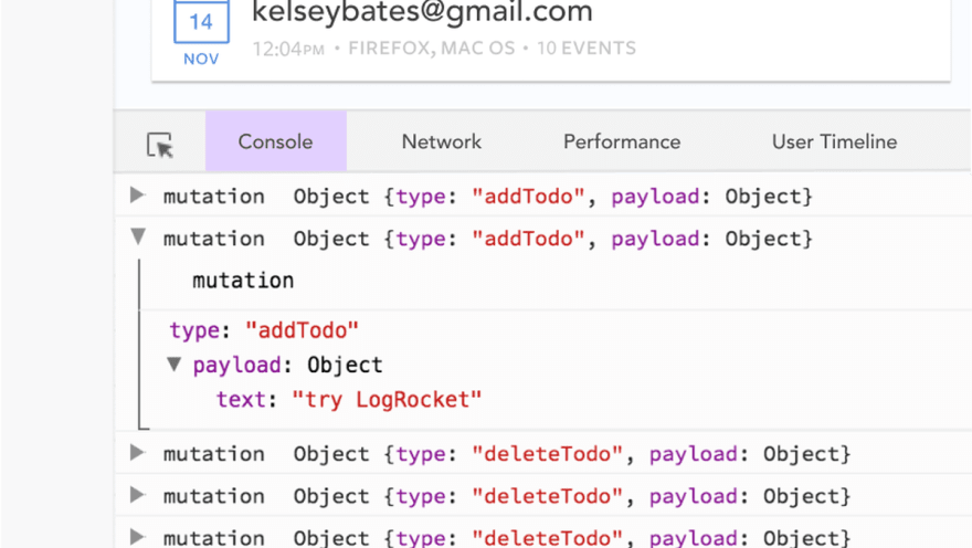
LogRocket is like a DVR for web apps, recording literally everything that happens in your Vue apps including network requests, JavaScript errors, performance problems, and much more. Instead of guessing why problems happen, you can aggregate and report on what state your application was in when an issue occurred.
The LogRocket Vuex plugin logs Vuex mutations to the LogRocket console, giving you context around what led to an error, and what state the application was in when an issue occurred.
Modernize how you debug your Vue apps - Start monitoring for free.
The post Dynamic component rendering with Vue portal appeared first on LogRocket Blog.


Top comments (0)