
Do whatever it takes to present the data to aid analysis and thinking. — Edward Tufte
How do you create graphs like these if you don’t already have some ready-made cool dataviz tool?
You can run queries to wrangle the data to get the results. Often you want to present the data visually in pie charts, bubble charts, histograms and line graphs. If you have Tableau, Cognos, etc it’s easier to visualize. Otherwise, you’ll have to copy the results into google sheets or excel. Cut and paste of the results to google sheets is difficult, due to formatting, header-row issues, etc. However, Couchbase Query Workbench makes it easy. Next to the query results, we have a copy icon that copies the output into a tabular form that you can paste into spreadsheets such as Google Sheets, Excel, etc. This facility is available in both query workbench and analytics query workbench.
Let’s look at some sample data and charts.
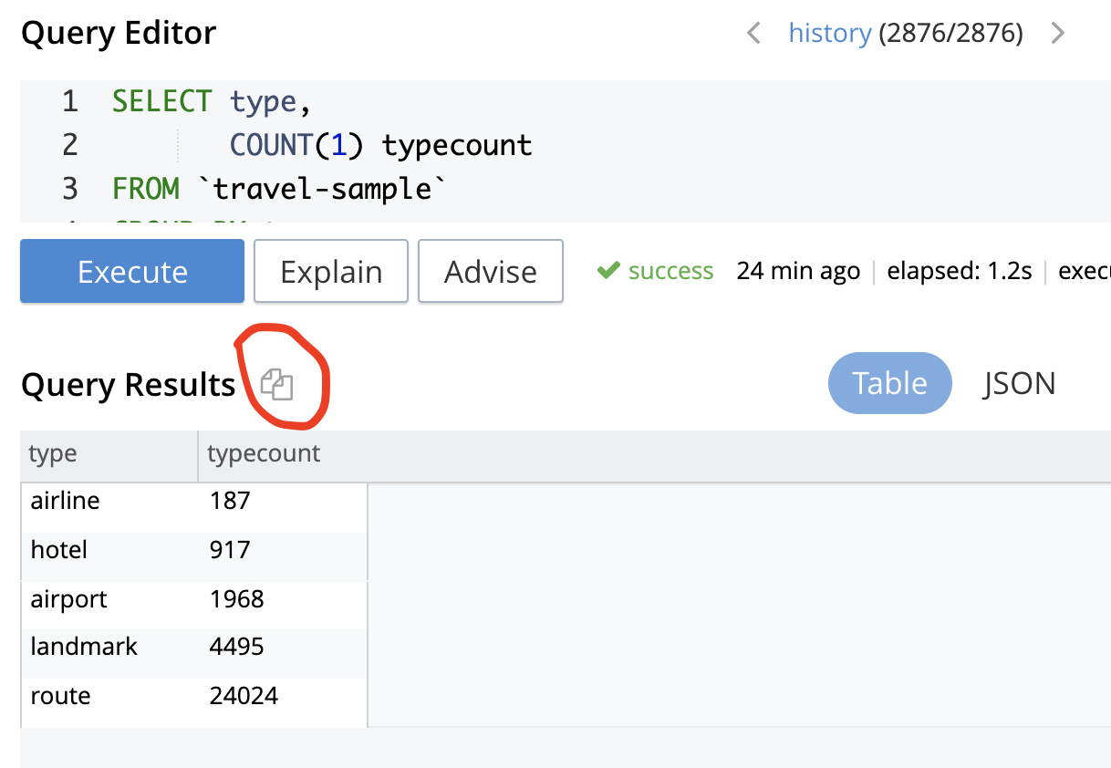
- Calculate the types of documents and their count.
Here’s the query on the travel-sample dataset shipped with Couchbase. Click on the image to see the GIF animation.
|
1 2 3 4 5 6 7 |
SELECT type, COUNT(1) typecount FROM `travel-sample` GROUP BY type ORDER BY typecount |
|
1 2 3 4 5 6 7 8 |
type typecount "airline" 187 "hotel" 917 "airport" 1968 "landmark" 4495 "route" 24024 |
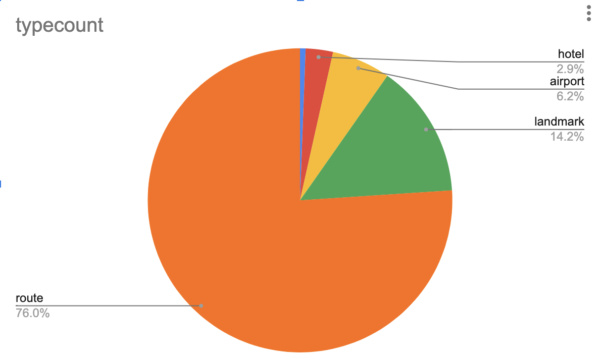
Here’s the piechart created for the data. This can be easily customized for color, data display, various labels, and legends.
Click on the image to see the GIF animation on how to get the results to google sheets to get the charts in a second.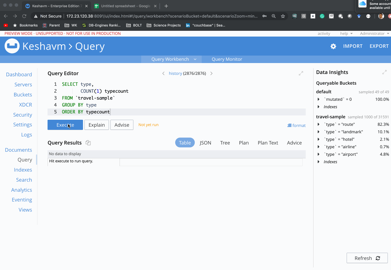
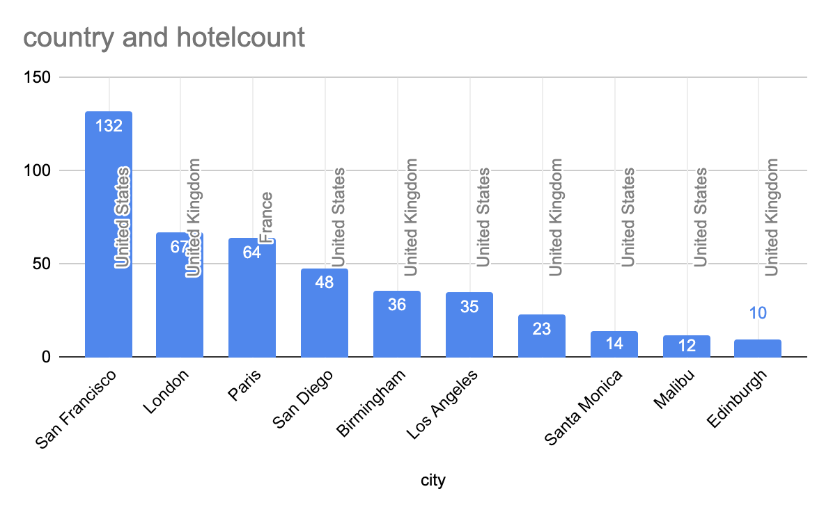
2. Task: Find the top 10 cities with the most number of hotels.
|
1 2 3 4 5 6 7 8 9 10 11 |
SELECT country, city, COUNT(1) hotelcount FROM `travel-sample` WHERE type = 'hotel' GROUP BY country, city ORDER BY hotelcount DESC LIMIT 10 |
Results:
|
1 2 3 4 5 6 7 8 9 10 11 12 13 |
city country hotelcount "San Francisco" "United States" 132 "London" "United Kingdom" 67 "Paris" "France" 64 "San Diego" "United States" 48 "Birmingham" "United Kingdom" 36 "Los Angeles" "United States" 35 "United Kingdom" 23 "Santa Monica" "United States" 14 "Malibu" "United States" 12 "Edinburgh" "United Kingdom" 10 |
The only customization to the histogram here is to add the data labels to show the actual number of hotels.
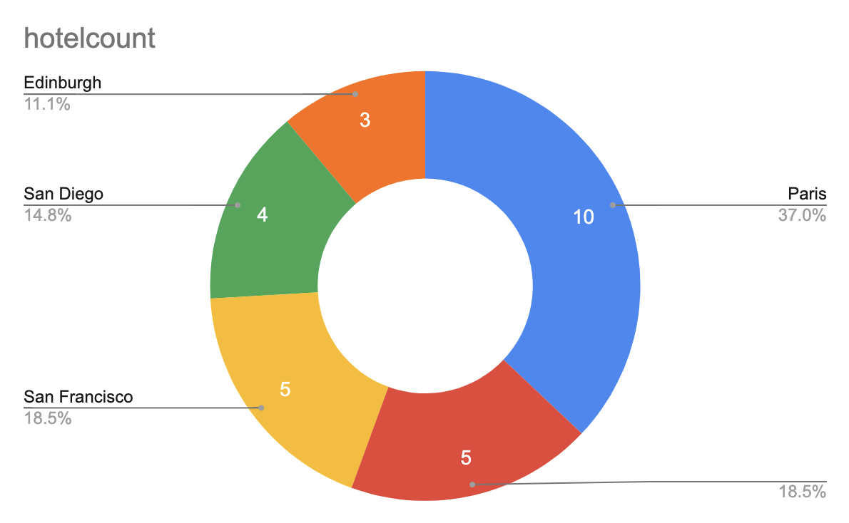
2. Task: Find the top 5 cities with the most number of hotels with “gardens” in the review
|
1 2 3 4 5 6 7 8 9 10 |
SELECT city, COUNT(1) hotelcount FROM `travel-sample` WHERE type = 'hotel' AND ANY r IN reviews SATISFIES search(r.content, "garden") END GROUP BY city ORDER BY hotelcount DESC LIMIT 5; |
|
1 2 3 4 5 6 |
city hotelcount "Paris" 10 5 "San Francisco" 5 "San Diego" 4 "Edinburgh" 3 |
Simply choose the “Doughnut piechart” and add the labels.
6. Bubble charts require you to create the percentage value for each row. The window function RATIO_TO_REPORT() help you to do that easily. Once you have your query, creating a bubble
|
1 2 3 4 5 6 7 8 9 10 11 12 13 14 |
SELECT country, city, SUM(ARRAY_SUM(reviews[*].ratings[*].Location)) / COUNT(1) city_avglocation, SUM(ARRAY_SUM(reviews[*].ratings[*].Service)) / COUNT(1) city_avgservice, RATIO_TO_REPORT(COUNT(1)) OVER(partition by country) * 100 ratio_val, (TO_STR(ROUND(RATIO_TO_REPORT(COUNT(1)) OVER(partition by country) * 100, 0)) || "%" ) AS ratio_percent FROM `travel-sample` WHERE type = 'hotel' group by country, city order by ratio_val desc, city_avgservice desc, city_avgvalue desc LIMIT 10 |
|
1 2 3 4 5 6 7 8 9 10 11 12 13 |
city city_avglocation city_avgservice country ratio_percent ratio_val "Paris" 13.75 15.421875 "France" "46%" 45.714285714285715 "San Francisco" 15.583333333333334 16.71969696969697 "United States" "37%" 36.56509695290859 "London" 11.567164179104477 15.746268656716419 "United Kingdom" "16%" 16.105769230769234 "San Diego" 15.583333333333334 16.729166666666668 "United States" "13%" 13.29639889196676 "Los Angeles" 11.971428571428572 12.628571428571428 "United States" "10%" 9.695290858725762 "Birmingham" 14.666666666666666 18.083333333333332 "United Kingdom" "9%" 8.653846153846153 "Avignon" 10.375 13.375 "France" "6%" 5.714285714285714 16.91304347826087 17.782608695652176 "United Kingdom" "6%" 5.528846153846153 "Chamonix-Mont-Blanc" 18 29.142857142857142 "France" "5%" 5 "Nice" 11.571428571428571 15 "France" "5%" 5 |

Bubble chart showing avg rating by location, etc. The size of the bubble shows the %ge of hotels represented within the respective country.
This animated GIF shows how to create this chart.

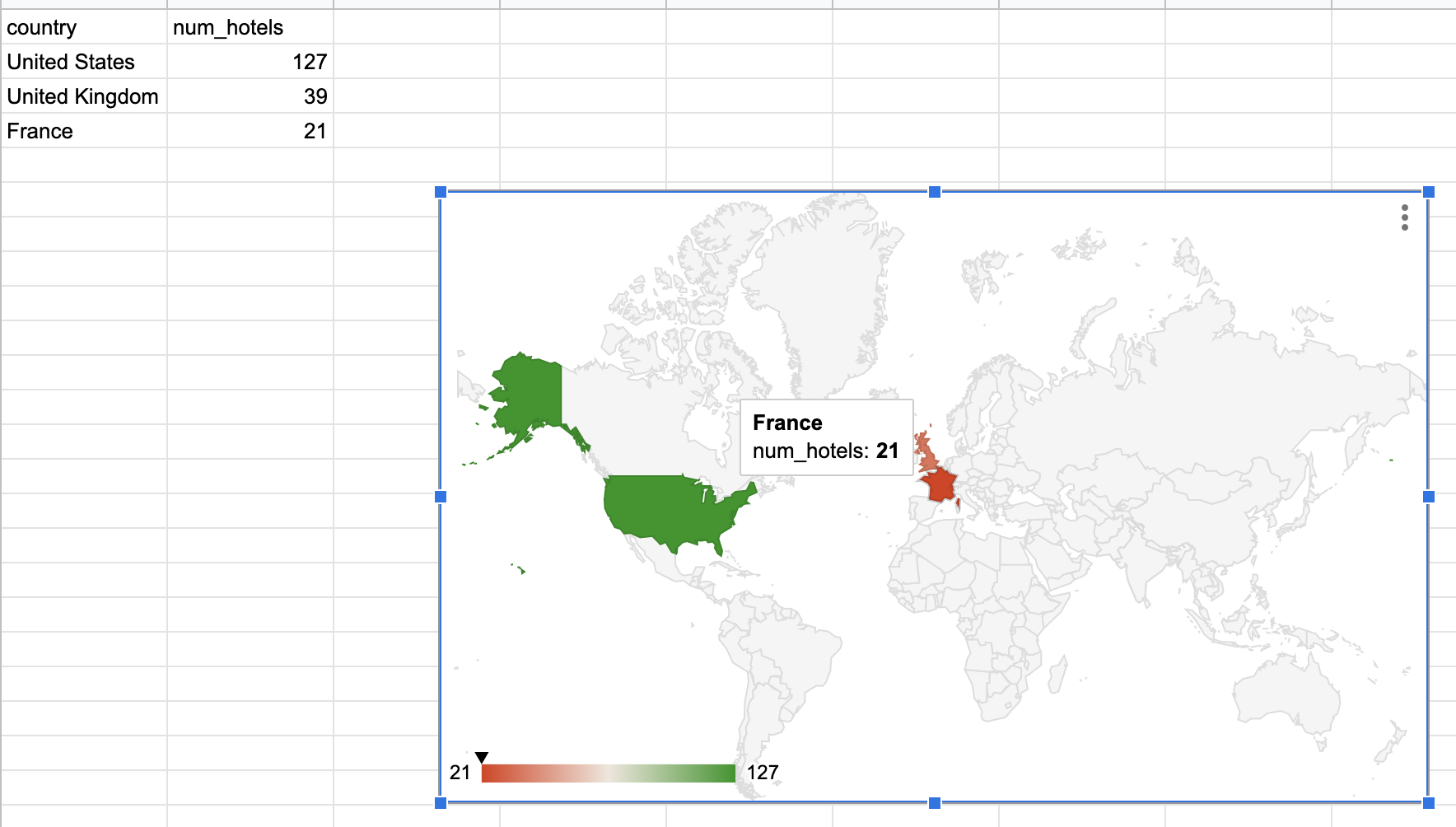
7. Creating geo charts is pretty easy in google charts since it recognizes the countries and cities. You don’t need to deal with latlongs.
|
1 2 3 4 5 |
Select country, count(1) num_hotels from `travel-sample` where type = 'airline' |
|
1 2 3 4 5 6 |
country num_hotels "United States" 127 "United Kingdom" 39 "France" 21 |
With the data above, simply paste into a google sheet and then create a geo chart.
8. You can also create a geo chart with markers (proportional bubbles), again, using the RATIO_TO_REPORT() window functions.
|
1 2 3 4 5 6 7 8 |
SELECT country, COUNT(1) AS num_hotels, (TOSTR(ROUND(RATIO_TO_REPORT(COUNT(1)) OVER () * 100,0)) || "%") AS hotels_percent FROM `travel-sample` WHERE type = 'hotel' GROUP BY country; |
|
1 2 3 4 5 6 |
country hotels_percent num_hotels "United Kingdom" "45%" 416 "France" "15%" 140 "United States" "39%" 361 |
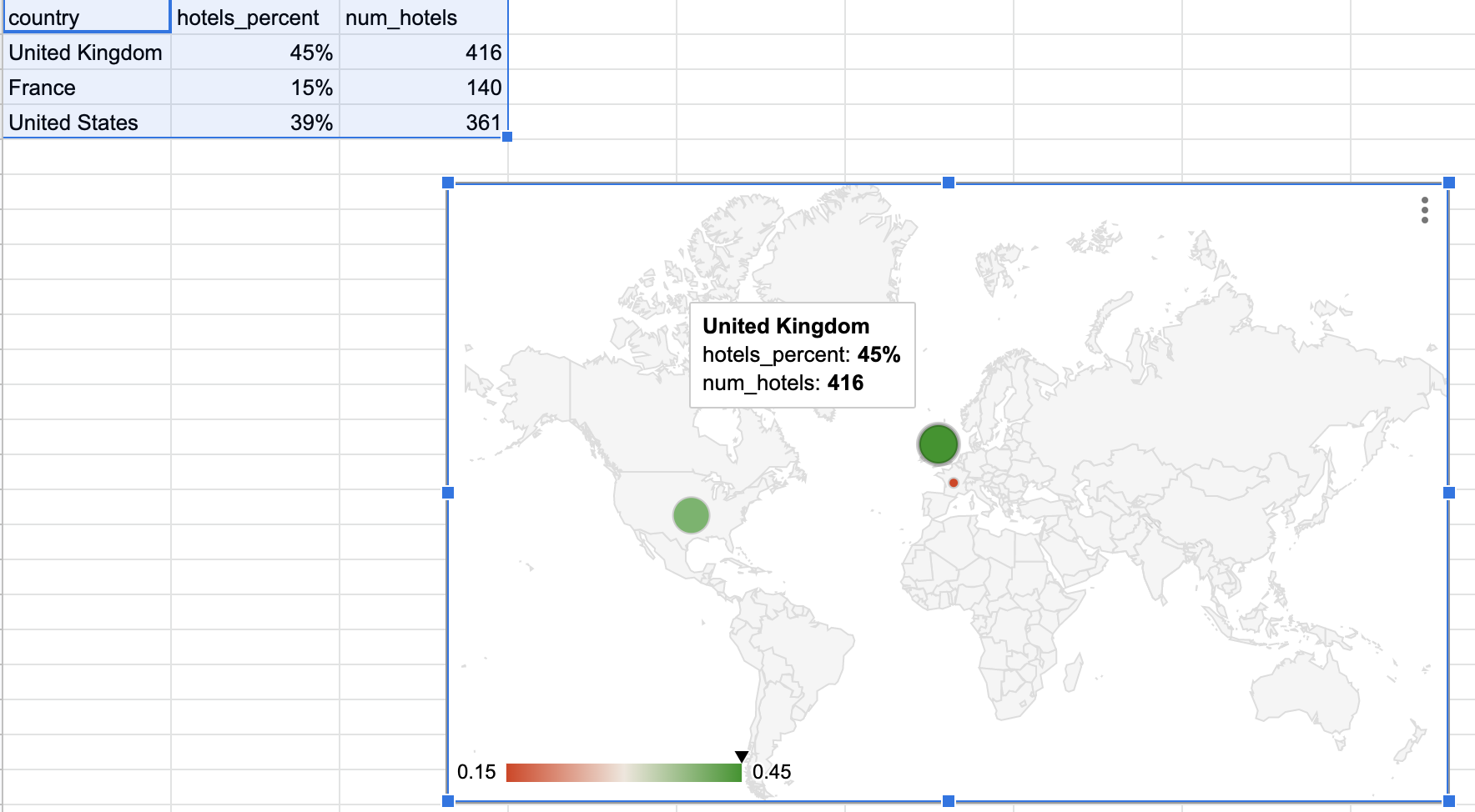
You can also customize the charts to the region, for example, the United States.
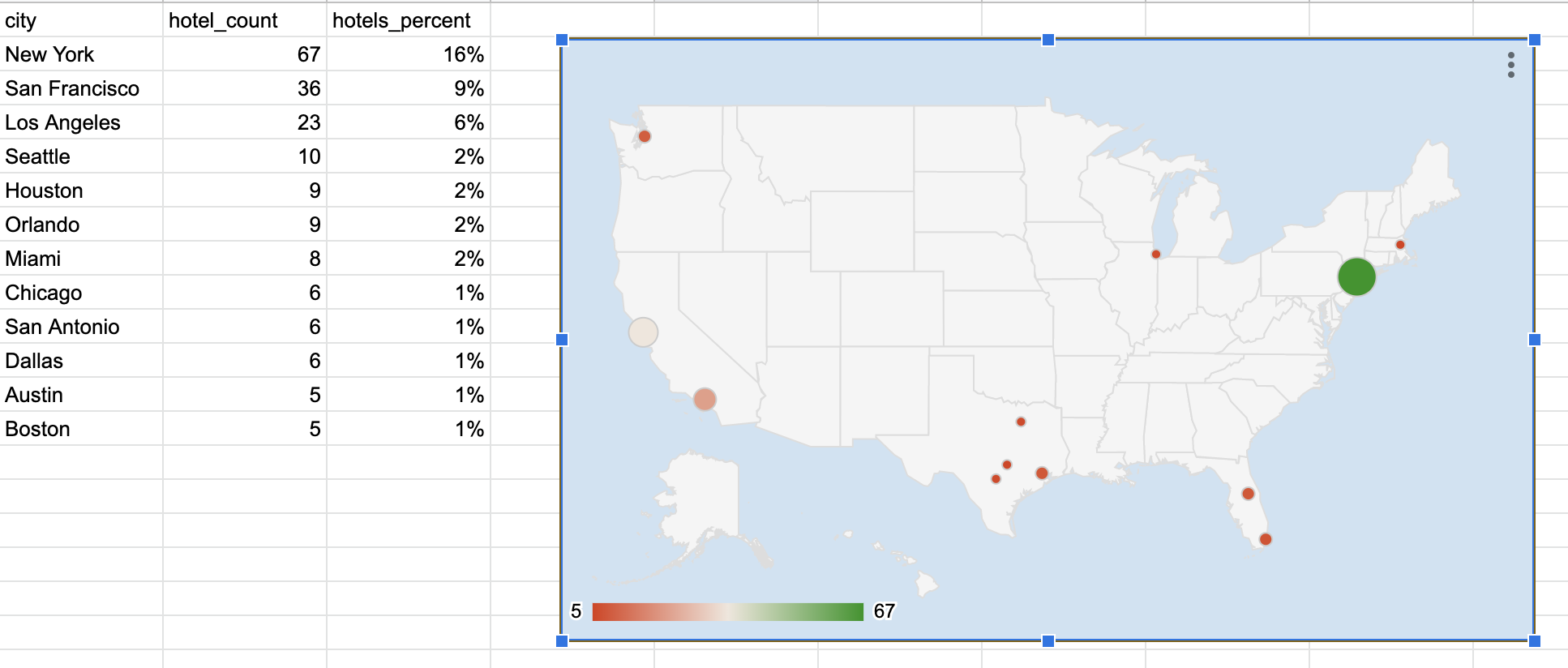
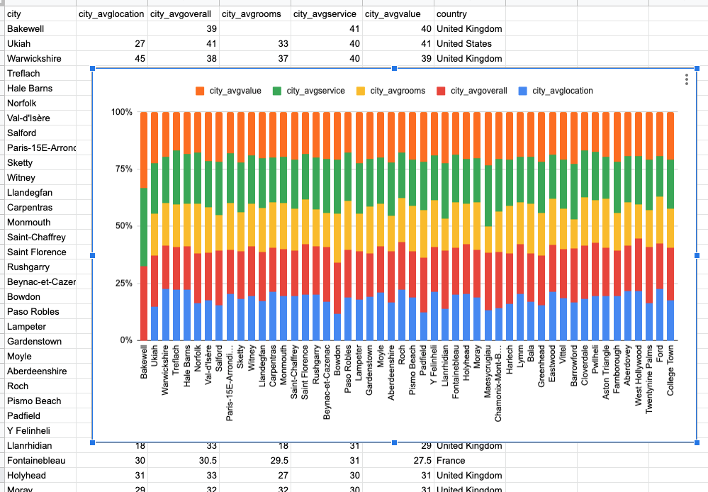
Finally, the query to generate the first graphic of this blog:
|
1 2 3 4 5 6 7 8 9 10 11 12 13 |
SELECT country, city, SUM(ARRAY_SUM(reviews[*].ratings[*].Location)) / COUNT(1) city_avglocation, SUM(ARRAY_SUM(reviews[*].ratings[*].Service)) / COUNT(1) city_avgservice, SUM(ARRAY_SUM(reviews[*].ratings[*].Overall)) / COUNT(1) city_avgoverall, SUM(ARRAY_SUM(reviews[*].ratings[*].Rooms)) / COUNT(1) city_avgrooms, SUM(ARRAY_SUM(reviews[*].ratings[*].`Value`)) / COUNT(1) city_avgvalue FROM `travel-sample` WHERE type = 'hotel' group by country, city order by city_avgservice desc, city_avgvalue desc LIMIT 50 |