Customer attrition is a metrics used by many businesses to monitor and quantify the loss of customers and/or clients for various reasons. Why? For most business lines, it is more expensive to acquire new customers than to keep the ones they already have. Business leaders routinely request analytics teams to understand customer behavior data. Output from such analyses could be instrumental in the development and introduction of targeted customer retention promotions or communications to lessen customer attrition to competitors. This post illustrates the applications of preparing categorical features for customer churn exploratory data analysis using python.
The data set used in this post was obtained from this site . The specific file you need to download is “WA_Fn-UseC_-Telco-Customer-Churn.csv”. It’s a telecom company data that included customer-level demographic, account and services information including monthly charge amounts and length of service with the company. Customers who left the company for competitors (Yes) or staying with the company (No) have been identified in the last column labeled Churn.
Load Required Libraries
import pandas as pd
import matplotlib.pyplot as plt
import seaborn as sns
Import Dataset
churn1 = pd.read_csv('C://Users// path to the location of your copy of the saved csv data file //Customer_churn.csv')
Examining The Dataset
An important first step of data analytics project is to become familiar with the structure of the dataset itself.
print(churn1.shape)
print("The data set contains: {} rows and {} columns".format(churn1.shape[0], churn1.shape[1]))

(7043, 21)
The data set contains: 7043 rows and 21 columns
Next, we would want to know the number of categorical features.
print("Number of categorical features : {}".format(len(churn1.select_dtypes(include=['object']).columns)))
print("Number of numerical features : {}".format(len(churn1.select_dtypes(include=['int64', 'float64']).columns)))

Number of categorical features : 18
Number of numerical features : 3
Gathering information about the different data fields is also part of the early steps of data analysis.
churn1.dtypes
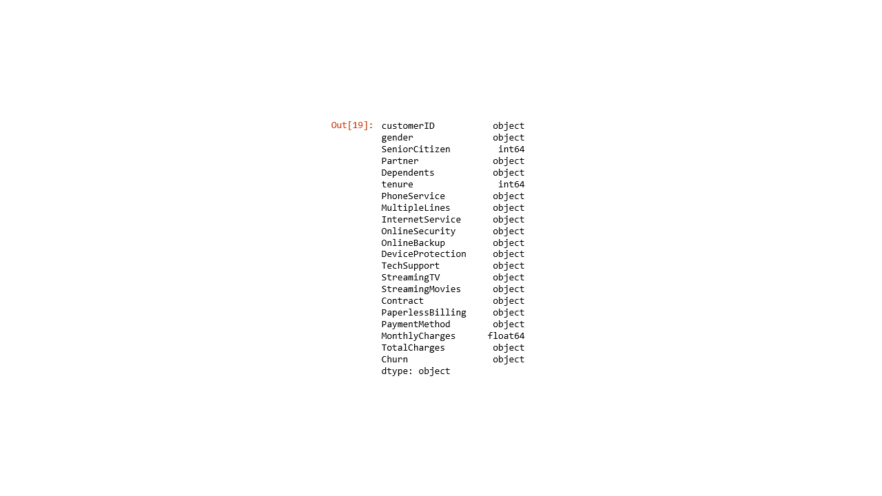
The data set contains 18 potential categorical features and 3 numerical columns. You can also use churn1.info() which would output the above information along with the number of rows, columns, memory usage, among others.
How about data levels (unique data values) in each column?
churn1.nunique()
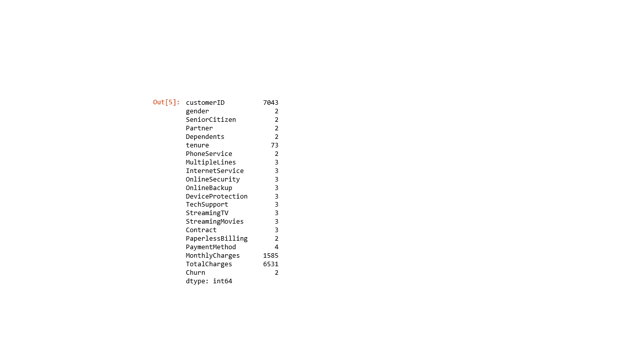
Many of the categorical features are comprised of 2 to 4 unique values, except for customerID and TotalCharges columns with over 6,500 unique values each.
Preparing Data for Analysis
Often, excluding selected data fields is a necessary part of the initial data analysis step. In this case, I suggest to drop CustomerID and TotalCharges columns from further consideration. The code to exclude columns is shown below.
churn1.drop(['customerID', 'TotalCharges'], axis=1, inplace=True)
When we check the size of the updated dataset using the code below,
print("You would notice that the updated dataset contains: {} rows and {} columns, instead of the original 21 columns".format(churn1.shape[0], churn1.shape[1]))
You would notice that the updated dataset contains: 7043 rows and 19 columns, instead of the original 21 columns
Since this post deals with the application of categorical features for data analysis, let’s examine the three numerical variables (SeniorCitizen, Tenure & MonthlyCharges) and try to show how to coerce these variables into categorical features.
First, looking at the unique levels output above, the SeniorCitizen column contains two unique levels. Let’s examine what these levels are.
churn1['SeniorCitizen'].unique()

array([0, 1], dtype=int64)
Turns out, values for SeniorCitizen are coded as 0 & 1. We can either coerce 0 and 1 as factors (category value); or recode 0 and 1 to ‘No’ and ‘Yes’ format, I chose the latter approach for consistency with the way values in the other categorical features are coded.
One way to recode values is to use the map method that accepts a dictionary object containing a mapping of values like below.
senior = {0 : 'No',
        1 : 'Yes'}
churn1['SeniorCitizen'] = churn1['SeniorCitizen'].map(senior)
Verify if levels in SeniorCitizen have changed to ‘No’ and ‘ Yes’.
churn1['SeniorCitizen'].unique()

array(['No', 'Yes'], dtype=object)
Let’s explore tenure vs churn using density plot visualization
sns.set_style('whitegrid')
g1 = sns.kdeplot(churn1[churn1['Churn'] == 'Yes']['tenure'], shade=True, color="b", label='Churn = Yes')
g1 = sns.kdeplot(churn1[churn1['Churn'] == 'No']['tenure'], shade=True, color="r", label='Churn = No')
plt.legend(loc='center left', bbox_to_anchor=(1, 0.5))
plt.xlabel('Tenure (Months)', fontsize=18)
plt.ylabel('Frequency', fontsize=18)
plt.show()
Produces this plot
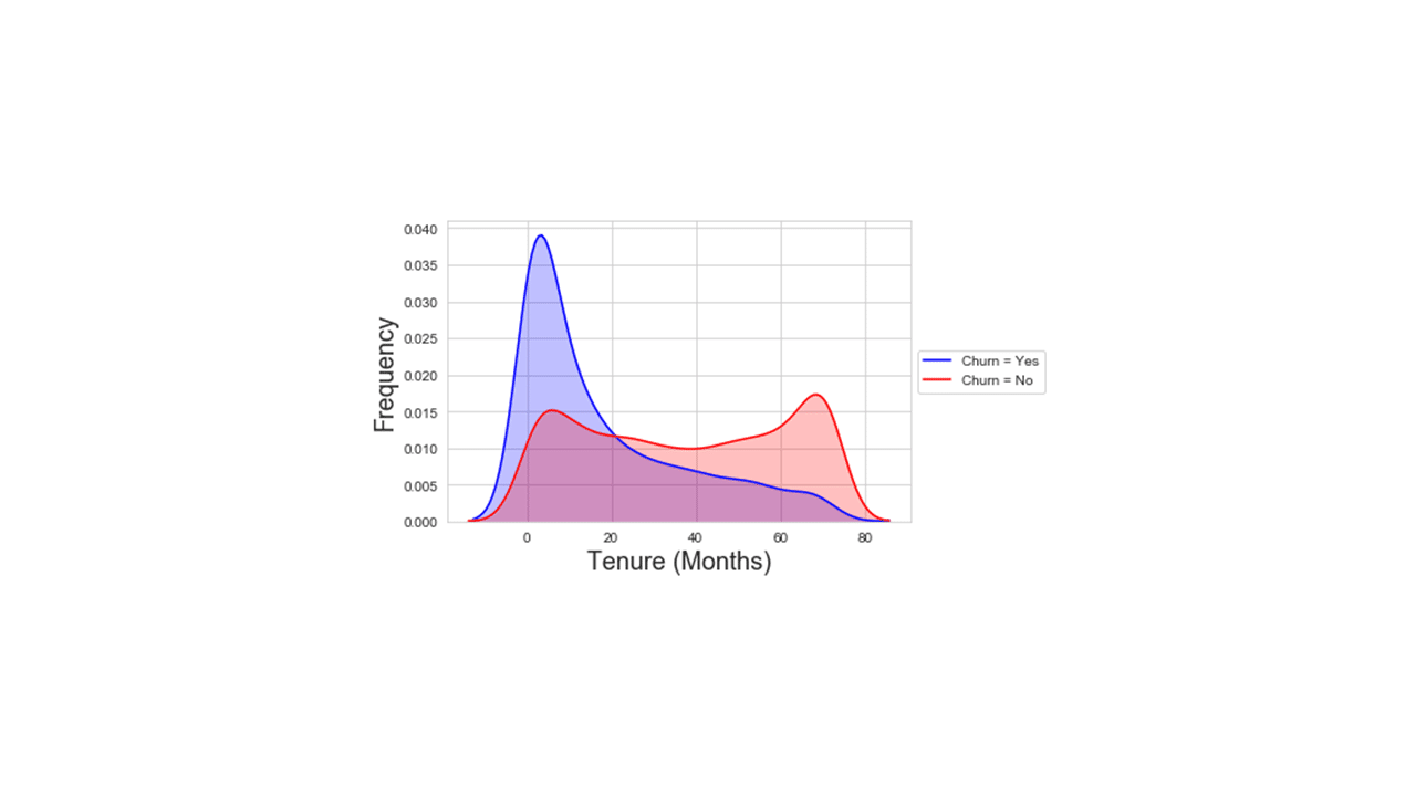
Looking at the data distribution in the plot above, values in the tenure numerical column could be coerced to a 2-level short vs long category using, for example, 24 months as a cut-off point as follows.
# Code to define values and coerce the numerical tenure into a categorical feature.
def tenure(data):
    if 0 < data  <= 24 :
        return 'Short'
    else:
        return 'Long'

churn1['tenure'] = churn1['tenure'].apply(tenure)
Verify if levels in tenure have changed to ’Short’ and ‘Long’.
churn1['tenure'].unique()

array(['Short', 'Long'], dtype=object)
Explore Monthlycharges vs Churn using density plot visualization
sns.set_style('whitegrid')
g2 = sns.kdeplot(churn1[churn1['Churn'] == 'Yes']['MonthlyCharges'], shade=True, color="b", label='Churn=Yes')
g2 = sns.kdeplot(churn1[churn1['Churn'] == 'No']['MonthlyCharges'], shade=True, color="r", label='Churn=No')
plt.legend(loc='center left', bbox_to_anchor=(1, 0.5))
plt.xlabel('Monthly Charges ($)', fontsize=18)
plt.ylabel('Frequency', fontsize=18)
plt.show()
Produces this plot
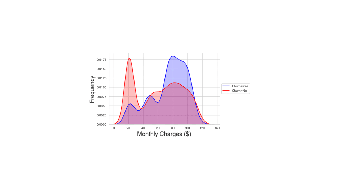
Looking at the data distribution in the plot above, values in the MonthlyCharges numerical column could be coerced to a 2-level LowCharge vs HighCharge category using, for example, $70 as a cut-off point as follows.
# Code to define values and coerce the numerical MonthlyCharges into a categorical feature.

def charges(data):
    if 0 < data  <= 70 :
        return 'LowCharge'
    else:
        return 'HighCharge'

churn1['MonthlyCharges'] = churn1['MonthlyCharges'].apply(charges)
Looking at the data structure, some data columns need recoding. For instance, changing values from “No phone service” and “No internet service” to “No”, for consistency. The following code statements are to recode those observations and more.
Another way to recode values is to use the replace method that also accepts a dictionary object.
recode = {'No phone service' : 'No',
          'No internet service' : 'No',
            'Fiber optic' : 'Fberoptic',
            'Month-to-month' : 'MtM',
            'Two year' : 'TwoYr',
            'One year' : 'OneYr' ,
            'Electronic check' : 'check',
            'Mailed check' : 'check',
            'Bank transfer (automatic)' : 'automatic',
            'Credit card (automatic)' : 'automatic'
            }
churn1.replace(recode, inplace=True)
It’s time to check for missing values in the dataset.
churn1.isnull().sum().sort_values(ascending=False)
There are no missing values.
Now, the dataset is ready for aggregation and visualization analysis.
What Was The Overall Customer Churn Count in the Dataset?
The overall customer churn count can be determined by
print(churn1.Churn.value_counts())

No 5174 Yes 1869 Name: Churn, dtype: int64
Visualizing Overall Customer Churn Count
An important task during data exploratory process is making data visualizations. Python has many libraries for making plots. In this post, we are using the matplotlib and seaborn libraries.
sns.countplot(churn1.Churn)
Produces this plot.
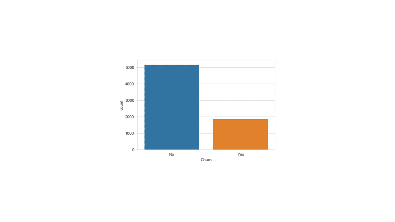
The plot shows customer counts of over 5000 No-Churn and close to 2000 Yes-Churn.
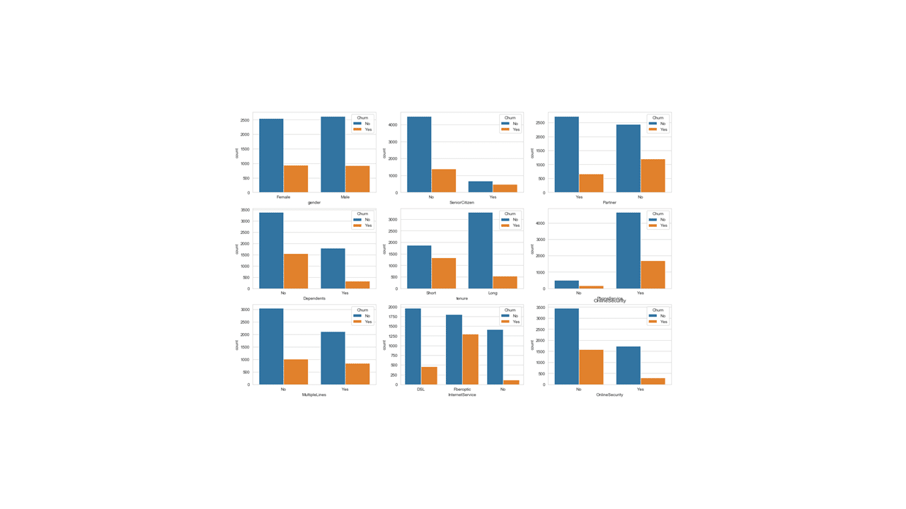
There are 18 categorical features in the dataset. So, we can make two sets of a 3×3 count plots for each categorical feature.
Below is a code for a 3×3 count plot visualization for the first set of nine categorical features.
churn1a = churn1[['gender', 'SeniorCitizen', 'Partner', 'Dependents', 'tenure',
       'PhoneService', 'MultipleLines', 'InternetService', 'OnlineSecurity','Churn']]

import seaborn as sns
fig, ax = plt.subplots(3, 3, figsize = (18, 12))

for i, ax in enumerate(fig.axes):
    if i < len(churn1a.columns) - 1:
        sns.countplot(x=churn1a.columns[i],hue='Churn', data=churn1a, ax=ax)
        plt.title(churn1a.columns[i])
Produces this 3 x 3 plot
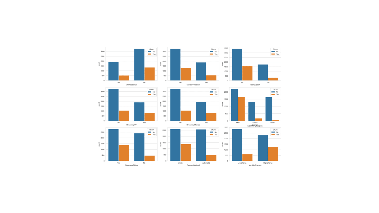
Below is a code for a 3×3 count plot for the second set of nine categorical features
churn1b = churn1[['OnlineBackup', 'DeviceProtection', 'TechSupport', 'StreamingTV',
       'StreamingMovies', 'Contract', 'PaperlessBilling', 'PaymentMethod',
       'MonthlyCharges', 'Churn']]

fig, ax = plt.subplots(3, 3, figsize = (18, 12))

for i, ax in enumerate(fig.axes):
    if i < len(churn1b.columns) - 1:
        sns.countplot(x=churn1b.columns[i],hue='Churn', data=churn1b, ax=ax)
        plt.title(churn1b.columns[i])
Produces this 3x 3 plot!
Visualizing customer churn rates for each categorical feature
Although it is convenient to visualize customer churn counts across the different categorical features, it is not easy to pick out the feature(s) with the lowest attrition rate. By using relative values (proportions), one can quickly compare churn rates across categories.
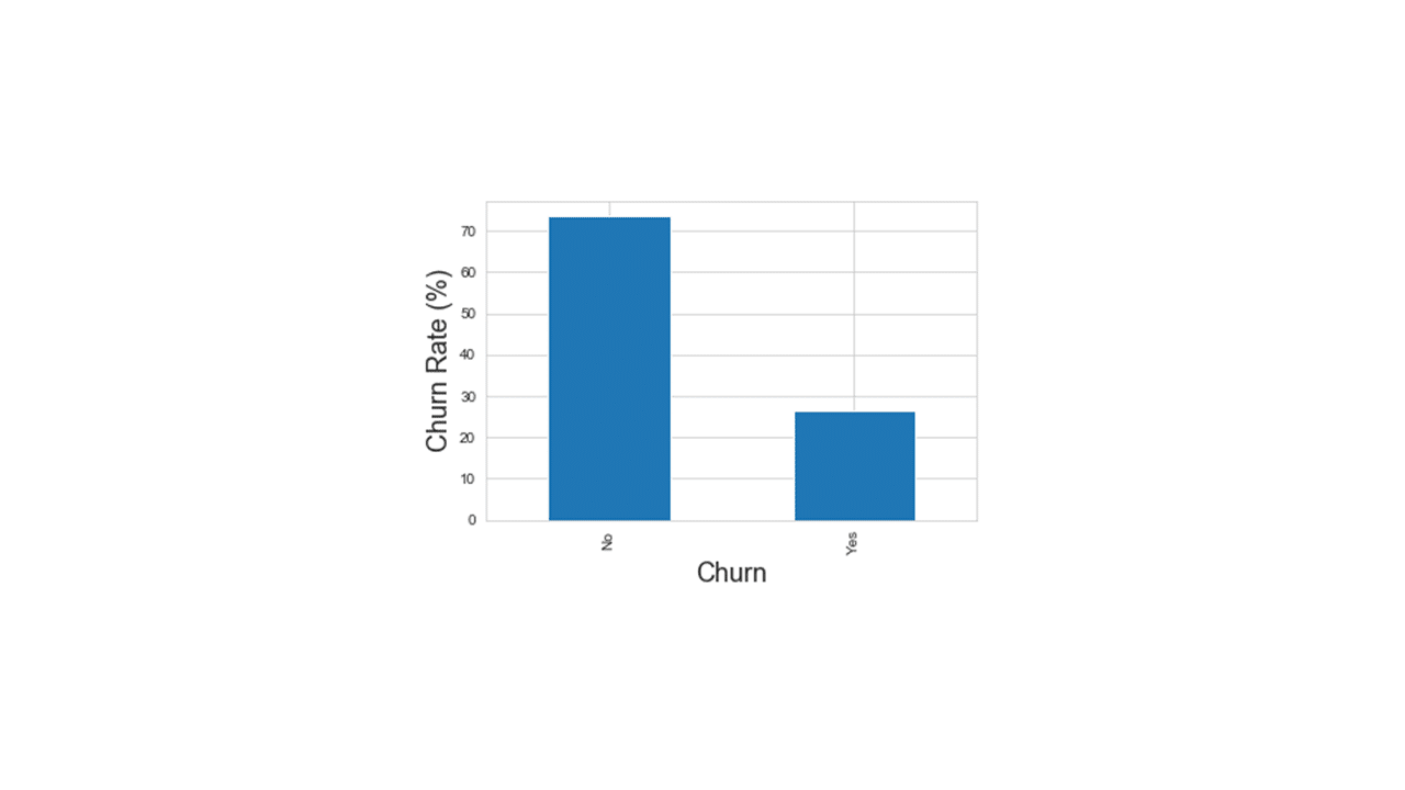
Overall Customer Churn Rate
mt1 = churn1.Churn.value_counts(normalize='columns')*100
print("Proportion of customers that did churn: {:.1f}%".format(mt1.iloc[1]))
print("Proportion of customers that did not churn: {:.1f}%".format(mt1.iloc[0]))

Proportion of customers that did churn: 26.5%
Proportion of customers that did not churn: 73.5%
want to display overall churn rate as a bar graph
mt1.plot(kind="bar")
plt.ylabel('Churn Rate (%)', fontsize=18)
plt.xlabel('Churn', fontsize=18)
plt.show()
Produces this plot!
The following code will transform the dataset from wide to narrow format and then calculates churn rate for each categorical feature.
tt = pd.melt(churn1, id_vars=['Churn'], value_vars=churn1[churn1.columns[1:18]],
             var_name='variable1', value_name='event')


## concatenate two colums to create a descriptive variable name
tt['variable2'] = tt['variable1'] +'_'+tt['event']

mt1 = pd.crosstab(tt.Churn, tt.variable2, normalize='columns').T.add_prefix('churn_')
mt2 = mt1.assign(**mt1.index.to_frame()).sort_values(['churn_Yes'])
The code below is for a plot showing customer churn rates for each categorical feature.
sns.barplot(y='variable2', x='churn_Yes', data=mt2)
t1 = sns.set_style('whitegrid')
plt.xlabel('average churn rate', fontsize=18)
plt.ylabel('Feature', fontsize=18)
plt.axvline(.265, ls=":", lw=4, color='red', c=".5")
plt.show()
Produces this plot.
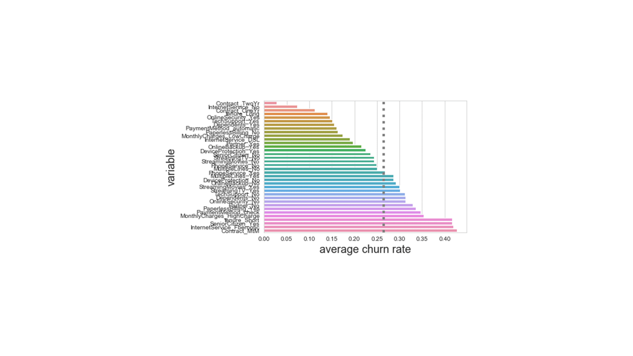
Looking at the figure above produced using relative churn rates, customers with longer contracts, customers with additional product subscriptions and usage such as online security services, device protection, and tech support, customers with dependents or partners, or customers paying with automatic payments by credit card or bank transfers showed a much lower than average rates of attrition. On the other side, customers who paid with check, those with month to month contracts, paperless billing, those with higher monthly charges showed considerably higher than average rates of attrition and have left the telecom company.
In conclusion
In this post, we have focused on handling and working with categorical features as it relates to customer churn analysis. We have employed three python libraries (pandas, matplotlib, and seborn) for the task. The analysis showed that such features as length of service contract, method of paying monthly bills, subscription of additional product types and even customer demography appeared to have played a role in customer retention. Of particular focus for business leaders from this data could be the high attrition rates for fiber optic technology subscribers vs those with DSL internet services. The next step for this company could be to entertain predictive and prescriptive models that would score leads and prospects for the propensity of risk to churn. This is all this post has to offer. Part-2 will follow on multiple correspondence analysis of categorical features in python.