Responsive webpages often rearrange content while loading. This can lead to considerable frustration for users when the text they are reading is suddenly moved off-screen. In this article, we’ll look at several new and existing ways to solve this performance problem.
Fluid layouts were possible from the moment Sir Tim Berners-Lee developed the first web browser (as well as HTML, a page editor, web server, HTTP and DNS). Web content was only constrained by the width of the browser viewport.
In the days of dial-up access, developers religiously added width and height attributes to every img tag. This ensured appropriate space was allocated on the page before the image started to download and reflows were avoided.
<img src="myimage.jpg" width="400" height="300" alt="my image" />
The unitless dimensions refer to pixels. In this case, a 400×300 area would be reserved and the image would be stretched or squeezed into that space, even if the real dimensions did not match.
As the web evolved, designers and developers moved toward fixed-width layouts, which were easier to comprehend, design, and code. Image width and height attributes became more critical when they were used to determine layout dimensions.
Unfortunately, fixed layouts were only effective when the browser was wide enough to accommodate the design. A 960px-width layout design looked good on a 1024×768 monitor, but somewhat sparse on a larger screen, and required awkward horizontal scrolling on a smaller device.
The smartphone revolution — and the iPhone launch in particular — changed everything. Small screens rapidly became important and, while the devices were capable of rendering standard webpages, panning and zooming to read text was laborious. Web developers initially solved the problem by duplicating content into alternative mobile sites, often with an “m” subdomain.
Ethan Marcotte’s pivotal 2010 article titled “Responsive Web Design” explained how CSS media queries could be used to create a single site layout that adapted to the viewport dimensions. Various techniques emerged, and for the past decade developers have been encouraged to omit img width and height attributes and use CSS sizing instead. For example, you could size an image to the width of its container.
img {
  width: 100%;
  height: auto;
}
You could also ensure an image was no wider than its actual pixel width.
img {
  max-width: 100%;
  height: auto;
}
This technique had an unfortunate consequence: page space could only be allocated once the image started to download and the browser could determine its dimensions. Content had to be reflowed as each image started to appear. The text you were reading could suddenly move or disappear off-screen, especially on mobile devices.

The loading issue is also evident with videos, iframes, and advertising.
There is no easy way to solve this problem within web code. Determining whether an asset has started to load and unintentionally reflowed content is currently impossible. Browsers have implemented scroll anchoring in an attempt to prevent content jumping, but the annoyance still occurs.
An aspect ratio defines the relationship between an element’s width and height. Consider a typical 16:9 screen: for every 16 units across, the screen is nine units deep.
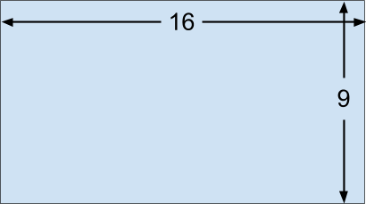
If we know one dimension, we can calculate the other.
Note: televisions and monitors are normally advertised using the diagonal measurement. Using a little Pythagorous, an 85-inch, 16:9 screen would therefore be 74.1×41.7 inches. The screen size calculator does the hard work for you.
In the case of browser rendering, the width of an HTML element is often known almost immediately because it can be determined during the initial layout. If an aspect ratio can be provided, the height and corresponding area can be calculated and reserved.
Firefox 71 and above calculates aspect ratios when the width and height attributes are defined in an img tag.
<!-- set a 400:300 - or 4:3 - aspect ratio -->
<img src="myimage.jpg" width="400" height="300" alt="my image" />
CSS can be used to size the image to the width of its containing element.
img {
  width: 100%;
  height: auto;
}
height: auto is essential to ensure the image height is not fixed at 300px.
Therefore, if a 4:3 image is shown in a 200px-width parent container, its corresponding height is calculated and a 200px-by-150px area can be reserved before the image starts to download. The result is a jank-free loading experience.

Any appropriate img width and height can be used since the image is resized by CSS (e.g., width="4" height="3". However, it is best to set a reasonable size to ensure the image remains visible in very old browsers, if CSS fails to load, or when a user style sheet is defined.
Firefox 71 is set to be released in December 2019, and Chrome will support aspect ratio calculations shortly after. However, you can add img width and height attributes now. Older browsers and those without support will not reserve space, but the image will be sized as before.
Responsive images use the srcset and sizes attributes to define a set of bandwidth-efficient alternatives. This is typically used on high native resolution screens (HiDPI or Retina) to ensure the best quality image is downloaded. For example, only use the highest-resolution img-400.jpg on 4x DPI devices.
 <img width="100" height="100"
      alt="responsive image"
        src="img-100.jpg"
     srcset="img-100.jpg 1x,
             img-200.jpg 2x,
             img-300.jpg 3x,
             img-400.jpg 4x" />
It can also be used to load appropriate images for the space available. For example, use img-400.jpg when the browser viewport approaches a 400px width.
<img width="100" height="100"
       alt="responsive image"
       src="img-100.jpg"
    srcset="img-100.jpg 100w,
            img-200.jpg 200w,
            img-300.jpg 300w,
            img-400.jpg 400w" />
Each image should use the same aspect ratio so the img width and height can be set.
The HTML picture element requests one of its child elements according to browser support and conditions. Different images can be used according to the dimensions and orientation of a device. For example, download landscape.jpg when the viewport width is greater than the height, or fall back to portrait.jpg otherwise.
<picture>
  <source srcset="landscape.jpg"
           media="(min-aspect-ratio:1/1)" />
  <img src="portrait.jpg" alt="portrait image" />
</picture>
Each image could have a different aspect ratio. At the time of writing, browser vendors are considering the best solution. The most likely option is width and height attributes on all source and img child elements.
<picture>
  <source srcset="landscape.jpg"
           media="(min-aspect-ratio:1/1)"
           width="800" height="450" />
  <img src="portrait.jpg" alt="portrait image"
           width="450" height="800" />
</picture>
The aspect ratio is not calculated when a width and height attribute is defined for an iframe, video, or any other element. This would be useful, so two proposals have been put forward, but neither is implemented in a browser at the time of writing:
CSS aspect-ratio property, e.g. aspect-ratio: 16/9HTML intrinsicsize attribute (this seems less likely to gain support given that the width and height attributes effectively do the same thing)Let’s go over some alternative aspect ratio options that work in most browsers.
Our puffin image is 1,600×1,200, so it has a 4:3 ratio.
<img src="puffin.jpg" width="1600" height="1200" alt="a puffin" />
If we attempt to place it in an area with a different aspect ratio, such as 200×300, the browser will stretch or squash the image to fit.
img {
  width: 200px;
  height: 300px;
  border: 2px solid #000;
}

The CSS object-fit property provides further options. object-fit: fill is the default and is identical to the image shown above.
object-fit: contain ensures the whole image is scaled to fit the available space. The aspect ratio is maintained, so borders will appear on either the horizontal or vertical edges.
img {
  width: 200px;
  height: 300px;
  object-fit: contain;
  border: 2px solid #000;
}

object-fit: cover resizes the image to fit the area without showing borders. Its aspect ratio is maintained so cropping can occur.

This may not be ideal, so object-position can be used to specify the horizontal and vertical alignment, e.g., object-position: 20% 50%.

object-fit: none does not resize the image, so in this case, only a small portion will be shown.
Finally, object-fit: scale-down resizes the image as if none or contain were specified and chooses whichever results in the smallest size. Since our image is larger than the containing space, contain is effectively chosen.
The CSS background-size property provides similar options for background images.
While these methods may be appropriate for some images, they force the content into a sized container. If that container does not match the aspect ratio, parts of that content could be hidden, e.g., the playback controls on a video element.
Fortunately, there is an unusual way to define the aspect ratio of any element using the CSS padding-top or padding-bottom property. When either is expressed as a percentage, the resulting padding is proportional to the width of the element, not the height.
The following element will be a perfect 16:9 ratio since padding-top is set to 56.25 percent of the width (9 / 16 x 100 percent). The actual height is set to zero because it would normally be added to the padding.
.container-16-9 {
  position: relative;
  width: 100%;
  height: 0;
  padding-top: calc(9 / 16 * 100%);
}
If the width is 400px, the vertical padding is 56.25 percent of 400px which is 225px. The height will change as the width increases or decreases.
We can therefore place any element inside that container, such as a 16:9 video.
<div class="container-16-9">
  <video controls preload="none">
    <source src="video.mp4" type='video/mp4' />
  </video>
</div>
We can also absolutely position it to retain the aspect ratio.
.container-16-9 {
  position: relative;
  width: 100%;
  height: 0;
  padding-top: calc(9 / 16 * 100%);
}

.container-16-9 > :first-child {
  position: absolute;
  width: 100%;
  height: 100%;
  top: 0;
  left: 0;
}

It would be great if we could extract the container’s width and height attributes as CSS attr() values, then use them in a calc(), but that is not possible because the attr() function only returns a string for use in content properties. However, browser vendors are considering casting.
Therefore, we can define a series of known ratios.
.aspect {
  position: relative;
  width: 100%;
  height: 0;
  padding-top: 100%; /* default 1:1 */
}

.aspect.ratio-16-9 {
  padding-top: calc(9 / 16 * 100%);
}

.aspect.ratio-9-16 {
  padding-top: calc(16 / 9 * 100%);
}

.aspect.ratio-4-3 {
  padding-top: calc(3 / 4 * 100%);
}

.aspect.ratio-3-4 {
  padding-top: calc(4 / 3 * 100%);
}

.aspect > :first-child {
  position: absolute;
  width: 100%;
  height: 100%;
  top: 0;
  left: 0;
}
Then, set an aspect and appropriate ratio class on the container.
<div class="aspect ratio-16-9">
  <video controls preload="none">
    <source src="video.mp4" type='video/mp4' />
  </video>
</div>
A CSS preprocessor such as Sass may be an easier option since all aspect ratios can be defined in a list and calculated at build time.
// define all known ratios
$ratio:
  (w: 16, h:  9 ),
  (w:  9, h: 16 ),
  (w:  4, h:  3 ),
  (w:  3, h:  4)
;

.aspect {
  position: relative;
  width: 100%;
  height: 0;
  padding-top: 100%; /* default 1:1 */
}

.aspect > :first-child {
  position: absolute;
  width: 100%;
  height: 100%;
  top: 0;
  left: 0;
}

@each $r in $ratio {
  $w: map-get($r, w);
  $h: map-get($r, h);
  .aspect.ratio-#{$w}-#{$h} {
    padding-top: $h / $w * 100%;
  }
}
The main drawback of predefining these classes is that you cannot set any aspect ratio in the HTML like you can with width and height attributes. However, custom properties (CSS variables) provide an option since an aspect ratio can be defined in a style attribute.
<!-- define a 21:9 container -->
<div style="--aspect-ratio: 21/9;">
  <video...></video>
</div>
Its value is available in CSS and can be used accordingly:
@supports (--custom:property) {

  [style*="--aspect-ratio"] {
    position: relative;
    width: 100%;
    height: 0;
    padding-top: calc( 100% / (var(--aspect-ratio)) );
  }

  [style*="--aspect-ratio"] > :first-child {
    position: absolute;
    width: 100%;
    height: 100%;
    top: 0;
    left: 0;
  }

}
This is shorter and more flexible, but will fail in older browsers without custom property support (the @supports rule ensures those browsers don’t even try).
The primary flaw of the padding trick is that the sized element must be wrapped in a container where the aspect ratio is defined. JavaScript options such as fitvids can handle this automatically, but there can still be some page reflowing as aspect ratios are calculated and containers are added.
Text content being moved by reflowing pages as they load has been a user frustration for several years, but a little light has appeared at the end of the tunnel.
For the immediate future, remember to add width and height attributes to all img tags. Consider using the padding percentage trick on video and iframe containers if they are likely to cause a reflow.
As browsers evolve, the CSS aspect-ratio property may become an essential way to reserve page space, and the era of janky page loading will be over.
As web frontends get increasingly complex, resource-greedy features demand more and more from the browser. If you’re interested in monitoring and tracking client-side CPU usage, memory usage, and more for all of your users in production, try LogRocket.

LogRocket is like a DVR for web and mobile apps, recording everything that happens in your web app, mobile app, or website. Instead of guessing why problems happen, you can aggregate and report on key frontend performance metrics, replay user sessions along with application state, log network requests, and automatically surface all errors.
Modernize how you debug web and mobile apps — start monitoring for free.

The AHA stack — Astro, htmx, and Alpine — is a solid web development stack for smaller apps that emphasize frontend speed and SEO.

Explore what Hattip is, how it works, its benefits and key features, and the differences between Hattip and Express.js.

React Shepherd stands out as a site tour library due to its elegant UI and out-of-the-box, easy-to-use React Context implementation.

Cookies are crucial to web development. This article will explore how to handle cookies in your Next.js applications.

 Learn more →

3 Replies to "Jank-free page loading with media aspect ratios"
Impressive.
This is great but I am struggling here a bit. For example. On my photo hosting site, I display a random selection of images. These are shown as thumbnails. See here:
https://www.ag2si.com/gallerysoft/
What I am having difficulty with understanding is the following:
I created the site as responsive, so when you grow or shrink the browser, the thumbnails grow and shrink as well.
I know the aspect ratio of the original image.
I use flex and specify something like so
flex:${aspect};
However, since the page is dynamic in size, I do not know what size the thumbnails will be. Therefore, I cannot add the width and height attributes to the src tag. And a pagespeed web dev site recommends I should include them.
Does that make sense?
Thanks
JT
You set the width and height of the original image – not the dimensions it’ll be displayed at.
So a 600×450 image has width=”600″ height=”450″ regardless of how it appears on the page. The browser will calculate it’s aspect ratio so, if the resulting image width is 300px, it’ll reserve 225px of vertical space before the image has started to load.
Therefore, width=”4″ height=”3″ and width=”8000″ height=”6000″ would act identically – they’re all the same aspect ratio.