Internet users access the web from a variety of devices from desktop computers, tablets, mobile phones (high end and smaller phones) to assistive technologies.
Designing a website to accommodate these devices can be a daunting task due to different screen sizes, browser viewport, resolution and device type.
There is a particular CSS feature that can make this task approachable and if done right most of the devices accessing your site(s) will get the appropriate user experience.
Introducing Media queries. Literally speaking the word "media" means the device(s) and "queries" in this context refer to the code that will be used to target these devices.
This post will serve as an introduction and the knowledge acquired therein will serve as a stepping stone that you can build upon and will also be of great help in the Final Project of this series.
The following snippets will be used in this post with slight modifications along the way. Please save the snippets with the .html and .css extension respectively and make sure the CSS file is linked with the HTML. Remember all HTML snippets should be placed between the start and closing body tag in your HTML.
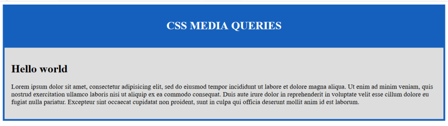
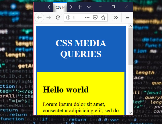
<header>
  <h1>CSS MEDIA QUERIES</h1>
</header>
<main>
  <h1>Hello world</h1>
  <p>Lorem ipsum dolor sit amet, consectetur adipisicing elit, sed do eiusmod
tempor incididunt ut labore et dolore magna aliqua. Ut enim ad minim veniam,
quis nostrud exercitation ullamco laboris nisi ut aliquip ex ea commodo
consequat. Duis aute irure dolor in reprehenderit in voluptate velit esse
cillum dolore eu fugiat nulla pariatur. Excepteur sint occaecat cupidatat non
proident, sunt in culpa qui officia deserunt mollit anim id est laborum.
</p>
</main>
/*
 * Nothing sophisticated the codes are just cosmetics
*/

header {
  padding: 1.2em;
  text-align: center;
  background-color: #1560bd;
  color: #ffffff;
}

main {
  background-color: #dddddd;
  padding: 1.2em;
  border: 5px solid #1560bd;
}

p {
  font-size: 1.2em;
  color: black;
}
And kindly note that all screenshots are from Firefox 70 web browser and its Developer Tools.
With that out of the way, Let's start.
Media queries are used to modify your website or web application depending on the device type or characteristics.
They have varying use cases but the most common one you'll find is; Responsive Design. Responsive design is all about altering the layout of your site based on device screen size or orientation.
We'll talk about media types that we can target and also their characteristics better known as media features.
Let's start with media types.
TARGETING MEDIA TYPES
The category of devices that can be targeted with a media query can be categorized into four. Technically speaking these categories are referred to as Media Types . They are:
-
all- This will be applicable to all devices -
print- This apply to document that will be printed by the user -
screen- Mainly for screen like computers and handheld devices -
speech- This is intended for speech synthesizers
Now that we know the category of devices we'll cater for, what's next is how to actually use a media query.
Media queries can be applied to an HTML document using any of the following method:
- via the
mediaattribute for thestyleandlinktags - using the
@mediarule in your CSS files
It's time for some code. But first, load the HTML in your browser.
Back to our code editor we will apply some media attribute to the style tag to hide the h1.
Add the following to your in the head tag of your HTML:
<style media="screen">
  h1 {
   display: none;
  }
</style>
Refresh your browser, you will realize the h1 tag is hidden, technically speaking you should not hide critical part of the web page on screen like we just did. This is just for learning purposes only.
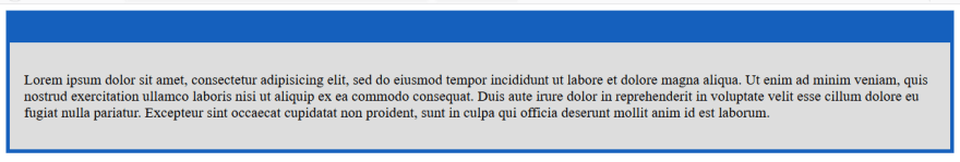
The h1 is only hidden from the screen, if you print the document you will realize it will appear in the printed document.
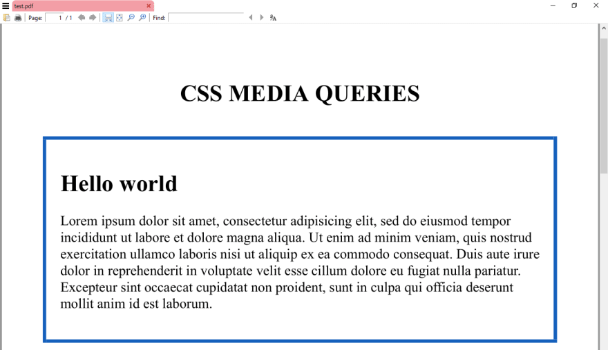
I mentioned earlier that you should not do this on screen but hiding less important part of the document when its printed is a recommended practice as it saves printer ink.
If you check our previous image you will realize the border shows up in our document in reality anyone that prints your document won't care about the border in this particular context so its best if we just hide it when the document is printed.
We'll update the code in the style tag to optimize it for printed media:
<style media="print">
  main {
    border: none;
  }
</style>
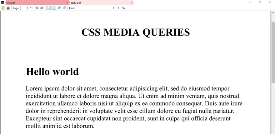
Save and refresh your browser, you'll notice no change. Go ahead and print the document, the border will not be printed.
We can repeat the same step using the@media rule inside our CSS file.
The basic syntax of the @media rule is:
@media <device type> {
    /* your CSS rules */
}
From the syntax above please note the following:
- You replace
<device type>withscreenorprintdepending on the scenario - Your CSS rules are stuff you are used to in this series e.g
p { font-weight: 12em; }
Now, delete the style tag and every code in it and switch to your CSS file then add the following at the top of your code:
/*
 * Note i have used the keyword !important to make it more
 * specific to prevent the "cascade" from overriding it
*/

@media print {
  main {
    border: none !important;
  }
}
Refresh your browser and print the document. The result will be the same.
speech should be used when you want to target speech synthesizers and all should be used for all devices.
TARGETING MEDIA FEATURES
Apart from Media Types we can also target Media Features which describe specific characteristics of the browser output device or environment.
We can not cover all media features but let's discuss the most common ones:
-
color- This will apply to any output device that has color -
height- Height of the viewport i.e the height of the available browser window -
width- Width of the available browser window -
min-width- The minimum width -
max-width- The maximum width -
hover- This will check if the user can hover over elements e.g mouse hover -
orientation- orientation of the viewport which can be landscape or portrait
Time for some code.
The following code will apply to any device with a color screen:
@media (color) {
  /* your CSS rules here */
}
Do you want to check if user can hover over elements? Here you go:
@media (hover) {
  /* your CSS rules here */
}
The specification states that this value (hover) is at risk which means it can be dropped if the specification reaches a Candidate Recommendation level. So be careful before you use it.
The min-width and max-width have a close relationship because you might want to apply some specific styles to a particular range of device screen. The min- and max- are called prefixes and they stand for minimum and maximum.
The following media rule will apply to devices with at least 320px screen size:
@media (min-width: 320px) {
     /* your CSS rules here */
}
The code inside the following media rule will apply to devices with a landscape orientation:
@media (orientation: landscape) {
     /* your CSS rules here */
}
height and width follow the same pattern. You write the width or height followed by a semicolon then the value e.g
@media (height: 450px) { /*your CSS rules here*/ }
You might find yourself in a situation where you might want a single @media rule that will test for multiple media features discussed above this is where complex media queries comes into the picture.
CREATING COMPLEX MEDIA QUERIES
Complex media queries come in handy if you want to test several device features at once. To do this we will have to familiarize ourselves with some basic Boolean logic also called Logical operators
The Boolean logic allowed in media queries are
andnot, (comma)
Others include:
only
and
When you use the and logical operator with @media rule every condition has to return true in order for the query to be true. If the query returns false the CSS code within the media query will not execute.
Take the following the example:
@media screen and (min-width: 12em) {
  /*
    * The CSS code will only execute if the device has a screen and a
    * width of at least 12em
  */
}
Another example:
@media screen and (min-width: 12em) and (orientation: landscape) {
  /*
   * The CSS code will only run if device has a screen and
   * width of at least 12em and the device orientation is landscape
  */
}
not
The not operator is used to negate a media query, returning true if the query would otherwise return false.
Take the following example:
@media not screen and (orientation: portrait) {
  /*
   * The main background color will only change to yellow if
   * the device orientation is not portrait which means the
   * background color will be yellow in landscape mode or if
   * the device orientation is too small to be considered as a portrait
  */

   main {
     background-color: yellow !important;
   }
}
Update the media query in your CSS with the code above and resize the browser to a portrait format, the background color will default to the other value declared in our CSS.

only
The only operator is used to apply a style only if an entire query matches. The specification states:
The
onlykeyword has no effect on the media query’s result, but will cause the media query to be parsed by legacy user agents as specifying the unknown media type “only”, and thus be ignored.
This means the only keyword is useful for preventing older browsers from applying selected styles. If you have to deal with an old web browser this keyword will definitely come in handy but this would be rare.
Up next, CSS Typography.


Top comments (0)