Originally posted on my blog
In this post, we are going to have some good time with CSS animations and DOM manipulation by building an animated testimonial card using HTML, CSS, and JavaScript.
You can check it live here
HTML
We start by wrapping our elements in the main tag.
<main>
  <!--This is the current testimonial-->
  <div class="testimonial-container testimonial-active">
    <div class="testimonial-header"></div>
    <div class="testimonial-body">
      <img alt="Avatar" src="" class="testimonial-avatar" />
      <h1></h1>
      <p></p>
    </div>
    <div class="testimonial-footer">
      <div>
        <span><i class="fab fa-google"></i></span>
        <span><i class="fab fa-linkedin"></i></span>
        <span><i class="fab fa-twitter"></i></span>
      </div>
      <div>
        <button id="next">
          <i class="fa fa-3x fa-chevron-circle-right"></i>
        </button>
      </div>
    </div>
  </div>
We gonna have two main div, the first will be used for the actual testimonial card and the second in the code block below will help us to show the next testimonial card.
Notice that the HTML content will be added through javaScript.
      <!--This is the next testimonial-->
      <div class="testimonial-ghost-container">
        <div class="testimonial-ghost-header"></div>
        <div class="testimonial-ghost-body">
          <img alt="Avatar" src="" />
          <h1></h1>
          <p></p>
        </div>
        <div class="testimonial-ghost-footer">
          <div>
            <span><i class="fab fa-google"></i></span>
            <span><i class="fab fa-linkedin"></i></span>
            <span><i class="fab fa-twitter"></i></span>
          </div>
          <div>
            <button id="ghost-next">
              <i class="fa fa-3x fa-chevron-circle-right"></i>
            </button>
          </div>
        </div>
      </div>
    </main>
As I said earlier, this div will be hidden at the start. But when we switch to the next testimonial, it will be used to show the two testimonial cards at the same time.
CSS
As usual, we start the CSS part with some resets.
@import url("https://fonts.googleapis.com/css?family=Roboto:400,400i,700&display=swap");

* {
  margin: 0;
  padding: 0;
  box-sizing: border-box;
}

body {
  background: #f5f6f7;
  line-height: 1.6;
  font-family: "Roboto", sans-serif;
}

main {
  display: flex;
  justify-content: center;
  align-items: center;
  height: 100vh;
  width: 100%;
  max-width: 100%;
  position: relative;
}
Then, change the font, set the background of the body to a light-grey color. Next, the main tag takes the full width and height, and we use display: flex to literally bring the testimonial card to the center of the viewport.
.testimonial-container,
.testimonial-ghost-container {
  width: 22rem;
  height: 28rem;
  background: #fff;
  border-radius: 1.2rem;
  overflow: hidden;
  position: absolute;
}
.testimonial-active {
  z-index: 1;
  box-shadow: 0.5rem 0.5rem 1rem rgba(51, 51, 51, 0.2), 0.5rem 0.5rem 1rem rgba(51, 51, 51, 0.2);
}

.testimonial-header,
.testimonial-ghost-header {
  height: 10rem;
  background-image: linear-gradient(
      to right,
      rgba(239, 124, 0, 0.8),
      rgba(255, 181, 102, 0.8)
    ), url("https://shorturl.at/grwP6");
  background-size: cover;
  background-position: cover;
}
We continue by styling our two card elements. In the .testimonial-container and .testimonial-ghost-container classes, we use position: absolute; to sit these two elements one over the other following the main tag position. Then, the .testimonial-active class will help us bring the active testimonial card to the front.
the next two classes are used to style the card header. It will have an image doubled by a gradient color as a background.
.testimonial-avatar,
.testimonial-ghost-body img {
  border-radius: 100%;
  display: block;
  margin: auto;
  margin-top: -4rem;
  border: 0.5rem solid #fff;
  z-index: 100;
}

.testimonial-body,
.testimonial-ghost-body {
  padding: 0 1rem;
  text-align: center;
  margin-bottom: 1rem;
}
This part styles the avatar of our card. We use a negative value -4rem on the margin-top property to bring the avatar in the middle of the card header and the z-index property ensures that the element will be always at the top of the header.
.testimonial-ghost-header {
  background-image: linear-gradient(
      to right,
      rgba(119, 119, 119, 0.8),
      rgba(119, 119, 119, 0.8)
    ), url("https://shorturl.at/grwP6");
}

.testimonial-ghost-body img {
  filter: blur(2px);
}

.testimonial-ghost-body h1,
.testimonial-ghost-body p i,
.testimonial-ghost-footer button i,
.testimonial-ghost-footer span i {
  color: #777;
}

.testimonial-footer,
.testimonial-ghost-footer {
  display: flex;
  justify-content: space-between;
  padding: 1rem;
}
When a change occurs, the previous testimonial card's style changes. the avatar will be blurred with filter: blur(2px);. The card header and elements color will be turned to dark, just for having a nice style.
.testimonial-active-animated {
  animation: moveRight 1.5s ease-in-out;
}

.testimonial-inactive-animated {
  animation: moveLeft 1.5s ease-in-out;
}

@keyframes moveRight {
  0% {
    transform: translateX(0);
    box-shadow: none;
  }
  50% {
    transform: translateX(-10rem);
    box-shadow: none;
  }
  100% {
    transform: translateX(0);
  }
}

@keyframes moveLeft {
  0% {
    transform: translateX(0);
    opacity: 1;
    z-index: 2;
  }
  50% {
    transform: translateX(18rem) scale(0.96);
    opacity: 0.7;
  }
  100% {
    transform: translateX(0) scale(0.98);
    opacity: 0.2;
  }
}
This code block will be essential when it comes to switching to the next testimonial. We have two animations: the first moveRight will move the element from the left to the right with the transform property and the box-shadow will be hidden to just have a more natural effect.
The second animation moveLeft will move from the left to the right and scale down a little bit with transform: translateX(18rem) scale(0.96). It will also have a fade-in effect with the opacity property. And the z-index property will place the element at the top when the animation starts.
The .testimonial-active-animated and .testimonial-active-animated will be attached to the appropriate testimonial cards.
JavaScript
As you can see here, we start by selecting the two testimonial containers.
const testimonialContainer = document.querySelector(".testimonial-container");
const testimonialGhost = document.querySelector(".testimonial-ghost-container");
const nextBtn = document.querySelector("#next");
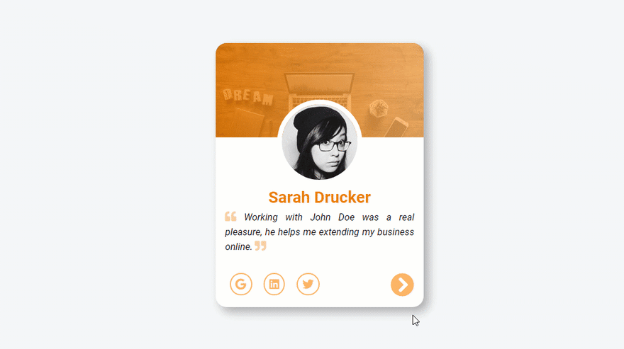
const testimonials = [
{
name: "Sarah Drucker",
text:
"Working with John Doe was a real pleasure, he helps me extending my business online.",
avatar: "https://shorturl.at/eqyGW"
},
{
name: "Nicolas Jaylen",
text:
"My business was broken, then i start working with John Doe, and now everything works fine.",
avatar: "https://shorturl.at/ptC58"
},
{
name: "Awa Fall",
text:
"John Doe helps me a lot from designing my website to make it live in just 5 weeks.",
avatar: "https://shorturl.at/lwBY1"
}
];
let counter = 0;
Then, we have a button for listening to the click event and an array of testimonials that will be displayed dynamically following the counter variable.
const handleFirstTestimonial = () => {
  // Author avatar selection
  testimonialContainer.children[1].children[0].src = testimonials[0].avatar;
  // Testimonial Author selection
  testimonialContainer.children[1].children[1].innerHTML = testimonials[0].name;
  // Testimonial text selection
  testimonialContainer.children[1].children[2].innerHTML = `
  <i class="fas fa-quote-left"></i>
  ${testimonials[0].text}
  <i class="fas fa-quote-right"></i>
  `;
};
The handleFirstTestimonial() function helps us showing the first testimonial of the array. Here, we traverse the DOM through the testimonialContainer element to select child elements. We set the avatar, the author of the testimonial, and the text with the first testimonial on the testimonials array.
const activeTestimonial = () => {
  testimonialContainer.classList.add("testimonial-active-animated");
  // Author avatar selection
  testimonialContainer.children[1].children[0].src =
    testimonials[counter].avatar;
  // Testimonial Author selection
  testimonialContainer.children[1].children[1].innerHTML =
    testimonials[counter].name;
  // Testimonial text selection
  testimonialContainer.children[1].children[2].innerHTML = `<i class="fas fa-quote-left"></i>
  ${testimonials[counter].text}
  <i class="fas fa-quote-right"></i>`;

  setTimeout(() => {
    // Remove the active animated class
    testimonialContainer.classList.remove("testimonial-active-animated");
  }, 1400);
};
Then, when the user switches to the next testimonial, we call the activeTestimonial() function to handle it. And, use the testimonialContainer to traverse the DOM and set appropriate data to the card elements. And make the animation happen with testimonialContainer.classList.add("testimonial-active-animated");, and finally, remove the animation after 1.4 seconds to be able to animate it again.
const inactiveTestimonial = () => {
  testimonialGhost.classList.add("testimonial-inactive-animated");
  let newCounter = counter;
  if (newCounter === 0) {
    newCounter = testimonials.length;
  }
  // image selection
  testimonialGhost.children[1].children[0].src =
    testimonials[newCounter - 1].avatar;
  // title selection
  testimonialGhost.children[1].children[1].innerHTML =
    testimonials[newCounter - 1].name;
  // text selection
  testimonialGhost.children[1].children[2].innerHTML = `<i class="fas fa-quote-left"></i>
  ${testimonials[newCounter - 1].text}
  <i class="fas fa-quote-right"></i>`;
  setTimeout(() => {
    // Remove the active animated class
    testimonialGhost.classList.remove("testimonial-inactive-animated");
  }, 1400);
};
Like the activeTestimonial(), the inactiveTestimonial function will handle the inactive testimonial card. We traverse the DOM with testimonialGhost to select elements and set the data to the previous testimonial card.
Here, we use a newCounter to just handle the testimonials array if the counter is equal to 0, we reassign the newCounter with the last testimonial card of the array.
nextBtn.addEventListener("click", () => {
  if (counter === testimonials.length - 1) {
    counter = 0;
    inactiveTestimonial();
    activeTestimonial();
  } else {
    counter++;
    inactiveTestimonial();
    activeTestimonial();
  }
});

handleFirstTestimonial();
To make all the magic happen, we need to listen to the click event. And check if the counter is equal to the last element of the array. If it's the case reinitialize the counter to 0 and call the needed functions. Otherwise, increment the counter variable and call inactiveTestimonial() and activeTestimonial().
Then, to start everything when the page loads, we call the handleFirstTestimonial() function.
That's all folks
You can check it live here


Top comments (4)
Love the animation and design!
I feel that an indicator showing how many testimonials there are would contribute to the UX. Also, I could image that somebody doesn't know you can show the next card by clicking the arrow. Maybe a suddle animation like a little wobble would help there :-) Wondering what you guys think about that ideas...
You're absolutely right, i will update the code with you feedback. Thanks again for your very useful comment.
This is great! The animation is smooth...
Thanks for your comment Jefferson