This post is the second part of CSS Grid part 1. If you've not read the post I'll encourage you read it before proceeding with this post.

All code snippets remain the same unless otherwise stated.
ALIGNING ITEMS ON THE GRID
Similar to Flexbox grid items can be aligned. In this section we will talk about properties that make this possible and in the next section we'll see how we can pack all the grid items to a specific location on the grid.
The properties for aligning items are as follows:
justify-itemsjustify-selfalign-itemsalign-self
These properties accept the following values:
-
auto normalstartendcenterstretchbaselinefirst baselinelast baseline
justify-items
The name of this property says it all, if you've used a word processor like Microsoft Word™ you should already have an idea of how this property will behave.
This property is applied on the grid container itself and it can be used to move all the grid items along the grid row.
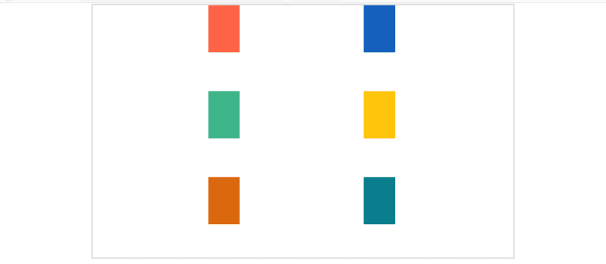
The HTML code remains the same but you'll have to clean up your CSS until you are left with bare bones code and let it match the snippet below. Take note of the minor additions and read the comments.
.parent {
  display: grid;
  width: 70%;
  outline: 5px solid #dddddd; /* Just a cosmetic to note the edge of the grid */
  margin: 0 auto;
}

/*
 * We are using a attribute selector to select all
 * child boxes
*/
[class ^= "child"] {
  width: 100px;              /* TAKE NOTE we have reduce the width of the box */
  height: 150px;             /* The height of the box */
  margin-right:0.5em;        /* Some outer spacing to the right of the box */
  margin-bottom: 0.5em;      /* Some outer spacing to the bottom part of the box */
}

.child-1 {
  background-color: tomato;
}
.child-2 {
  background-color: #1560bd;
}
.child-3 {
  background-color: #3eb489;
}
.child-4 {
  background-color: #ffc40c;
}
.child-5 {
  background-color: #da680f;
}
.child-6 {
  background-color: #0a7e8c;
}
Save and refresh your browser.
From the image above, please note the following:
- The browser zoom level has been reduced to
67%so that we can get a better view when the grid items are aligned. If you are on Microsoft Windows™ you can use the keyboard shortcutCtrland+or-to reduce or increase the zoom level - I have enabled the grid lines
- The Developer Tools is docked to a separate window.
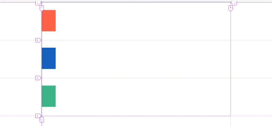
Back to your code editor and update the .parent with the following:
.parent {
  /* All other properties remains the same */

  justify-items: center;  /* Add this */
}
Save and refresh your browser.

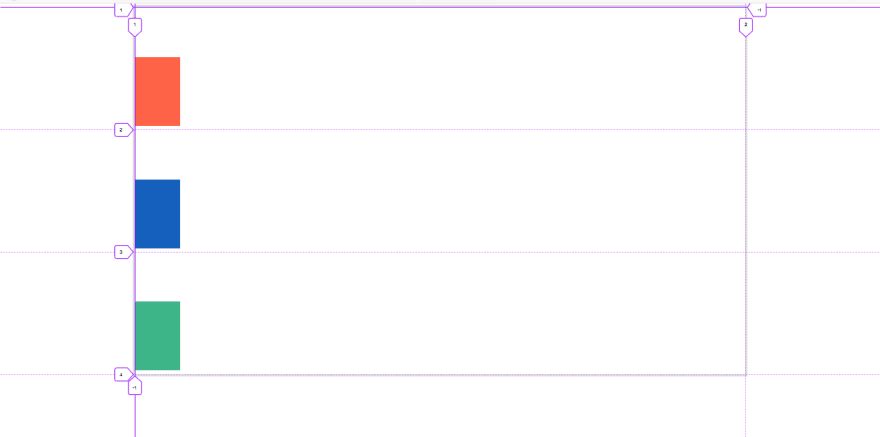
How about we move them to the end of the grid? Update your code:
.parent {
  /* All other properties remains the same */

  justify-items: end;  /* Add new value */
}
The result in the browser.

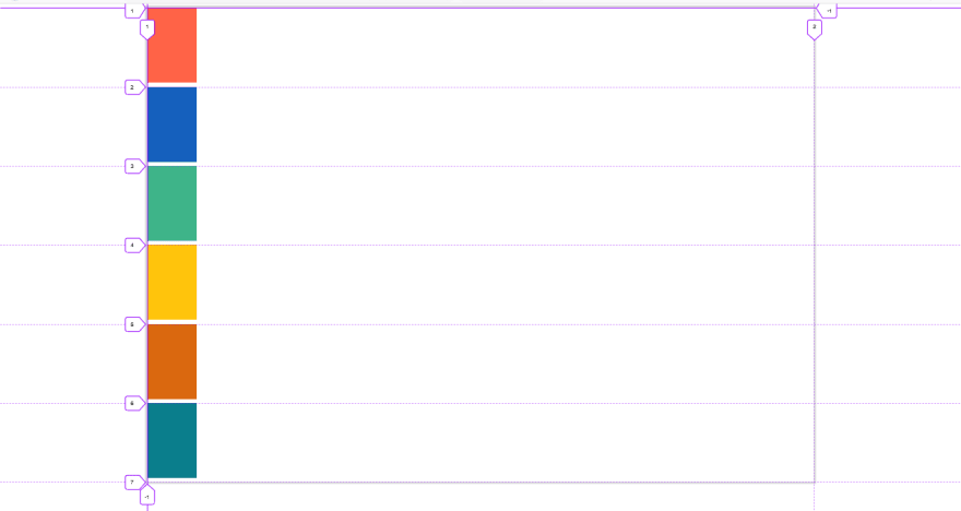
If you use justify-item: stretch; items will be stretched across the row axis. This is the default value for justify-item. Apply the stretch value and refresh your browser, the grid items will return back to their default position and won't span the entire row because our grid items have a fixed width of 100px.
justify-self
The justify-self property can be applied to a single grid item.
Delete the justify-items property from the .parent then add the following to .child-3:
.child-3 {
  /* All other properties remains the same */

  justify-self: center;  /* Add this */
}
Save and refresh your browser.

The snippet below will move the last box (.child-6) to the end of the grid row.
.child-6 {
  /* All other properties remains the same */

  justify-self: end;  /* Add this */
}
The result in the browser.

align-items
This property is used to align items on the column axis i.e vertically
Comment three boxes from your HTML file, preferably child-3, child-4, child-6 and delete any justify-* code from the child elements then update the .parent CSS rule with the following:
.parent {
  /* All other properties remains the same */


  height: 800px;  /* Add this */
}
Save and refresh your browser.

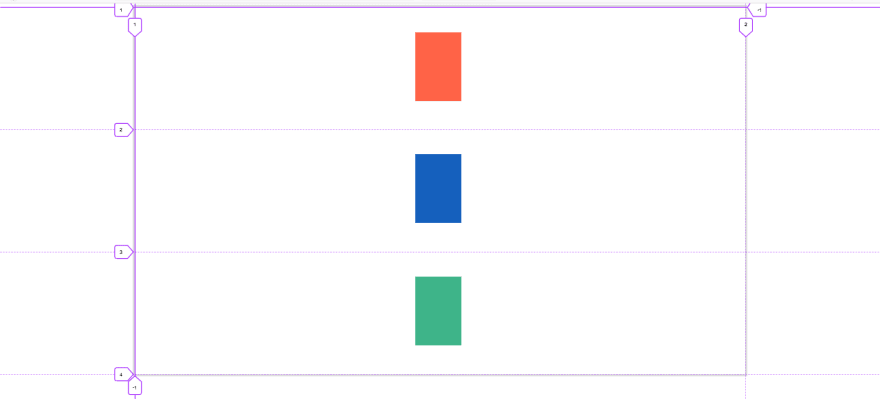
Now, lets align the item to the end of the column.
.parent {
  /* All other properties remains the same */

  align-items: end; /* Add this */
}
The result in the browser:
The following snippet will align the items to the center of the column.
.parent {
  /* All other properties remains the same */

  align-items: center; /* New value */
}
The result in the browser:
The default value is align-start.
If you feel the boxes are not moving comment another child div in your HTML and start again.
Placing an item at the center of the column and row axis is sometimes a daunting task and before CSS Grid developers had to use the margin property to get the job done. With CSS Grid this is super easy.
In CSS Grid all you have to do is use the combination of align-items and justify-items on the grid container with a value of center for both properties.
.parent {
  /* All other properties remains the same */

  /* Use both properties at once */
  align-items: center;
  justify-items: center;
}
Save and refresh.
If you have just one child element in the grid you will see the true beauty of this technique.

align-self
This is analogous to justify-self and it used to align a single item along the column axis.
Make sure you have no align-items or justify-items in your .parent then add the following to child-2:
.child-2 {
  /* All other properties remains the same */


  align-self: end; /* Add this */
}
Save and refresh your browser.

In the image above the green box is obstructing the blue box from moving to the end of the grid container, try commenting the HTML code for the green box and refresh your browser.

ALIGNING TRACKS ON THE GRID
Grid tracks can be aligned relative to the grid container along the row and column axes.
Two properties are used for this:
-
align-content- aligns tracks along the column axis -
justify-content- align tracks along the row axis
They accept similar values like previous properties with three additions:
space-aroundspace-betweenspace-evenly
Let's start.
We'll be applying the properties to the .parent element, so if you have code in the .parent and any child element from previous section please delete them.
Add the following to the .parent:
.parent {
  /* All other properties remains the same */


  justify-content: end; /* Add this */
}
Save your file and refresh your browser.

To demonstrate the space-* family of properties, we'll have to make some changes to our HTML and CSS.
Perform the following steps
-
Delete the
justify-content:end;from the.parent - Remember we commented three boxes in the HTML from previous section, remove the comment, now we will have our six boxes back.
- Add
grid-template-areasto the.parentCSS with the following values"h1 h2" "h3 h4" "h5 h6"
- Add
grid-gap: 1.2emto.parent
Now it's time for some action.
The code below will align all the element to the center of the container. Don't forget to save.
.parent {
  /* All other properties remains the same
   * including the grid-template-areas and grid-gap that you just added
  */

  justify-content: center; /* Add this */
}
The result in the browser.

The subsequent images are for space-around, space-between and space-evenly


That's it for justify-content, up next align-content.
align-content aligns items on the column axis (vertical) which is opposite of how justify-content align content in horizontal direction.
If you have justify-content in your .parent, please delete them and add the following:
.parent {
  /* All other properties remains the same */

  align-content: end; /* Add this */
}
The result in the browser.

I'll leave you to have fun with the following values:
startspace-aroundspace-evenlyspace-betweencenter
Save your files before trying each value.
We've come long way in CSS Grid, but we have certainly not covered everything but this is enough to get you started.
Our next topic has to do with devices and screens; Media Queries.


Top comments (0)