You'd probably use em for padding and margin before. However, do you know how is it calculated?
Take this html:
<div id="container">
    <div id="box"></div>
</div>
And the following css rules:
    #box {
        border: 1px solid blue;
        padding: 3em;
    }
As I inspected the padding in the computed tab of dev tools, I see #box has 48px padding each side.

This is because when you set padding using em, it will take the font size of that element as base and multiple with the multiplier (3).
Since I didn't specify any font size, the default 16px from the browser is applied. 16 * 3 = 48.
Now let's add the following rule:
    #container {
        font-size: 30px;
    }
The padding of each side of #box is now 90px (30 * 3). #box inherited font size from its parent, #container.

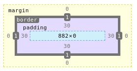
Finally, let's set font size for #box while keeping font size for #container at 30px.
    #box {
        font-size: 10px;
    }
Can you guess the value of padding on each side of #box now?
If your answer is 30px, you are correct.


Top comments (7)
i use REM + reset.
html {
font-size: 62.5%; // 10/16*100 = 10px
}
body {
font-size: 1.6rem; // = 16px
}
This is a common approach for setting font size. However, I'm talking about using em for margin and padding :)
Any particular reason to use em instead of REM?
It's a common practice to use rem for font size and em for padding and margin. For border, use px.
The reason (to use em for padding and margin) is as em based on font size of the element, when you change the font size, the margin and padding will reflect that change.
In the case of font size, using rem make it more predictable since it is based on the root element only, not parent's size like while using em.
Ahh that makes sense. Thank you for clarifying!
My pleasure. I'm glad it helps :)
Thanks , for the clarity.