Today is Saturday. I have been watching videos on Git and Github. I watched a really good one about working with the terminal in VS Code. I knew a little bit but this really cemented it and it's definitely something that I will revisit.
On Thursday, I started a project recreating a Youtube page. I finished it Friday but I didn't have time to write a summary on the experience.
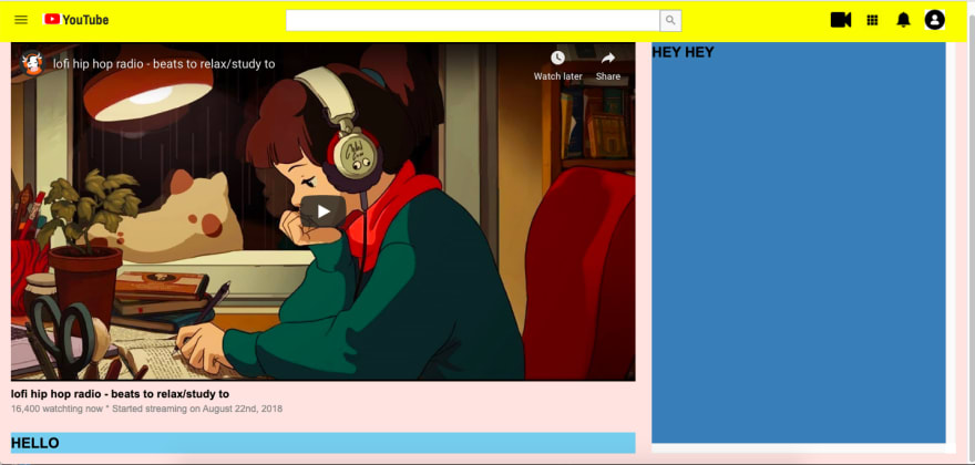
Recap, this is what the page looked like after I was done on Thursday. The layout was done and I had added the video.
So let's go back to how I approached it and what was the process from beginning to end.
When I first looked at the prompt on Odin Project, I wasn't sure how I would approach it. You can see other student's solutions and I checked out some and there was one where the structure inspired how I structured mine. I usually start working section by section and started with the navigation.
I placed the nav bar in a div container and used the Grid to separate the logo, the search bar and the icons. I decided to use actual icons instead of a picture of all the icons together and used Flexbox to layout the icons (flex items) at the end of their container. It was a bit of challenge sizing the images to be appear the same. The YouTube logo was another issue as I could not find a logo that was big enough. I ended up using an icon of the red play button and adding the word "Youtube" and styling it through CSS.
When I was done with the navigation bar, I tackled the rest of the page and thought of it as 3 sections: the video section, the comment section and the suggestion section.
I used the main tag for the video section, the section tag for the comment section and the aside tag for the suggestion section.
Within the video section, I created separate containers for:
- The video
- The area with likes, dislikes and share.
- The area with the profile info and video description.
I added the video that I wanted and that's when I thought "Let's add the layout for these sections". I used the grid-template-areas to layout the different sections
It became evident that I should have planned a little more before starting as the navigation is separated from the rest of the page. It wasn't the best but I left it as is.
After adding the video, I worked on the video data and profile/video description section.
One of things that I loved from following Brad Traversy's HTML/CSS course is that with each project, he always creates variables and utility classes. It is like using your personal bootstrap. When looking at the texts on the page, the main text is usually bold and the others are a light gray. I created variable for these two types of text and created utility classes that I used for all the texts except for the comments and the video description.
I used nested Grid and Flexbox all over this page. The video data is a grid of two columns and I used Flexbox in the right column to layout the the likes/dislikes at the end. For the icons, I used Font Awesome and wrapped the texts in a span within the i tags. I used margin on the right of the i tags to separate them.
The horizontal line is another utility class that I created and would add whenever it was needed.
For the video description, I used the grid again and this time, I set the first column to 60px, the middle column to auto and the last to a fractional unit of 1. To create the button, I wrapped the text in a span within an atag. I used Flexbox to display it to the end and when I added the background color, it stretched vertically. I was having a lot of issues with that until I gave the a tag a height and set it to fit-content and added padding to widen the background color.
The comment section was a little easier. I was now in a groove and was getting more comfortable. Each comment is two div displayed as a grid of 2 columns. The first column has what would be the commenter's profile picture and is set to 60px to match the alignment of the uploader's profile picture in the description box. After that is was a matter of pasting the container for the rest of the comments and changing small details. I used my utility classes there as well to make changes to the font.
The last section was the suggestion section was the quickest to complete. Within that section, I created a container for the button to show the chat. I approached the suggestion videos the same as the comments. I displayed each suggestions as a two columns grid with the first grid set to 1fr and the other column to 2fr. The only issue that I experienced there was setting the with of the images. No matter how I tried targeting them, it wouldn't work. I ended up setting the width in HTML.
This is not responsive at all and that one of the things I would like to fix to make it better.
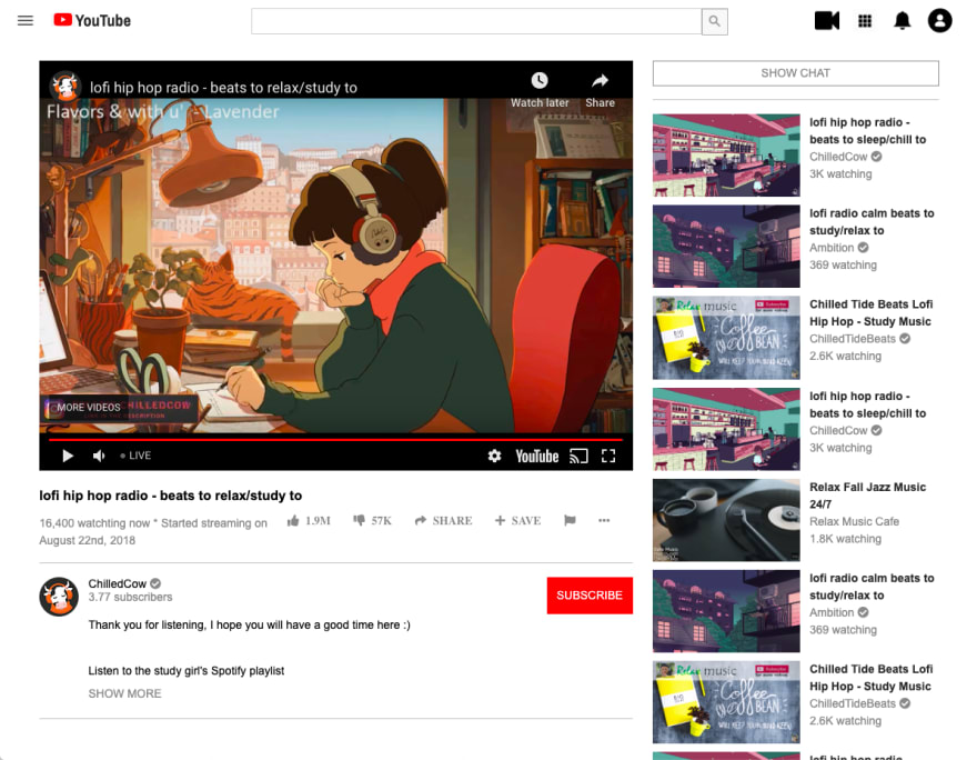
I was now done and I was elated. This is a picture of the final version (as of now)
You can see a live demo on Github here.
At the end of July/early August, I had finished a bootcamp's prep course and I wanted to practice and I got to this section of The Odin Project. I looked at the assignment and I just did not know how to do it. I started Colt Steele's Udemy course and still did not feel comfortable and I wanted to have a good understanding of the basics.
To be able to complete something that nearly 3 months ago was hard for me is the greatest feeling.
On the next one!


Top comments (0)