How to Design a Better Progressive Web App

Sometimes it’s hard to tell when the newest web design trend will be worth adopting or when it’s just a passing fad we shouldn’t invest too much time or energy in. Progressive web apps (PWAs), for instance, had that problem in the beginning, which is why most content written about them focused on explaining what they were.
Today, though, we don’t need to be educated on what a PWA is or why it’s a more valuable mobile asset than a mobile responsive website.
PWAs are inherently fast and secure. Plus, they’re a great option for anyone who wants to leverage the good stuff from native mobile apps (like offline caching and telephony integrations) while improving upon their weaknesses (like battery and storage consumption and sharing capabilities).
Needless to say:
PWAs have proven to not only be a viable design trend, but one with loads of staying power.
Now that we can move the conversation away from the what and why of PWAs, it’s time to look at the how.
How to Design a Better Progressive Web App
Although a mobile website and a progressive web app both live in the browser, the way you design them should be approached differently.
Whether you’re tasked with building a PWA from scratch, or turning a mobile website into a PWA, there are certain things you’re going to have to do differently.
Here are some things to think about when you design progressive web apps:
1. Design It; Then Cut 10%
There’s a trick writers use in editing, whether they’ve written something for the web or they’ve written a story. They sit down and write. Then, they return to the piece later and cut at least 10% of it out.
The same basic principle should apply when you’re designing a PWA. Sit down and create the design you would for a website. Then, when you return to review and refine it, cut out the components, sections and details that are nice-to-have, but not necessary.
This is the CVS website:
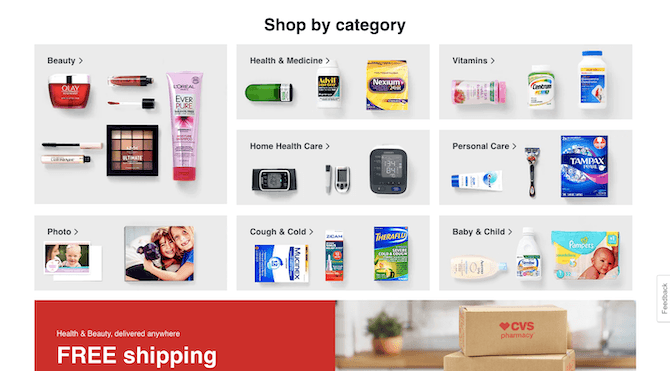
This is a well-designed block of categories with sample products to help consumers decide where they need to go on the site.
This is the same section on its PWA:
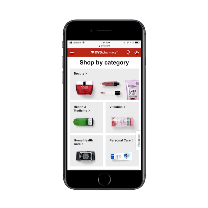
CVS has scaled back the design here. With the exception of Beauty, each category is now represented by a single product image.
While the designer could’ve retained the original design of each block, it wouldn’t have worked on the PWA. Either the side-by-side blocks would’ve been too small for users to see the three product images or the full-width blocks would’ve forced users to do extra scrolling to see each of the categories.
Instead, the PWA does away with that by trimming each category’s image down.
I would suggest taking it one step further by removing the background color, too. You can see how this looks on the “Shop Online” page of the CVS website:
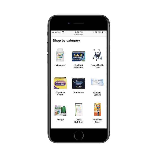
I’d argue that the products look more attractive when framed against a solid white background in this tiny bit of space. So, if you’re looking for somewhere to trim the fat, don’t be afraid to start with something as simple as color.
2. Don’t Be Afraid To Go “Lite”
Twitter has one of the most commonly referenced PWAs and for good reason.
This is what the Twitter website looks like with its latest redesign:
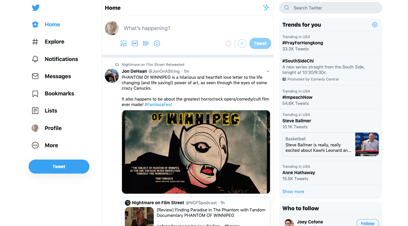
There’s a lot going on here. The menu has over a dozen options to choose from (if you reveal “More” options). The list of topics and people to follow on the right side also pulls users’ attention away from the main attraction: the news feed.
If your website suffers from information overload like this, think about how that could be improved by creating a “lite” experience for the PWA. Twitter did just that:
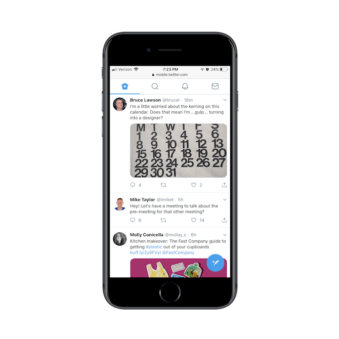
The menu on its PWA has been reduced to four tabs:
- Home feed
- Search
- Notifications
- DMs
There’s also a blue button in the bottom-right corner where users compose new messages.
I’d guess that Twitter users aren’t clamoring for features like hashtag search, follow suggestions, list creation and profile management on mobile. So, look at your own analytics and see if you can make a similar judgment call to help you create a more streamlined experience for your PWA.
3. Toss the Footer
If you were to install heatmaps on your website, I bet you’d be surprised to see how few people make it to the footer. Unless they’re specifically looking for something they can’t find in the navigation, there probably aren’t too many mobile users, specifically, who are willing to scroll to it.
So, when you design your PWA, just get rid of it.
Again, this is about removing pieces of your design that aren’t 100% necessary. It’s also about leveraging the app shell to be more efficient with your mobile design.
A great example of this is Wyndham Hotels:
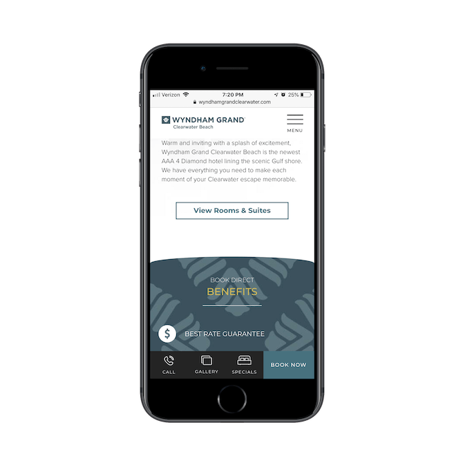
Wyndham makes good use of the bottom bar. The buttons sit at the bottom of the app shell, are all well-sized, and in good range of the thumb zone.
This way, users don’t have to do any clicking or scrolling to get to the pages or actions that matter most to their experience.
Another PWA that does this well is the Weather Channel:
734f11ee8f7d41f2ac488025a2a95a95.png?sfvrsn=9cd2764e_0)
It makes sense that the bottom bar would contain forecast options as well as live radar and video feeds. Why come to the Weather Channel PWA if you’re not going to get instant details about the weather?
If you’re wondering where you’re going to put all that stuff that would otherwise live in the footer, the Weather Channel has a good solution for it:
.png?sfvrsn=dc740a39_0)
When you open the Weather Channel menu, it contains a list of all the pages in the PWA (as it should). However, at the very bottom of its menu is its footer elements! This way, visitors can connect on social, inquire about advertising, and subscribe for the newsletter without having to scroll endlessly to the bottom of the site. It takes just one swipe of the menu to get there.
4. Find Another Way to Advertise
Just because you’re building a lighter and more streamlined experience for users doesn’t mean you can afford to cut back on marketing and advertising. It’s how your clients pay their bills, after all. However…
Because your PWA will likely have an ever-present app shell — at the top, bottom, or both — you really don’t have a lot of room to play with. Case in point:
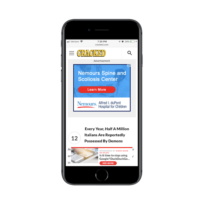
This is from the Cracked PWA. As you can see, ads take up about two-thirds of the available real estate of this article. All you can see in this screenshot is one of the headers and a few words peeking out from behind the bottom pop-up.
This makes for a painful reading experience.
I know your clients need to monetize, but you’re going to have to find a better way to do it, whether it be with fewer ads, smaller ads, or switching to a subscription model.
Another way to handle this would be to minimize your ads or lead gen pop-ups and give your visitors the choice to click as Ulta does:
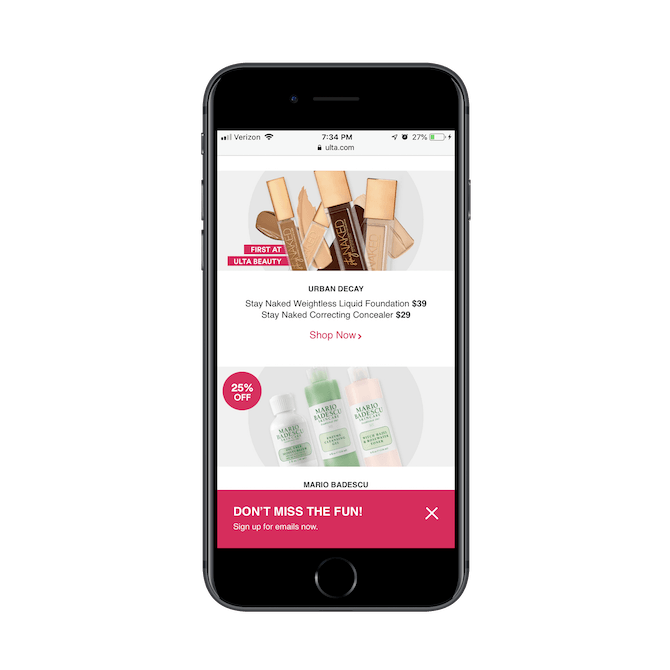
This a better way to advertise or market your business anyway. Pop-up and ad blindness is very real, and designing your PWA in a way that invites users to engage will lead to more clicks and sales.
.png?sfvrsn=c63db20f_0)
5. Design an Eye-catching Home Screen Logo
Even though PWAs don’t live in the app store (or, rather, they don’t need to), users can still save them to the home screen to live alongside their downloaded apps.
The first thing you should do is make sure you create an “Add to home screen” message for your PWA users. This isn’t something I’ve seen a lot of, though I think your clients would greatly benefit from it as consumers grow more accustomed to interacting with PWAs and realize they can save them.
Next, you should create a unique icon for it. Here’s why:
![]()
These are the icons for three news PWAs:
Le Monde and The New Yorker both use eye-catching home screen icons, whereas the Washington Post just has a black box.
If you’re going to go to the trouble of creating a PWA that can be saved to the home screen for quick-click access, take the time to create a unique and eye-catching icon for it.
PWAs Are the Future. Design Them That Way.
There’s no doubt that an app interface provides a better experience on mobile than a website can. That said, there are a number of obstacles and objections that are going to make your clients wary of investing in them and users reluctant to download them.
Which is why PWAs are the best solution for everyone.
As you try out the design tips above, don’t be afraid to play around with them. There are other ways to trim back your design without compromising on messaging or engagement. It’s all about finding the right balance.
Oh, and if you’re new to designing or building PWAs, it’s going to be extra important to have a way to translate your designs into code while the team adjusts. With Unite UX, you’ll be able to bridge that gap while further streamlining your app development process.

Suzanne Scacca
A former project manager and web design agency manager, Suzanne Scacca now writes about the changing landscape of design, development and software.

