
As GitLab continues to grow in depth and breadth across the DevOps lifecycle, the use of charts and data visualizations has increased in frequency and complexity. Throughout the life of GitLab as a project, we've used multiple libraries to render beautiful charts. As the number of different libraries increased along with our charting requirements, we decided it was time to start unifying our charting libraries to help us move quickly.
At first, we wanted to unify our charts using D3.js but this was difficult because D3.js isn't a charting library. In their own words: "D3.js is a JavaScript library for manipulating documents based on data," meaning it is a low level visualization tool. D3.js is powerful but it has a big learning curve. Our team did not have the time to develop the expertise without impacting our product development velocity. We also knew we had an ambitious hiring plan, and we would be adding time to our onboarding process by using D3.js.
The frontend team set out to investigate different charting libraries that we could use to gain more velocity. The library didn't have to do everything we needed, but it had to get us most of the way there. We investigated many libraries including ECharts, Britecharts, and Plotly as potential options. In the end, ECharts was the clear winner for us. Here's why:
Echarts robust yet flexible chart types
On the monitor stage frontend team, we have the ambitious goal of replacing well-known monitoring tools like DataDog and Grafana. It was absolutely critical that our charting library had enough flexibility for us to create our own custom charts, but it was also important that the library had existing charts so that we didn’t have to create every chart from scratch for the sake of development velocity.
ECharts has an incredible showcase of the adaptability of their charts. This was a great starting point for us. We tested out styling ECharts to match our design system to determine how adaptable it was and we were very satisfied with the results.
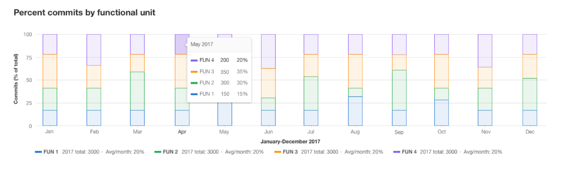 Design spec for future GitLab charts.
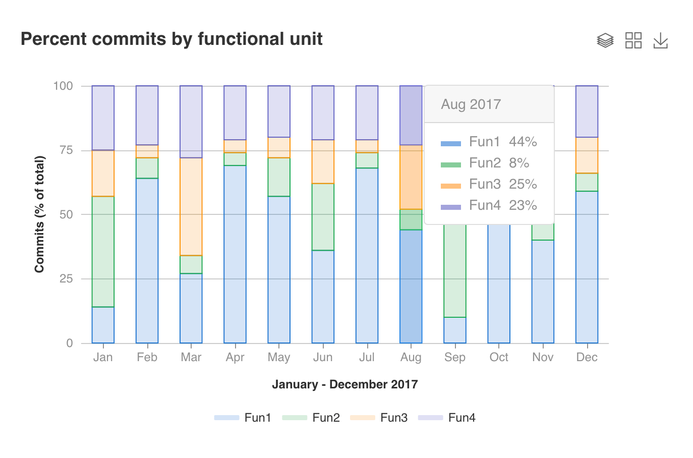 Evaluation implementation using ECharts.
Echarts performance
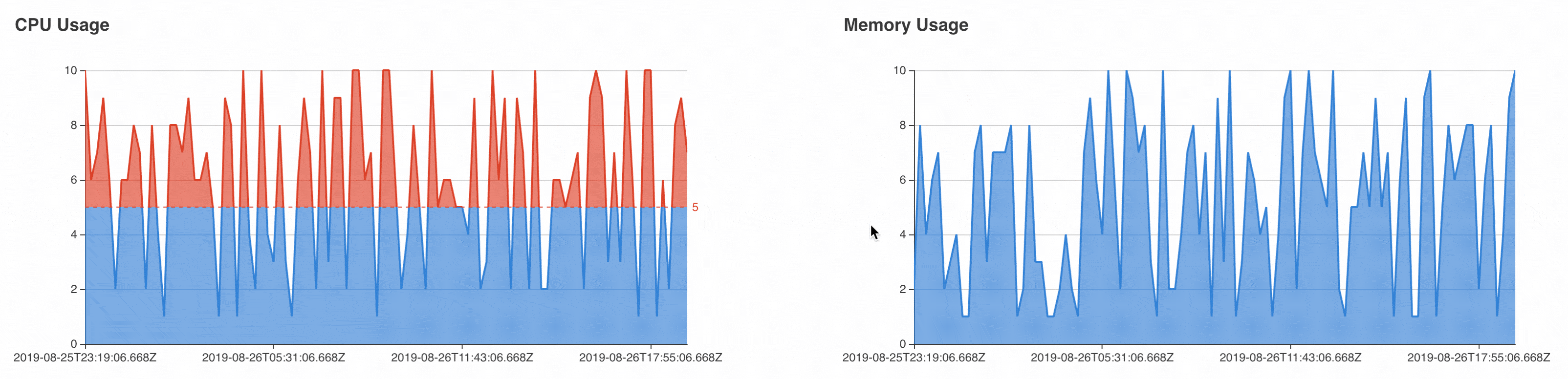
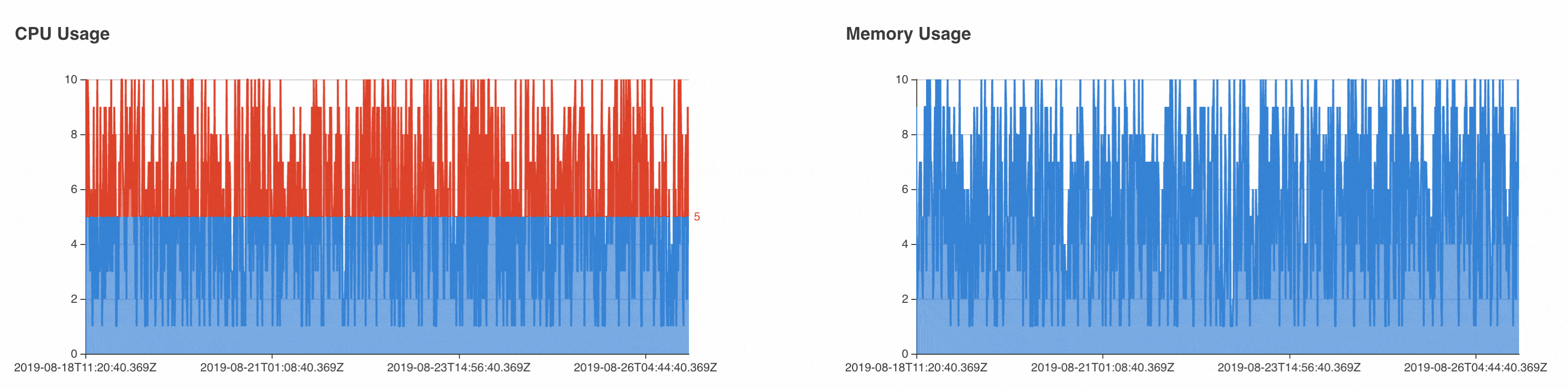
When we were evaluating ECharts, we took one of our most complex user interactions for charts to benchmark the performance of the charting library. Although ECharts wasn’t perfect, it fared better than the alternatives. Below are some gifs recorded from changing the chart values in our evaluation project. As you can see, performance does decrease as the data points increase but it is still usable and it is unlikely we would have that many points in such a small chart.
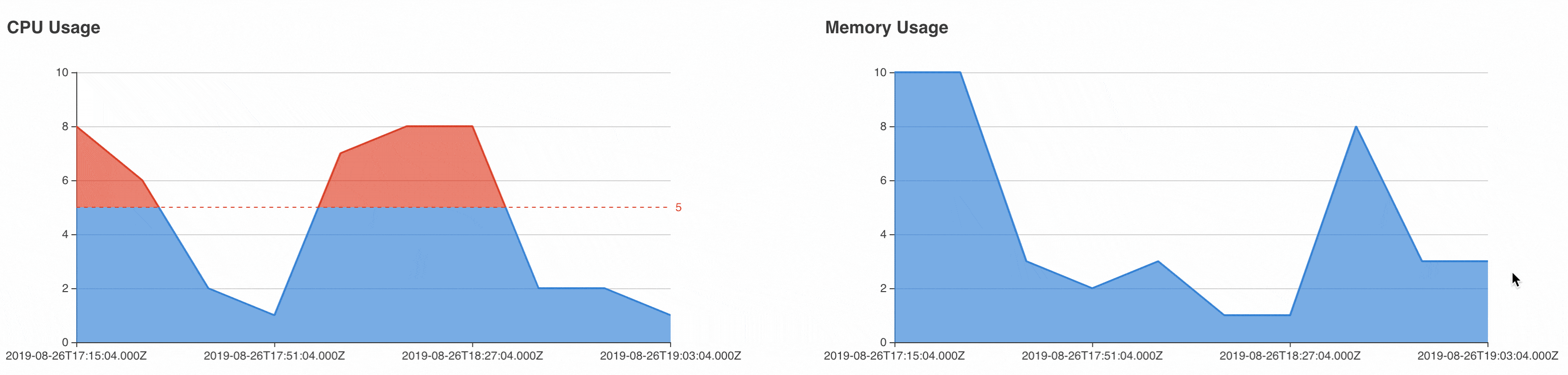 Linked chart with 10 values.
 Linked chart with 100 values.
 Linked chart with 1000 values.
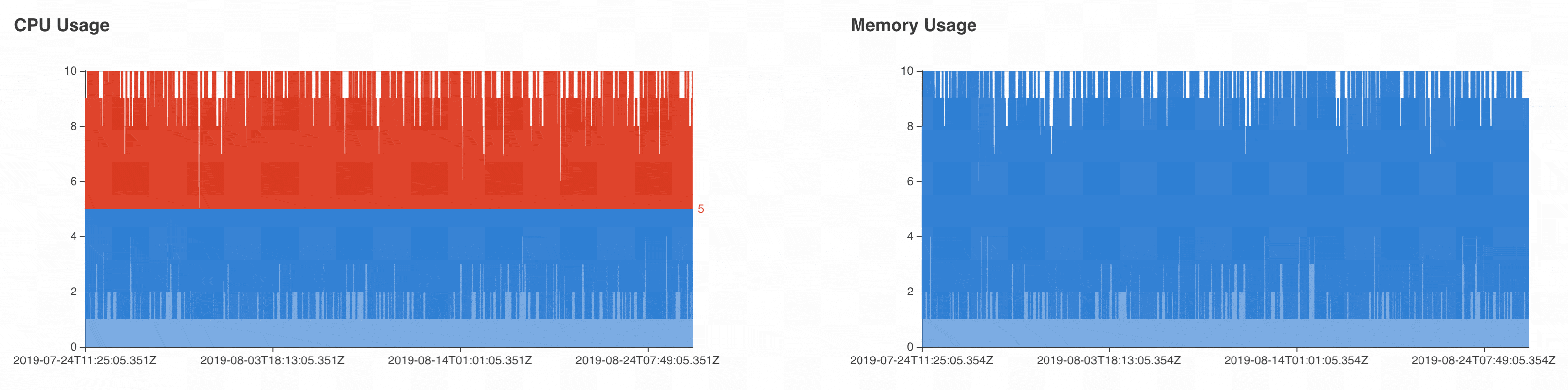 Linked chart with 4000 values.
Growing ecosystem
ECharts isn’t perfect but it has improved over time. It started off as an open source project from Baidu but is still going through the process of being incubated into the Apache Software Foundation. The majority of ECharts users still seem to be based in China, meaning the developer community and corresponding documentation is written primarily in Chinese. Despite some language barriers, the ECharts community does seem to be growing more internationally. We’ve come across a variety of companies from the United States and Mexico who are either evaluating or using ECharts internally.
The Podling Project Management Committee (PPMC) of ECharts, which is their core team in GitLab terms, has also been very welcoming and energetic about growing the ecosystem. As we decided on ECharts and began developing new charts and replacing old charts, we’ve been able to build a partnership with the company. They have been very kind to meet with us online every month to help answer questions and to guide us in using their library effectively. This has been extremely helpful. For example during one of our meetings, Shuang Su gave us a brief walkthrough of the codebase and it's architecture.
Where we are today with Echarts
We introduced ECharts to the GitLab codebase in 11.6 and through ECharts have been rapidly building new chart types into our component library at a faster rate than ever before. We started with updating the charts in just our Monitor stage but have since introduced charts into the Secure and Manage stages.
Depending on your use case, Apache ECharts could be a good fit for you too. For our team, ECharts has without a doubt increased our product development velocity over against what it was with D3.js.
| Old chart in D3.js | New chart in ECharts |
|---|

