
Written by Paramanantham Harrison✏️
Introduction
A skeleton screen is a UI that doesn’t contain actual content; instead, it shows the loading elements of a page in a shape similar to actual content.
Skeleton screens show users that content is loading, offering a vague preview of how content will look once it fully loads.
Frontend devs use skeleton UIs for a variety of reasons.
Chief among these are the UI’s capacity to visually streamline the user experience, mimic content loading speed, and progressively load content without requiring that all content on a page is fetched at once.
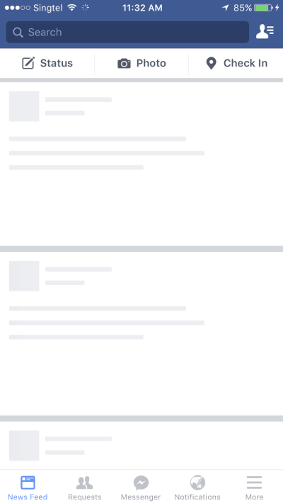
Slack, Youtube, Facebook, Pinterest, and other big tech companies display skeleton screens while their content loads to boost UX.


In addition to skeleton screens, these user interfaces are commonly referred to as content placeholders, content loaders, and ghost elements.
How skeleton screens improve UX
Skeleton UI resembles the real UI, so users have an understanding of how quickly the website loads even before content shows up. Let’s see it in action in a comparison of the two screens:

Neither screen has loaded actual content, but the empty page seems slower to the user while the skeleton screen looks richer, seems faster, and feels more responsive.
Even though the real content loads at the same speed for both screens, the skeleton screen offers a superior UX.
Different skeleton UI
There are a few different kinds of skeleton UI. The major ones are content placeholders and image (or color) placeholders.
Companies like Medium, Slack, and Youtube use content placeholders in skeleton UI on their main pages.
They’re easy to build because they don’t require any details about actual content data and instead only mimic the UI.
Meanwhile, Pinterest and Unsplash — two image-heavy websites — use color placeholders. Color placeholders are harder to build because they require details about actual content data.
How it works
First, load a skeleton instead of images (usually with a gray or off-white background).
Once the data is fetched, load the actual color of the image from the image metadata.
This metadata is derived from the image while uploading through backend algorithms, as well as processing on top of the images.
Finally, lazy load the images to allow the user to actually view the content using the intersection observer API.
Demo
In our tutorial, we’re going to explore skeleton UI in React by creating a mock of the YouTube main page.
Before we get started, let’s list off the most popular packages for skeleton UI development already available in React:
These packages are pretty well-maintained, but they have their faults. We’ll look at the pros and cons of each before deciding which to use for our application.
React content loader
Pros
- SVG-based API; you can use any SVG shapes to create the skeleton elements
- Easy to create animated placeholder, which shines from left to right (pulse animation)
- Has a few pre-styled content loaders (e.g, Facebook, Instagram, etc)
- Can be used for any complex skeleton UI since SVG supports a lot of shapes
Cons
- You need to create custom skeleton components for all your components separately
- SVG is not the same as CSS elements, so creating custom elements with custom alignment requires a steep learning curve
- Browser support might be inconsistent because of the SVG dependencies, so skeleton might look and feel different on different browsers
Here’s an example of a skeleton component using react-content-loader :
import ContentLoader from "react-content-loader";

    // API support all SVG shapes - rect is a SVG shape for rectangle
    const SkeletonComponent = () => (
      <ContentLoader>
        <rect x="0" y="0" rx="5" ry="5" width="70" height="70" />
        <rect x="80" y="17" rx="4" ry="4" width="300" height="13" />
        <rect x="80" y="40" rx="3" ry="3" width="250" height="10" />
      </ContentLoader>
    )
React placeholder
Pros
- Component based API
- Easy to create custom skeleton UI using the placeholder components
- Supports pulse animation, which you can control through props
Cons
- Similar to React content loader, we need to maintain a skeleton component separately, so updating styles to a component requires possible updates to the skeleton component as well
- Learning curve is not very linear since there are multiple components for different needs
The following is an example of a skeleton component using react-placeholder:
import { TextBlock, RectShape } from 'react-placeholder/lib/placeholders';
import ReactPlaceholder from 'react-placeholder';

//
const MyCustomPlaceholder = () => (
  <div className='my-custom-placeholder'>
    <RectShape color='gray' style={{width: 30, height: 80}} />
    <TextBlock rows={7} color='yellow'/>
  </div>
);

// This is how the skeleton component is used
<ReactPlaceholder ready={ready} customPlaceholder={<MyCustomPlaceholder />}>
  <MyComponent />
</ReactPlaceholder>
React loading skeleton
Pros
- Very simple API — it just has one component with props for all customization
- Pretty easy to learn
- Can be used as separate skeleton component and also inside any component directly, so it’s flexible to use the way we want
- Supports animation and theming
Cons
- Very good for simple skeleton UI, but difficult for complex skeletons
The following is an example of a React loading skeleton:
import Skeleton, { SkeletonTheme } from "react-loading-skeleton";

const SkeletonCompoent = () => (
  <SkeletonTheme color="#202020" highlightColor="#444">
    <section>
      <Skeleton count={3} />
      <Skeleton width={100} />
      <Skeleton circle={true} height={50} width={50} />
    </section>
  </SkeletonTheme>
);
For the full demo, we’ll use react-loading-skeleton.
That said, all three libraries adequately satisfy simple use cases. Feel free to go through the documentation and choose the one you feel most comfortable using in your application.
Skeleton UI example using React
We’re going to build a YouTube-like UI and show how skeleton UI works.
First, let’s create the YouTube UI:
import React from "react";
// Youtube fake data
import youtubeData from "./data";
// Styles for the layout
import "./App.css";
// Each Card item component which display one video - shows thumbnail, title and other details of a video
const Card = ({ item, channel }) => {
return (
<li className="card">
<a
href={`https://www.youtube.com/watch?v=${item.id}`}
target="_blank"
rel="noopener noreferrer"
className="card-link"
>
<img src={item.image} alt={item.title} className="card-image" />
<h4 className="card-title">{item.title}</h4>
<p className="card-channel">
<i>{channel}</i>
</p>
<div className="card-metrics">
{item.views} • {item.published}
</div>
</a>
</li>
);
};
// Card list component
const CardList = ({ list }) => {
return (
<ul className="list">
{list.items.map((item, index) => {
return <Card key={index} item={item} channel={list.channel} />;
})}
</ul>
);
};
// App component - each section have multiple videos
const App = () => {
return (
<div className="App">
{youtubeData.map((list, index) => {
return (
<section key={index}>
<h2 className="section-title">{list.section}</h2>
<CardList list={list} />
<hr />
</section>
);
})}
</div>
);
}
export default App;
Next, let’s input fake YouTube data:
const youtubeData = [
  {
    section: "JavaScript Tutorials by freeCodeCamp",
    channel: "freeCodeCamp.org",
    items: [
      {
        id: "PkZNo7MFNFg",
        image: "https://img.youtube.com/vi/PkZNo7MFNFg/maxresdefault.jpg",
        title: "Learn JavaScript - Full Course for Beginners",
        views: "1.9M views",
        published: "9 months ago"
      },
      {
        id: "jaVNP3nIAv0",
        image: "https://img.youtube.com/vi/jaVNP3nIAv0/maxresdefault.jpg",
        title: "JavaScript, HTML, CSS - Rock Paper Scissors Game",
        views: "216K views",
        published: "1 year ago"
      }
    ]
  },
  {
    section: "Small steps on React",
    channel: "Learn with Param",
    items: [
      {
        id: "ylbVzIBhDIM",
        image: "https://img.youtube.com/vi/ylbVzIBhDIM/maxresdefault.jpg",
        title: "useState example by building a text-size changer",
        views: "148 views",
        published: "3 days ago"
      }
    ]
  }
];
export default youtubeData
Let’s show the skeleton UI before loading actual data. Since our data is fake, we need to mock it like API data by loading after a two-second timeout:
import React, { useState, useEffect } from "react";

const App = () => {
  const [videos, setVideos] = useState([]);
  // Load this effect on mount
  useEffect(() => {
    const timer = setTimeout(() => {
      setVideos(youtubeData);
    }, 2000);
    // Cancel the timer while unmounting
    return () => clearTimeout(timer);
  }, []);

  return (
    <div className="App">
      {videos.map((list, index) => {
        ...
      })}
    </div>
  );
};
You’ll see a white screen for three seconds, and then the data loads abruptly.
Now, we’ll install react-loading-skeleton:
yarn add react-loading-skeleton
Let’s create a skeleton component for our videos data:
import Skeleton from "react-loading-skeleton";

/*
   Separate Skeleton component
  - It is created with the same shape as Card component
  - Pros: Component will be isolated from the skeletons so the component won't become complex or heavy
  - Cons: Maintaining separate skeleton component will make it harder to maintain when UI changes and style gets changed
*/
const CardSkeleton = () => {
  return (
    <section>
      <h2 className="section-title">
        <Skeleton height={28} width={300} />
      </h2>
      <ul className="list">
        {Array(9)
          .fill()
          .map((item, index) => (
            <li className="card" key={index}>
              <Skeleton height={180} />
              <h4 className="card-title">
                <Skeleton height={36} width={`80%`} />
              </h4>
              <p className="card-channel">
                <Skeleton width={`60%`} />
              </p>
              <div className="card-metrics">
                <Skeleton width={`90%`} />
              </div>
            </li>
          ))}
      </ul>
    </section>
  );
};
You can also create a skeleton component by embedding the skeleton directly into the component, like this:
import Skeleton from "react-loading-skeleton";
/*
Cards component with embedded skeleton UI
- Pros: This is much easier to maintain for UI and styles changes
- Cons: UI will become complex and heavy with lot of unnecessary elements in it
*/
const Card = ({ item, channel }) => {
return (
<li className="card">
<a
href={item.id ? `https://www.youtube.com/watch?v=${item.id}` : `javascript:void(0)`}
target="_blank"
rel="noopener noreferrer"
className="card-link"
>
{
item.image ?
<img src={item.image} alt={item.title} className="card-image" />
:
<Skeleton height={180} />
}
<h4 className="card-title">
{
item.title ? item.title :
<Skeleton height={36} width={`80%`} />
}
</h4>
<p className="card-channel">
{ channel ? <i>{channel}</i> : <Skeleton width={`60%`} /> }
</p>
<div className="card-metrics">
{
item.id ?
<>{item.views} • {item.published}</>
:
<Skeleton width={`90%`} />
</div>
</a>
</li>
);
};
I used the isolated skeleton component in my example, but feel free to use whatever style component best fits your needs. It all depends on personal preference and the complexity of the component.
Finally, here’s the CardSkeleton component before actual data gets loaded:
const App = () => {
  const [videos, setVideos] = useState([]);
  // Manage loading state - default value false
  const [loading, setLoading] = useState(false);

  useEffect(() => {
    // set the loading state to true for 2 seconds
    setLoading(true);

    const timer = setTimeout(() => {
      setVideos(youtubeData);
      // loading state to false once videos state is set
      setLoading(false);
    }, 2000);

    return () => clearTimeout(timer);
  }, []);

  // Show the CardSkeleton when loading state is true
  return (
    <div className="App">
      {loading && <CardSkeleton />}
      {!loading &&
        videos.map((list, index) => {
          return (
            <section key={index}>
              <h2 className="section-title">{list.section}</h2>
              <CardList list={list} />
              <hr />
            </section>
          );
        })}
    </div>
  );
};
We now have a fully-functional example of a skeleton UI. Our example loads the skeleton for 2 seconds before showing the data. See it in action here.
Codebase for this example is available in Github. I’ve written the branches so you can run all intermediate stages and see the differences.
Conclusion
Skeleton screens significantly improve UX by mitigating the user frustrations associated with entirely blank screens and giving users an idea of what content will look like before it loads.
It’s easy to use skeleton UI in your React applications.
If you don’t want to use an existing package, you can also create your own skeleton UI pretty easily by creating div elements that mimic skeletons by creating rectangle and circle elements.
Share your experience with using skeleton UI in the comment section.
Editor's note: Seeing something wrong with this post? You can find the correct version here.
Plug: LogRocket, a DVR for web apps

LogRocket is a frontend logging tool that lets you replay problems as if they happened in your own browser. Instead of guessing why errors happen, or asking users for screenshots and log dumps, LogRocket lets you replay the session to quickly understand what went wrong. It works perfectly with any app, regardless of framework, and has plugins to log additional context from Redux, Vuex, and @ngrx/store.
In addition to logging Redux actions and state, LogRocket records console logs, JavaScript errors, stacktraces, network requests/responses with headers + bodies, browser metadata, and custom logs. It also instruments the DOM to record the HTML and CSS on the page, recreating pixel-perfect videos of even the most complex single-page apps.
Try it for free.
The post Improve UX in React apps by showing skeleton UI appeared first on LogRocket Blog.


Top comments (3)
It's such a coincidence that you wrote about UX skeletons! We just implemented this in one of our eCommerce products, and so far we've gotten some solid feedback from our users once we made the switch to loading with skeletons instead of something like a leading spinner or dedicated loading screen.
I really love the idea - on the one hand you “tell” the user “Here will be content”. On the other, you can see the skeleton and think - can the user use this regardless of content?
Have you already thought if there are no content to show after page loaded? Do you think it may cause frustration or make the users thinking my app is broken?
I guess no, but my managers don't think this way .. :(