Already, many browsers include support for background effects of the backdrop-filter, and they can be used to create the blur effect like Apple (see iOS, MacOS).
How it works?
For the block to be blurred, you need to add a style:
backdrop-filter: blur(degree of blur);
The simplest example:
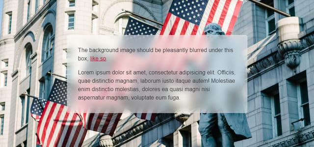
But does it look like Apple? In the screenshot we have 10 pixels blur. Add a little more blur - 20 pixels, and what do we get:
We’ll get something strange, at the edges of the block the blur disappears altogether.
Why it happens? — It's hard to tell a person who is not versed in browsers.
Is there a solution to this? — Yes, it is rather strange and simple, but it works.
By a long search for a solution on the Internet, it was impossible to stumble upon something about this filter this year. After about a dozen decisions of the type to create an after element with a size larger than a block, blur it, and give its parent overflow: hidden, the following was noticed:
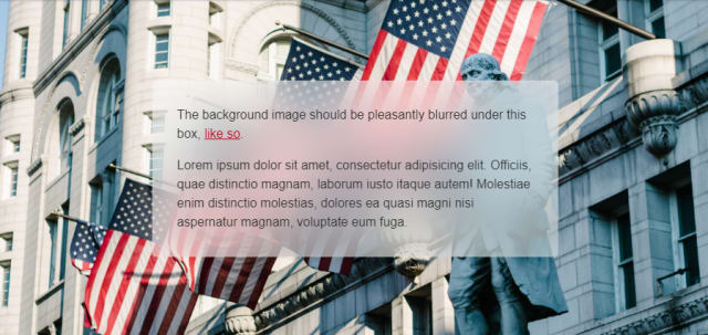
Adding a shadow to the object, it expands the blur area, and the idea arose to make a transparent shadow, this turned out to be the right decision, and the result was as expected:

I wish you successful use. look at the source code of the solution and play with it here: https://codepen.io/sergey-popovich/pen/dybepBv


Top comments (1)
Very nice effect! Thanks for the post and code link :)