Image optimization — at least in my experience — has always been a major pain when building speedy websites. Balancing image quality and bandwidth efficiency is a tough act without the right tools. Photo editing tools such as Photoshop are great for retouching, cropping and resizing bitmap images. Unfortunately, they are not that good at creating 100% optimized images for the web.
Luckily, we have extension packages for build tools that can optimize images for us quickly:
- Gulp: gulp-imagemin
- Grunt: grunt-imagemin
- Webpack: imagemin-webpack
- Parcel: parcel-plugin-imagemin
Unfortunately, image optimization alone is not enough. You need to make sure that the entire website is responsive and looks great at all screen sizes. This can easily be done through CSS, but here lies the problem:
Should you optimize your image for large screens or small screens?
If the majority of your audience is using mobile devices to access your site, then the logical choice is to optimize images for small screens. However, it’s likely that a significant source of revenue is coming from visitors with large screens over 17″. You definitely wouldn’t want to neglect them.
Luckily, we have technology that allows us to deliver optimized responsive images for different screen sizes. This means we need to generate multiple optimized images with different resolutions fit for specific screen sizes or responsive breakpoints.
For WordPress site owners, this kind of image optimization requires the use of a plugin and a third-party service. The creation of these responsive images cannot be done on the hosting server without significantly slowing down the site for users, hence the need for a third-party service.
If you are using Gatsby to run your website, then you are in luck. This feature is built-in and already configured for you to optimize your responsive images. You just need to drop in some images and write a bit of code to link up your responsive images with your web page. When you run the gatsby build command, the images are optimized for you. This saves you from requiring a third-party service to perform the optimization for you. It’s simply done on your deployment machine.
In the subsequent sections, we are going to learn:
- How image optimization works in Gatsby
- How to optimize images on a web page
- How to optimize images in a Markdown post
Prerequisites
Before we start, I would like to note that this tutorial is for developers who are just starting with Gatsby and would like to learn specifically about how to handle images. I am going to assume you already have a good foundation in the following topics:
- React
- GraphQL
This tutorial doesn’t cover beginner concepts for Gatsby — we have a getting started with Gatsby guide here. With that out of the way, head over to the next section to set up our demo project. You can view the completed source project here.
Demo Project Setup
Assuming you already have a recent version of Node.js installed on your system, let’s quickly set up a Gatsby starter project:
npm install -g gatsby-cli
gatsby new gatsby-image-demo
cd new gatsby-image-demo
npm start
This starter project includes the necessary dependencies and configuration required for creating and rendering responsive optimized images. If you used a different starter project or you preferred starting from a completely blank project, this is what you will need to do:
npm install gatsby-image gatsby-transformer-sharp gatsby-plugin-sharp gatsby-source-filesystem
Next, you’ll need to configure the dependencies as follows in gatsby-config.js:
plugins:[
    {
      resolve: `gatsby-source-filesystem`,
      options: {
        path: `${__dirname}/src/images`,
        name: 'images'
      }
    },
    'gatsby-transformer-sharp',
    'gatsby-plugin-sharp',
]
If you open http://localhost:8000/, you should have the Gatsby Default Starter page with an optimized PNG image of an astronaut. Feel free to look through the project code to see how the image was loaded and rendered.
It looks pretty complicated, right? Well, in the next section we’ll look at what that’s all about.
Image Optimization in Gatsby Explained
Rendering an optimized responsive image on a web page is done using Gatsby Image, a React component. It looks like this:
import Image from 'gatsby-image';

<!--  Fixed Image Example -->
<Image fixed={fixed} />

<!--  Fluid Image Example -->
<Image fluid={fluid} />
As seen in the above code samples, there are two types of images that the gatsby-image component is designed to handle:
- Fixed: image with fixed width and height
- Fluid: image with maximum width, and possibly height
Fixed is useful if you want to display retina images. Note that scroll bars will appear if the browser window is resized smaller than the image width. For fluid, the image will resize automatically based on the browser window size. Smaller or larger images will be swapped automatically to fit within a set viewport.
Now that we have talked about rendering, how does one provide image data to a gatsby-image component?
We use GraphQL to load an image for use on a web page. This query language allows us to access images from the local filesystem, a WordPress site or a custom API. You will need a special plugin to access a particular location type:
GraphQL not only fetches assets but is also capable of processing them before returning them to the calling function. In the case of image optimization, we are dealing with the following plugins:
The Gatsby Plugin Sharp is a low-level helper plugin that does the actual work of reducing image size with zero or minimal loss of image quality. It uses the Sharp image processing library to perform this task. For JPEGs, it generates progressive images with a default quality level of 50. For PNGs, it uses the pngquant library with a quality setting of 50-75.
The Gatsby Transformer Sharp plugin is responsible for creating responsive images. In other words, it performs resizing and cropping functions to generate different resolutions of an image for optimum display on mobile, tablet and large-screen devices.
In the next section, we’ll look at the practical usage of the above technologies.
Optimize Images on a Web Page
Let’s first start by dropping some images in the src/images folder:
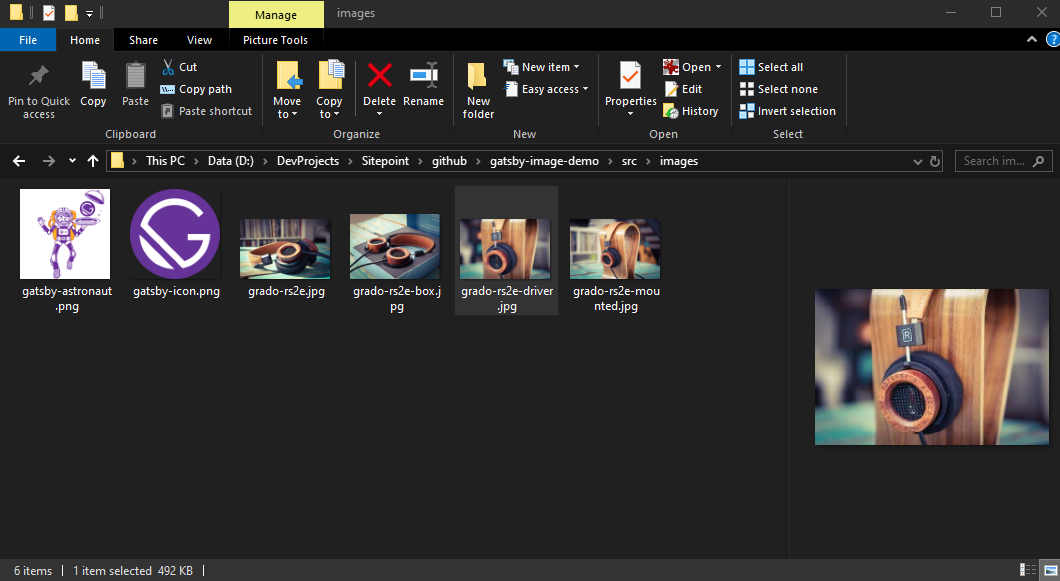
Feel free to use any image on your hard drive or from the internet. If you plan on using high resolution DSLR photos, I’d recommend you at least bring the size down to 700kb and below. Using large images will unnecessarily prolong the build optimization process, and will balloon the size of your project repository.
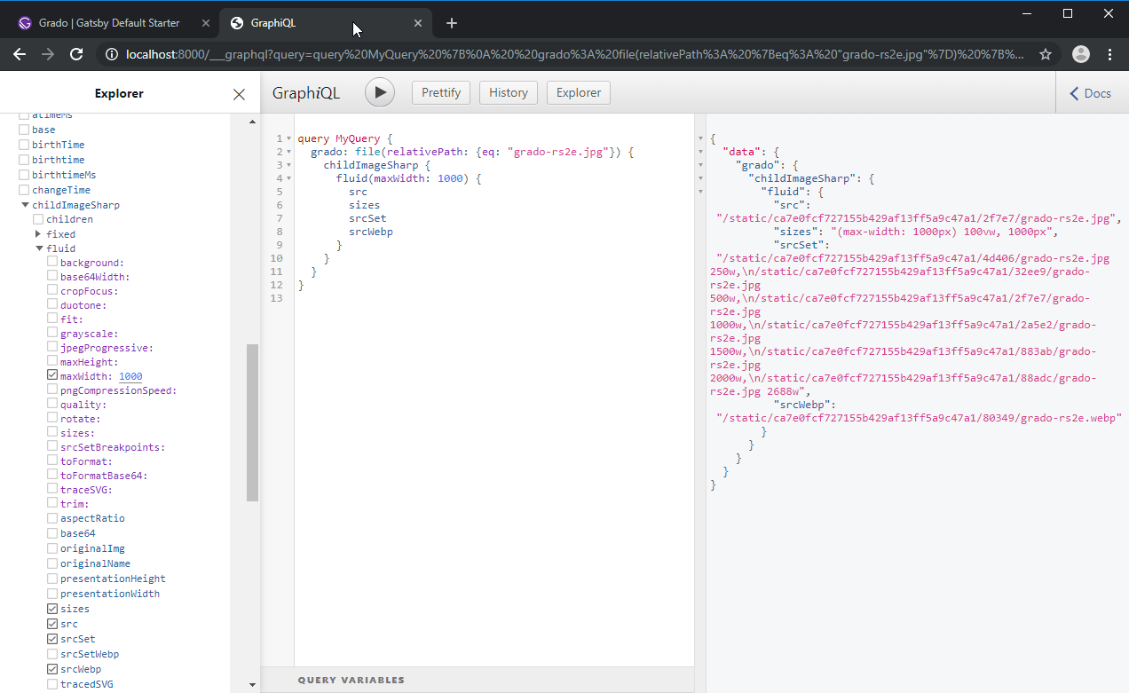
Next, let’s figure out the GraphQL queries that we’ll use to query our responsive optimized images. Open http://localhost:8000/___graphql in your browser to launch the GraphQL Explorer and Query interface. On the Explorer panel, take note of all the nodes we have available to us. In our case, we are only interested in the file and childImageSharp nodes. Below is a simple query that I have constructed. The Explorer panel will list all the parameters and nodes you can use to define your query:
Now that we have defined a GraphQL query, let’s create a new page, say grado.js. In the following code example, we are going to render both fixed and fluid images. However, for the query part, we’ll use GatsbyImageSharpFluid and GatsbyImageSharpFluid query fragments instead of listing all the required child nodes (i.e. src, sizes, srcSet etc). Do note that query fragments are not yet supported in GraphQL Query Explorer.
import React from "react"
import Image from 'gatsby-image';
import { graphql } from "gatsby"

import Layout from "../components/layout"
import SEO from "../components/seo"

const GradoPage = ({data}) => (
  <Layout>
    <SEO title="Grado" />
    <h1>Grado Headphones ShowCase</h1>
    <h3>Fluid</h3>
    <Image fluid={data.gradoFluidImage.childImageSharp.fluid} />
    <br/>
    <h3>Fixed</h3>
    <Image fixed={data.gradoFixedImage.childImageSharp.fixed} />
    <p>Grado Rs2e</p>
  </Layout>
)

export default GradoPage

export const pageQuery = graphql`
  query {
    gradoFluidImage: file(relativePath: { eq: "grado-rs2e.jpg" }) {
      childImageSharp {
        fluid(maxWidth: 1000) {
          ...GatsbyImageSharpFluid
        }
      }
    }
    gradoFixedImage: file(relativePath: { eq: "grado-rs2e.jpg" }) {
      childImageSharp {
        fixed(width: 600, height: 401) {
          ...GatsbyImageSharpFixed
        }
      }
    }
  }
`
Assuming Gatsby is still running, navigate to localhost:8000/grado:
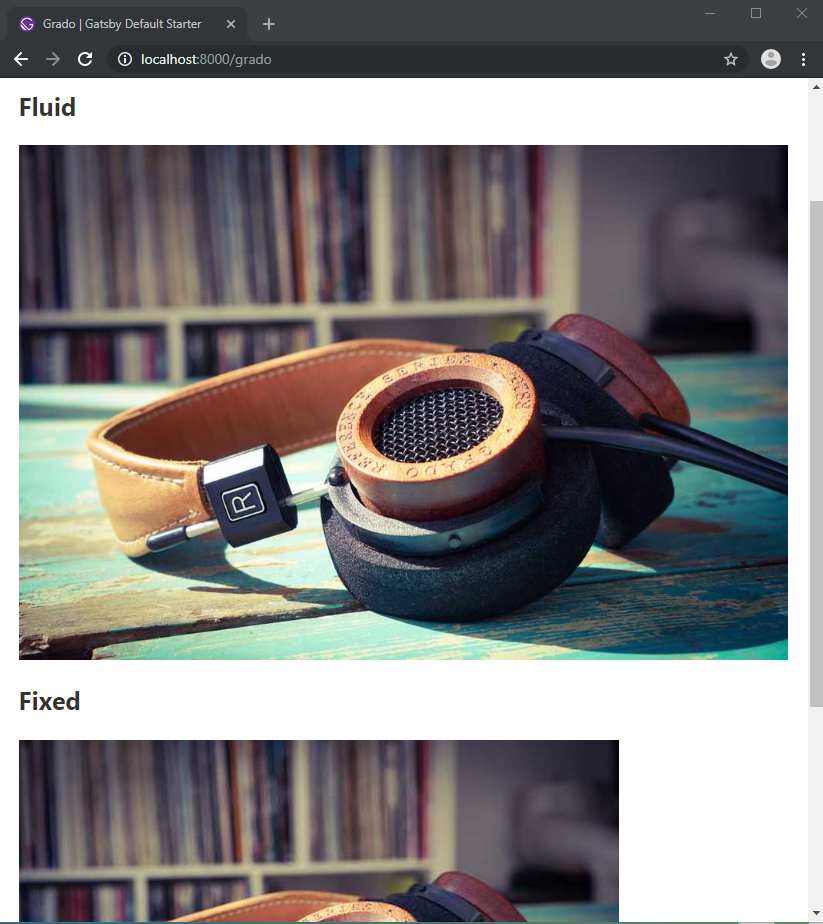
The example above will show you the visual difference between fluid and fixed images. The fluid image will always fit within the container width, while the fixed image will remain static regardless of the viewport size.
In the next code example, we’ll look at how we can list multiple fluid images on the same page:
const GradoPage = ({data}) => (
  <Layout>
    <SEO title="Grado" />
    <h1>Grado Headphones ShowCase</h1>
    <h3>Grado</h3>
    <Image fluid={data.grado.childImageSharp.fluid} />
    <br/>
    <h3>Grado Boxed</h3>
    <Image fluid={data.gradoBox.childImageSharp.fluid} />
    <br/>
    <h3>Grado Mounted</h3>
    <Image fluid={data.gradoMounted.childImageSharp.fluid} />
  </Layout>
)

export default GradoPage

export const pageQuery = graphql`
  query {
    grado: file(relativePath: { eq: "grado-rs2e.jpg" }) {
      childImageSharp {
        fluid(maxWidth: 1000) {
          ...GatsbyImageSharpFluid
        }
      }
    }

    gradoBox: file(relativePath: { eq: "grado-rs2e-box.jpg" }) {
      childImageSharp {
        fluid(maxWidth: 1000) {
          ...GatsbyImageSharpFluid
        }
      }
    }

    gradoMounted: file(relativePath: { eq: "grado-rs2e-mounted.jpg" }) {
      childImageSharp {
        fluid(maxWidth: 1000) {
          ...GatsbyImageSharpFluid
        }
      }
    }
  }
`
The /grado page should refresh automatically. You should see all the images appear on the page. If you try downloading one of the images right from the browser, you’ll see that size has been reduced. In my case, if I shrink the browser to the smallest width, the ‘Grado Box’ image is reduced to 19.5 KB. When I maximize the browser on my 17″ 1920×1080 screen, the image size is increased to 60.1 KB which still looks pretty sharp. These are pretty awesome numbers considering the source image I placed in the images folder weighs 618KB at a resolution of 2500x1800px.
You may have noticed that the query is looking redundant. We can simplify by creating our own query fragment as follows:
export const fluidImage = graphql`
  fragment fluidImage on File {
    childImageSharp {
      fluid(maxWidth: 1000) {
        ...GatsbyImageSharpFluid
      }
    }
  }
`;

export const pageQuery = graphql`
  query {
    grado: file(relativePath: { eq: "grado-rs2e.jpg" }) {
       ...fluidImage
    }

    gradoBox: file(relativePath: { eq: "grado-rs2e-box.jpg" }) {
       ...fluidImage
    }

    gradoMounted: file(relativePath: { eq: "grado-rs2e-mounted.jpg" }) {
       ...fluidImage
    }
  }
`
Optimize Images in Markdown Posts and Pages
There are two ways of optimizing images in Markdown posts and pages:
1. Featured Images
Featured images are usually placed within the metadata section. You just need to specify a field called featuredImage, like this:
---
title: First Post
featuredImage: ./first-post-image.png
---

Place content here
Next, you need to process the featuredImage in your Markdown template file, like this:
//src/templates/blog-post.js
---
export const query = graphql`
  query PostQuery($slug: String!) {
    markdownRemark(fields: { slug: { eq: $slug } }) {
      html
      frontmatter {
        title
        featuredImage {
          childImageSharp {
            fluid(maxWidth: 800) {
              ...GatsbyImageSharpFluid
            }
          }
        }
      }
    }
  }
`
You will also need to import the gatsby-image package in order to render your optimized responsive image:
//src/templates/blog-post.js

import Img from "gatsby-image"

export default({data}) {
  let post = data.markdownRemark
    let featuredImgFluid = post.frontmatter.featuredImage.childImageSharp.fluid
    return(
        <Layout>
          <div>
            <h1>{post.frontmatter.title}</h1>
            <Img fluid={featuredImgFluid} />
            <div dangerouslySetInnerHTML={{ __html: post.html }} />
          </div>
        </Layout>
    )
}
That’s it. All your Markdown posts will have the featuredImage field optimized for responsive screens.
2. Inline Images
For inline images used in Markdown posts and pages, all you have to do is install the following plugins:
npm install gatsby-remark-images
You will also need gatsby-plugin-sharp and gatsby-source-filesystem installed as well. Next, you’ll need to configure gatsby-remark-images in gatsby-config.js as follows:
module.exports = {
  plugins: [
    `gatsby-plugin-sharp`,
    {
      resolve: `gatsby-plugin-mdx`,
      options: {
        gatsbyRemarkPlugins: [
          {
            resolve: `gatsby-remark-images`,
            options: {
              maxWidth: 1200,
            },
          },
        ],
      },
    },
    {
      resolve: `gatsby-source-filesystem`,
      options: {
        path: `${__dirname}/src/pages`,
      },
    },
  ],
}
In your Markdown posts and images, you can use the default syntax to render images. The optimization will be done for you automatically:

Summary
I hope you now understand how to optimize images responsively for Gatsby sites. There are a few scenarios we haven’t covered here — you can read more about them on the relevant Gatsby package pages:
Frequently Asked Questions (FAQs) about Automatically Optimizing Responsive Images in Gatsby
What is the importance of optimizing images in Gatsby?
Optimizing images in Gatsby is crucial for several reasons. Firstly, it improves the performance of your website. Large, unoptimized images can slow down your site, negatively impacting the user experience. Secondly, optimized images are more likely to rank higher in search engine results, driving more traffic to your site. Lastly, optimized images consume less bandwidth, which can be beneficial for users with limited internet access or those browsing on mobile devices.
How does Gatsby handle image optimization?
Gatsby provides a powerful plugin system that includes several plugins for image optimization. These plugins, such as gatsby-image and gatsby-plugin-image, offer features like lazy loading, image processing, and the generation of multiple image sizes for different screen resolutions. They work by reducing the file size of images without compromising on their quality, ensuring that your site loads quickly and smoothly.
What is the difference between gatsby-image and gatsby-plugin-image?
Both gatsby-image and gatsby-plugin-image are plugins provided by Gatsby for image optimization. However, gatsby-plugin-image is the newer and more advanced of the two. It offers improved performance, better Lighthouse scores, and additional features like support for AVIF images. It’s also easier to use, with a simpler API and automatic integration with Gatsby’s GraphQL data layer.
How can I use gatsby-plugin-image to optimize my images?
To use gatsby-plugin-image, you first need to install it and add it to your gatsby-config.js file. Then, you can use the GatsbyImage component to display your images. This component accepts an image object that you can obtain using one of Gatsby’s GraphQL queries. The plugin will then automatically optimize the image, generating different sizes for different screen resolutions and applying techniques like lazy loading.
What are responsive images and why are they important?
Responsive images are images that adapt to different screen sizes and resolutions. They ensure that your images look good on all devices, from small mobile phones to large desktop monitors. Responsive images are important because they improve the user experience and performance of your site. They also help with SEO, as search engines prefer sites that are mobile-friendly.
How does Gatsby generate responsive images?
Gatsby generates responsive images using its image optimization plugins. These plugins create multiple versions of each image at different sizes. When a user visits your site, the appropriate image size is served based on their device’s screen resolution. This ensures that your images always look sharp and load quickly, regardless of the device being used.
Can I use Gatsby to optimize images for different formats?
Yes, Gatsby supports multiple image formats, including JPEG, PNG, and the newer AVIF and WebP formats. You can specify the formats you want to use in your GraphQL queries, and Gatsby will generate optimized images in those formats. This allows you to take advantage of the benefits of newer formats, like improved compression and quality, while still providing fallbacks for older browsers.
What is lazy loading and how does it improve performance?
Lazy loading is a technique where images are only loaded when they are about to become visible on the screen. This reduces the initial load time of your site, as images that are off-screen are not loaded immediately. Gatsby’s image optimization plugins automatically apply lazy loading to your images, improving the performance of your site and providing a smoother user experience.
How can I customize the appearance of my images in Gatsby?
Gatsby provides several options for customizing the appearance of your images. You can apply CSS styles to the GatsbyImage component, use the “aspectRatio” option to control the image’s aspect ratio, or use the “layout” option to choose between different layout modes. You can also use Gatsby’s image processing functions to apply effects like blurring or cropping.
What are the best practices for working with images in Gatsby?
Some best practices for working with images in Gatsby include: using the gatsby-plugin-image for image optimization, specifying multiple image formats in your GraphQL queries, using responsive images to ensure your images look good on all devices, applying lazy loading to improve performance, and customizing the appearance of your images to match your site’s design.
 Michael Wanyoike
I write clean, readable and modular code. I love learning new technologies that bring efficiencies and increased productivity to my workflow.