In this tutorial you will build a simple, responsive and animated navigation bar with React JS. You will use styled-components for the css and react-springs for the animations.
You can check here the final result of this project.
Styled components is a CSS-in-JS styling framework that uses tagged template literals in JavaScript and the awesome power of CSS to provide a platform that allows you to write actual CSS to style react components. In essence, styled components are easy-to-make react components you write with the styled-components library where you can style your components with plain CSS inside your javascript code and React-Spring is a spring-physics based animation library that should cover most of your UI related animation needs in a very simple way.
Lets start !
I will assume that you have node installed on your computer, you can check it by typing in your terminal :
node -v
if you don’t please install the latest version.
OK, all set now ! You will start a new project using create-react-app so open your terminal and type:
npx create-react-app react-navbar
And add the dependencies you will need during the project
npm install styled-components react-spring
Now open your newly created project with your favorite code editor, go to the src folder and delete app.css, index.css and logo.svg.
Open your index.js file and remove the line :
import “./index.css”
Also open your app.js and clean it up to look like this:
import React from “react”;

const App = () =>  {
  return(
    <div>

    </div>
  )
}

export default App;
In your src folder create a directory named styles with a Global.js file inside it, also in your src folder create a components folder, a sub-folder named navbar and inside this folder create this files: Brand.js , BurgerMenu.js, CollapseMenu.js and Navbar.js.
We will also create a folder named assets in the src folder and we will put a image inside of it, you can download the file from here.
Your project tree should look like this:
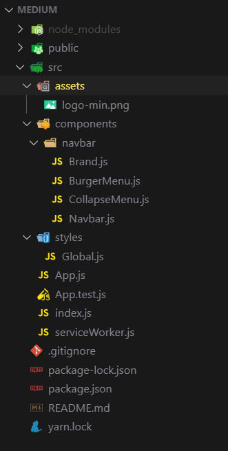
Great, this will be your starting point.
First of all your going to create the global style file using Styled Components, open your Global.js file and add this code:
import { createGlobalStyle } from 'styled-components';

const GlobalStyles = createGlobalStyle`

  @import url('https://fonts.googleapis.com/css?family=Montserrat:400,600&display=swap');;

  *,
  *::after,
  *::before {
    margin: 0px;
    padding: 0px;
    box-sizing: inherit;
  }

  html {
    font-size: 62.5%;
  }

  body {
    box-sizing: border-box;
    font-family: 'Montserrat', sans-serif;
  }
`;

export default GlobalStyles;
Now you will open your App.js file, refactor it to a class component, add the dependencies we will need, add the Global.js and Navbar.js components and the state for the navbar.
import React, { Component } from 'react'
import Navbar from "./components/navbar/Navbar";

import GlobalStyle from './styles/Global';

class App extends Component {
  state = {
    navbarOpen: false
  }

  handleNavbar = () => {
    this.setState({ navbarOpen: !this.state.navbarOpen });
  }

  render() {

    return (
      <>
        <Navbar
          navbarState={this.state.navbarOpen}
          handleNavbar={this.handleNavbar}
        />
        <GlobalStyle />
      </>
    )
  }
}

export default App
Great, before you start working on the Navbar.js component you will deal with the small components, open your Brand.js and make it look like this:
import React from 'react'
import styled from "styled-components";

import logo from "../../assets/logo-min.png";

const Brand = () => {
  return (
    <Image src={logo} alt="Company Logo" />
  )
}

export default Brand

const Image = styled.img`
  height: 85%;
  margin: auto 0;
`;
Now the BurgerMenu.js:
import React from 'react';
import styled from "styled-components";
const Burgermenu = (props) => {
return (
<Wrapper onClick={props.handleNavbar}>
<div className={ props.navbarState ? "open" : "" }>
<span> </span>
<span> </span>
<span> </span>
</div>
</Wrapper>
);
}
export default Burgermenu;
const Wrapper = styled.div`
position: relative;
padding-top: .7rem;
cursor: pointer;
display: block;
& span {
background: #fdcb6e;
display: block;
position: relative;
width: 3.5rem;
height: .4rem;
margin-bottom: .7rem;
transition: all ease-in-out 0.2s;
}
.open span:nth-child(2) {
opacity: 0;
}
.open span:nth-child(3) {
transform: rotate(45deg);
top: -11px;
}
.open span:nth-child(1) {
transform: rotate(-45deg);
top: 11px;
}
`;
Great, now the final to components, first the CollapseMenu.js:
import React from 'react';
import styled from 'styled-components';

import { useSpring, animated } from 'react-spring';

const CollapseMenu = (props) => {
  const { open } = useSpring({ open: props.navbarState ? 0 : 1 });

  if (props.navbarState === true) {
    return (
      <CollapseWrapper style={{
        transform: open.interpolate({
          range: [0, 0.2, 0.3, 1],
          output: [0, -20, 0, -200],
        }).interpolate(openValue => `translate3d(0, ${openValue}px, 0`),
      }}
      >
        <NavLinks>
          <li><a href="/" onClick={props.handleNavbar}>link n1</a></li>
          <li><a href="/" onClick={props.handleNavbar}>link n2</a></li>
          <li><a href="/" onClick={props.handleNavbar}>link n3</a></li>
          <li><a href="/" onClick={props.handleNavbar}>link n4</a></li>
        </NavLinks>
      </CollapseWrapper>
    );
  }
  return null;
};

export default CollapseMenu;

const CollapseWrapper = styled(animated.div)`
  background: #2d3436;
  position: fixed;
  top: 4.5rem;
  left: 0;
  right: 0;
`;

const NavLinks = styled.ul`
  list-style-type: none;
  padding: 2rem 1rem 2rem 2rem;

  & li {
    transition: all 300ms linear 0s;
  }

  & a {
    font-size: 1.4rem;
    line-height: 2;
    color: #dfe6e9;
    text-transform: uppercase;
    text-decoration: none;
    cursor: pointer;

    &:hover {
      color: #fdcb6e;
      border-bottom: 1px solid #fdcb6e;
    }
  }
`;
And finally the Navbar.js;
import React from 'react'
import styled from "styled-components";
import { useSpring, animated, config } from "react-spring";

import Brand from "./Brand";
import BurgerMenu from "./BurgerMenu";
import CollapseMenu from "./CollapseMenu";

const Navbar = (props) => {
  const barAnimation = useSpring({
    from: { transform: 'translate3d(0, -10rem, 0)' },
    transform: 'translate3d(0, 0, 0)',
  });

  const linkAnimation = useSpring({
    from: { transform: 'translate3d(0, 30px, 0)', opacity: 0 },
    to: { transform: 'translate3d(0, 0, 0)', opacity: 1 },
    delay: 800,
    config: config.wobbly,
  });

  return (
    <>
      <NavBar style={barAnimation}>
        <FlexContainer>
          <Brand />
          <NavLinks style={linkAnimation}>
            <a href="/">link n1</a>
            <a href="/">link n2</a>
            <a href="/">link n3</a>
            <a href="/">link n4</a>
          </NavLinks>
          <BurgerWrapper>
            <BurgerMenu
              navbarState={props.navbarState}
              handleNavbar={props.handleNavbar}
            />
          </BurgerWrapper>
        </FlexContainer>
      </NavBar>
      <CollapseMenu
        navbarState={props.navbarState}
        handleNavbar={props.handleNavbar}
      />
   </>
  )
}

export default Navbar

const NavBar = styled(animated.nav)`
  position: fixed;
  width: 100%;
  top: 0;
  left: 0;
  background: #2d3436;
  z-index: 1;
  font-size: 1.4rem;
`;

const FlexContainer = styled.div`
  max-width: 120rem;
  display: flex;
  margin: auto;
  padding: 0 2rem;;
  justify-content: space-between;
  height: 5rem;
`;

const NavLinks = styled(animated.ul)`
  justify-self: end;
  list-style-type: none;
  margin: auto 0;

  & a {
    color: #dfe6e9;
    text-transform: uppercase;
    font-weight: 600;
    border-bottom: 1px solid transparent;
    margin: 0 1.5rem;
    transition: all 300ms linear 0s;
    text-decoration: none;
    cursor: pointer;

    &:hover {
      color: #fdcb6e;
      border-bottom: 1px solid #fdcb6e;
    }

    @media (max-width: 768px) {
      display: none;
    }
  }
`;

const BurgerWrapper = styled.div`
  margin: auto 0;

  @media (min-width: 769px) {
    display: none;
  }
`;
And you are done !
If you don't want to write all this code you can fork the github repo I made for this example.
See you soon for more tips and tutorials !


Top comments (19)
You need to stop relying upon hoisting as all of your examples would throw an eslint error. For example, you are calling
CollapseWrapperbefore it has been declared and this is consistent throughout your code unless you are actually hoisting functions by intent declare the pointer first.This is a standard way of use Styled Components in React but thanks for your comment. If you dont link to use it this way you can put the styled component on another file
My comment was purely about your javascript. The code you have given us as an example would fail when run through eslint.
Please be careful sharing code that is bad practice as you are encouraging others to write code in this way.
I understand what you are trying to say but, is not true.
You will not get any linting error, if you quickly install eslint and extend airbnb preset or even react-standard for instance on my demo you will see that no error or warning will show up.
Declaring styled-components in react at the end of the file is not consider bad practice either.
Thanks for the nice series of posts on DEV, Nuno~
May I request to add syntax highlights for code snippets?
Check out the Editor Guide for more info.
Thx for the tip ! I'll do it on all my articles !
Thank you ~
great post
Thank you !!
Thank you for the amazing, simple and straightforward. I was looking into spring and your post really helped :)
Thank you so much for your positive feedback !
Thank you so much, I am a beginner this is exactly what I was looking for, simple and straightforward.
Im glad I could help you ! Thx for the feedback !
thanks for the tutorial. can we make navbar font color & background color different for different links?
sure you can, just style the a tags accordingly
Thanks for the tut! I'm just curious why you would need to refactor to an App.js class component?
Today with hooks you dont need it, but when I made the tutorial i still used class based react components
thanks for this wonderful tutorials. I have an observation which is Module not found: Can't resolve './styles/Global'.....this is the error i get, thanks.
Thanks for your feedback !
Did you create de globalstyles file ?
You tried to follow the tutorial or you get that error cloning the repository ?