
As a developer, choosing colors for my designs has always been one of the more difficult tasks. To help I tend to use tools like Coolors, SASS Color Generator, and this color contrast checker.
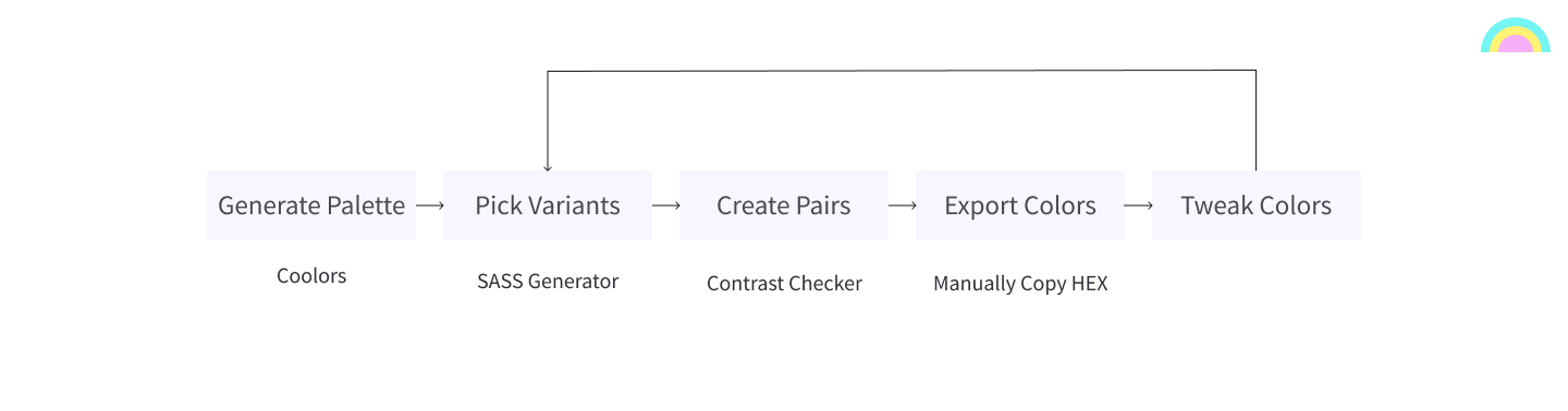
My process used to look something like this:
- Generate a palette using Coolors
- Pick variants for each color using SASS Color Generator
- Pair variants together into background/foreground combinations.
- Check that the pairs are accessible using the color contrast checker.
- Add my chosen colors to my design tool of choice (Figma).
- Tweak colors and repeat from step 2.
So, what was the problem?
My old process involved a lot of back and forth between different applications. I couldn’t tweak my colors and see the impact on accessibility in real time. Instead, I had to copy/paste HEX codes from one app into another. Then when I was ready to start development, I had to manually create the variables in SASS/CSS and copy the values over again.
And the solution?
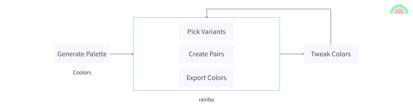
Create a tool where I could do (almost) everything in one place. My goal was to move towards a process like this:
- Generate a palette using Coolors
- Pick variants, pair colors, and make tweaks using a single app.
- Add the resulting colors to my design tool of choice.
I also wanted the app to be able to export my colors to code so I would have a good starting point for development.
The initial proof of concept
I wanted to get something up and running as quickly as possible so I could start testing it out. To that end, I set about creating a prototype.
Use Cases
The first step in getting a prototype put together was to define the use cases that would drive it.
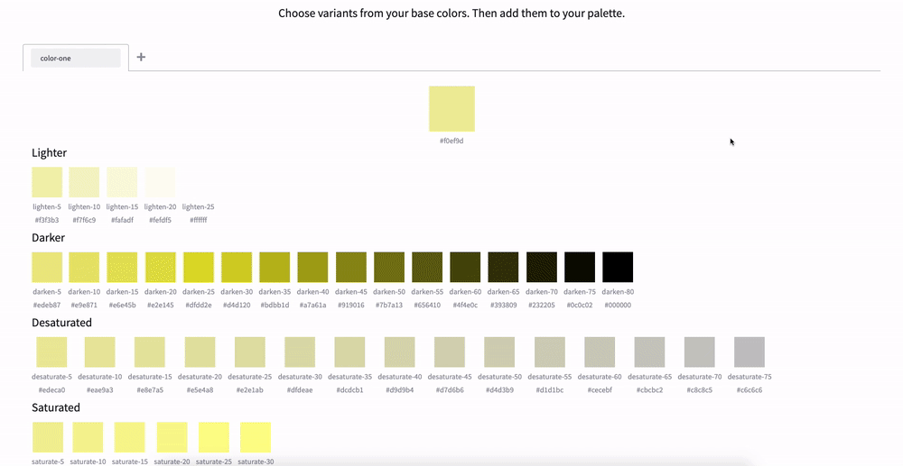
- As a user, I want to generate variants for my base colors.
I wanted to be able to open up the app, add my base colors, pick the variants, and then re-export them back out to my design tool again. Simple ?.
2. As a user, I want to check if a background/foreground color pair is accessible.
From the entered base colors or their variants, I wanted to be able to check if two colors were accessible when paired together.
3. As a user, I should be able to see the impact that changing a base color has on accessibility.
I wanted to be able to get real-time feedback on the color pairs I had picked each time I made tweaks to my base colors.
A (very rough) working version
With the use cases defined, I then set about designing the prototype. I came up with a color palette, designed a limited set of components, and eventually arrived at a solution that had three “modes” or pages, with the user having to switch between them to accomplish their tasks.
Rather than describing it any further, let’s take a look.
As you can see from the image above, the prototype achieved everything I wanted based on the initial use cases… Sort of.
Click here if you would like to try the prototype for yourself, thanks to the magic of Netlify deploy previews.
The good and bad of the original design
I never intended for the first prototype to be anything other than a stepping stone, and you can see for yourself that it was quite rough and flawed.
For the next version, I started by looking at what I liked about the prototype.
Variant Mode
I was quite happy with how the variant generating part of the prototype turned out. It was quite simple to pick a color and get your list of variants. Also, the tabbed approach worked quite well for adding multiple base colors.
Being able to see changes to accessibility after changing a color
As you can see in the short demo above, there was no need to copy/paste HEX codes between applications. I could now change one of my colors and see how that affected color accessibility really quickly.
Then, I started picking things which I didn’t like and needed to be improved.
Interactions weren’t obvious
Based on arriving at the home page, it wasn’t immediately obvious how you go about picking variants and checking for accessibility. You could probably figure out that you had to click the tiles eventually, but it was really clunky.
The modes were confusing
In the initial designs, you could only add pairs from the palette view, and you could only add/remove variants from the variants view. It all involved a lot of switching between screens and I found myself getting frustrated by how much work the app was making me do. This leads me to my next point.
Too much clicking was needed
You have to click to add a variant. Then you have to click to move to the palette view. Then you have to click multiple times to create a pair. Then you have to click some more to see the pair you just added. As I mentioned above, the whole thing was quite clunky and this was probably the worst part of the prototype and something I knew I needed to change.
Not enough information was visible on the screen at once
The more I used it, the more I started to dislike the “modes” concept I created. I think I was influenced by the original process that inspired the application and I designed the screens in silos rather than designing a unified experience. After using the prototype I decided that I needed to migrate away from the “modes” concept to something that ideally could all be done on a single page.
A second attempt
I took the lessons I had learned from the prototype and set about creating a better version of the app.
In order to reduce the number of interactions required, reduce the ambiguity in the interactions, and to increase the amount of information available to the user at once, I decided to move to a drag and drop based UI where the user would be able to drag tiles around to add to their palette or create accessibility checks.
The drag target would always display and this would avoid the need to switch between screens.
Let’s take a look at what I came up with.
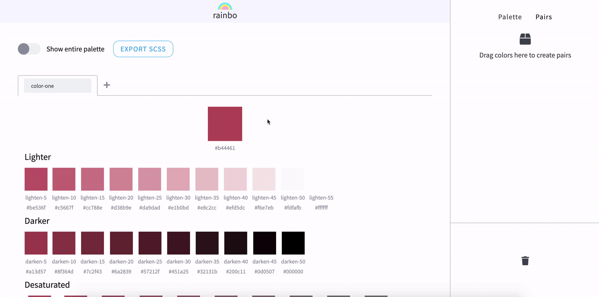
You can access the current version of the application here.
Next steps
The application is still very much in its infancy and although the second version is much closer to the idea I had in mind, there are still improvements that can be made.
Import from code
As well as exporting the palette I plan to add the ability to read the initial base colors from code containing variables (SASS, and CSS variables to start with)
Export to more formats
Currently, you can only export SASS. I plan to add support for CSS Variables, and other formats in the future.
Integrate with design tools
Exporting to code is great, but it would be even better if I could export the palette and then import it as a layer or shared style in a design tool such as Figma or Sketch.
Refine the UI
Let’s face it, it’s not the best looking application in the world. I plan to tweak the UI components to improve the app visually.
Feedback and bug reporting
This one speaks for itself. I can only improve the app with input from those who use it. To do that, I plan to add a feedback form in the future.
Feedback
Speaking of feedback… I wrote this article for two reasons. The first being to walk you through the process I went through to arrive at the current design in the hopes that you can learn from it.
The second reason is that I wanted to showcase the tool to the development and design community as I believe it can be useful for many people, and also to gather feedback on it in its current state.
So, if you have any thoughts on the design, functionality, the process I went through to create the tool, or anything else, I would love to hear it!