

The goal is to turn data into information, and information into insight.
―Carly Fiorina
About Kibana

Kibana is a piece of data visualization software that provides a browser-based interface for exploring Elasticsearch data and navigating the Elastic Stack — a collection of open-source products (Elasticsearch, Logstash, Beats, and others).
While Logstash and Bits deliver data to Elasticsearch, Kibana opens the window into the Elastic Stack, allowing you to track the health of your cluster, perform log and time-series analysis, detect anomalies in the data with unsupervised machine learning, discover relationships using graphs and, most importantly, extract insights from the Elasticsearch data with visualizations that can be combined together in a custom interactive dashboard.
Today I’d like to show you how to create a stunning dashboard and a tabular report based on the Elasticsearch data.
Roll up your sleeves and let’s start!
Where to start
The Home page is the place where everything starts.
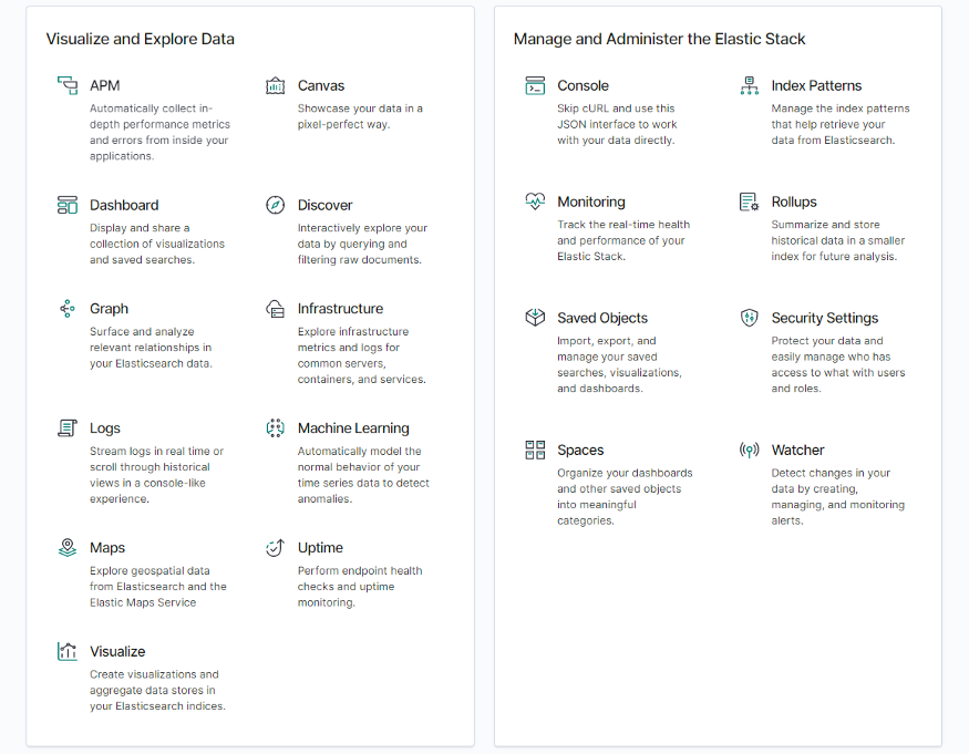
Here you can decide which actions to take next. The available functionality can be divided into two logical sections:
- Visualizing and exploring the data. Here you can create a new dashboard, visualization or presentation, build a machine learning model, analyze relationships in your data using graphs, and more.
- Managing the Elastic Stack: configure your spaces, analyze logs of an application, configure security settings, etc.
We’ll focus on the process of creating visualizations and adding them to the dashboard.
How to create a dashboard in Kibana
Let me get you a feel for how easy it is to set up a rich dashboard and start reporting.
The first essential step to take is to import your data into Kibana. Multiple options for adding data are at your disposal — you can choose the one that works best for you:
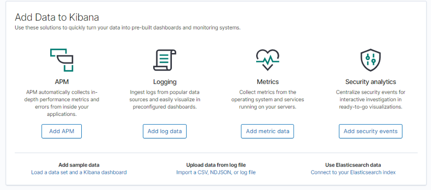
For demonstration purposes, I’ve selected the sample data.
To design your first data visualizations and combine them into the dashboard, open the Visualize page. Here you can create, modify and view the existing visualizations.
What will strike you at once is the abundance of visualization types you can choose from.
After you’ve selected the one you need, choose an index pattern as a source so as to inform Kibana about your index. Let’s choose `kibana_sample_data_flights` and start creating a horizontal bar chart.
Now you can apply a metric aggregation for the Y-axis and a bucket aggregation for the X-axis. Here is a list of all available aggregations for charts.
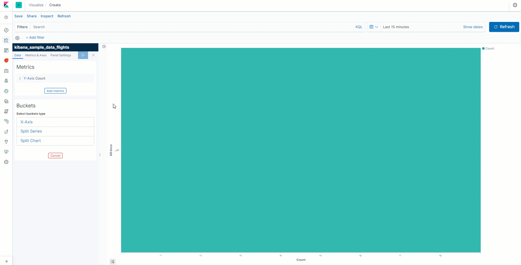
Optionally, you can customize the colors of the visualization.
Filtering is another mighty feature of Elasticsearch and Kibana. It provides a way to visualize only a selected subset of documents.
See how you can apply filters to the fields based on logical conditions:
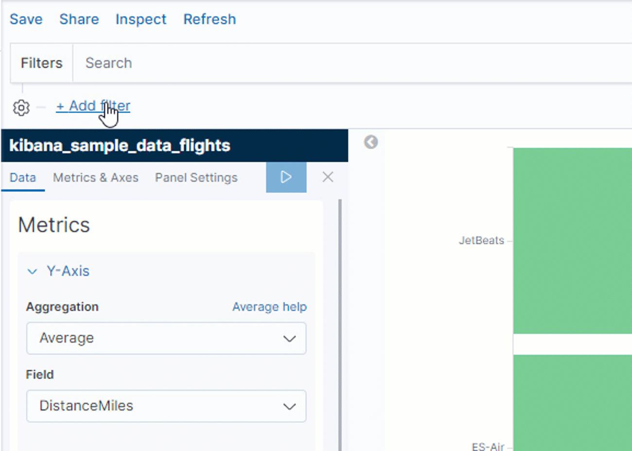
As you see, Kibana provides a straightforward way of filtering the data via the comfy interface. Along with that, you can choose how to filter the data — either by using the Kibana Query Language (a simplified query syntax) or Lucene.
To allow end-users to filter the data interactively, you can add control widgets — special elements of the dashboard which allow filtering the data simply by clicking them.
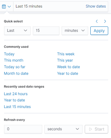
Another feature I’d like to highlight is the advanced filtering by dates and the ability to set time intervals for refreshing the data in the dashboard.
The good thing is that visualizations are reusable. After creating it, you can save your result and add it to the dashboard any time as well as share with your colleagues given they have access to your Kibana instance.
After arranging all the visualization elements on a single page, you can export the final dashboard to PNG or PDF format. This is what makes the dashboards portable — it’s easy to share them across departments in no time.
Let’s look at an example of the dashboard you can create:
To my mind, the principal features which make each dashboard special are interactivity and expressiveness. With it, you can communicate business metrics efficiently.
Personal impression
The visualizations in Kibana ideally perform the tasks they are designed for. What is more, all the visualizations are eye-catching and you can tailor them according to your design ideas. The entire process of creating a dashboard in Kibana is meant to be fast and efficient — and it is so due to the Kibana’s user-friendly and intuitive interface.
On the other hand, I’ve felt that some functionality is missing here.
When working with data, one of the effective exploratory techniques you can apply is slicing and dicing your data before getting to know which aspects of the data to pay attention to. To my mind, the data table widget isn’t the best option — it presents the data in a flat table which doesn’t support a multi-dimensional view of the data. But playing with data should be done interactively and fast.
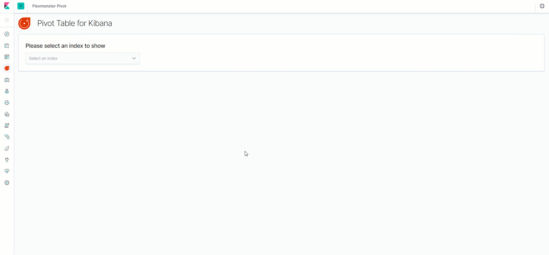
And this is where a pivot table control comes into play. After searching for available solutions, my choice fell on one open-source plugin called Flexmonster. It handles connecting to the Elasticsearch index and allows creating tabular reports based on the data from its documents. Along with that, integrating with Kibana is smooth — the only thing required to get started is to install a plugin by running one line of code in the command line. You can find more details on GitHub. Before using it, I recommend making sure that your Kibana and Elasticsearch instances are of the same version.
Once you set up a tool, you are ready to use all available features for searching in-depth insights.
Features for analytics and reporting
Flexmonster Pivot provides fast access to the most essential reporting functionality. Its toolbar allows connecting to the data source, loading previously saved reports, exporting reports to PDF, Excel, HTML, CSV, and images. Besides, I’ve managed to quickly switch between two different modes — the grid and the charts. Cells formatting options include conditional and number formatting. The field list deserves particular attention — here you can select hierarchies to rows, columns, measures, and report filters. There is also the search input field which is helpful if the index has a long list of fields.
One of the features I’d like to highlight is the ability to drag and drop the hierarchies right on the grid. Thereby, you can change the slice completely via the UI.
Another one is the drill-through feature — it helps to know which records stand behind the aggregated values.
Working with a pivot table
Let me show you how to create a report based on the Elasticsearch data:
While testing the tool, I’ve managed to aggregate and filter the data, sort the values on the grid and save the results to continue working with the report later. Plus, exporting works well — it’s easy to share the reports with teammates.
Bringing it all together
Today I’ve covered the benefits Kibana provides for visualization of Elasticsearch data. You’ve been able to make sure how dashboards can empower the analysis process.
To my mind, a pivot table is a good tool which enables you to benefit from exploring data before teasing out the answers to complex questions.
Flexmonster nicely complements the available functionality of Kibana - the reports you are creating with it are insightful, customizable and can be easily shared across departments.
Working together, both tools have all the potential to boost your storytelling.
I encourage you to give such a combination a try.