
Web applications are normally data-driven and oftentimes the need arises to visualize this data. That’s where charts and graphs come in. They make it easier to convey information, as well as demonstrate correlations or statistical relationships. Information presented in the form of a chart or a graph is also easier for a non-native speaker to understand.
In this tutorial, we’ll learn how to visualize data in a Vue project. For this, we’ll be using the popular D3.js library, which combines powerful visualization components and a data-driven approach to DOM manipulation.
Let’s get started.
Note: the code for this tutorial can be found on GitHub.
Want to learn Vue.js from the ground up? This article is an extract from our Premium library. Get an entire collection of Vue books covering fundamentals, projects, tips and tools & more with SitePoint Premium. Join now for just $9/month.
What is D3?
As you can read on the project’s home page, D3.js is a JavaScript library for manipulating documents based on data. D3 helps you bring data to life using HTML, SVG, and CSS. Its emphasis on web standards gives you the full capabilities of modern browsers without tying yourself to a proprietary framework.
Whereas most people will refer to D3.js as a data visualization library, it’s not. D3 is more of a framework comprising different parts — such as jQuery parts (which help us select and manipulate DOM elements), Lodash parts, animation parts, data analysis parts, and data visualization parts.
In this tutorial, we’ll be working with the visualization aspect of D3. The real meat of D3 when visualizing data is:
- the availability of functions for decorating data with drawing instructions
- creating new drawable data from source data
- generating SVG paths
- creating data visualization elements (like an axis) in the DOM from your data and methods
What We’ll Be Building
We want to create an app that lets users search for a repo on GitHub, then get a visual representation of issues opened in the past week that are still open. The end result will look like this:
Prerequisites
This tutorial assumes you have a working knowledge of Vue. Previous knowledge of D3.js isn’t required, but if you’d like to get up to speed quickly, you might want to read our D3 by example tutorial.
You’ll also need to have Node installed on your system. You can do this by downloading the binaries for your system from the official website, or using a version manager.
Finally, we’ll be using the following packages to build our app:
- Vue CLI — to scaffold out the project
- D3.js — to visualize our data
- Lodash — which provides a handful of utility methods
- Moment JS — for date and time formatting
- axios — an HTTP client to help us make requests to an external API
New Vue Project
I prefer creating new Vue projects using Vue CLI. (If you’re not familiar with Vue CLI, our beginner’s guide in this Vue series gives a full introduction.) Vue CLI provides a nice folder structure for placing different sections of the code, such as styles, components, and so on.
Make sure that the CLI is installed on your machine:
npm install -g @vue/cli
Then create a new project with the following command:
vue create issues-visualization
Note: while creating a new project using Vue CLI, you’ll be prompted to pick a preset. For this particular project, we’ll just stick with the default (Babel + ESLint).
Once our new Vue project has been created, we cd into the project folder and add the various node modules we’ll need:
npm install lodash d3 axios moment
Even though this is a simple app that doesn’t have many running parts, we’ll still take the components approach instead of dumping all the code inside the App.vue file. We’re going to have two components, the App component and a Chart component that we’re yet to create.
The App component will handle fetching data from GitHub, then pass this data to the Chart component as props. The actual drawing of the chart will happen inside the Chart component. Structuring things this way has the advantage that, if you want to use a library other than axios to fetch the data, it’ll be easier to swap it out. Also, if you want to swap D3 for a different charting library, that’ll be easier too.
Building the Search Interface
We’ll start by building a search interface that lets users enter the name of the repo they want to see visualized.
In src/App.vue, get rid of everything inside the <template> tag and replace the content with this:
<template>
  <div id="app">
    <form action="#" @submit.prevent="getIssues">
      <div class="form-group">
        <input
          type="text"
          placeholder="owner/repo Name"
          v-model="repository"
          class="col-md-2 col-md-offset-5"
        >
      </div>
    </form>
  </div>
</template>
Here we have a form which, upon submission, prevents the browser’s default submission action, then calls a getIssues method that we’re yet to define. We’re also using a v-model directive to bind the input from the form to a repository property inside the data model of our Vue instance. Let’s declare that property repository as an empty string. We’ll also add a startDate property, which we’ll later use as the first date in our time range:
import moment from "moment";
import axios from "axios";

export default {
  name: "app",
  data() {
    return {
      issues: [],
      repository: "",
      startDate: null
    };
  },
  methods: {
    getIssues() {
      // code goes in here
    }
  }
};
Now on to creating the getIssues method:
getIssues() {
  this.startDate = moment()
    .subtract(6, "days")
    .format("YYYY-MM-DD");

  axios
    .get(
      `https://api.github.com/search/issues?q=repo:${this.repository}+is:issue+is:open+created:>=${this.startDate}`,
      { params: { per_page: 100 } }
    )
    .then(response => {
      const payload = this.getDateRange();

      response.data.items.forEach(item => {
        const key = moment(item.created_at).format("MMM Do YY");
        const obj = payload.filter(o => o.day === key)[0];
        obj.issues += 1;
      });

      this.issues = payload;
      console.log(this.issues);
    });
}
In the above block of code, we start by setting the startDate data property to six days ago and formatting it for use with the GitHub API.
We then use axios to make an API request to GitHub to get all issues for a particular repository that were opened in the past week and that are still open. You can refer to GitHub’s search API if you need more examples on how to come up with query string parameters.
When making the HTTP request, we set the results count to 100 per page (the max possible). There are hardly any repositories with over 100 new issues per week, so this should be fine for our purposes. By default, the per_page value is 30.
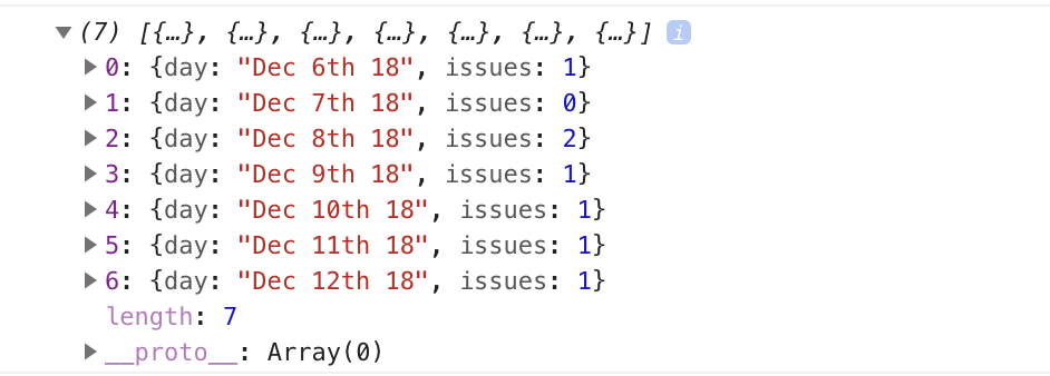
If the request completes successfully, we use a custom getDateRange method to initialize a payload variable that we will be able to pass to the Chart component. This payload is an array of objects that will like so:
[
  {day: "Dec 7th 18", issues: 0},
  {day: "Dec 8th 18", issues: 0},
  {day: "Dec 9th 18", issues: 0},
  {day: "Dec 10th 18", issues: 0},
  {day: "Dec 11th 18", issues: 0},
  {day: "Dec 12th 18", issues: 0},
  {day: "Dec 13th 18", issues: 0}
]
After that, we iterate over the API’s response. The data we’re interested in is in an items key on a data property on the response object. From this, we take the created_at key (which is a timestamp) and format it as the day property in our objects above. From there, we then look up the corresponding date in the payload array and increment the issues count for that date by one.
Finally, we assign the payload array to our issues data property and log the response.
Next, let’s add in the getDateRange method:
methods: {
  getDateRange() {
    const startDate = moment().subtract(6, 'days');
    const endDate = moment();
    const dates = [];

    while (startDate.isSameOrBefore(endDate)) {
      dates.push({
        day: startDate.format('MMM Do YY'),
        issues: 0
      });

      startDate.add(1, 'days');
    }

    return dates;
  },
  getIssues() { ... }
}
Before we get to the visualization bit, let’s also log any errors we might encounter when making our request to the console (for debugging purposes):
axios
  .get( ...)
  .then(response => {
    ...
  })
  .catch(error => {
    console.error(error);
  });
We’ll add some UX for informing the user in the case that something went wrong later.
So far, we have an input field that lets the user enter the organization/repository name they wish to search issues for. Upon form submission, all issues opened in the past one week are logged to the console.
Below is an example of what was logged on the console for the facebook/react repo:
If you start up the Vue dev server using npm run serve and enter some different repos, you should see something similar. If you’re stuck for inspiration, check out GitHub’s Trending page.
Next comes the fun bit — visualizing this data.
Drawing a Bar Chart Using D3
Earlier on, we mentioned that all the drawing will be handled inside a Chart component. Let’s create the component:
touch src/components/Chart.vue
D3 works on SVG elements, and for us to draw anything with D3, we need to have an SVG element on the page. In our newly created component (src/components/Chart.vue), let’s create an SVG tag:
<template>
  <div>
    <svg></svg>
  </div>
</template>
For this particular tutorial, we’ll visualize our data using a bar chart. I picked a bar chart because it represents a low complexity visual element while it teaches the basic application of D3.js itself. The bar chart is also a good intro to the most important D3 concepts, while still having fun!
Before proceeding, let’s update our App component to include the newly created Chart component below the form:
<template>
  <div id="app">
    <form action="#" @submit.prevent="getIssues">
      ...
    </form>

    <chart :issues="issues"></chart>
  </div>
</template>
Let’s also register it as a component:
import Chart from './components/Chart.vue';

export default {
  name: "app",
  components: {
    Chart
  },
  ...
}
Notice how we’re passing the value of the issues data property to the Chart component as a prop:
<chart :issues="issues"></chart>
Let’s now update our Chart component to make use of that data:
<script>
import * as d3 from "d3";
import _ from "lodash";

export default {
  props: ["issues"],
  data() {
    return {
      chart: null
    };
  },
  watch: {
    issues(val) {
      if (this.chart != null) this.chart.remove();
      this.renderChart(val);
    }
  },
  methods: {
    renderChart(issues_val) {
      // Chart will be drawn here
    }
  }
};
</script>
In the above code block, we’re importing D3 and Lodash. We then instantiate a chart data property as null. We’ll assign a value to this when we start drawing later on.
Since we want to draw the chart every time the value of issues changes, we’ve created a watcher for issues. Each time this value changes, we’ll destroy the old chart and then draw a new chart.
Drawing will happen inside the renderChart method. Let’s start fleshing that out:
renderChart(issues_val) {
  const margin = 60;
  const svg_width = 1000;
  const svg_height = 600;
  const chart_width = 1000 - 2 * margin;
  const chart_height = 600 - 2 * margin;

  const svg = d3
    .select("svg")
    .attr("width", svg_width)
    .attr("height", svg_height);
}
Here, we set the height and width of the SVG element we just created. The margin attribute is what we’ll use to give our chart some padding.
D3 comes with DOM selection and manipulation capabilities. Throughout the tutorial, you’ll see lot’s of d3.select and d3.selectAll statements. The difference is that select will return the first matching element while selectAll returns all matching elements.
The Axes
For bar charts, data can either be represented in a vertical or horizontal format. D3 comes with axis methods, which let us define our axes the way we want:
- axisLeft
- axisTop
- axisBottom
- axisRight
Today, we’ll be creating a vertical bar chart. For vertical bar charts, we’ll only need the axisLeft and axisBottom methods:
renderChart(issues_val) {
  ...

  this.chart = svg
    .append("g")
    .attr("transform", `translate(${margin}, ${margin})`);

  const yScale = d3
    .scaleLinear()
    .range([chart_height, 0])
    .domain([0, _.maxBy(issues_val, "issues").issues]);

  this.chart
    .append("g")
    .call(d3.axisLeft(yScale).ticks(_.maxBy(issues_val, "issues").issues));

  const xScale = d3
    .scaleBand()
    .range([0, chart_width])
    .domain(issues_val.map(s => s.day))
    .padding(0.2);

  this.chart
    .append("g")
    .attr("transform", `translate(0, ${chart_height})`)
    .call(d3.axisBottom(xScale));
}
The above block of code draws axes on the SVG element. Let’s go through it step by step:
this.chart = svg.append('g')
  .attr('transform', `translate(${margin}, ${margin})`);
We first specify where we want our chart to start within the SVG element. When working with D3, for any element we want to be added to the SVG, we usually call the append method, then define attributes for this new element.
To add attributes to an element, we usually call the attr method, which takes in two parameters. The first parameter is the attribute we want to apply to the selected DOM element, and the second parameter is the value we want, or a callback function that returns the desired value. Here we’re moving the start of the chart to the 60, 60 position of the SVG:
const yScale = d3.scaleLinear()
  .range([chart_height, 0])
  .domain([0, _.maxBy(issues_val, 'issues').issues]);

this.chart.append('g')
  .call(d3.axisLeft(yScale)
  .ticks(_.maxBy(issues_val, 'issues').issues));
This codeblock draws the y-axis while making use of D3 scales to come up with a y-scale. Scales are functions that will transform our data by either increasing or decreasing its value for better visualization.
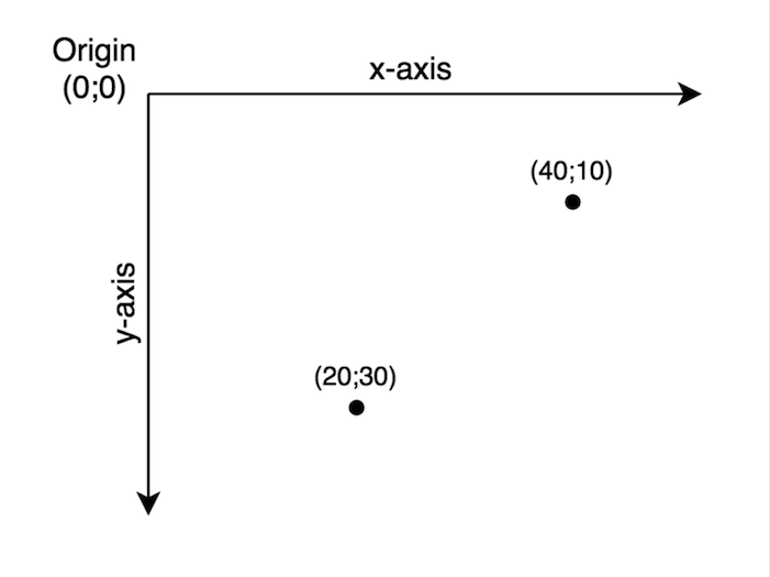
The range function specifies the length that should be divided between the limits of the input data. You may have noticed I used height as the first parameter and not zero when calling range. This is because the SVG coordinate system starts from the top left corner. You’ll get to understand this better when we get to draw the bar heights.
On the other hand, the domain function denotes minimum and maximum values of the input data. For this particular data set, we want to start from zero to the highest value in our data set. Think of the domain as the input and range as the output.
After defining a y-scale, we make use of this scale to draw the axis by calling the axisLeft method, which takes in the y-scale as the argument.
The snippet below draws the x-axis:
const xScale = d3.scaleBand()
  .range([0, chart_width])
  .domain(issues_val.map((s) => s.day))
  .padding(0.2)

this.chart.append('g')
  .attr('transform', `translate(0, ${chart_height})`)
  .call(d3.axisBottom(xScale));
For the xScale we use the scaleBand function, which helps to split the range into bands and compute the coordinates and widths of the bars with additional padding. Assuming 3 is the maximum number of issues raised across all dates, the chart output should look like this:
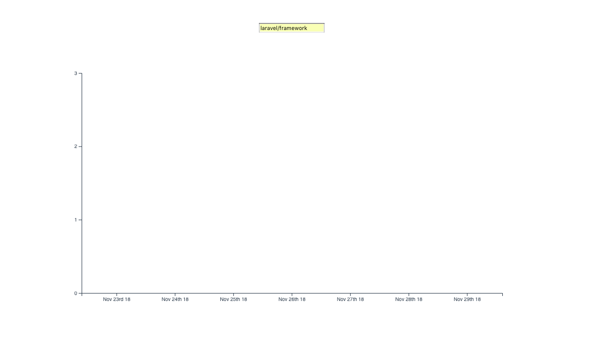
If you test this in your browser with the code we’ve covered so far, you should see something similar.
Now enough with the axes. Let’s spit some bars!
Drawing Bars
For our bar chart, the bar width will be fixed and the bar height will vary depending on the dataset size:
renderChart(issues_val) {
  ...

  const barGroups = this.chart
    .selectAll("rect")
    .data(issues_val)
    .enter();

  barGroups
    .append("rect")
    .attr("class", "bar")
    .attr("x", g => xScale(g.day))
    .attr("y", g => yScale(g.issues))
    .attr("height", g => chart_height - yScale(g.issues))
    .attr("width", xScale.bandwidth());
}
Let’s address how we added the bars. First, we created a barGroups element:
const barGroups = this.chart
  .selectAll('rect')
  .data(issues_val)
  .enter()
Calling the selectAll method on our chart returns an empty selection/array, since we don’t have any rectangles in our chart so far. We then chain the data method, passing in the dataset we want visualized. This puts the data in a waiting state for further processing.
The next step is to chain the enter method. The enter method looks both at the data set we passed into data() and at the selection we get after calling selectAll(), and then tries to look for “matches” — more like mapping between our sample data and elements already present in the DOM. In this particular case, no matches were found.
Note: this article is an excellent guide for understanding the select, enter and append sequence when working with D3 to manipulate the DOM.
Since selectAll('rect') returned an empty array, the enter method will return a new selection representing the elements in our data set.
Note that, after chaining enter(), every item in the returned array is acted upon individually. This means that any method chained onto barGroups will define the behavior of individual items.
barGroups
  .append('rect')
  .attr('class', 'bar')
  .attr('x', (g) => xScale(g.day))
  .attr('y', (g) => yScale(g.issues))
  .attr('height', (g) => chart_height - yScale(g.issues))
  .attr('width', xScale.bandwidth());
The code block above creates a rectangle for each item in our in our data set. We give each of these rectangles a class of bar.
To set the x and y coordinates for the rectangles, we use the scaling functions we defined earlier. So far, these rectangles are sitting on top of each other, and we need to give our rectangles some height and width.
The width of our bars would be determined by the scaleBand function. Chaining the bandwidth function to the xScale returns a calculated bandwidth from the range and padding provided to the x-scale.
To set the bar height, we subtract the computed y-coordinate of the bar from the height of the SVG to get the correct representation of the value as a column. Remember that, when working with SVGs, x and y coordinates are always calculated starting from the top-left corner.
Adding Labels
So far we have a bar chart. But this chart is not really helpful, as it doesn’t tell the user what each axis represents. To give our chart more context, we’ll have to add labels for the axes as well as a chart title.
To add labels, we append text elements to our SVG:
svg
  .append('text')
  .attr('class', 'label')
  .attr('x', -(chart_height / 2) - margin)
  .attr('y', margin / 2.4)
  .attr('transform', 'rotate(-90)')
  .attr('text-anchor', 'middle')
  .text('Issues opened')

svg
  .append('text')
  .attr('class', 'label')
  .attr('x', chart_width / 2 + margin)
  .attr('y', chart_height + margin * 1.7)
  .attr('text-anchor', 'middle')
  .text('Days')

svg
  .append('text')
  .attr('class', 'title')
  .attr('x', chart_width / 2 + margin)
  .attr('y', 40)
  .attr('text-anchor', 'middle')
  .text('Issues in the past 1 week')
The text elements can be positioned with x and y coordinates while text alignment is done with the text-anchor attribute. To add the text itself, we call the text method on the text element.
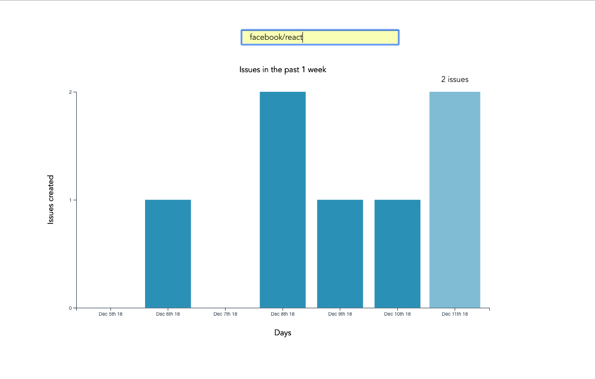
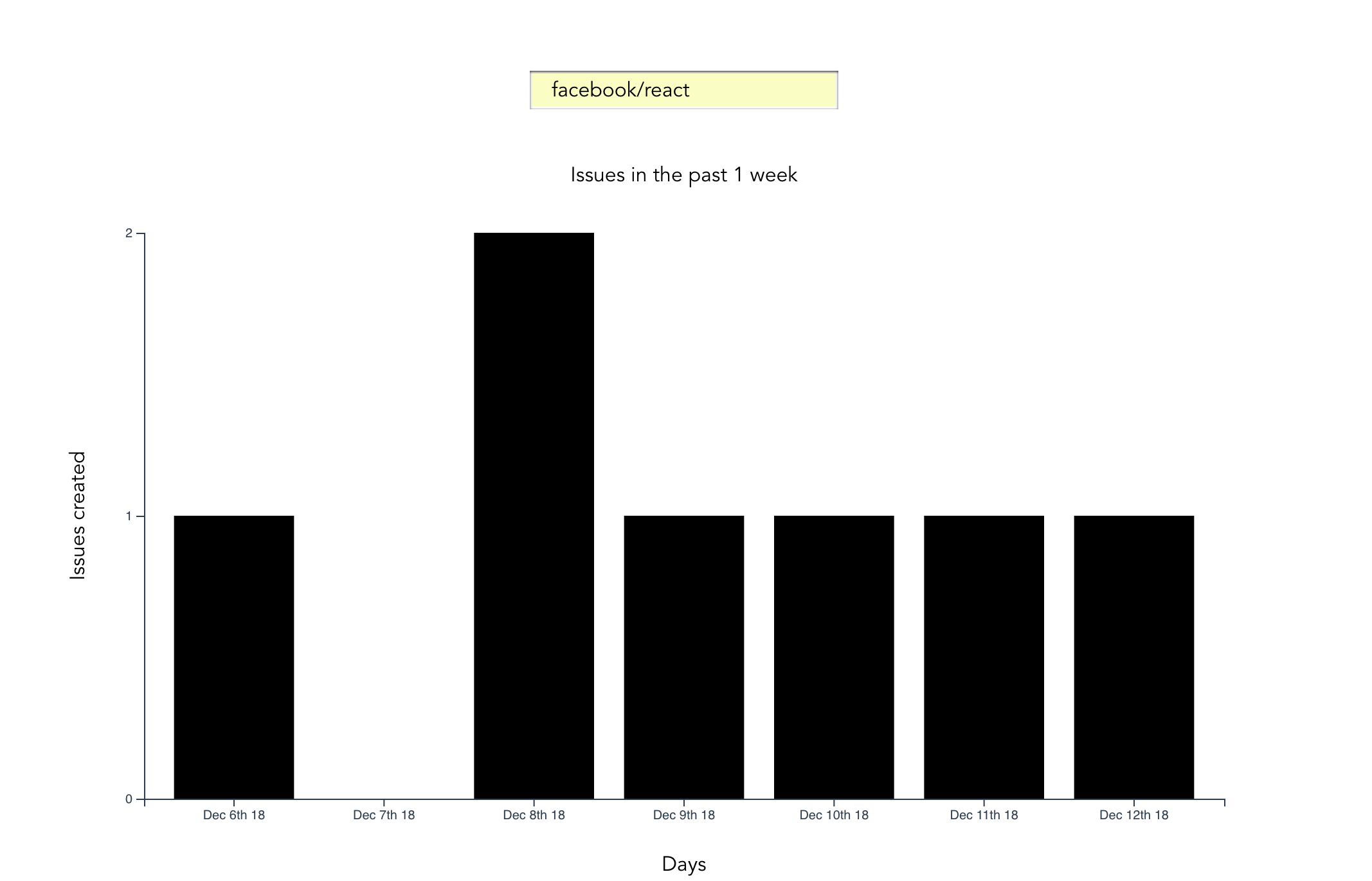
We can test things out by serving our app then searching for a repo. Search for any popular repo — such as facebook/react:
Back in our App component, we can now get rid of the console statement inside the getIssues method:
console.log(this.issues)
Even though our chart does an excellent job of visualizing our data, there’s still much to be done in terms of the user experience. In the next section, we’ll look at how to add transitions to D3 charts.
Adding Transitions
For this particular chart, we want to make it such that, when one hovers over a bar element, its shade changes and the number of issues represented by the bar shows up at the top of the bar.
For this to happen, we have to do some event handling on mouseEnter and mouseLeave for the barGroups.
Edit the barGroups code block above the three svg blocks:
barGroups
  ...
  .attr("width", xScale.bandwidth())
  .on("mouseenter", function(actual, i) {
    d3.select(this)
      .transition()
      .duration(300)
      .attr("opacity", 0.6)
      .attr("x", a => xScale(a.day) - 5)
      .attr("width", xScale.bandwidth() + 10);
    barGroups
      .append("text")
      .attr("class", "value")
      .attr("x", a => xScale(a.day) + xScale.bandwidth() / 2)
      .attr("y", a => yScale(a.issues) - 20)
      .attr("text-anchor", "middle")
      .text((a, idx) => {
        return idx !== i ? "" : `${a.issues} issues`;
      });
  });
We call the transition method to add animations to an element when working with D3.
Each time the cursor hovers over a bar, we reduce the opacity of the bar and increase the width by 10px. We also add text on top of the bar, stating the number of issues the bar represents. This transition takes a duration of 300 milliseconds.
Since we don’t want to leave this bar in the new state when the mouse leaves, let’s define a mouseleave event, which removes the selection features we had applied in the mouseenter event:
barGroups
  ...
  .attr("width", xScale.bandwidth())
  .on("mouseenter", function(actual, i) { ... })
  .on("mouseleave", function() {
    d3.selectAll(".issues").attr("opacity", 1);

    d3.select(this)
      .transition()
      .duration(300)
      .attr("opacity", 1)
      .attr("x", a => xScale(a.day))
      .attr("width", xScale.bandwidth());

    svg.selectAll(".value").remove();
  });
What we are doing above is setting the opacity of the bar to the original value and also removing the text from the bar.
svg.selectAll('.value').remove();
The code above removes any text on the DOM that has a class of value.
Here’s the final result:
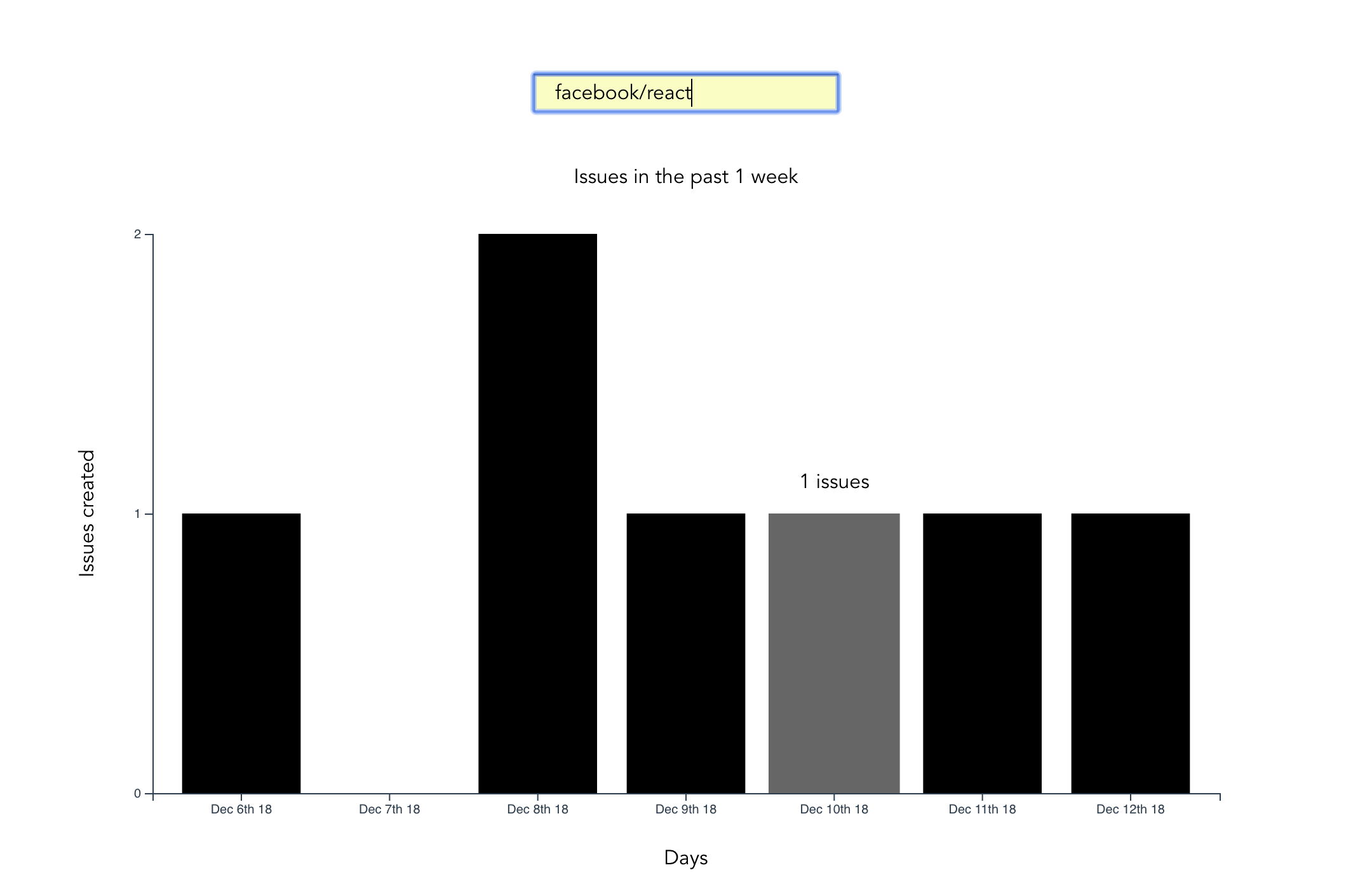
If you try things out in your browser now, you should see something like the above.
Some Final UI/UX Touches
When making the request to GitHub, we anticipate some loading time before getting a response back from GitHub. For UX purposes, we’ll make the user aware we’re still retrieving results from GitHub by flashing a loading alert on the page. In the App component, add this snippet to the HTML section of your code — right above the Chart component:
<div class="alert alert-info" v-show="loading">Loading...</div>
<chart :issues="issues"></chart>
For prototyping purposes, we’ll leverage Bootstrap. Vue has an official Bootstrap package that we’re going to install:
npm install bootstrap-vue
Once the package has been installed, we’ll have to import Bootstrap’s CSS classes to our main.js file to make the alert show up:
[...]
import "bootstrap/dist/css/bootstrap.css";
import "bootstrap-vue/dist/bootstrap-vue.css";
We’re almost done, but we need to add a loading attribute to our data model — whose value will determine whether or not to show the loading alert:
data() {
  return {
    loading: false,
    ...
  };
},
Every time we make a new request, we’ll set the value of loading to true, so the alert shows up, and then we’ll finally set this value to false for successful requests or in the case the app errored:
getIssues() {
  this.loading = true;
  ...
  axios.get( ... )
  .then( ... )
  .catch( ... )
  .finally(() => (this.loading = false));
}
Error Handling
As it stands, we’re just logging any errors we might run into on the console — something the user isn’t aware of. To make the user is aware if something goes wrong when making the request, we’ll flash an error alert on the page. Add this snippet below the loading alert we just created:
<div class="alert alert-danger" v-show="errored">An error occured</div>
<chart :issues="issues"></chart>
We also need to update our data model with the errored attribute, which we initialize with a false value:
data() {
  return {
    loading: false,
    errored: false,
    ...
  };
},
We’ll set the errored value to true every time we run into an error. This should happen inside the catch block:
getIssues() {
  this.loading = true;
  this.errored = false;
  ...
  axios.get( ... )
  .then( ... )
  .catch(error => {
    console.error(error);
    this.errored = true;
  })
  .finally( ... );
}
Some Basic Styling
Eagle-eyed readers will have noticed that in the screen shot at the top of this guide, the color of the bars was blue. Let’s add that as a final touch to our App component:
<style>
.bar {
  fill: #319bbe;
}
</style>
Conclusion
Congratulations for making it to this point. Even though we have a working bar chart, there’s still more we can do to make the chart more visually appealing. We could, for example, add grid lines, or alternatively visualize this data using a line chart.
What we drew was a simple bar chart, but D3.js has amazing capabilities in terms of what you can do. Any data visualization that you’ve seen anywhere — including powerpoint presentations — can probably be handled by D3. This article is a good read for some of the things D3 is capable of doing. You can also check out D3 on GitHub to see other use cases.
Frequently Asked Questions on Vue and D3 Data Visualization
How can I integrate D3 with Vue.js for data visualization?
Integrating D3 with Vue.js for data visualization involves a few steps. First, you need to install D3 and import it into your Vue.js project. You can do this by running the command npm install d3 in your project directory. Once installed, you can import D3 into your Vue.js component using the import * as d3 from 'd3' statement. After importing D3, you can use its methods to create and manipulate data visualizations within your Vue.js components. Remember to update your data and visualization in Vue’s updated lifecycle hook to ensure that your visualization stays in sync with your data.
What are some best practices for using D3 with Vue.js?
When using D3 with Vue.js, it’s important to follow some best practices to ensure that your data visualizations are efficient and maintainable. One best practice is to use Vue’s reactivity system to manage your data and let D3 handle the visualization. This means updating your data in Vue’s data object and using D3 in Vue’s updated lifecycle hook to update the visualization. Another best practice is to encapsulate your D3 code in Vue components. This makes your code more modular and easier to maintain.
Can I use Vue’s reactivity system with D3?
Yes, you can use Vue’s reactivity system with D3. In fact, it’s recommended to use Vue’s reactivity system to manage your data and let D3 handle the visualization. This means updating your data in Vue’s data object and using D3 in Vue’s updated lifecycle hook to update the visualization. This approach ensures that your visualization stays in sync with your data and allows you to take advantage of Vue’s reactivity system.
How can I use D3’s transitions with Vue.js?
Using D3’s transitions with Vue.js involves a few steps. First, you need to create a transition in D3 using the transition method. This method returns a transition object, which you can use to animate changes to your visualization. You can then apply this transition to your D3 elements using the call method. Remember to update your transition in Vue’s updated lifecycle hook to ensure that it stays in sync with your data.
Can I use D3’s scales with Vue.js?
Yes, you can use D3’s scales with Vue.js. D3’s scales allow you to map your data to visual properties like position, size, and color. You can create a scale in D3 using the scale methods, such as scaleLinear for numerical data and scaleOrdinal for categorical data. Once you’ve created a scale, you can use it to map your data to visual properties in your D3 elements. Remember to update your scales in Vue’s updated lifecycle hook to ensure that they stay in sync with your data.
How can I use D3’s axes with Vue.js?
Using D3’s axes with Vue.js involves a few steps. First, you need to create an axis in D3 using the axis methods, such as axisBottom for a bottom axis and axisLeft for a left axis. These methods return an axis function, which you can use to create an axis in your visualization. You can then append this axis to your D3 elements using the call method. Remember to update your axis in Vue’s updated lifecycle hook to ensure that it stays in sync with your data.
Can I use D3’s shapes with Vue.js?
Yes, you can use D3’s shapes with Vue.js. D3’s shapes allow you to create complex shapes like lines, areas, and arcs from your data. You can create a shape in D3 using the shape methods, such as line for a line shape and area for an area shape. Once you’ve created a shape, you can use it to create a path in your D3 elements. Remember to update your shapes in Vue’s updated lifecycle hook to ensure that they stay in sync with your data.
How can I use D3’s layouts with Vue.js?
Using D3’s layouts with Vue.js involves a few steps. First, you need to create a layout in D3 using the layout methods, such as layoutPie for a pie layout and layoutForce for a force layout. These methods return a layout function, which you can use to transform your data into a layout. You can then use this layout to create and manipulate your D3 elements. Remember to update your layout in Vue’s updated lifecycle hook to ensure that it stays in sync with your data.
Can I use D3’s selections with Vue.js?
Yes, you can use D3’s selections with Vue.js. D3’s selections allow you to select and manipulate elements in your visualization. You can create a selection in D3 using the select and selectAll methods. Once you’ve created a selection, you can use it to manipulate your D3 elements. Remember to update your selections in Vue’s updated lifecycle hook to ensure that they stay in sync with your data.
How can I use D3’s data joins with Vue.js?
Using D3’s data joins with Vue.js involves a few steps. First, you need to bind your data to your D3 elements using the data method. This method returns a selection of elements that are bound to your data. You can then use the enter, update, and exit methods to manipulate your elements based on your data. Remember to update your data joins in Vue’s updated lifecycle hook to ensure that they stay in sync with your data.
 Christopher Vundi
Chris is a software developer at Andela. He has worked with both Rails and Laravel and blogs to share a few tips. Chris also loves traveling.