
As a developer dealing with the Front End technologies, you probably are familiar with attempts to reuse the code in the form of components, for example with libraries like React, Angular and Vue. Web Components implement a similar idea. It consists of a few technologies, that together create an environment suitable for creating reusable, encapsulated components. In this article, we go through the basics of Web Components stack. It consists of covering shadow DOM, custom elements, and templates by implementing a simple material design slider.
Custom elements
With custom elements, we can create new HTML tags, or extend existing ones. In this article, we create a material design slider. Let’s start by defining our new element. To do this, we extend the HTMLElement class and use the define function in the global customElements object.
|
1 2 3 4 |
class Slider extends HTMLElement { } customElements.define('slider', Slider); |
Uncaught DOMException: Failed to execute ‘define’ on ‘CustomElementRegistry’: “slider” is not a valid custom element name
The above causes an error because the name of the component needs to have a dash. It helps to avoid name overlapping. It also allows the browser to tell the difference between custom elements and native ones. Let’s rename it and throw some functionality in:
|
1 2 3 4 5 6 7 8 9 10 |
class MaterialSlider extends HTMLElement { constructor() { super(); this.addEventListener('click', () => { console.log('slider clicked!'); }); } } customElements.define('material-slider', MaterialSlider); |
Since we successfully registered a component, we can use it in our HTML. Every time we click on our slider, we see a message in the console. To make it visible, let’s add some styles to it too.
|
1 2 3 4 5 6 |
material-slider { display: block; width: 300px; height: 50px; background-color: lightgrey; } |
|
1 2 3 4 5 6 7 8 9 10 |
<!DOCTYPE html> <html> <head> <script src="index.js"></script> <link rel="stylesheet" href="style.css" /> </head> <body> <material-slider></material-slider> </body> </html> |
Using attributes
We can also use attributes with our web components. The most basic way would be to use them through the getAttribute function:
|
1 |
<material-slider width="300"></material-slider> |
|
1 2 3 4 5 6 7 |
constructor() { super(); this.addEventListener('click', () => { console.log('slider clicked!'); }); this.width = Number(this.getAttribute('width')) || 200; } |
Basic custom element reactions
When using custom elements, we have access to a set of custom element reactions methods that run during its existence and act as lifecycle functions. For now, we take a look into three of them.
- constructor – it runs when we create an instance of the element
- connectedCallback – runs every time we insert the element into the DOM
- disconnectedCallback – executes every time we remove the element from the DOM
We can use the above to improve our component.
|
1 2 3 4 5 6 7 8 9 10 11 12 13 14 15 16 17 |
class MaterialSlider extends HTMLElement{ constructor() { super(); this.addEventListener('click', this.onClick); } onClick() { console.log('clicked!'); } connectedCallback() { this.innerHTML = '<div class="circle"></div>'; } disconnectedCallback() { this.removeEventListener('click', this.onClick); } } customElements.define('material-slider', MaterialSlider); |
As you can see, in the example above we use the connectedCallback function to define a template of our custom element. Instead of doing that, we can use the Shadow DOM
Shadow DOM
A crucial thing about web components is encapsulation. It means isolating our components from the rest of the page in a similar manner to the <iframe>. Selectors and styles within the Shadow DOM node don’t reach outside of it, and we don’t have to worry about any conflicts.
To initialize the Shadow DOM, we use the attachShadow function.
|
1 2 |
const shadowRoot = this.attachShadow({ mode: 'open' }); shadowRoot.innerHTML = '<div class="circle"></div>'; |
The open mode means that the elements are accessible through JavaScript from outside
By the code above we create a shadow root. It is a start of a particular shadow DOM in a similar way that the <html> is the beginning of a regular DOM tree. Let’s inspect it in the Developer Tools.

Our Shadow tree root node is attached to the material-slider, which we call a shadow host.
Styling shadow DOM
As you might have noticed, our styles no longer work. The above is because the styles from outside of the Shadow DOM are not applied to it. The most basic way to style the Shadow DOM is to add the <style> tag to it.
|
1 2 3 4 5 6 7 8 9 10 11 12 13 14 15 16 17 18 19 20 21 22 23 24 25 26 |
class MaterialSlider extends HTMLElement{ constructor() { super(); this.addEventListener('click', this.onClick); const shadowRoot = this.attachShadow({ mode: 'open' }); shadowRoot.innerHTML = ` <style> .circle { width: 15px; height: 15px; background-color: #6200ee; border-radius: 100%; } </style> <div class="circle"></div> `; } onClick() { console.log('clicked!'); } disconnectedCallback() { this.removeEventListener('click', this.onClick); } } customElements.define('material-slider', MaterialSlider); |
That does not seem too pleasant, though, and we would like to separate the style from the logic. Fortunately, according to W3C using <link> tags inside of a Shadow DOM is now a standard. Thanks to that, we can use the following syntax:
|
1 2 3 4 |
shadowRoot.innerHTML = ` <link rel="stylesheet" href="material-slider.css"> <div class="circle"></div> `; |
The only issue with that is the time when it starts fetching. It begins after the Shadow DOM has been initialized through our JavaScript. We can fix that by putting <link rel="prefetch" /> in our HTML.
|
1 2 3 4 5 6 7 8 9 10 11 |
<!DOCTYPE html> <html> <head> <script src="index.js"></script> <link rel="stylesheet" href="style.css" /> <link rel="prefetch" href="material-slider.css"> </head> <body> <material-slider></material-slider> </body> </html> |
Now our additional style starts fetching right away, even though it does not apply to the whole document.
Native HTML tags with Shadow DOM
Some native HTML tags also implement Shadow DOM, but it is hidden from us by default. We can change this behavior for example, by setting devtools.inspector.showUserAgentShadowRoots to true through about:config in Firefox.

Using templates
So far, so good! My main concern with the above is that defining the whole component through the innerHTML isn’t very pleasing. The contents of the <template> tag, are not rendered in the DOM, but can still be referenced through JavaScript. Thanks to that, we can use it to create a template that we can use in the shadow DOM.
|
1 2 3 4 5 6 7 8 9 10 11 12 13 14 15 16 |
<!DOCTYPE html> <html> <head> <script src="index.js"></script> <link rel="stylesheet" href="style.css" /> <link rel="prefetch" href="material-slider.css"> </head> <body> <material-slider></material-slider> <template id="material-slider-template"> <link rel="stylesheet" href="material-slider.css"> <div class="circle"></div> </template> </body> </html> |
|
1 2 3 4 5 6 7 8 9 10 11 12 13 14 15 16 |
class MaterialSlider extends HTMLElement{ constructor() { super(); this.addEventListener('click', this.onClick); const template = document.getElementById('material-slider-template'); this.attachShadow({mode: 'open'}) .appendChild(template.content.cloneNode(true)); } onClick() { console.log('clicked!'); } disconnectedCallback() { this.removeEventListener('click', this.onClick); } } |
We might come across an issue, though. The above is due to the fact that we need to look for the template after the DOM loads. To fix it, we use the load event of the window:
|
1 2 3 |
window.addEventListener('load', () => { customElements.define('material-slider', MaterialSlider); }); |
Running the cloneNode function with the “deep” flag set to true gives as a full clone of the template that we can use in our shadow DOM.
Putting everything together
After putting everything together, we have a very basic slider made with pure JavaScript and Web Components.
index.html
|
1 2 3 4 5 6 7 8 9 10 11 12 13 14 15 16 17 18 |
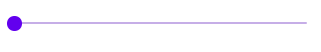
<!DOCTYPE html> <html> <head> <script src="index.js"></script> <link rel="prefetch" href="material-slider.css"> </head> <body> <material-slider width="300"></material-slider> <template id="material-slider-template"> <link rel="stylesheet" href="material-slider.css"> <div class="wrapper" id="wrapper"> <div class="line" id="line"></div> <div class="circle" id="circle" draggable="false" ></div> </div> </template> </body> </html> |
material-slider.css
|
1 2 3 4 5 6 7 8 9 10 11 12 13 14 15 16 17 18 19 20 |
.wrapper { height: 30px; display: flex; align-items: center; } .line { width: 100%; height: 2px; border-radius: 2px; background-color: #c6aee7; } .circle { width: 15px; height: 15px; background-color: #6200ee; border-radius: 100%; position: absolute; } |
index.js
|
1 2 3 4 5 6 7 8 9 10 11 12 13 14 15 16 17 18 19 20 21 22 23 24 25 26 27 28 29 30 31 32 33 34 35 36 37 38 39 40 41 42 43 44 45 |
class MaterialSlider extends HTMLElement{ constructor() { super(); const template = document.getElementById('material-slider-template'); this.attachShadow({mode: 'open'}) .appendChild(template.content.cloneNode(true)); this.width = Number(this.getAttribute('width')) || 200; } connectedCallback() { this.circle = this.shadowRoot.getElementById('circle'); this.line = this.shadowRoot.getElementById('line'); this.wrapper = this.shadowRoot.getElementById('wrapper'); this.wrapper.style.width = `${this.width}px`; this.circle.addEventListener('mousedown', this.startSliding); this.circle.addEventListener('mousemove', this.slide); this.ownerDocument.addEventListener('mouseup', this.stopSliding); } startSliding = () => { this.isSliding = true; } stopSliding = () => { this.isSliding = false; } slide = (event) => { if (this.isSliding) { const position = event.pageX - this.line.offsetLeft; if (position >= 0 && position <= this.width) { this.circle.style.left = `${position}px`; } } } disconnectedCallback() { this.circle.removeEventListener('mousedown', this.startSliding); this.circle.removeEventListener('mousemove', this.slide); this.ownerDocument.removeEventListener('mouseup', this.stopSliding); } } window.addEventListener('load', () => { customElements.define('material-slider', MaterialSlider); }); |
Summary
In this article, we’ve gone through the principles of Web Components. This included creating our HTML tags using custom elements, explaining the basics of the shadow DOM, and creating reusable HTML templates. While there is much more to be said about the above technologies, this article serves as an introduction to Web Components. By learning them, we can both have another technology up to our sleeve and have a better understanding of how the browser works.
