If a picture is worth a thousand words, then blending two pictures together must be worth many times that. Likewise, the design possibilities that open up with the availability of blend modes in CSS are likely greater than you realize.
When you hear CSS Blend Modes being talked about, the commotion is really about three new CSS properties that have gained fairly good support in modern browsers.
These properties include:
- background-blend-mode, for blending an element’s background images, gradients, and background colors
- mix-blend-mode, for blending elements over other elements, and lastly
- isolation, a lesser used property used with mix-blend-mode for keeping elements from mixing together.
However, this article will focus on background-blend-mode, the property with the most widespread support, and how you can use it today to create eye-catching backgrounds and photo effects for your website that once were only possible in Photoshop.

Combining CSS gradients with background-blend-mode
The background property is where we can use CSS gradients. Functions like linear-gradient(), radial-gradient(), and the repeating-linear-gradient() and repeating-radial-gradient() varieties of the two have widespread support and more critically, a standardized syntax across browsers.
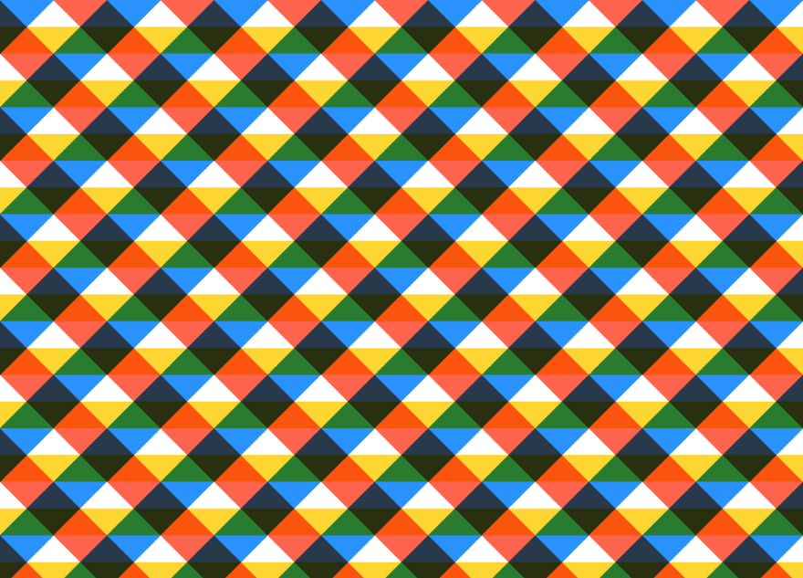
But the background property can also accept than one gradient rendered top of each other, with each function separated by a comma. Lea Verou showcased impressive patterns that can be created with this technique, from checkerboards, to bricks, to stars.
But now that we have the background-blend-mode property, we can create even more new gradients and patterns.
Spectrum background
Let’s overlay three gradients to make a background with nearly the full spectrum of colors that can be displayed on a monitor.
.spectrum-background {
    background:
        linear-gradient(red, transparent),
        linear-gradient(to top left, lime, transparent),
        linear-gradient(to top right, blue, transparent);
    background-blend-mode: screen;
}

The effect above used to only be possible with an image, weighing in at many tens of kilobytes. But we’ve just reproduced the effect with CSS in less than 200 bytes, not to mention saving an HTTP request as well.
Plaid background
We can also create some interesting plaid patterns with gradients and background-blend-mode.
.plaid-background {
    background:
        repeating-linear-gradient(
            -45deg,
            transparent 0,
            transparent 25%,
            dodgerblue 0,
            dodgerblue 50%
       ),
       repeating-linear-gradient(
            45deg,
            transparent 0,
            transparent 25%,
            tomato 0,
            tomato 50%
        ),
        repeating-linear-gradient(
            transparent 0,
            transparent 25%,
            gold 0,
            gold 50%
        ), white;
    background-blend-mode: multiply;
    background-size: 100px 100px;
}
Circles background
How about one more, this time with a radial gradient:
.circles-background {
    background:
        radial-gradient(
            khaki 40px,
            transparent 0,
            transparent 100%
        ),
        radial-gradient(
            skyblue 40px,
            transparent 0,
            transparent 100%
        ),
        radial-gradient(
            pink 40px,
            transparent 0,
            transparent 100%
        ), snow;
    background-blend-mode: multiply;
    background-size: 100px 100px;
    background-position: 0 0, 33px 33px, -33px -33px;
}

More backgrounds
With the help of Yoksel and Una Kravets, I’ve prepared a collection of 24 more blend mode gradients to make your website fast and attractive looking.

Photo effects with background-blend-mode
While background-image allows us to set multiple gradients on an element, one trick is that we can also set multiple image backgrounds with the url() syntax in much the same way. When we combine that with background-blend-mode and properties like filter, that’s where things can get really interesting.
Pencil sketch effect

We can use CSS to make a photograph on the left look like it was sketched with pencil and paper. No Photoshop, no HTML5 canvas, no WebGL, no Javascript libraries. Five CSS properties is all we need.
Although we can use other block-level elements like
, , , here’s the HTML we’ll use to get started.<div class=”pencil-effect”></div>
Let’s start styling. Replace chapel.jpg with the url of the image you are using. We will set the background image twice and its background-size to cover .
.pencil-effect {
    background:
        url(chapel.jpg),
        url(chapel.jpg);
    background-size: cover;
}
Below in the first square is the result of our first step:

Now let’s add in a blend mode:
background-blend-mode: difference;
Oh no, where did everything go? We are left with a completely black square. The difference blend mode takes the two backgrounds and subtracts pixel by pixel the darker color of one background from the lighter color of the other background.

If it’s confusing what is going on here, let’s see what happens when we offset the two backgrounds ever so slightly with background-position and calc().
background-position:
    calc(50% — 1px) calc(50% — 1px),
    calc(50% + 1px) calc(50% + 1px);

Using a comma, we set two background positions, each corresponding to one copy of the background image. The first image, we move from the center on the x-axis to the left by one pixel, and from the center on the y-axis, upwards by a pixel. For the second copy of the background image, we do the opposite, moving down and to the right.
What we are left with is two background images that are slightly offset but the whole picture is still centered in our element. Now that the difference blend mode finds the differences between the two images, it reveals the edges in the photo. Pretty cool?
Lastly, we will use the filter property to invert the photo and make it grayscale.
filter: brightness(3) invert(1) grayscale(1);
For this specific photo, we will also boost the brightness, which has the secondary effect of increasing the contrast of the lines.
Here’s our final snippet of CSS for this effect:
.pencil-effect {
    background:
        url(photo.jpg),
        url(photo.jpg);
    background-size: cover;
    background-blend-mode: difference;
    background-position:
        calc(50% — 1px) calc(50% — 1px),
        calc(50% + 1px) calc(50% + 1px);
    filter: brightness(3) invert(1) grayscale(1);
}

Chalkboard effect

We can recreate a chalkboard effect by following the steps for the pencil sketch effect, while omitting the invert(1) function on the final step.
Night vision effect

Let’s try to recreate one more effect with CSS blend modes and make a photo appear like we are viewing it through the lens of night vision goggles.
There are three parts to our background that we will blend together with the overlay blend mode. This blend mode both lightens and darkens a background and works as a combination of two other blend modes, multiply and screen.
First we will setup our background image, just once this time.
background: url(moose.jpg);
background-size: cover;
background-position: center;
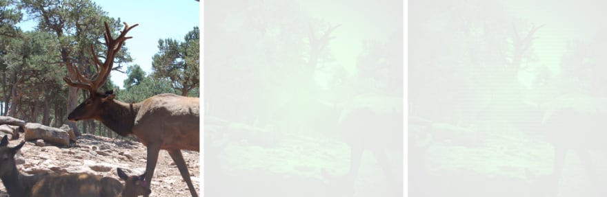
Now let’s add in a gradient and background-blend-mode. The we are using a slightly transparent lime to black radial gradient here.
background:
    url(moose.jpg),
    radial-gradient(
        rgba(0,255,0,.8),
        black
    );
background-blend-mode: overlay;

Not too bad, maybe we want to stop there. I have one more idea that might make the effect look more authentic, and that is to add some faux scan lines to the background with a repeating background gradient.
background:
    url(moose.jpg),
    radial-gradient(
        rgba(0,255,0,.8),
        black
    ),
    repeating-linear-gradient(
        transparent 0,
        rgba(0,0,0,.2) 3px,
        transparent 6px
    );

And to wrap it up, the full CSS used for this effect:
.night-vision-effect {
    background:
        url(moose.jpg),
        radial-gradient(
            rgba(0,255,0,.8),
            black
        ),
        repeating-linear-gradient(
            transparent 0,
            rgba(0,0,0,.2) 3px,
            transparent 6px
        );
    background-blend-mode: overlay;
    background-size: cover;
 }
More photo effects
I’ve made a gallery of 20 CSS image effects you can use on your website.
Browser support and graceful Degradation
The good news is that the background-blend-mode property has full support in Firefox, Chrome, and Opera.
The somewhat good news is that it has enough support in Safari to support all the effects we’ve overviewed here, while Safari currently lacks support for the saturation, hue, color, and luminosity blend modes.
The bad news is that Internet Explorer and IE Edge have no support for any CSS blend mode properties.
This means we need to plan ahead for browsers that do not yet support background-blend-mode. The nifty CSS @supports rule makes that pretty easy. Here’s two examples.
For the first example, we will take our spectrum background gradient and provide a fallback if the background-blend-mode property isn’t supported. We are using background: gray; for this example as a fallback, but any CSS can be used in its place.
.spectrum-background {
    background: gray;

    @supports (background-blend-mode: screen) {
        background:
            linear-gradient(red, transparent),
            linear-gradient(to top left, lime, transparent),
            linear-gradient(to top right, blue, transparent);
        background-blend-mode: screen;
    }
}
And here’s the pencil sketch effect with a fallback. We are testing for two crucial properties we need support for for the effect: filter and background-blend-mode. If a user’s browser doesn’t support those (or if the browser doesn’t support CSS @supports for that matter), we will fallback to the plain original photograph.
.pencil-effect {
    background-image: url(photo.jpg);
    background-size: cover;

    @supports (background-blend-mode: difference) and (filter: invert(1)) {
        background-image:
            url(photo.jpg),
            url(photo.jpg);
        background-blend-mode: difference;
        background-position:
            calc(50% — 1px) calc(50% — 1px),
            calc(50% + 1px) calc(50% + 1px);
        filter: brightness(3) invert(1) grayscale(1);
    }
}
Resources
Blending Modes Demystified by Justin McDowell
Basics of CSS Blend Modes by Chris Coyier
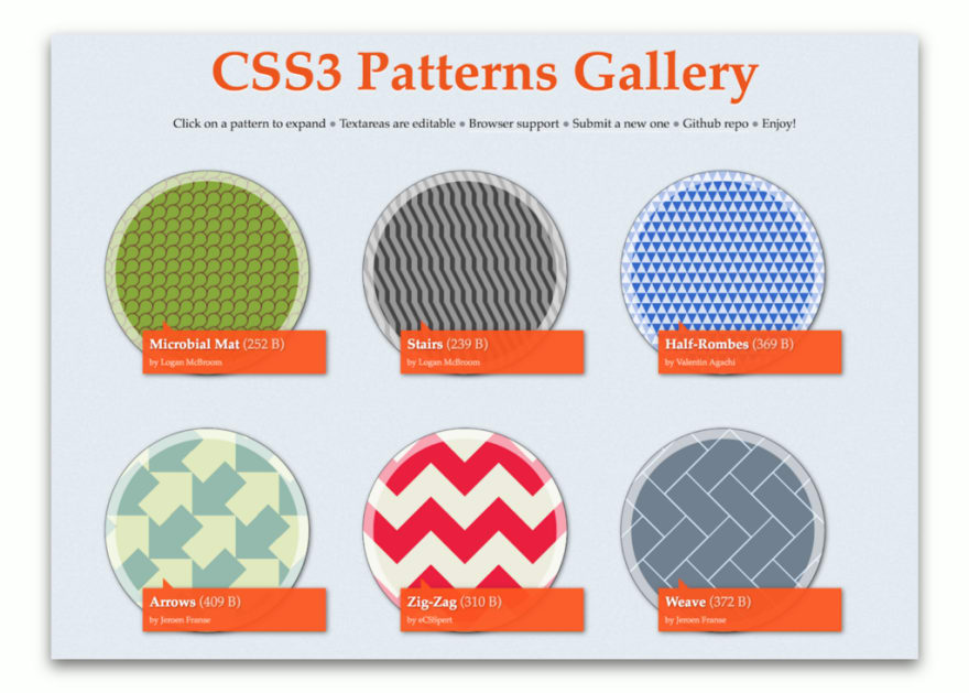
CSS3 Patterns Gallery by Lea Verou
Una Kravets’ 6-part CSS Image Effects Series
Can I use… Support for background-blend-mode
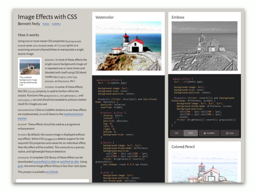
Image Effects with CSS by Bennett Feely
New CSS Gradient possibilities with the background-blend-mode property by Bennett Feely
Experimental Polyfill for background-blend-mode by Rik Cabanier
Compositing and Blending Level 1 Specification by the W3C
Plug: LogRocket, a DVR for web apps
LogRocket is a frontend logging tool that lets you replay problems as if they happened in your own browser. Instead of guessing why errors happen, or asking users for screenshots and log dumps, LogRocket lets you replay the session to quickly understand what went wrong. It works perfectly with any app, regardless of framework, and has plugins to log additional context from Redux, Vuex, and @ngrx/store.
In addition to logging Redux actions and state, LogRocket records console logs, JavaScript errors, stacktraces, network requests/responses with headers + bodies, browser metadata, and custom logs. It also instruments the DOM to record the HTML and CSS on the page, recreating pixel-perfect videos of even the most complex single page apps.
The post Advanced effects with CSS background blend modes appeared first on LogRocket Blog.


Top comments (0)