
Preface
Many web designers and developers today are putting SVG as an alternative to font technology used to represent icons in the web world. To what extent is this decision wise and correct?
This is what this article is trying to answer.
First, in this study we proceed from two hypotheses:
- Browser or screen reader does not have any errors or limitations: All recommended standards are supported and error-free, and screen reader is capable of reading all Unicode characters properly, and any bug or aspect of failure in either of them is a responsibility of their developers.
- What concerns us here are the solutions that deal with icons as properties displayed by CSS instructions, not as objects being called by HTML tags, such as
<img>,<object>or<svg>, etc, since icons are not part of the content, they are part of the reusable resources and software components, so care should be taken to be requested from the server only once. Those CSS properties are usually eitherbackgroundproperty orcontentproperty, and we exclude the first of them because it is a presentation attribute that does not have any semantic meaning —so it is not accessible— first, and it is unlikely to appear when printing second. The only remaining property we have iscontent.
Glossary
- Accessibility
-
For icons, it means the ability to express the icon with a semantic string that is significant to the nature of the icon and its function. In Unicode symbols, the semantic text is the description assigned to the character in the official Unicode blocks. In SVG files, it can be the Fragment Identifiers in a Spritesheet, or the
<title>tag in a single SVG file.The accessibility of icon helps users with special needs (visual disability in particular) identify and demonstrate the content of the icon using software called
screen readers
dedicated for this category of users. This also helps search engines understand the meaning and semantic of the icon, which makes semantic a very important issue —as is known— for webmasters.You can imagine search engines as a category of users with special needs, but their requirements belong to the category of developer requirements, not the user ones in practice, because a search engine is not a human user, and there is nothing obliges you to meet its requirements other than your keen on attracting real and end users to your site.
Scalability is another aspect of icon accessibility, helping users with special needs (visually impaired people in particular) see icons at a larger size.

Web Accessibility Model
[Icon credits] - Code Point
-
Any value in the Unicode codespace; that is, the range of integers from
0to10FFFFhex (i.e. in Hexadecimal Numerical System). It’s an atomic unit of a textual string.Not all code points are assigned to encoded characters necessarily. Rather, there are seven fundamental classes of code points in Unicode standards:
- Graphic (the most popular usage): a code point stores a glyph, which is a visual representation of a character (characters like letter, number, punctuation mark, or pictograph).
- Format.
- Control.
- Private-Use.
- Surrogate.
- Noncharacter.
- Reserved.
The main different between a font and another: different glyphs in the same code point. - Emoji
-
A symbol formally encoded (indexed) in Unicode standard. It’s typically colorful. Its plural form could be emoji or emojis. However, Unicode Consortium uses emoji as plural.
An emoji could be an emotional expression, a verb, an object, or even an abstract symbol.
The following table shows a brief history of emoji.
A brief history of emoji
Portmanteau Roots Meaning Description Inventor Year Example Emoticon emot + icon emotion + icon Vertical emotional symbol typed using a combination of regular keyboard characters. Scott Fahlman 1982 :-) Kaomoji kao + moji face + character Horizontal emotional symbol typed using a combination of regular keyboard characters. Kim Tong Ho 1986 ^_^ Pictograph Symbol formally encoded (indexed) in Unicode standard. 1993 ☺ Emoji e + moji picture + character Colorful version of a pictograph. Shigetaka Kurita 1999 
Additional notes:
- Emoticons actually originated on the PLATO IV computer system in 1972.
- Kaomoji: Kim Tong Ho attributed this innovation to himself, but some believe he does not have enough proof of his claim.
- Pictograph: At the time, i.e. in 1993, there was only a few pictographs when Unicode 1.1 was released.
- Emoji weren’t encoded (indexed in Unicode tables) at the time. Rather, they have formally encoded as Emoji as of 2010, when Unicode 6.0 was released.
- Fragment Identifier
-
A text string inside an SVG spritesheet, used to uniquely identify a part of the total image (sub-image).
Fragment identifier in SVGs is either the
<view>tag or theIDproperty or both. - Maintainability
-
In this context, we mean the ability to edit code using a simple text editor or simple image editor, without a need for additional software and tools.
- Performance
-
In this context, we mean fewer HTTP requests when loading icons. In practice, the ideal performance is to limit the process of calling icons to a single HTTP request.
- Private Use Area (PUA)
-
One of the Unicode tables, located in the range
U+E000-F8FF. It is intended to allow font developers to insert non-standard characters.There are also two other tables for the same purpose:
- Supplementary Private Use Area - A, located in the range
U+E0000-FFFFF. - Supplementary Private Use Area - B, located in the range
U+100000-10FFFF.
- Supplementary Private Use Area - A, located in the range
- Replacement Glyph
-
A glyph used to render a character that cannot be rendered with the correct appearance in a particular font. It often is shown as an open or black rectangle. Also known as a missing glyph.
Unicode Glossary - Resizibility
-
In the context of this article, we mean the ability to change an image size by:
- Nature: i.e. Scalability.
- Ability to control its size through CSS instructions (mainly
widthandheight).
- Scalability
-
The ability to zoom-in an image without being distorted. It’s one of the aspects of icon accessibility.
- Spritesheet
-
An image file represents a container for a set of images stacked side by side, forming a single image grouped from a set of images.
This image can be bitmap, in PNG, JPG, or GIF format, or vector; in SVG format, but most of the spritesheet images are bitmap.

The old Google icons grouped into a single image file in PNG format - SVG Container
-
Any file format allows storing a set of SVG icons and graphics in a single file.
Historical Overview
There are two categories of solutions for representing icons on the web:
The Old Solutions: Raster Images
Some of the most common formats are PNG, JPG, GIF, and recently WebP format. The main disadvantage of this type of image is that it is fixed in size and can not be zoomed-in without deformation. This type of image can be used in two ways:
- Each icon is in a file: an abandoned method, probably only used in the early days of the Internet, because it requires multiple HTTP requests: a request for each image (icon). The address of each icon here depends on its name, which is in the interest of both user (accessibility for users with special needs) and developer (maintainability, and accessibility for search engines).
- All the icons are stacked side by side in a single file (spritesheet): Each icon’s address is determined by selecting a space from the total area of the image file as much as the desired-icon space and position, and cropping it by specific instructions written in CSS, to be displayed cropped (truncated) in the browser. The result is a single HTTP request for all the icons. And since it —unlike the first method— relies on arithmetic instructions (CSS instructions) to access the desired icon instead of a specific semantic name, it suffers —in contrast to the first method too— from the difficulty of maintenance (for developer) and difficulty in accessibility (for users with special needs, and for search engines).
The Current Solutions: Vector Images
These images are scalable, and have two main formats:
- Fonts: Icons are stored here in a single file too, but it’s not an image file, it’s a font file, TTF or other common font-formats, so that each icon occupies a character (or rather: a code point) in it. In this method, icon can be called (encoded and requested) in an engineering rather than artistic way by just typing the character in the CSS code. This method shares the first old method with maintainability and accessibility, and the second old method with performance, because of its relying on a one HTTP request for icons at once; a feature that has been and remains the secret behind the spreading and popularity of this solution in the world of the web until the present day, but it:
- Also scalable: i.e. has the ability to zoom-in images (icons) without losing its smoothness.
- And is limited —until recently— in the ability to colorize (multicolor in a single icon). But that has changed now, and color fonts have become a reality. You can now see Firefox support in its recent versions for this type of font by previewing Color.TypeKit.com.
- SVG format: Allows you to use multi-color and scalable icons at the same time. The issue of providing SVG icons together in a single file (which we will call it here SVG containers), similar to the old second solution (one bitmap) or the first current solution (fonts), in order to avoid multiple HTTP requests, is an issue that is possible, but the problem is that these solutions vary in terms of advantages and disadvantages, and we will discuss each in detail later on.
No doubt, we will rule out the category of the old solutions that based on raster (fixed bitmap) images. Our study is limited to the second category of the solutions: the current solutions that better meet accessibility requirements, represented by fonts and SVG containers.
Icon Categories
Before going into the available solutions and balancing between them, let’s try to sort icons and symbols currently circulating in the web world, according to the characteristics and features they have, and the functions they perform.
Functionally, icons can be divided into three categories:
- UI Icons: These are the familiar icons in any digital platform to express a specific object, function, or state within the system, such as the bent-paper icon, which expresses files, the scissors icon that expresses Cut function, and the triangle warning icon indicating a danger state or a warning message.
- Commercial logos: Like Facebook, Twitter, Android, Windows, and Apple, etc.
- Countries’ flags.
In terms of characteristics and features, we are concerned with two factors:
- Standardization: the extent to which these symbols are fit for Unicode support, not necessarily the actual support they currently have. This fitness is related to the extent of the code’s popularity and its continued use.
- The extent to which they need for multicolor: i.e., do these symbols require, by their nature, more than one color, or is one color enough to express it?
Consequently, icon categories can be categorized as follows:
| Standardization | Multi-color | |
|---|---|---|
| UI icons | ✓ | ✕ |
| Commercial logos | ✕ | ✓ |
| Countries’ flags | ✓ | ✓ |
Commercial logos, contrary to UI icons and the Countries’ flags, are subject to what commercial organizations behind them are subject to, such as change, modify, rise, fall and merge, they should not be included in Unicode blocks.
On the other hand, the first category (UI icons category) remains the only category in which the designer has the freedom to color or not, whilst commercial logos and countries’ flags do not give developer in principle freedom to step in their design or modify any of them, yet he/she stay subject to the will of the original designer of the logo or the flag.
The representation of country flags by Unicode characters is usually done by using ISO-3166 country codes, such as US symbol for the United States, and DE symbol for Germany, etc, but using Regional Indicator Symbol Letters rather than the regular ASCII characters, which is within the range U+1F1E6-1F1FF, so the United States symbol is indicated by 🇺🇸, Germany’s one by 🇩🇪… and so on. As to how these symbols can be turned into Countries’ flags, we will talk about this later.

For a perfect preview of the way flags are displayed in this way, use a recent version of Firefox to browse the following page: Color.TypeKit.com/#Flags.
If Noto Emoji font is installed on your device, you will notice that the United States and Germany symbols have already been converted to the corresponding flag images, but without coloring. If Noto Color Emoji font is installed, the flags will appear colored (using Firefox until the moment of this writing). Noto Emoji and Noto Color Emoji fonts use the ligatures technique that we will discuss later.
Fonts Technique
Critics of the use of fonts to represent icons argue that it is just a trick that does not live up to standard practice, and a sufficient evidence for us here is the propagation of blank-rectangles phenomenon when waiting for a font to load or failure to load it.

They had all the right before Emoji emerged and supported increasingly by Unicode standard. Today, it is enough for a designer to be careful to use the correct characters in the font used, according to Unicode standard, to ensure the match between the icons at the server-side, and their equivalents at the client-side.

The client-side environment may involve a font representing these icons even before the font is loaded by the server or when it fails to load.
If a font such as Symbola, Noto Emoji, or Unifont, is pre-installed on user’s device, then the icons installed on his or her device will show to him/her first, pending the download of the required font from the server, just like when showing a web page using a local font pending the loading of the custom font (the site’s font) from the server.
However, modern browsers are preventing —by their default behavior— the emergence of local fonts as fallback fonts in such a case, as some view this behavior as hijacking the user experience and distort —albeit temporarily— the image of the page being loaded, while others —including me— view the emergence of readable text, using any font whatsoever, as better than nothing.
Designers express the first case, which prevents any font from appearing before the custom font is loaded, with the term “Flash of Invisible Text” or FOIT, and express the second case, which shows a fallback font before the custom font is loaded, with the term “Flash of Unstyled Text” or FOUT. The following video shows the difference between the two cases in a live show.
We say “by their default behavior” because CSS standards became allowing you now to modify and override this behavior. You can see the details of font-display property assigned to this task on font-display | CSS-Tricks.
Perhaps the next illustration of Monica Dinculescu is the best representation of the values of font-display property and the behavior of these values across timeline.

font-display values
In short, I think the best option to load icon fonts committed to Unicode standards is the value fallback as shown below.
@font-face {
    font-family: 'RichStyle';
    src: …;
    font-display: fallback;
}
The fallback option allows you to temporarily block the fallback font —if any in the user’s computer— in the hope that the custom font will appear directly without going through the temporary deformation phase of the page design that the fallback font may cause, until the custom-font load is complete and appears in the folds of the page.
This option represents a compromise between FOIT and FOUT.
This matching also guarantees excellent accessibility for icons, which means the ability to express and access these icons and symbols and their semantics using meaningful standard characters, rather than the graphical dimensions of spritesheets, which will not allow search engine or screen reader to extract any semantic data out of it.
As we are talking here about a solution that was not allow multicolor until recently, it is an acceptable solution for the first category of icons: UI icons.
Yes; designer does not have to use colors here, i.e. in UI icons, but what about user? What is his or her point of view: Should icons be monochromatic or multicolored?
We may not have a statistical answer to that now, but from our point of view; monochrome icons are better.
In details, these icons became, day by day, and by experience and practice, an alphabet, like any other alphabet, which is meant to be used for practical fleeting reading, not to meditate and enjoy, but it is a picture alphabet, such as hieroglyphic alphabet and other picture-based alphabets, which relied on drawings and images in their codification, which prevailed in ancient times and then destroyed, but what revived it again are two factors:
- Speed: the need to express system’s procedures, objects and states in a faster way to read than the textual expression that depends on a string of characters, because seeing a drawing of a bird, for example is faster to receive and access the user’s brain than reading the word “bird”, a picture is worth a thousand words. Imagine how traffic would be on roads if the sidewalks were full of textual plates instead of traffic signs of the day!
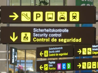
- Globalization (breaking the language barrier): the need to express in a global way beyond the language barrier, which varies from one geographical area to another around the world. The beginnings of the return to the illustrated alphabet may be traced back to the corridors of airports, where an urgent need for a unified language of communication was emerging in an environment full of people from different languages.
Otto Neurath of Vienna from 1920 to 1940 tried to develop a visual language called IsoTypes, in an attempt to revive pictographic symbols again, but it was not popular or successful, and perhaps the reason for its non-commonness at the time is that its use at the level of individuals requires considerable skills in manual drawing, at a time when digital platforms have not yet been emerged. These symbols will only serve then for mass communication, i.e. through traditional mass media of the time, such as road advertising, newspapers, print, television and cinema, since writing down character was then still faster for individuals than drawing.
Today, the attempt is repeated through Emoji, but with great success, because digital environment has turned the equation upside down: printing graphics on screen today is faster than writing words!
Although Unicode Consortium does not see Emoji as a new language, he pictographic alphabet today taught us that:
- When I see a drawing of scissors on screen, I realize that I’m in front of a button performs Cut function.
- When I see a drawing for two consecutive papers, I understand that I am in front of a button performs Copy function.
- When I see a musical note, I understand that I am in front of an audio file.
- When I see a video camera, I understand that I am in front of a video file.
And so on.
This is about UI icons, but does that apply to commercial logos and countries’ flags as well?
Initially no, this:
- Due to the lack of multi-color feature in fonts until recently, as indicated at the beginning of our research, and therefore lack of tools to produce this type of fonts currently, which means —according to the criteria of this study— lack of maintainability.
- No Unicode support for commercial logos, as we indicated at the beginning of our research as well.
However, these two problems can be worked around in commercial logos as follows:
Ligatures
Ligature is a character property within the font that allows that character to be called within a text using a set of other characters.
The simplest example would be to assign the value :) to the Ligatures property of the smiley character (☺ U+263A WHITE SMILING FACE) within a specific font; this will convert that string :), once it is received in the context of a specific text uses that font, to smiley character automatically.

Ligatures are usually used to represent the special combinations of certain characters when they meet together, for example, the convergence of f and i characters in serif fonts, where they are connected as you see in the image below.
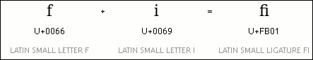
U+FB01) is used to join the letters f and i in a single glyph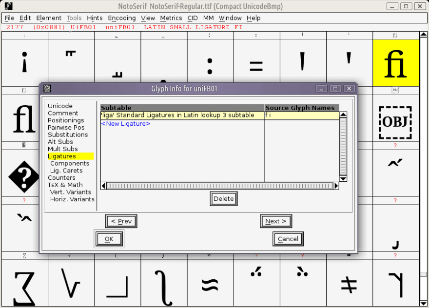
Arabic fonts are very expansive in using this feature. These are examples of using ligatures in Arabic characters.
This technique is useful for commercial logos as follows:
- Place the logo symbol you want, for example, the WordPress logo, under the Private Use Area (range:
U+E000-F8FF) so that it does not compete the systematically-reserved characters. - Set the value “wordpress” for the Ligature property of that character.
Then, when using the following CSS code:
.wordpress-blog:before {
    content: 'wordpress';
}
The phrase “wordpress” will not appear on the screen, but rather the WordPress logo.
Thus we have been able to represent a commercial logo that does not have a regular code point in Unicode blocks, without robbing the characters of others and causing a state of conflict between the characters first, and through a semantic string for people with special needs and for search engines secondly.
If the browser fails to load the font, the ligature (the phrase “wordpress” in our example) will appear instead of blank-rectangles.
However, the appearance of ligature phrases can also be circumvented by trying to match the logo and what may be corresponding or express with among symbols in Unicode tables. For example:
- Inserting Apple™ logo into Apple’s code point (
U+1F34E RED APPLEorU+1F34F GREEN APPLE). - Inserting Linux logo (penguin) into Penguin’s code point (
U+1F427 PENGUIN). - Inserting Twitter logo into Bird’s code point (
U+1F426 BIRD).
And so on.
You will then be able to use the ligature phrase or the original code in the CSS code. Either write:
.twitter:before {
    content: 'twitter';
}
Or write:
.twitter:before {
    content: '🐦';
}
However, using the original code would mean to some extent a loss of the icon’s accessibility. Instead of a screen reader reading —for example— Twitter icon as “Twitter”, it would read it as “Bird”.
Generally, you have now —as a developer— a logo that can be called programmatically using a text that is easily readable and modifiable by the standard QWERTY keyboard instead of dealing with a unicode character that is not common nor accessible through that keyboard, with showing an expressive string (the ligature phrase) or a symbol similar to the original one and is expressive to some extent, as a fallback if the browser fails to load the font.
Finally, there are two very important notes with regard to Ligatures technique:
- The characters you use in the ligature phrase should be available within the font itself. Of course, what is needed here is the character’s code point (its code and cell); not the glyph (its image). Yet it is also recommended to leave the character’s code point blank to save the font size as long as we speak of a font dedicated for icons only, and you will probably not need more than the basic Latin characters and numbers.
- Ligatures are case-sensitive.
Flat Design
On the issue of multicolor, It’s noted that many commercial and non-commercial organizations behind these brands have proceeded to adopt the principle of Flat Design, in line with the current trending artistic taste these days, using one single flat (gradient-free) color in their logos, which also serves the interests of traditional-icon-fonts (non-colored) fans.
If there is at least one multicolored logo, there is no escape from using:
- Color fonts,
- Or SVG containers to represent them, i.e. to represent colored logos, while the traditional (non-colored) font remains as a store for colorless icons.
SVG Containers: The Theory
SVG containers include the following options:
SVGs in SVG Method
- SVG Spritesheet (viewbox)
content: url('brands-sprite.svg#svgView(viewBox(100,0,100,100))'); - SVG Spritesheet (predefined views)
content: url('brands-sprite.svg#Linux-view'); - SVG Stack
content: url('brands-stack.svg#Linux');
You can see live examples of this method on Icon Methods page.
SVGs in CSS Method (Using DataURL)
- DataURL as base64:
content: url(data:image;base64, PD94bWwgdmVyc2lvbj…);
- DataURL as XML (as is):
content: url('data:image/svg+xml;charset=utf8, <svg … /></svg>');
Comparison of The Two Methods
We exclude the first two spritesheet options; viewbox and predefined views in the first method, due to the difficulty of maintaining them, which due —in turn— to the difficulty of stacking icons in a single file. The SVG Stack option is worth a try, although the resulting SVG file will not be show-able through regular images viewers.
The main common disadvantage of all options of the first method, SVGs in SVG, is that the icon size can not be controlled using height and width properties through CSS directly, but you must dive into the SVG code for this purpose whenever you want to modify the icon size.
The second method, SVGs in CSS, relies on a technique called DataURL, which involves embedding the actual data of an image directly into the URL field instead of including a link to that image.
The SVG file can be stored in this case as:
- Binary code called base64, which is not fit for maintenance and modification.
- In its original format: i.e. as an XML code.
There is no doubt that the second format is preferable, because of its maintainability and accessibility.
SVG Containers: The Practice
So, until now, we’ve opted —among SVG containers— the «DataURL as XML» method to be a haven:
- For commercial logos if they are colored,
- And for countries’ flags (in principle).
Colorful Commercial Logos
First, we point out that, when used, care should be taken to:
- SVG code meets the following conditions:
- Replace
#character with the string%23. For example, the following text:<g fill="#fff">
should be converted to the following formula:<g fill="%23fff">
- Preferably in one line, i.e., free of line breaks, as follows:
content: url('data:image/svg+xml;charset=utf8, <svg … /></svg>');Or insert the escape character \ before each transition to a new line, as follows:content: url('data:image/svg+xml;charset=utf8,\ <svg … />\ </svg>'); - Do not include tabs or line breaks (even with the escape character \) in a single tag, or Firefox will fail to display the SVG image.
- Replace
a:before pseudo element) as an inline-block to display it in the correct size.
a:before {
    display: inline-block;
}
We recommend storing these codes in a separate CSS file, as svg-icons.css for example. This procedure has two objectives:
- Prevents the delay of loading the original CSS file, thus preventing the page rendering process in the desired format from being delayed.
- Better maintainability for the original CSS file, due to its free of SVG lines that might be long.
Again, we say: Despite these limitations, «DataURL as XML» method remains, according to our estimation, and looking at the latest table Web Icons Solutions by Available Techniques, the best solution among SVG containers.
Two final points remain:
- The issue of adding special effects to the icon when you hover over it (
a:hoverselector). - A comparison between the last solution, «DataURL as XML», and fonts, for non-colored commercial logos.
Mouseover Effects
The color property is typically used for this purpose in the case of fonts as follows:
.wordpress-blog:before {
    content: 'wordpress';
    color: gray;            /* Effect: monochrome. */

}
.wordpress-blog:hover:before {
    color: #464646;         /* Formal color. */
}
But this method will not work with SVG icons and color fonts, so what’s the solution then?
The solution is to use mix-blend-mode property that can be used to disable the colors of any image or object when applied to it. For example:
.wordpress-blog:before {
    content: 'wordpress';
    mix-blend-mode: luminosity; /* Effect: monochrome */

}

.wordpress-blog:hover:before {
    mix-blend-mode: normal;     /* Formal color */
}
Non-Colored Commercial Logos: DataURL as XML or Fonts?
We can say that what distinguishes «DataURL as XML» method is the ease of maintenance and modification comparing to fonts, since the process of generating fonts requires special software —especially if we are talking about color fonts— and involves what can be considered a compiling process, whilst updating icons stored using «DataURL as XML» method only requires copy and paste procedures inside the user’s CSS file with some minor modifications.
The font file is probably smaller in size than the total size of SVG codes stored inside a CSS file. In other words, the size of the resulting font file is usually less than the size of an SVG container uses «DataURL as XML» format.
Countries’ Flags
The list of countries’ flags can be viewed as a stable standard component that is not relatively subject to overnight change and modification like commercial logos. It can easily be linked to ISO-3166 country codes, whether using standard ASCII characters or using Regional Indicator Symbol Letters.
However, the question now is:
- How effective is it to store more than 250 images of flags in a file with size not less than 5.5 MB?
- How will the alphabet-symbols of countries be replaced with flags with sizes fit the size of those icons on screen?
The answer is that —as long as we are talking about a component with stable standards— it should be provided, with an automatic-replacement feature, in advance, within browsers.
That is, country flags and their linking to symbols should be a client-side built-in component rather than a server-side one, and «DataURL as XML» method will not be effective here.
Insert the smile symbol ☺ in Input field on Live Preview Box at EmojiOne .
Notice how the icon appears in the Output field as a color image.
What’s required for countries’ flags is to provide such a solution in browsers or operating systems in advance, so that inserting the symbol 🇺🇸 leads to emergence of the United States flag, and inserting the symbol 🇩🇪 leads to emergence of the flag of Germany, etc.
This solution has become available recently in new Linux distributions thanks to the availability of Google’s Noto Color Emoji font, but is, until the moment of writing these lines, limited to just a few flags. It’s also supported and available in modern Firefox versions.
Conclusion
Ideal solutions for different icon categories can be summarized in the following table:
| Standardization | Multi-color | Ideal solution | |
|---|---|---|---|
| UI icons | ✓ | ✕ | Font emoji |
| Monochrome logos | ✕ | ✕ | Font PUA+Ligatures |
| Colorful logos | ✕ | ✓ | DataURL as XML |
| Countries’ flags | ✓ | ✓ | Client-side (built in browsers or OSs) |
The following table shows a simplified comparison between the various solutions of representing icons in web; including both the ideal and no-ideal (excluded from our research) ones:
| Maintainability | Accessibility | Resizibility | Multi-color | Performace | |
|---|---|---|---|---|---|
| Single bitmaps | ✓ | ✓ | ✕ | ✓ | ✕ |
| Spritesheet bitmaps | ✕ | ✕ | ✕ | ✓ | ✓ |
| Traditional fonts (monochrome) | ✕ | ✓ | ✓ | ✕ | ✓ |
| Colored fonts | ✕ | ✓ | ✓ | ✓ | ✓ |
| SVG Spritesheet (viewbox) | ✕ | ✕ | 50% | ✓ | ✓ |
| SVG Spritesheet (predefined views) | ✕ | ✓ | 50% | ✓ | ✓ |
| SVG Stack | 50% | ✓ | 50% | ✓ | ✓ |
| SVGs in CSS (DataURL as base64) | ✕ | ✕ | ✓ | ✓ | ✓ |
| SVGs in CSS (DataURL as XML) | ✓ | ✓ | ✓ | ✓ | ✓ |
Final Words
I think that operating systems, over time, and over a few years, will be pre-equipped with emoji color fonts, as an authentic component. If the abundance of this type of fonts is accompanied by the support of different browsers for color fonts, it will most likely mean that, after the exception of commercial logos, web developers are freed from the burden of developing web icons and their problems definitively. It will be enough for developer to be able to use one of the two values: monochrome and polychrome that we propose as new values of the <generic-font-family> within web standards, to choose between the available colored icons (emoji presentation style) and the non-colored one (text presentation style, or pictographs style), as an intermediate solution instead of resorting to manually switch between the two variants selectors responsible for controlling the emoji presentation style (colorful or monochrome):
-
U+FE0F VARIATION SELECTOR-16= emoji variation selector. -
U+FE0E VARIATION SELECTOR-15= text variation selector.
font-family: [ serif | sans-serif | cursive | fantasy | monospace ] [ monochrome | polychrome ]?
This will allow an emergence of new uses for such symbols, including but not limited to:
- UI Icons in desktop and mobile environments. But the odd thing about this is that Unicode does not see UI icons as part of Unicode standard, despite the fact that today’s Unicode standard is jammed with many Emoji that fit for this purpose!
- Emblems for folders and files in desktop environment. It is a simple solution provided by Ubuntu Linux distribution and some of its derivatives, allowing user to put some colorful symbols (icons) on its files and folders to distinguish them visually.


![[Icon credits]](https://richstyle.org/media/a11y-model-icon-credits.png)
Top comments (2)
A few days ago,
::markerpsudeo-element became supported by Firefox 68.I'm wondering now if:
::marker[is/could be] able to change the default icon of radio buttons and check boxes in a web page? 🤔::markeris going to be a standard way to represent icons in web pages?This is also beautiful website for free svg icon - custicon.com
10000+ free icons for use in web, iOS, Android, and desktop apps. Support for SVG. License: MIT, Free for commercial or personal use.
This provide svg icon and svg code and also provide the icon image and it should be free