
What is CSS Quickes?
I started to ask my beloved community on Instagram: "what CSS properties are confusing for you?"
In "CSS Quickies" I will explain one CSS property in deep. These are community requested properties. If you also confused about a CSS property, then write to me on Instagram or Twitter or down below in the comments. I answer all questions.
I'm also live streaming while coding on twitch.tv. If you want to talk to me directly!
The basics
Let's talk about border-radius.
The short answer is: you can give HTML elements round corners, and you can only see this if the background has a different color then the HTML Element or if the HTML element has a border color.
The most basic syntax is:
.radius {
  border-radius: 10px;
}
It is time to understand what radius means.
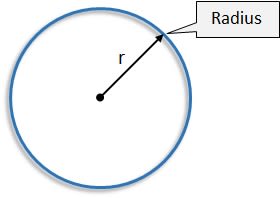
So you have to imagine a circle. Every circle has a radius. The Radius is the length from the middle to any border point of the circle.
Now that you know what a radius is. Imagine that you cut out the corner along the edges of the circle of your HTML element! That's it! Just a Circle where someone cuts along with scissors.
Getting deeper
There are different ways how you can use it.
.border{
    /* top-left-and-bottom-right | top-right-and-bottom-left */
    border-radius: 10px 10px;

    /* top-left | top-right-and-bottom-left | bottom-right */
    border-radius: 10px 10px 10px;

    /* top-left | top-right | bottom-right | bottom-left */
    border-radius: 10px 10px 10px 10px;
}
You see that we can set every corner what give is good flexability to create fancy websites.
Supported values
You can use px, em and % values.
Second radius
There is also an advanced use of border-radius where you can define a second radius. Think about it like you would have now two circles for every corner! And you can set them independent.
.radius{
    border-radius: 50px 50px 50px 50px / 50px 50px 50px 50px;
    /* you can read this like this: */
    border-radius:
       top-left-up top-right-up bottom-right-down bottom left-down /
       top-left-left top-right-right bottom-right-right bottom-left-left
}
Here are some examples:
Creating round elements
Border-radius is also used to create round elements.
That's it! There is not more to learn about border-radius.
This is straightforward; you have to have an element that has the same width and height and set border-radius to 50%.
Finale thoughts
This is a new format I'm trying out.
How do you like it?
What did you miss?
Please comment down below!
Resources
Thanks for reading!


Top comments (9)
A useful yet useless thing you can do to get the roundest corner.
Instead of
border-radius: 9999em;Use
border-radius: 9e9em;The result is 9 to the power of 9. So that's a big number 😅
MAXIMUM ROUND
Hahaha can't cut yourself on this roundness.
Haha yeah, that is also a solution!
I feel like you did a good job showing examples as well as defining the radius, but I don't know from reading why we get the shapes we do from the radius. How does this number get applied to the corners of our elements? Why does 50% on a square element, turn it into a circle? I'm not trying to be critical of your post, these were just answers I was hoping to find as I read through.
Thank. I was thinking of integrating it!
There is this wonderful StackOverflow answer how it is calculated:
stackoverflow.com/questions/299664...
Thanks - a handy reminder! I keep on meaning to try out some more elaborate border-radius's (did that need the extra 's'...I'm not sure) in a project and you reminded me!
Fancy border radius is a handy site for experimenting with border-radius
Fancy border-radius is a great way to create crazy shapes :)
This is a great series, Michael, thanks for writing it. I've bookmarked it for future reference :)