UPD: updated version is here
Demo is here. Source code is here.
Resize depending on the viewport
We don't need much to build a basic responsive image.
<img src="..." alt="..." >
img {
  width: 100%;
  height: auto;
}
Images will take all given space and resize proportionally to the viewport,
Dimensions
Without knowing dimensions (ratio) of the image browser will draw it with height 0 initially and then as soon as image loads it will redraw image with appropriate height, the page will unpleasantly "jump". To avoid this we need to provide width and height
<img src="..." alt="..." width="{{ $img.Width }}" height="{{ $img.Height }}">
to do this in Hugo we need to use imageConfig:
{{ $img := imageConfig (path to file) }}
srcset
The current implementation is responsive in the sense that the size of the image changes with the size of the screen, but resizing is done by the browser. Instead, we can provide several sizes of the image so that clients with smaller screens (mobile devices most likely) can spend less traffic by downloading smaller images.
To do this we can use srcset img attribute and Hugo built-in functionality to resize images. For example like in this article:
{{ $src := .Page.Resources.GetMatch (printf "*%s*" (image path)) }}

{{ $tiny := $src.Resize $tinyw }}
{{ $small := $src.Resize $smallw }}
{{ $medium := $src.Resize $mediumw }}
{{ $large := $src.Resize $largew }}

<img
  srcset='
  {{ if ge $src.Width "500" }}
    {{ with $tiny.RelPermalink }}{{.}} 500w{{ end }}
  {{ end }}
  {{ if ge $src.Width "800" }}
    {{ with $small.RelPermalink }}, {{.}} 800w{{ end }}
  {{ end }}
  {{ if ge $src.Width "1200" }}
    {{ with $medium.RelPermalink }}, {{.}} 1200w{{ end }}
  {{ end }}
  {{ if ge $src.Width "1500" }}
    {{ with $large.RelPermalink }}, {{.}} 1500w {{ end }}
  {{ end }}'
  {{ if .Get $medium }}
    src="{{ $medium.RelPermalink }}"
  {{ else }}
    src="{{ $src.RelPermalink }}"
  {{ end }}
  ...
lazy loading
We can save even more bandwidth by postponing images download unless they are in the viewport. We can use lazysizes to accomplish this.
import "lazysizes";
change src to data-src, srcset to data-srcset, add class="lazyload"
<img
  class="lazyload"
  data-sizes="auto"
  data-srcset=...
This technique is called lazy-loading.
LQIP
if we use lazy-loading and users network is slow or down user will see blank rectangles instead of images, which can be perceived as a broken site. Instead, we can provide low-quality image placeholders - blurry previews of actual content. To do this we can inline base64 encoded small version of original image:
{{ $lqip := $src.Resize $lqipw }}

<div class="img" style="background: url(data:image/jpeg;base64,{{ $lqip.Content | base64Encode  }}); background-size: cover">
  <svg width="{{ $img.Width }}" height="{{ $img.Height }}" aria-hidden="true"></svg>
  <img
    class="lazyload"
    ...
and a bit of CSS
.img svg,
.img img {
  margin: 0;
  width: 100%;
  height: auto;
}

.img {
  position: relative
}

.img img {
  position: absolute;
  top:0;
  left:0;
}
noscript
Another downside of lazy-loading is that images don't work without JS. Let's fix this by providing default img in <noscript>
<noscript>
  <img
    loading="lazy"
    ...
and
.nojs .img .lazyload {
  display: none;
}
final version
Let's create a shortcode
{{/* get file that matches the filename as specified as src="" in shortcode */}}
{{ $src := .Page.Resources.GetMatch (printf "*%s*" (.Get "src")) }}

{{/* set image sizes, these are hardcoded for now, x dictates that images are resized to this width */}}

{{ $lqipw := default "20x" }}
{{ $tinyw := default "500x" }}
{{ $smallw := default "800x" }}
{{ $mediumw := default "1200x" }}
{{ $largew := default "1500x" }}

{{/* resize the src image to the given sizes */}}

{{ $lqip := $src.Resize $lqipw }}
{{ $tiny := $src.Resize $tinyw }}
{{ $small := $src.Resize $smallw }}
{{ $medium := $src.Resize $mediumw }}
{{ $large := $src.Resize $largew }}

{{/* only use images smaller than or equal to the src (original) image size, as Hugo will upscale small images */}}
{{/* set the sizes attribute to (min-width: 35em) 1200px, 100vw unless overridden in shortcode */}}

{{ $img := imageConfig ($src.RelPermalink | printf "content/%s" ) }}

<div class="img" style="background: url(data:image/jpeg;base64,{{ $lqip.Content | base64Encode  }}); background-size: cover">
  <svg width="{{ $img.Width }}" height="{{ $img.Height }}" aria-hidden="true"></svg>
  <img
    class="lazyload"
    data-sizes="auto"
    data-srcset='
    {{ if ge $src.Width "500" }}
      {{ with $tiny.RelPermalink }}{{.}} 500w{{ end }}
    {{ end }}
    {{ if ge $src.Width "800" }}
      {{ with $small.RelPermalink }}, {{.}} 800w{{ end }}
    {{ end }}
    {{ if ge $src.Width "1200" }}
      {{ with $medium.RelPermalink }}, {{.}} 1200w{{ end }}
    {{ end }}
    {{ if ge $src.Width "1500" }}
      {{ with $large.RelPermalink }}, {{.}} 1500w {{ end }}
    {{ end }}'
    {{ if .Get $medium }}
      data-src="{{ $medium.RelPermalink }}"
    {{ else }}
      data-src="{{ $src.RelPermalink }}"
    {{ end }}
    width="{{ $img.Width }}" height="{{ $img.Height }}"
    {{ with .Get "alt" }}alt='{{.}}'{{ end }}>
  <noscript>
    <img
      loading="lazy"
      {{ with .Get "sizes" }}sizes='{{.}}'{{ else }}{{ end }}
      srcset='
      {{ if ge $src.Width "500" }}
        {{ with $tiny.RelPermalink }}{{.}} 500w{{ end }}
      {{ end }}
      {{ if ge $src.Width "800" }}
        {{ with $small.RelPermalink }}, {{.}} 800w{{ end }}
      {{ end }}
      {{ if ge $src.Width "1200" }}
        {{ with $medium.RelPermalink }}, {{.}} 1200w{{ end }}
      {{ end }}
      {{ if ge $src.Width "1500" }}
        {{ with $large.RelPermalink }}, {{.}} 1500w {{ end }}
      {{ end }}'
      {{ if .Get $medium }}
        src="{{ $medium.RelPermalink }}"
      {{ else }}
        src="{{ $src.RelPermalink }}"
      {{ end }}
      width="{{ $img.Width }}" height="{{ $img.Height }}"
      {{ with .Get "alt" }}alt='{{.}}'{{ end }}>
  </noscript>
</div>
Usage, instead of:

we need to write
{{< img src="image.jpg" alt="test" >}}
PS
before:

after:
The sad part is that there is no markdown preprocessor which would allow me to use the traditional syntax for images instead of shortcode 😞.
I can't use shortcodes inside theme files, as the result I copy-pasted code from shortcode to theme files 😞.


Top comments (15)
Updated version stereobooster.com/posts/hugo-ideal...
When running your shortcode, I get the following errors. It seems 'Resize' is not recognized?
dev.to has magical SEO
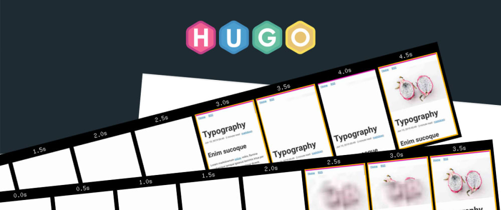
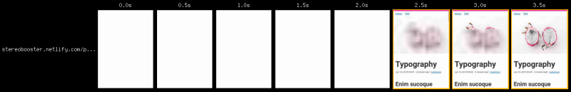
it is third and fourth rows
Good Day.
So, this is working fine with the update of
{{ .Get $medium }}to{{ .Get (print $medium) }}since Hugo 0.59+.I'm having an issue where the svg shows a bit, because it has a larger Height value, even though the source is the same. Notice at the bottom of the full res image, you'll see the fuzzy svg placeholder.
Any suggestions?
Here's the generated code from "view page source"
@stereobooster why does only the no-js fallback include the
sizesattribute? I know compared to Laura's solution you're including the JS fallback but I wasn't sure why the attribute is only present there. I also saw yourelseis blank so it's not falling back to your default noted in the comments.I was looking for something like this. Thanks for sharing.
I can't use shortcodes inside theme files, as the result I copy-pasted code from shortcode to theme files 😞.
Can you share an example of how you implement this in a theme file?
Great post!
The good part is that Markdown Render Hooks were added in v0.62 😄
I got an error using the code above:
Upon searching for this error I found a recommendation (which is what @dmayo2 below has mentioned, but without listing the error) in the Hugo support form to change:
{{ if .Get $medium }}to:
{{ if .Get (print $medium) }}I don't understand why this is happening but it works and reflects Laura Kalbag's solution.
I created the image sizes as follows,
add_image_size( 'size-260', 260, 0, false ); //260px Original
add_image_size( 'size-260-landscape', 260, (int) round( 260 * 0.7 ), true ); //260px Landscape
add_image_size( 'size-260-portrait', 260, (int) round( 260 / 0.75 ), true ); //260px Portrait
add_image_size( 'size-260-square', 260, 260, true ); //260px Square
How do I replace 'src' with lqip, depending on where these dimensions are used?
add_image_size( 'size-lqip-20', 20, 0, false ); //LQIP Original
add_image_size( 'size-lqip-20-landscape', 20, (int) round( 20 * 0.7 ), true ); //LQIP Landscape
add_image_size( 'size-lqip-20-portrait', 20, (int) round( 20 / 0.75 ), true ); //LQIP Portrait
add_image_size( 'size-lqip-20-square', 20, 20, true ); //LQIP Square
I didn't understand your question
I wrote a small script to lazy-load my images gist.github.com/bgadrian/68ec61ed9...
Responsiveness will be a nice addition.
I'm not sure that it is lazy-loading. It is more like delayed loading - you load all images on the page, but postpone download till DOM load event. Where is lazy-loading will postpone download of images until they get in viewport. Maybe different terminology
¯\_(ツ)_/¯What is hugo?
Static website generator, like Jekyll but built with Go. gohugo.io/
Excellent write up. I wrote a srcset shortcode but have been relying on externally generating the different image sizes till now. Maybe it's time to let Hugo handle the image work instead.