
Introduction
In my article on lessons from my first deep learning hackathon, I introduced heatmaps. I mentioned that they highlight the regions in an image that the CNN focuses on while trying to make a prediction, and that it would be interesting to learn how they’re generated. Well, I finally know how. Let’s first go back and see what they look like.
These heatmaps are known as Grad-CAM heatmaps and are generated using the final layer of a Convolutional Neural Network. Hence, we’ll start by learning all about CNNs, and once we reach the final layer, we’ll learn about how heatmaps are generated.
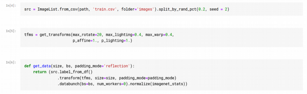
Dataset
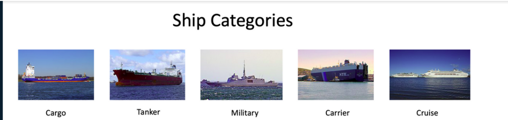
The dataset used in this article is from a computer vision hackathon conducted by Analytics Vidhya. It’s a classification task between 5 ship categories. The training set has 6252 images, while the test set has 2680 images. The evaluation metric used is f1-score.
Convolutional Neural Networks
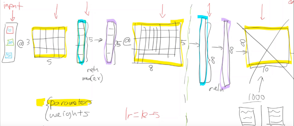
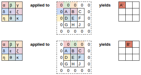
When we create a fully connected neural network, this is what goes on behind the scenes. We have a bunch of parameters and activations, and we use matrix multiplication (@) to calculate outputs at each layer.
Kernels
In a convolutional neural net, instead of matrix multiplication, we use something called a convolutional kernel. It’s kind of like matrix multiplication, with some interesting properties. It can be seen as a sliding filter we apply over our input.
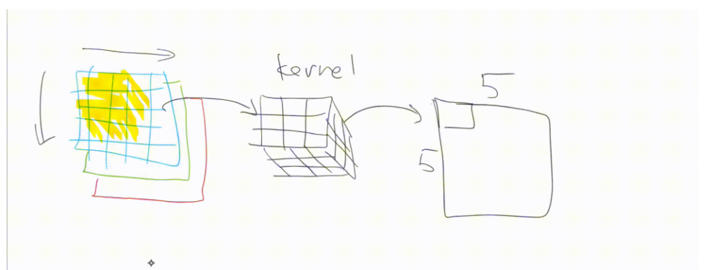
We start with a 3×3 kernel and multiply it by every 3×3 part of the image. We then we take all the values and add them up. We map these outputs to a new image. This process is shown below:
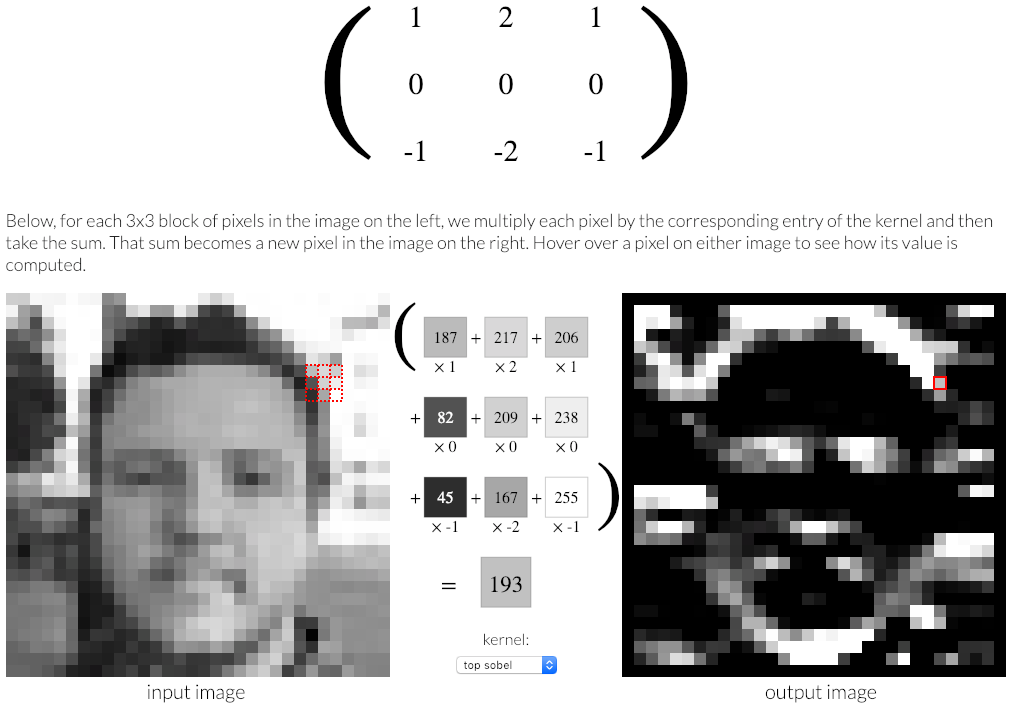
Since our kernel can’t go any further than the edge, the output is one pixel shorter on each edge than the original kernel. We can pad the edge in different ways (zero padding, reflection padding, and so on).
Here’s another illustration of applying a kernel over an image:
Now let’s go back to the first illustration and inspect its output. Applying a convolution over the grayscale image has the effect of detecting horizontal edges in the image. We’ve seen this kind of thing before in my article on how pre-trained models work, where we saw an illustration of what layers of a neural net can detect.
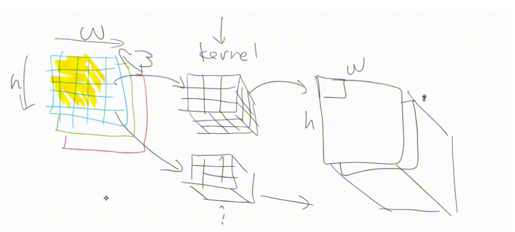
The reason our kernel detected horizontal edges has to do with its values. A different set of values would detect different things. Hence, we’ll be applying more than one kernel for our input. Before we do that, let’s discuss colored images and channels.
3-Channel Images
In real life, most images will have 3 channels (Red, Green, and Blue). We don’t want to use the same kernel over all the 3 channels. If we’re creating a green frog detector, we want more activations on the green channel than we would on the blue channel. Hence, we create a 3×3 kernel.
The output of one kernel has just one channel. One kernel can only be used to detect one thing (i.e. horizontal edges). We want our network to do much more than that. We want it to detect all kinds of things; hence, we use a bunch of kernels and stack their outputs together. The output will have height and width the same as the original image, and depth equal to the number of kernels used.
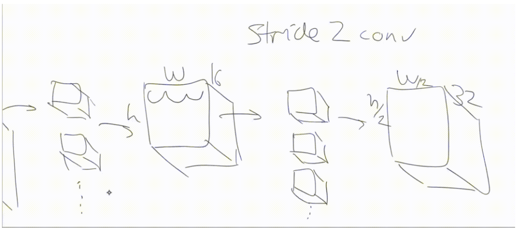
In order to avoid running out of memory, from time to time we create a convolution where we don’t step over every single set of 3×3, but instead we skip over two at a time.
We’d start with a 3×3 centered at (2, 2) and then jump over to (2, 4), (2, 6), (2, 8), and so forth. That’s called a stride 2 convolution. This convolution looks exactly the same—it’s still just a bunch of kernels—but we’re just jumping over 2 at a time. We’re skipping every alternate input pixel.
So the output from that will be H/2 by W/2. When we do that, we generally create twice as many kernels, so we can now have 32 activations in each of those spots. That’s what modern convolutional neural networks tend to look like.
CNN in Code
Let’s create a cnn_learner using fast.ai and examine these things ourselves.
We start by creating a data bunch. We use a helper function so that we can easily create data bunches of images with different sizes and padding_modes. We also apply some augmentations to the data that we think might prove useful:
We then create our cnn_learner using the following command:
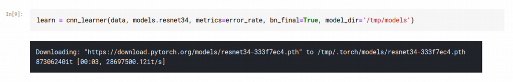
Notice that the bn_final parameter is set to True.
This parameter includes a Batch Normalization layer at the end of our CNN. I haven’t spoken about batch normalization in any of my articles, but in simple terms, it accelerates training by allowing us to use higher learning rates. It smoothens our loss function, which has a regularization effect just like weight decay or dropout.
Once we’ve created a learner, we can use either learn.model or learn.summary() to check the various layers in our model. learn.model shows that most of our kernels are of size 3×3, which makes sense because if we use larger kernels we’ll have to do more padding.
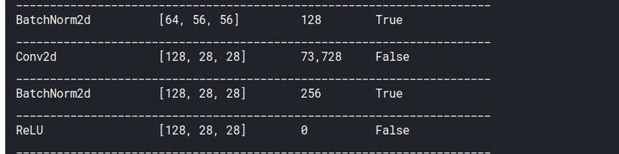
The output of learn.summary() shows that from time to time, our image sizes reduce to half (224->128->56 and so on), while the number of output channels doubles, as shown above (64->128). This keeps happening until we reach 512 channels.
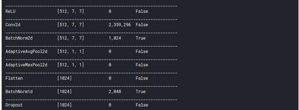
Notice that the final layers of the network mention something called Adaptive Pooling . These are the layers we’ll use to generate the heatmap. But before we do that, we will do our own manual convolution.
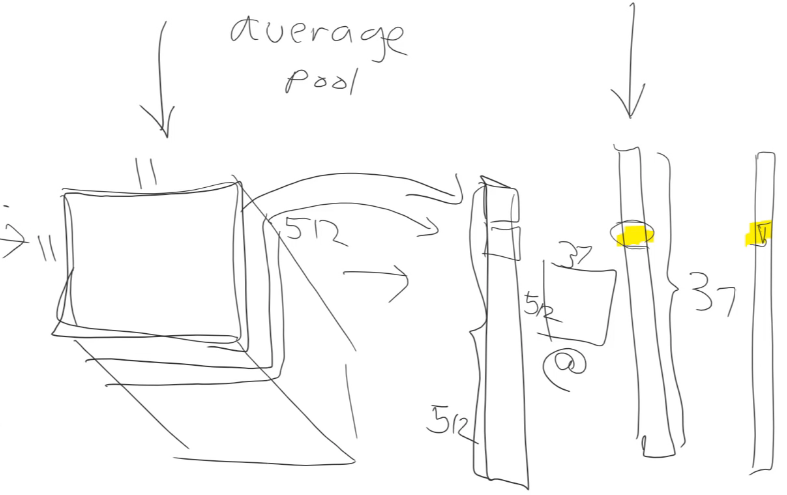
Manual convolution
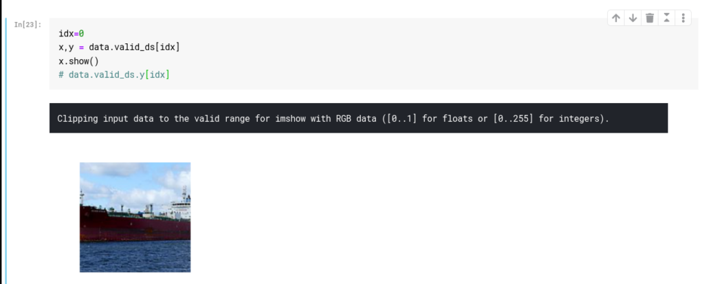
We take one image to which we will be applying the convolution. We take this image from our validation set:
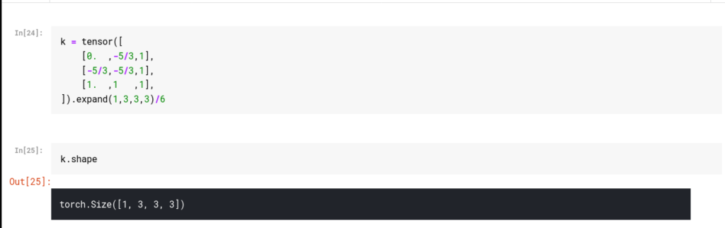
We then initialize our kernel. Since our image has 3 channels (RGB), we’ll require a 3x3x3 kernel. We do this by creating a 3×3 kernel and copying the same values for the other 2 channels using the function expand. This function does not make copies of our kernel but uses the same values stored in memory. Hence, it’s more memory efficient.
We can use a bunch of values for our kernel to experiment. The way this works is, the most positive values are the things the convolution will identify.
For example, this kernel will identify bottom and right edges. In deep learning, the most important thing to look at is shape. Printing the shape is often a good idea because we’re not used to dealing with higher dimensions, and we’d like to confirm the output at every stage and think about why it has the shape it does.
The output for k.shape is [1,3,3,3], which means we have just one 3x3x3 kernel.
We can now apply the kernel over the image. We do this as shown below:
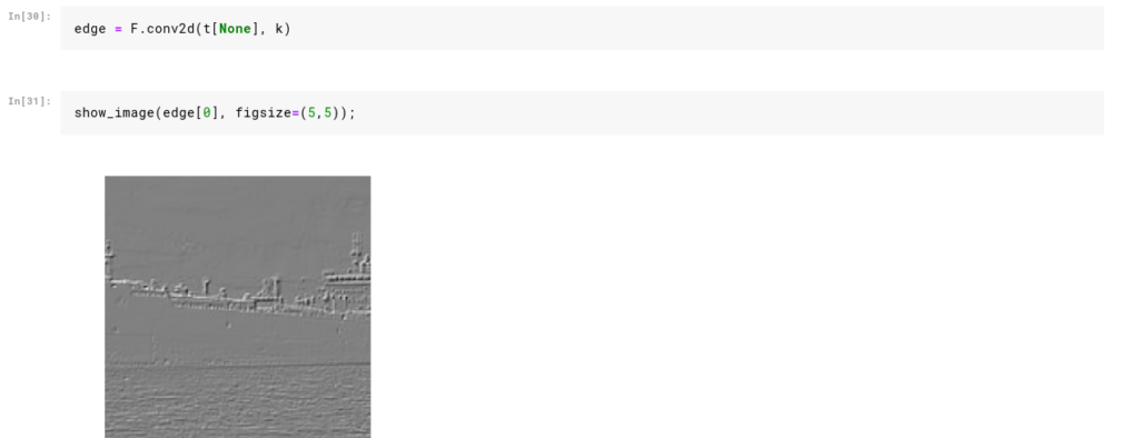
PyTorch provides a pretty useful library called function, which is imported in fast.ai as F . We can use this library directly to call various types of functional aspects of deep learning. We see that our kernel did detect right and bottom edges of the ship. We can now move on to creating heatmaps.
Creating Heatmaps
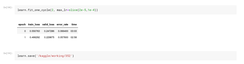
In order to create a heatmap, we need to train our learner. I’ve done so using the standard steps we’ve followed in all deep learning applications so far. We start with a pre-trained model, train for a few epochs, unfreeze, and then train some more.
We can now talk about the Adaptive Pooling layers toward the end of our network. As we’ve seen above, after a bunch of convolution layers, we end up with an output that’s small in size with a lot of channels (7x7x512 in our case). In Adaptive Average Pooling we take the average of all these channels and convert them to a tensor of 512 outputs as shown.
We can then multiply this tensor with a matrix of size (512 x no. of classes) to get our final output. If this matrix multiplication gives us the correct class, then the only way that’s possible is if the 512 values represent certain things in our images. And they do.
The 512 values represent features in our image that potentially dozens or even hundreds of layers of convolutions must have eventually come up with. These features are stored in 7×7 matrices and can be anything related to the ship’s keel, hull, or other features that distinguish one ship from another.
Instead of taking the average of all the values in a 7×7 matrix, what if we took the average of the first cell across every channel? These averages will tell us how activated that area was when our network predicted a Cargo or a Cruise. Let’s see this in action:
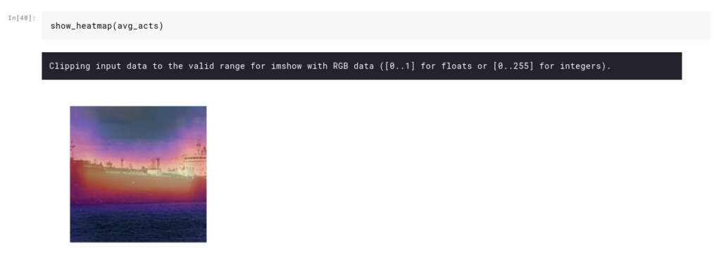
To generate these heatmaps, we make use of hooks, which are a really cool feature in PyTorch. When we apply a hook to a particular layer in our model, PyTorch will store its values during the forward pass. We can then use these values to generate our heatmap.
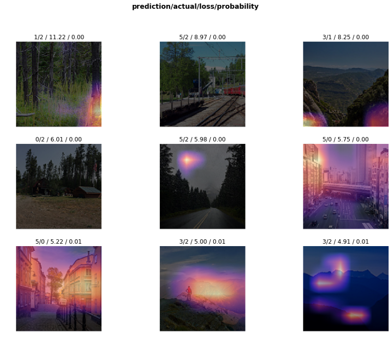
Interpreting top losses
Before I finish this article, I’d like to very quickly show how to read the output of the plot_top_losses function, which generates these heatmaps. Let’s start with a sample without heatmaps.
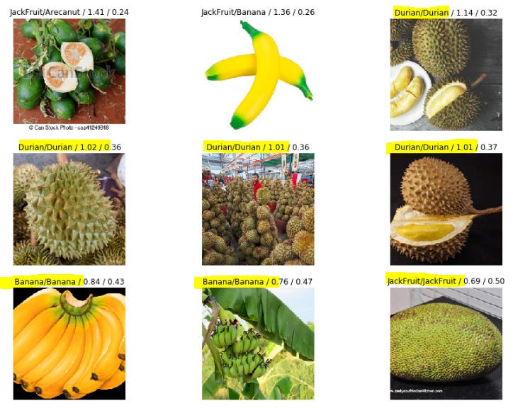
This image is from a fruit classification challenge. The output is in the format predicted class / actual class / loss / probability of actual class .
Say we have 10 classes. Whenever we train a model and make a prediction, the model generates 10 probabilities for the 10 classes, and the highest one is selected as our prediction.
Now check the first cell of our image. The way to read this output is:
- our model predicted Jackfruit
- the actual fruit was Arecanut
- the loss was 1.41
- and the probability of Arecanut (actual class) as predicted by the model was just 0.24 (remember, the model will have 10 probabilities). Read that again and make sure you understand it.
Now in this case, we misclassified, and hence the loss was high. There can be cases where we classify correctly but with low confidence leading to high loss. The reason I included this info in this article is that, it’s really essential to interpret your model and interpret it well in order to fine tune it effectively.
That will be it for this article.
To try these things yourself, fork my Jupyter notebook and experiment with it.
If you liked this article give it at least 50 claps :p
If you want to learn more about deep learning check out my series of articles on the same:
~Happy learning.

Comments 0 Responses